

Case Study: How A/B Testing Boosted Thumbnail CTR
A thumbnail test took CTR from 1.9% at baseline to 5.1% on the top version, without hurting watch time. That’s the whole lesson: if people who click already watch for a decent amount of time, your problem may be the packaging, not the video.
Here’s the short version:
- I started with a video style that got 80,000 impressions per upload but only 1.9% CTR
- Viewers who clicked were still watching for about 2:58, so retention was not the main issue
- I tested one thumbnail variable at a time: face crop, text length, and background contrast
- The top version reached 5.1% CTR vs. 3.8% for the control in the main test
- That led to about 1,560 more views at roughly the same impression level
- Watch quality stayed flat at about 4:05–4:15 average view duration and 42%–44% viewed
If you want the takeaway in one line, it’s this: shorter text, a tighter face crop, and a clearer visual message got more clicks. In this case, the shortest, easiest-to-scan thumbnail won.
This case study walks through the starting numbers, the test setup, the thumbnail changes, and what the results say about what people click on.
How the Thumbnail A/B Test Was Set Up
Hypothesis, Variables, and Success Criteria
The creator began with one clear hypothesis: a more emotionally expressive close-up face, shorter hook text, and stronger color contrast would produce a higher CTR than the current thumbnail design. The point was to fix the packaging, not the video itself.
To make the test clean, they split that idea into three separate variables for thumbnail A/B testing: a closer face crop, text length, and background contrast. Then they tested one variable at a time, so any CTR shift could be linked to one change instead of a messy mix of changes.
They also set the win condition before the test started. Success meant a 15–20% CTR lift over the control, while average view duration stayed within ±5% of the baseline. That second part matters. A thumbnail that gets more clicks but brings in lower-quality views isn't much of a win.
With the variables locked, the creator kept the rest of the upload the same and tracked the impact.
Test Conditions, Duration, and Traffic Controls
To keep the results clean, the creator left the video and title unchanged. Each variant ran for 48–72 hours and needed at least 10,000–20,000 impressions from Browse and Suggested. For slower videos, that window extended to 5–7 days. External promotion also stayed paused so traffic spikes wouldn't skew the data.
Once those rules were in place, the creator moved on to building the control and test versions.
Using ThumbnailCreator to Build Test Variants
ThumbnailCreator helped the creator put together variants fast. They started with one base template: face on one side, bold text on the other, and a plain background.
From there, each edit focused on one part of the thumbnail:
- Face swapping changed the expression without a reshoot
- Text edits trimmed longer lines into 2–4 word hooks
- Background edits increased contrast without changing the layout
Using that setup, the creator made 3–5 polished variants in under an hour. That made repeated testing practical across back-to-back uploads, instead of treating thumbnail work like a one-off task. Those versions became the control-and-test set covered next.
sbb-itb-b59debf
The Thumbnail Variants That Were Tested
Control Thumbnail: What the Creator Started With
The creator tested one original control against three single-variable variants.
The control was the live thumbnail the video started with. It used a wide crop, which made the subject look small in the frame. The background was neutral and low contrast, so the subject didn’t stand out much. It also had too much thumbnail text, which made the message harder to scan on a phone screen.
Put simply, the control had no strong focal point, weak contrast, and text that took extra effort to read at small sizes. That made it a clean baseline.
What Changed Across Variants: Face, Text, Color, and Composition
Each variant changed one main element. That way, any CTR shift could be linked back to one edit instead of a mix of changes.
Variant A tested the face crop. The creator zoomed in so the face filled more of the frame. That made the expression easier to read and improved emotional readability. The text, background, and layout stayed the same as the control.
Variant B tested text length. The original sentence was shortened to a 2–4 word hook in a bolder font. The goal was simple: make it faster to scan on a phone screen. The face crop and background stayed at the control setting.
Variant C tested background color contrast. The neutral background was swapped for a bolder, high-contrast color, which helped the subject stand out more in the feed. The face crop and text stayed unchanged from the control.
Background and face edits often move CTR more than text, so Variant A and Variant C went after the strongest levers first.
Comparison Table of Thumbnail Variants
The table below shows each version and the single change it isolated.
| Variant | Visual Change | Hypothesis | Element Tested |
|---|---|---|---|
| Control | Wide crop, low-contrast background, too much thumbnail text | No changes | Baseline |
| Variant A | Tighter face crop | A larger, easier-to-read expression will increase emotional connection and click intent | Face crop |
| Variant B | Text reduced to a short hook with heavier typography | Shorter copy will be easier to scan on mobile, lowering friction to click | Text length |
| Variant C | Background replaced with a bolder, high-contrast color | Higher contrast will make the subject stand out more in the feed | Background color contrast |
How to A/B Test YouTube Thumbnails (Step-by-Step)
Results: CTR Lift, View Growth, and What the Data Showed
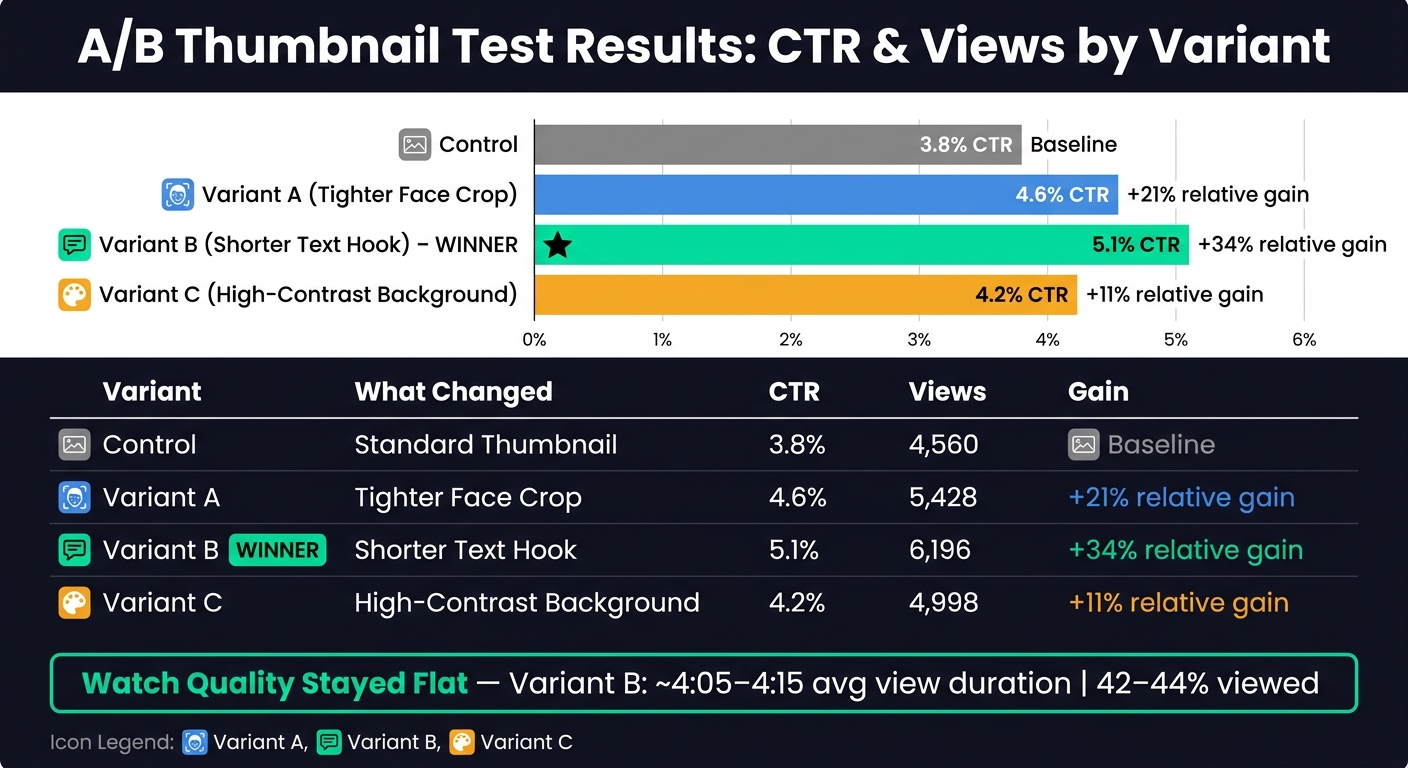
A/B Thumbnail Test Results: CTR & Views by Variant
CTR Change Across Variants
Once traffic leveled out, it was clear which thumbnail change got more clicks. After each version picked up about 120,000 impressions, the control ended at a 3.8% CTR with 4,560 views. Variant A hit 4.6% CTR and 5,428 views. Variant B led the group with 5.1% CTR and 6,196 views. The background-color-only variant improved as well, but not as much as Variant B.
That puts the jump from the control to Variant B at +1.3 percentage points in absolute CTR. On a relative basis, the gain was 34%, based on (5.1 − 3.8) ÷ 3.8. Put simply, the new thumbnail was about one-third better at turning impressions into clicks, which added about 1,560 views.
The big thing to check next: did more clicks come at the cost of watch quality?
Did Higher CTR Hurt Watch Quality?
In this case, no.
Watch quality stayed about the same across the top result. The control averaged 4:10 with 43% viewed, while Variant B stayed in that same band at about 4:05–4:15 and 42%–44% viewed. So the higher CTR didn't seem to bring in lower-intent viewers.
Results Summary Table
| Variant | Impressions | CTR | Views | Relative CTR Gain |
|---|---|---|---|---|
| Control | 120,000 | 3.8% | 4,560 | - |
| Variant A | 118,000 | 4.6% | 5,428 | +21% |
| Variant B | 121,500 | 5.1% | 6,196 | +34% |
| Variant C | 119,000 | 4.2% | 4,998 | +11% |
Variant B was the clear winner. It posted the top CTR, brought in the most views, and didn't lower retention. The data point to the tighter face crop and shorter text as the main drivers of lift, more so than background color alone. That sets up the workflow used in the conclusion.
Conclusion: What This Creator Learned and How to Repeat It
Variant B won because it made the video's promise clear at a glance.
The Design Patterns That Increased CTR
The winning thumbnail worked because several high-impact changes came together at the same time: a tighter crop on the creator's face with direct eye contact, a stronger emotional expression, shorter hook text, and a higher-contrast background that helped the subject pop. The lift didn't come from just one tweak. It came from the mix.
The winner stripped the frame down to what mattered most: one clear face, shorter text, and stronger contrast.
Put your attention on changes that directly affect readability and attention.
Those same patterns can shape every test you run next.
A Repeatable Thumbnail Testing Workflow for Future Uploads
The creator's workflow is simple enough to use on every upload without eating up hours of production time.
- Write a hypothesis before you design anything Say what you expect to happen and why. That keeps the test focused and makes the result easier to read.
- Build 2–3 variants that each change one major variable Keep each variant centered on one main change.
- Run until each variant has enough impressions Let each variant collect enough impressions to judge performance. Don't stop the test too soon.
- Check CTR and retention together Look at CTR and early retention side by side.
- Log everything Track each test in a simple spreadsheet, then review the results again after 7–14 days.
Speed matters if you want to test on a regular basis. ThumbnailCreator can help you move faster with AI generation, face swap, text editing, and background tools.
FAQs
How many impressions are enough for a thumbnail test?
Aim for at least 1,000 impressions for each thumbnail variant. A common target is 1,000 to 5,000 impressions, though some tests may need as many as 10,000 before you can feel good about the result.
It also helps to watch secondary metrics like watch time. A high click-through rate looks nice, but it doesn’t tell the whole story. If people click and then leave fast, your thumbnail may be pulling in the wrong crowd.
Why test one thumbnail element at a time?
Testing one thumbnail element at a time helps you pinpoint what’s affecting click-through rate.
If you change several things at once - like color, text, and facial expression - you won’t know which change led to the result.
That keeps your data clear and useful instead of muddy or hard to read. ThumbnailCreator can help by letting you make test variants fast, so you can check single elements without wasting time.
What should I track besides CTR?
CTR matters, but it shouldn’t be the only thing you track. Look at watch time, average view duration, and total impressions too. That gives you a much clearer read on how a video is doing.
It also helps to check broader engagement signals like shares, comments, and subscriber conversion rates. These fill in the gaps that CTR can’t.
For example, a high CTR paired with low retention usually means the thumbnail gets people to click, but the video doesn’t deliver on the promise.