

Case Study: Thumbnails Boosting Browse Feature Views
I’d sum it up like this: simpler thumbnails led to more Browse views. In this case, Browse CTR moved from 3.4% to 6.1%, Browse impressions went from 80,000 to 145,000, and Browse views climbed from 2,700 to 8,800 in one 28-day before-and-after check.
If you want the short version, here it is:
- I saw better results after thumbnails were cleaned up
- The main changes were:
- larger faces
- shorter text
- stronger contrast
- less busy backgrounds
- more steady channel style
- Browse traffic also took a bigger share of total views: 22% to 41%
- The upload pace stayed the same, which makes the thumbnail update the main thing that changed
This case does not prove thumbnails were the only cause. But the timing lines up, and the shift in clicks and views was hard to miss.
If you get Browse impressions but weak CTR, this is the main takeaway: follow proven thumbnail composition rules to make the design easier to understand in one glance.
UnThumbnails: The NEW Revolution on YouTube (easier, higher CTR)
sbb-itb-b59debf
Baseline: Browse Traffic Before the Thumbnail Update
Before the redesign, Browse traffic came from Home, Subscriptions, and other recommendation surfaces. The channel was getting impressions, but the thumbnails weren’t pulling enough clicks. That’s the starting point for the baseline.
Starting Metrics from YouTube Analytics
In the 28 days before the thumbnail update, the case study tracked baseline metrics in YouTube Analytics: Browse impressions, Browse CTR, views from Browse, and Browse share of total views. The right way to read those numbers is against the channel’s own averages, not in isolation.
Why the Old Thumbnails Underperformed in Browse
The pre-update thumbnails had several issues that often drag down Browse performance: low contrast, too much visual clutter, a weak focal point, and text that was too small or too dense to read on mobile. On a thumbnail that may appear at about 168×94 pixels, those choices made the images harder to scan in a busy feed. So the videos earned impressions but lost clicks.
That matters more in Browse than many creators think. On Home and other recommendation surfaces, people make a click choice in a split second. If the package doesn’t read fast, it gets passed over. This is a core principle of thumbnail psychology and viewer behavior.
This baseline is a starting point, not proof that thumbnails alone caused the weak performance. Topic demand, upload timing, and recommendation patterns can also shape Browse distribution. The next step was to change the thumbnail package and see whether Browse performance moved.
Thumbnail Changes Made and How They Were Executed
Design Updates That Made the Thumbnails Easier to Click
The redesign was a focused cleanup. Each thumbnail was stripped down to 2–3 core elements: the face, one key object, and a short text phrase.
Small logos, extra shapes, and busy background details were removed or blurred. The main subject sat on one side of the frame, with bold text on the other. The face was cropped much tighter, taking up 50–70% of the thumbnail width, so the expression could still read on a phone screen.
Expressions were picked to match the video's emotional hook and pushed a bit so they came through at small sizes. Backgrounds moved to solid colors, light gradients, or heavily blurred imagery, which pulled attention toward the subject and text. Text was cut to 2–4 bold words that named the outcome directly. Fonts got larger and heavier, with a solid color block or drop shadow behind the text to keep it readable.
The end result was a thumbnail built for fast scanning in Browse. After that, the team tested those layout shifts across new thumbnail variants.
Using ThumbnailCreator to Speed Up Testing and Revision
Making these changes by hand across multiple videos would have taken a lot of time. To move faster, the creator used ThumbnailCreator, which cut thumbnail production time and made it much easier to create multiple variants for each video.
The process started with ThumbnailCreator's pre-built templates, which already use strong YouTube layout patterns. The AI generation feature gave the creator several starting directions without having to begin from a blank canvas. Face swapping made it simple to test different expressions and angles. Object swapping handled outcome imagery, like upward-trending graphs, before/after panels, or bold arrows based on the video's hook. And with text editing, the creator could test different short phrases and font pairings fast, then check which ones still worked at thumbnail size.
Here’s how the main design elements changed from the original thumbnails to the redesigned versions:
| Element | Before | After |
|---|---|---|
| Contrast | Low; similar tones between background, text, and subject | High; bright subject and text against a darker or simplified background |
| Face visibility | Small, competing with other elements; expressions unreadable on mobile | Large, close-cropped; clear expressions visible at small sizes |
| Text clarity | Long, sentence-like text in thin fonts | Short, bold, outcome-focused phrases (2–4 words); large, high-contrast fonts |
| Focal point | Multiple competing elements; no clear visual priority | Single dominant focal point (face or key object) with strong visual hierarchy |
| Alignment with video hook | Generic imagery that didn't show the result or transformation | Outcome-driven imagery (graphs, before/after, arrows) tied directly to the video's promise |
| Background complexity | Busy backgrounds with many details | Simplified or blurred; directs attention to subject and text |
| Consistency across thumbnails | Inconsistent styles, fonts, and layouts | Standardized layout, color palette, and typography across the channel |
| Creation workflow | Manual design; few variants per video | AI-assisted with templates, face/object swapping; multiple variants tested quickly |
Testing showed a clear pattern: large faces, upward-trending visuals, and short outcome text led to stronger early CTR on Browse. The next section shows how those variants changed Browse impressions, CTR, and views.
Results: Changes in Browse Impressions, CTR, and Views
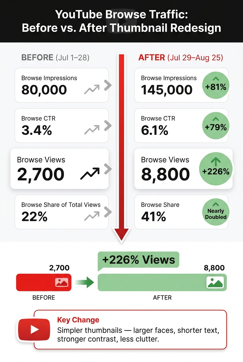
YouTube Browse Traffic: Before vs. After Thumbnail Redesign
Before-and-After Metrics Over the Tracking Window
Once the new thumbnails went live, the next two 28-day windows gave a clear read on how Browse responded. Browse traffic came from YouTube Analytics across two matching periods: July 1–July 28, 2026 (before the thumbnail update) and July 29–August 25, 2026 (after).
After the move to simpler layouts, stronger contrast, and larger faces, every Browse metric moved up fast:
| Metric | Before (Jul 1–28) | After (Jul 29–Aug 25) |
|---|---|---|
| Browse impressions | 80,000 | 145,000 |
| Browse CTR | 3.4% | 6.1% |
| Browse views | 2,700 | 8,800 |
| Browse as % of total views | 22% | 41% |
The signal here is hard to miss. Impressions went up, and CTR climbed at the same time. Browse views jumped by 226%, pushed by both more impressions and more clicks. Browse also went from 22% of total channel views to 41%, which is close to doubling its share of traffic.
What the Performance Shift Suggests About Browse Distribution
The numbers point to a simple idea: a higher Browse CTR may have helped YouTube test these videos with more people on Home and other Browse surfaces. Browse impressions rose from 80,000 to 145,000, an 81% increase, during the same window that CTR climbed from 3.4% to 6.1%. Put plainly, the videos appeared in Browse more often after viewers started clicking more often.
That said, this is an interpretation, not proof of cause and effect. YouTube has not published an exact formula showing how CTR affects distribution. Still, the timing matters. Impressions climbed right after the thumbnail change, and there were no major shifts in titles or topics. That makes thumbnails the most likely reason for the lift. The bigger point is simple: a stronger thumbnail may do more than lift CTR on its own. It may also change how hard YouTube pushes the video on Home.
Methodology and Limits of This Case Study
The setup was pretty simple: lock in a baseline, implement a thumbnail update strategy as the main variable, keep other factors as steady as possible, and track the results in standard YouTube Analytics reports. Upload pace stayed at two videos per week in both windows. Browse data came from the Traffic Source breakdown so the analysis stayed focused on Browse performance.
This was not a perfectly controlled test. It wasn't a lab setup, and other factors can affect Browse impressions, including seasonality, platform shifts, audience growth, and topic strength. Those limits matter when looking at the results.
Conclusion: Key Lessons for Browse-Focused Thumbnails
This case showed a pretty clear pattern: clearer thumbnails led to better Browse performance. When the thumbnail had stronger contrast, one clear focal point, and an obvious payoff, Browse clicks went up. That tracks with how Browse works. People make a split-second call, so the thumbnail has to make the value clear at a glance.
Here are four practical takeaways:
- Isolate thumbnail changes whenever possible. The redesign worked because the creator kept uploads and topics steady, so the thumbnail was the clearest variable. Change one major variable, then measure.
- Track Browse impressions, CTR, and Browse views over 30 to 60 days. Judge the result after enough impressions, not after just a few days.
- Refresh evergreen videos with proven demand and weak CTR. A better thumbnail on an existing video can open the door to more Browse exposure.
- Use faster creation workflows when running repeated tests. Tools like ThumbnailCreator can help speed up testing with AI generation, templates, face swapping, object swapping, and text editing.
This is a pattern, not a rule. Browse distribution still depends on topic, audience, and timing. But this case does show something important: a jump in Browse CTR from 3.4% to 6.1%, along with a 226% lift in Browse views, can change how far YouTube pushes a video across Browse surfaces.
So the move is simple: review Analytics, find videos with Browse potential and weak CTR, change one thumbnail variable, and then measure what happens. In this case, a simpler thumbnail package was the clearest path to more Browse views.
FAQs
Why did simpler thumbnails improve Browse performance?
Simpler thumbnails tend to do better in Browse because they stop the scroll faster. People there usually move quickly through their feed. They’re not hunting for one specific video, so your thumbnail needs one clear focal point right away.
Busy designs often get skipped or become tough to read, especially on mobile. High-contrast colors, expressive faces, and 3 to 5 words create a cleaner visual order and help viewers understand the video’s value at a glance.
How long should I test a thumbnail change?
Test a thumbnail change for at least 7 to 14 days so you get data from both weekdays and weekends. That gives you a better read on how people respond across different viewing habits.
Don’t judge the result in the first 48 hours. Early numbers can be noisy and may not show how the thumbnail will perform over time.
It also helps if each version gets around 1,000 to 5,000 impressions. And once you change a thumbnail, wait at least 30 days before changing it again.
Which thumbnail element should I change first?
Change the thumbnail’s background color first. It’s often the biggest driver of CTR shifts, usually around 18% to 25%.
Test one element at a time so you can see exactly what changed the result. If you’re already working on a CTR problem, an expressive facial emotion is often the next big lever to test.