

Case Study: How Thumbnail Updates Increased Views
Yes - changing only the thumbnail led to more clicks and more views. In this test, CTR moved from 4.1% to 6.8%, impressions went from 48,200 to 61,700, and daily views climbed from 120 to 310 on older videos, while watch time and average view duration stayed about the same.
If I boil this case study down, here’s the takeaway:
- The problem was packaging, not the videos
- Old thumbnails were getting impressions but not enough clicks
- Simple design changes drove the lift
- The best results came from older evergreen videos
- Changing the thumbnail alone was enough to improve performance
The updates focused on a few clear fixes:
- Higher contrast backgrounds
- Faces that were easier to see
- Short text hooks with 3–5 words
- Less clutter
- One clear focal point
What stands out most is this: if a video has steady retention but weak CTR, the thumbnail is often the first thing I’d check. In this case, the channel kept titles, descriptions, and video content the same, then compared matched 30- to 90-day windows before and after each thumbnail swap. The result was simple: more people clicked, and they did not leave faster.
Here’s the short version of what changed and what happened:
| Area | Before | After |
|---|---|---|
| CTR | 4.1% | 6.8% |
| Impressions | 48,200 | 61,700 |
| Daily views | 120 | 310 |
| Viewer behavior | Steady retention | Steady retention |
I’d describe this case study as a plain test with a clear lesson: if your videos are being shown but not getting clicked, a thumbnail update can have a big effect. The strongest wins came from fixing common thumbnail mistakes like low contrast, excessive text, or making the subject hard to spot.
So before I touch a title or redo a video, I’d start here: find videos with solid impressions, low CTR, and good watch time, update the thumbnail, then give the data at least 30 days before making another change.
I Changed My Old Thumbnail and it got 100,000% More Views
sbb-itb-b59debf
Baseline: Why the Original Thumbnails Were Holding Videos Back
The data pointed to a click issue, not a content issue. Impressions were solid. Retention stayed steady. But the thumbnails weren't turning those impressions into views.
Common Problems in the Original Designs
Most of the weak thumbnails had the same set of problems. Dark, low-contrast backgrounds faded into YouTube's home page and suggested feeds, so people could scroll past before the video even had a shot. Faces were small or turned away, which hurt the emotional pull. And the text? It was often too long, too thin, or laid over busy imagery, which made it hard to read on mobile.
The layouts didn't help either. When a thumbnail tries to say three or four things at once, the viewer usually gets none of them. People scan fast - almost at a glance. If there's no single thing pulling the eye in, the design gets skipped. That's exactly what was happening here: too many competing elements, no clear visual hierarchy, and no obvious focal point.
So the test focused on a few direct fixes: better contrast, stronger hierarchy, clearer face visibility, and text that could be read fast.
Before-Update Performance Snapshot
The affected videos were sitting at 2.5–4.0% CTR from home and suggested traffic, and views had flattened between 5,000 and 20,000 over 90 days. That's below the 5–7% CTR often seen from stronger thumbnails in this niche.
That gap made the weak spots pretty clear.
| Thumbnail Attribute | Original State | Why It Hurt Performance | Related Metric |
|---|---|---|---|
| Background | Dark, low-contrast colors | Low visual stopping power | 18–25% CTR change |
| Text Overlay | Too much text, too small, and low contrast | Hurts mobile readability | 8–15% CTR change |
| Subject/Face | Small, turned away, or neutral expression | Weak emotional hook | 12–18% CTR change |
| Composition | Cluttered; no clear focal point | No clear focal point; easy to ignore | Low CTR across feed surfaces |
| Outdated Look | 2+ years old | Looks dated against modern design standards | Up to 45% CTR increase when refreshed |
Once it was clear the issue was packaging, not the videos themselves, the next move was simple: clean up the design and see if a simpler thumbnail could push CTR higher.
The Thumbnail Update Process and How It Was Tested
Which Videos Were Selected for Thumbnail Updates
After spotting the weak patterns, the creator changed thumbnails only on videos that had the best shot at improving.
The shortlist focused on evergreen videos that still brought in steady impressions but had weak CTR. This was significantly below thumbnail CTR benchmarks for their specific niche. It also included older uploads with thumbnails that looked dated. Videos with thumbnails older than 2 years got first priority, since refreshes in that age range have shown a 45% CTR lift.
To keep the test clean, the titles didn't change. Only the thumbnail changed.
What Changed in the New Thumbnails
Each redesign went straight at the problems found in the baseline review. The changes were kept small on purpose, with each update tackling the variables most likely to move CTR first.
Background color came first. Faces changed from neutral or turned-away shots to expressions with more emotion. On-thumbnail text was trimmed down to 3–5 words, then styled with high-contrast colors plus strokes or shadows so it stayed readable on mobile. Before upload, every updated thumbnail was checked against mobile-first vs desktop-first design standards.
The final setup stayed simple: one subject, one emotion, and one short hook.
How ThumbnailCreator Helped Speed Up Testing
Once the plan was set, the bottleneck was speed. The creator needed enough variations to test without dragging the process out. ThumbnailCreator helped move things along with AI concepts, face swaps, text edits, and object swaps.
Each update changed one variable at a time, ran for at least 30 days, and was reviewed on days 7 and 28. That made it much easier to compare results from one video to the next.
| Design Change | Implementation Method | Metric Tracked | Test Duration |
|---|---|---|---|
| Higher contrast background | AI-generated color swap via ThumbnailCreator | CTR, impressions | 30 days |
| Fewer words (3–5 max) | Text editing with stroke/shadow | CTR, mobile readability | 30 days |
| One clear subject | Object swapping, clutter removal | CTR, retention | 30 days |
| Expressive face | Face swap via ThumbnailCreator | CTR, watch time | 30 days |
| Thumbnail-only swap | Title left unchanged to isolate packaging | CTR, impressions, views | 30 days |
The gap between changes mattered too. Leaving at least 30 days between thumbnail updates helped avoid muddy results. Changing a thumbnail more than once a month can lead to a 15% drop in impressions while the algorithm recalibrates.
Results: CTR, Views, and Re-Engagement After the Thumbnail Updates
CTR and Impression Changes After the Update
For the same videos flagged in the baseline audit, the thumbnail refresh led to more clicks without any change to the actual content. Impressions stayed about the same or moved up a bit, while CTR climbed. That points to a simple takeaway: the new thumbnail got more people to click from about the same level of reach.
Watch time stayed steady, which matters. It suggests the issue wasn’t the video itself. The main problem was the packaging.
View Growth and Renewed Activity on Older Videos
The biggest lift showed up on older uploads that had already flattened out. One video went from about 120 daily views to 310 within 30 days. That’s a big jump for a video that had already slowed down.
On average, view growth from updating old thumbnails is about 28%, and the higher CTR did not lower average view duration. In plain English: more people clicked, and they didn’t leave any sooner.
Before-and-After Performance Table
The April 7, 2026 to June 30, 2026 comparison window shows the lift. The table below shows the clearest before-and-after shift.
| Metric | Before Update | After Update | Change |
|---|---|---|---|
| CTR | 4.1% | 6.8% | +65.9% |
| Impressions | 48,200 | 61,700 | +28.0% |
| Daily views | 120 | 310 | +158.3% |
AVD held at 41% of video length. That kind of variation is normal, and it helps the numbers feel grounded. Thumbnail testing takes a few rounds, not one magic fix. Following a structured thumbnail A/B testing guide helps identify which designs actually resonate. Some videos react more than others based on topic demand and how far off the original thumbnail was from what viewers expected.
Takeaways: A Thumbnail Update Process Creators Can Repeat
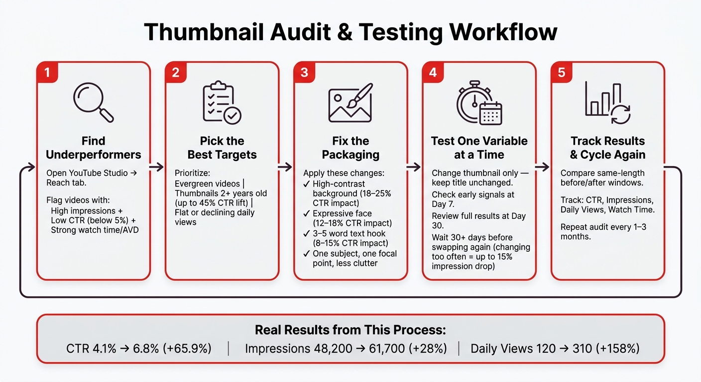
Thumbnail Audit & Testing Process: Step-by-Step Workflow
The results show a workflow creators can use again and again to spot thumbnails that are dragging videos down.
What This Case Study Shows About Thumbnail Performance
The lift came from thumbnail changes alone.
That matters. If a video has strong retention but weak CTR, the issue usually isn't the video itself. It's the packaging. People click the thumbnail first, and if that click rate lags while viewers who do click keep watching, the thumbnail is the weak link.
A Simple Audit and Testing Process to Reuse
You can use the same signals from this case study to find your next batch of update candidates.
Start in YouTube Studio’s Reach tab. Look for videos with strong impressions but weak CTR. If a video also has strong watch time or average view duration but weak clicks, it deserves a closer look. That’s even more true for evergreen videos with thumbnails that are more than two years old.
Then make two to three thumbnail variants for each video. Focus first on the changes most likely to shift performance: low contrast, small faces, too much text, and clutter. Those are often the biggest drags on clicks. Use short text hooks of 3–5 words in high-contrast type. If you want to move faster, ThumbnailCreator can help with templates, face swaps, text edits, and object swaps.
Give the test a little room to breathe. Check early signals after 7 days, look at results after 30 days, and wait at least 30 days before swapping again. If you change thumbnails too often, impressions can drop by up to 15%.
Conclusion: Key Design Changes and Metrics That Drove the Results
These design changes drove the biggest lift:
| Design Change | Avg. CTR Impact |
|---|---|
| Background color | 18–25% |
| Facial expression swap | 12–18% |
| Radical text change | 8–15% |
| Minor layout tweaks | <3% |
The success signals were straightforward: CTR, impressions, views, and watch time. Track them over the same before-and-after window so you’re comparing like with like.
Refreshing old thumbnails helps you get more out of videos you’ve already published, and the gains can stack over time. A simple rhythm works well: run this audit-and-update cycle every 1–3 months - audit, update, test, measure, repeat.
FAQs
How do I know if my thumbnail is the real problem?
Check your CTR and average view duration in YouTube Studio. Those two numbers tell a pretty clear story.
If both are low, your thumbnail may not be doing its job. It might not grab attention, or it may not set the right expectation for the video.
If CTR is high but watch time is low, that usually points to a mismatch. People click, then leave. In plain English: the thumbnail got the click, but the video didn’t feel like what they expected.
That’s where ThumbnailCreator can help. You can fine-tune your design fast, so your thumbnail lines up better with the actual content and brings in clicks that are more likely to stick.
Which videos should I update first?
Start with your top 20% of videos. Those videos drive 78% of results from thumbnail updates, so that’s where the upside usually is.
Inside YouTube Studio, look for videos with strong watch time but low click-through rates. That combo is a good sign: people tend to stick around once they click, but the thumbnail isn’t doing enough to get them in the door.
It also helps to bump older thumbnails to the front of the line. Thumbnails that are more than 18 months old can see an average 45% CTR increase after a refresh. That’s a big lift from a small change.
For your first update, add an expressive human face. It’s one of the simplest ways to make a thumbnail feel more immediate and eye-catching. If you want a faster path, ThumbnailCreator can help with templates and AI face swapping.
How long should I wait before judging results?
Wait 7 to 14 days before you judge thumbnail results. That gives the test enough time to pass through normal weekday and weekend viewing habits. Also, avoid calling it too early in the first 48 hours.
If you want results you can trust a bit more, each variant should get 1,000 to 2,000 impressions. When you compare them, look for a 15% to 20% gap in performance. And don’t stop at click-through rate alone - check watch time too.