
Case Studies: Thumbnail Changes Boosting Watch Time
Want more views and longer watch times on YouTube? Start with your thumbnails.
Thumbnails act as the "doorway" to your video. A great thumbnail grabs attention, sets clear expectations, and attracts the right audience. But poorly designed ones - cluttered visuals, unreadable text, or misleading images - can hurt your click-through rate (CTR) and retention.
This article breaks down three case studies showing how creators improved their thumbnails to boost CTR and watch time. Here’s what worked:
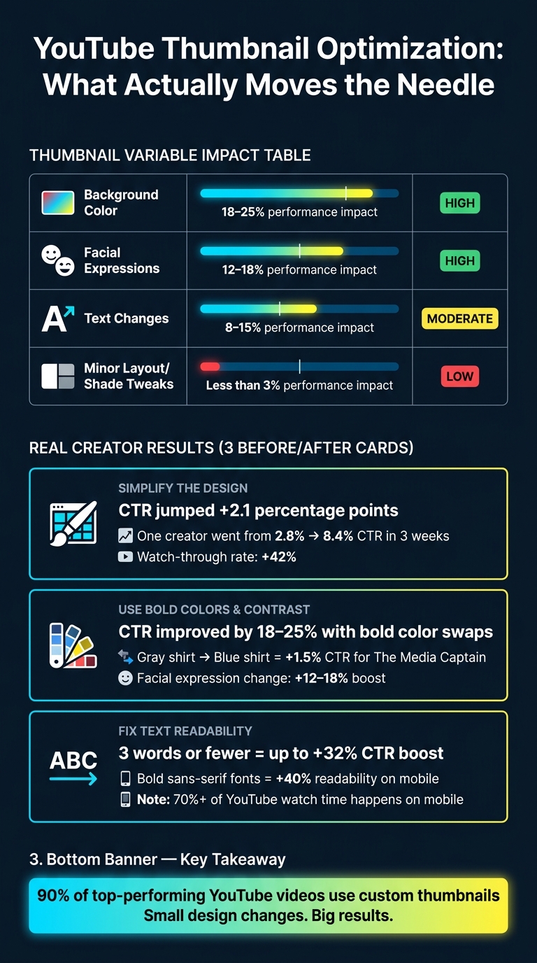
- Simpler Designs: Clean, focused layouts with fewer visual elements increased CTR by up to 2.1%.
- Bold Colors & Contrast: Bright, contrasting colors made thumbnails pop, improving CTR by 18–25%.
- Readable Text: Short, bold text (3–5 words) improved clarity and engagement, especially on mobile.
The key takeaway? Small but smart changes - like clearer fonts, better color contrast, or simplified layouts - can have a big impact on performance. Keep testing and refining through A/B experiments to find what resonates with your audience. This data-driven approach is often more effective than relying on A/B testing vs gut feeling alone.
MrBeast's Closed Mouth Hack That Gets MORE WATCH TIME (Not Just Clicks)
sbb-itb-b59debf
Case Study 1: Simplifying the Thumbnail Design
This case study highlights how simplifying a thumbnail can lead to higher click-through rates (CTR) and improved watch time. When thumbnails are cluttered, they fail to grab attention, as viewers lose interest in under two seconds. Small tweaks can make a big difference in boosting engagement.
The Original Thumbnail: Overwhelming and Ineffective
In May 2026, a cooking tutorial creator saw 180,000 impressions but only achieved a 1.9% CTR. The original thumbnail featured a pasta dish with the phrase "Easy Weeknight Pasta" written in white script over a busy, patterned background. The white text blended into the background, making it hard to read, especially on smaller screens. Research shows thumbnails with three or more competing visual elements tend to have 23% lower CTRs, and 52% of newer creators struggle with CTRs below 2% due to unreadable fonts.
"A cluttered thumbnail gives the eye nowhere to land, so the eye moves on." - Hooksnap Blog
The Change: Simplifying and Focusing
The creator revamped the thumbnail by removing the patterned background and shortening the text to "Better Than Takeout" in bold, high-contrast font. The pasta dish image was replaced with a close-up reaction face. This followed the "One Thing" rule: focus on a single, compelling element to grab attention. Keeping text concise (three to four words) and ensuring strong contrast between text and background made the thumbnail more visually effective.
Results: Higher CTR and Watch Time
After the redesign, the CTR jumped by 2.1 points, which translated to thousands of additional views from the same 180,000 impressions. A clear thumbnail not only attracts clicks but also encourages viewers to stay and watch. Brand strategist Benjamin C observed a similar pattern in December 2025. By redesigning thumbnails for an AI content creator, CTR increased from 2.8% to 8.4% in just three weeks, while watch-through rates rose by 42%, thanks to a clearer and more honest visual approach.
"Great thumbnails aren't about being flashy. They're about being honest and clear." - Benjamin C, Brand Strategist
Case Study 2: Using Bold Colors and Contrast
Building on the focus on clarity from Case Study 1, bold colors take engagement a step further. While often underestimated, bold and contrasting colors in thumbnails can significantly improve visibility and draw attention. Let’s dive into how these adjustments can impact viewer retention.
The Original Thumbnail: Flat Colors and Low Contrast
Back in March 2026, The Media Captain, a digital marketing agency, analyzed the performance of their "Backlink Building for Dummies" video, a prime example of educational YouTube thumbnails. The thumbnail featured their president, Jason, wearing a muted gray shirt and sporting a frown. Against YouTube's white background, the thumbnail lacked visual appeal, blending into the interface. YouTube growth strategist Daniel Whitmore explained:
"Bright, contrasting color schemes pop against YouTube's white background. Dark or muted thumbnails get lost."
The Change: Brighter Colors and a Bolder Design
The fix was surprisingly simple: swap the gray shirt for a bright blue one and replace the frown with a smile. No major layout changes were necessary. The combination of a vibrant blue shirt and a cheerful expression did the trick. According to A/B testing data, changes in background colors led to an average click-through rate (CTR) improvement of 18–25%. Adjusting facial expressions contributed a 12–18% boost, while smaller tweaks, like minor shade adjustments, had less than a 3% effect.
Results: More Viewers Staying to Watch
The revamped thumbnail delivered a 1.5% higher CTR for The Media Captain. While 1.5% may seem modest, the increase significantly impacted total views when scaled. Additionally, YouTube’s "Test & Compare" feature now prioritizes thumbnails based on watch time share rather than just clicks. This shift emphasizes the importance of setting clear expectations through thumbnails.
"The winning thumbnail is no longer the most clickable one. It is the one that sets the most accurate expectation." - Hooksnap Blog
Case Study 3: Fixing Text Placement and Readability
When it comes to thumbnails, color and layout often get the spotlight. But text readability can be just as critical for grabbing attention. This case study dives into how adjusting text placement can transform viewer engagement, using a pasta tutorial video as an example.
The Original Thumbnail: Text That Was Hard to Read
The original thumbnail for the pasta tutorial video featured the phrase "Easy Weeknight Pasta" in white script font placed directly over a busy image of food. On mobile screens - where over 70% of YouTube watch time happens - this text was almost impossible to read. Unreadable fonts contribute to a CTR below 2% for 52% of new creators.
"The mistake most creators make is treating a low CTR as a design problem when it is really a communication problem. The thumbnail is failing to answer one question in under two seconds: why should I click this?" - Hooksnap Blog
The Change: Clearer Text in the Right Place
To fix the issue, the creator swapped the script font for bold, high-contrast lettering and shortened the text to "Better Than Takeout." This concise, catchy phrase - just four words - was easier to read and more compelling. The text was also moved away from the cluttered food background and placed near a close-up reaction shot, giving it a clean, unobstructed area to stand out.
Why does this work? Thumbnails with six or more words tend to perform poorly on mobile, while hooks with three words or fewer can boost CTR by up to 32%. This tweak not only improved text clarity but also aligned perfectly with the video’s key message, setting realistic expectations for viewers.
Results: Higher Engagement and Longer Watch Times
The revamped thumbnail led to a noticeable increase in CTR and maintained steady watch times. This shows that the new design attracted the right audience - viewers who stayed to watch rather than clicking out quickly, avoiding the pitfalls of clickbait vs authentic thumbnails.
This is a big deal because YouTube now prioritizes watch time share over raw clicks. A thumbnail that draws genuinely interested viewers will always outperform one that relies on misleading tactics. As Nolan Fowler, Digital Marketing Specialist at The Media Captain, explains:
"Leading with a strong emotive element that ignites curiosity and keeping it simple with text under 5 words are key to winning the click on YouTube."
What the Data Showed: Patterns and Lessons
YouTube Thumbnail Changes: Impact on CTR & Watch Time
Data from the three case studies highlights a clear trend: making bold, thoughtful design changes to thumbnails can significantly improve performance.
Thumbnail Changes That Made a Difference
Big changes deliver big results. For example, altering background colors can lead to performance shifts of 18–25%, while tweaking facial expressions adds another 12–18% boost. Even text updates can make a difference, typically improving performance by 8–15%, though the exact impact depends on the content type. On the other hand, small layout adjustments or shade tweaks usually result in less than a 3% change. In short, minor tweaks won’t move the needle much - only major updates deliver noticeable improvements. To ensure your efforts count, avoid common thumbnail mistakes that often stall growth.
Sougan Kumar Mandi, founder of Peplio, summed it up perfectly:
"US creators don't treat thumbnails as decoration - they treat them as conversion assets."
This shift in perspective - from simply making thumbnails look good to designing them to drive action - is what separates the high-performing thumbnails from the rest. The data makes it clear: focus on impactful changes to maximize results.
Before-and-After Metrics Comparison
The numbers back up the idea that refining thumbnail design directly affects watch time and engagement. Here’s how different variables stack up:
| Thumbnail Variable | Avg. Performance Impact | Priority |
|---|---|---|
| Background Color | 18–25% | High |
| Facial Expressions | 12–18% | High |
| Text Changes | 8–15% | Moderate |
| Minor Layout/Shade Tweaks | <3% | Low |
An example from April 2026 illustrates this perfectly. Mandi swapped out a standard graphic thumbnail for one featuring an AI-generated realistic face with a clear emotional expression. The result? The video's click-through rate (CTR) jumped from 2.1% to 4.8% in just five days. A follow-up test revealed that realistic image styles generated twice as many clicks as cartoon-style thumbnails. These results emphasize the importance of focusing on the most impactful variables: visual style and emotional expression.
Takeaways for Creators: Practical Thumbnail Tips
Building on the case study insights, here are some actionable tips to improve your thumbnail game.
Change One Thing at a Time
When testing thumbnail designs, focus on altering one variable at a time. If you tweak multiple elements - like background color, text, and facial expressions - simultaneously, you won’t know which change actually made the difference. By isolating each element, you can clearly identify what drives a higher click-through rate (CTR) and improves viewer retention.
Design for Mobile Screens First
Your thumbnail has to pop on a small screen - think 5 inches or less. Bold, outlined sans-serif fonts can boost readability by up to 40% on mobile devices. Keep your text short and snappy, ideally between 3–5 words, for maximum clarity.
Close-up shots are another key factor. Thumbnails featuring close-ups of faces or products perform 40% better than wide-angle shots. This is because the subject remains clear and recognizable, even at a small size. If your thumbnails rely on tiny text or distant visuals, tackling those issues by following a YouTube thumbnail size guide should be your first move.
Speed Up Your Thumbnail Workflow
One of the biggest challenges isn’t design skill - it’s time. Traditional thumbnail creation in tools like Photoshop can take 30–45 minutes per image. That’s valuable time you could spend on filming or editing instead.
Take Alex, a solo tech creator with 85,000 subscribers, as an example. Between February and April 2026, Alex adopted an AI-driven workflow, creating 5–8 thumbnail concepts per video and A/B testing 3–5 variations. This shift helped him grow his monthly views from 180,000 to 420,000 and double his CTR from 4.2% to 8.7%, all while cutting thumbnail creation time down to just 3–5 minutes per image.
Tools like ThumbnailCreator simplify this process even further. Its "YouTube URL to Thumbnail" feature analyzes your video content and generates multiple design options automatically - no manual input required. After launching this feature, ThumbnailCreator saw a 246% month-over-month MRR growth in just 30 days. As Aleric Heck, Founder & CEO of AdOutreach, explains:
"Sometimes the best feature isn't adding more - it's removing friction."
You can test it out yourself with 10 free thumbnails at thumbnailcreator.com. By speeding up your workflow, you’ll have more time to experiment and refine your designs for better results.
Conclusion: Better Thumbnails, More Watch Time
Key Takeaways from the Case Studies
The case studies above clearly show how even small tweaks to your thumbnail design can significantly impact watch time. Adjustments like decluttering the design, enhancing color contrast, or repositioning text yielded measurable improvements in both click-through rates (CTR) and watch time.
One consistent takeaway: thumbnails that accurately represent the video content keep viewers engaged longer. On the flip side, misleading visuals often lead to early drop-offs, with completion rates falling by as much as 42%. The message is simple: your thumbnail sets the tone, and your video has to deliver on that promise.
These findings highlight the importance of ongoing experimentation.
Keep Testing and Refining Your Thumbnails
To build on these insights, treat thumbnail design as a constant work in progress. Viewer preferences evolve, and what grabs attention today might lose its impact over time. Take Ali Abdaal’s experience as an example - he overcame a 5.4% CTR plateau in 2026 by testing benefit-driven thumbnail designs, eventually reaching an impressive 8% CTR. This kind of growth only happens when you approach thumbnails as part of a continuous optimization process.
When testing, focus on one element at a time and let each experiment run for at least seven days to account for natural viewing fluctuations. Keep track of your results in a simple spreadsheet - log the variant, CTR, and watch time. Over time, this approach will help you identify trends unique to your audience, offering insights far more actionable than generic best practices.
Here’s a compelling stat: 90% of top-performing YouTube videos use custom thumbnails. Fine-tuning yours could be one of the most impactful steps you take as a creator.
FAQs
How can I tell if a low CTR is due to the thumbnail or the video?
Evaluating your click-through rate (CTR) alongside metrics like average view duration (AVD) can reveal a lot about your video’s performance. For example, if your CTR is high but your watch time is low, it’s a red flag that the thumbnail might be misleading - essentially a case of clickbait. On the other hand, if both CTR and watch time are low, it’s likely that your thumbnail isn’t grabbing attention or clearly communicating the video’s content.
To dig deeper, use YouTube Studio’s audience retention reports. These can help you spot early drop-offs in viewership, which often indicate that the video isn’t living up to the expectations set by the thumbnail or title.
What thumbnail change should I test first for the biggest watch time gains?
To increase watch time, begin by experimenting with changes that enhance your click-through rate (CTR) without compromising your content's integrity. Studies indicate that including an expressive human face in your thumbnails can boost CTR by as much as 47%. Other effective tweaks include:
- Keeping text concise - just 3 to 5 words.
- Opting for high-contrast color combinations like yellow and black or red and white, which are easier to see on mobile screens.
Make sure your thumbnails are an honest representation of your video to prevent viewers from leaving prematurely.
How long should I run a thumbnail test before picking a winner?
When running a thumbnail test, aim for a duration of 5 to 14 days to gather enough data for reliable results. Avoid the temptation to end the test within the first 48 hours, as the initial data may not accurately reflect long-term performance. Each thumbnail should ideally receive 1,000 to 2,000 impressions to ensure the results are meaningful. Pay attention to performance differences - look for a gap of 15% to 20% between the variants. If the results remain inconclusive after two weeks, YouTube will automatically revert to the original thumbnail.