
Ultimate Guide To Thumbnails For Watch Time
Your YouTube thumbnail is the first thing viewers see, and it plays a huge role in whether they click on your video. Here’s what you need to know:
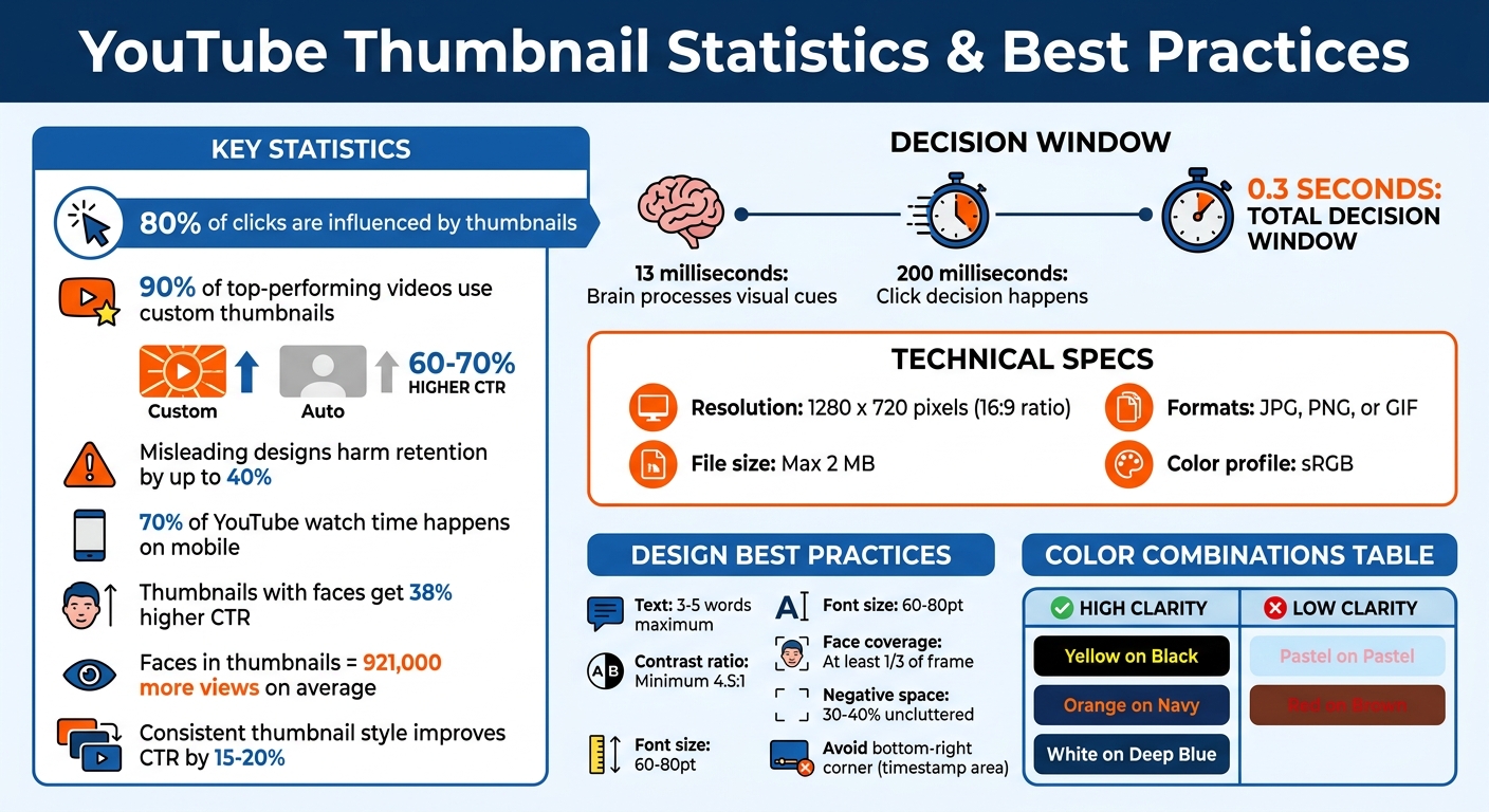
- Thumbnails influence 80% of clicks, and 90% of top-performing videos use custom thumbnails.
- A strong thumbnail can boost your click-through rate (CTR), but misleading designs can harm audience retention by up to 40%.
- YouTube’s algorithm prioritizes CTR and watch time, so your thumbnail must attract the right audience and deliver on its promise.
Key tips for designing effective thumbnails:
- Use bold, high-contrast colors and simple layouts for mobile clarity (70% of YouTube watch time happens on mobile).
- Keep text minimal (3–5 words) and readable with bold fonts and clear contrast.
- Include faces with emotions like surprise or joy to create an instant connection.
- Ensure the thumbnail aligns with the video content to maintain trust and retention.
Technical specs to follow:
- Resolution: 1280 x 720 pixels (16:9 aspect ratio)
- File size: Max 2 MB
- Formats: JPG, PNG, or GIF
- Use the sRGB color profile for accurate colors.
Test your thumbnails by shrinking them to 120 pixels wide (Stamp Test) and track performance metrics like CTR and watch time per impression. Tools like ThumbnailCreator can speed up the process with pre-designed templates and AI features.
A well-designed thumbnail increases clicks, keeps viewers engaged, and helps your channel grow. Focus on clarity, emotional connection, and delivering on your video’s promise.
YouTube Thumbnail Statistics and Best Practices Guide
YouTube Impressions & Watch Time Explained | CTR, Views, Thumbnail Performance & Growth Guide
sbb-itb-b59debf
How Thumbnails Affect Watch Time
Thumbnails play a dual role: they spark initial interest and influence how long viewers stick around. A thumbnail that draws clicks but misleads the audience can harm retention and, ultimately, your channel's growth. To succeed, it's crucial to understand how viewers process thumbnails and what compels them to keep watching. This sets the stage for mastering the design elements that drive viewer behavior.
The 0.3-Second Decision Window
Your thumbnail has an incredibly short window - just fractions of a second - to grab attention. Research shows the human brain processes visual cues in as little as 13 milliseconds, with the decision to click happening in under 200 milliseconds. In this blink-of-an-eye moment, viewers make instinctive choices without consciously analyzing the thumbnail.
This quick decision-making follows a three-step neural process: the visual cortex processes the image, the amygdala evaluates its emotional impact, and the fusiform face area identifies faces or familiar patterns. Interestingly, this all happens before viewers even glance at your video title. As Viral Finder aptly describes it:
Your thumbnail is a billboard on the busiest highway in the world.
- Viral Finder
Given this rapid processing, simplicity is key. Overly complicated thumbnails can become visual noise, especially on mobile devices, where over 70% of YouTube watch time occurs. A single dominant element - like a face, a clear object, or a concise message - helps viewers instantly understand your video’s focus. Thumbnails showcasing human faces with high-arousal emotions (e.g., surprise, joy, fear) tend to perform better, achieving a 38% higher click-through rate. These emotions act as a preview, sparking curiosity and emotional engagement.
The best thumbnails create a curiosity gap vs direct value strategy by showing just enough to pique interest while holding back the full story. This approach can increase click-through rates by up to 50%. However, it’s essential to use this strategy responsibly. The curiosity you generate must align with your video’s content to maintain viewer trust and interest. Next, we’ll explore why meeting viewers’ expectations is just as important as grabbing their attention.
Setting Accurate Viewer Expectations
A high click-through rate (CTR) alone isn’t enough - your video must keep viewers engaged. YouTube’s algorithm evaluates both CTR and watch time. If a thumbnail drives clicks but fails to retain viewers, the platform may interpret it as misleading—often the result of clickbait vs authentic thumbnails imbalances—and reduce the video’s visibility.
When viewers click on a thumbnail, they expect the video to match the promise made by the image. If the content doesn’t deliver, the amygdala - the brain’s emotional center - responds negatively. This can lead to "thumbnail blindness", where viewers begin ignoring your future thumbnails altogether.
The first 10 seconds after a click are critical. If your video doesn’t immediately address the hook suggested by your thumbnail, viewers are likely to leave. This early drop-off sends negative signals to YouTube’s algorithm, creating what some call "Click-Debt" - attention gained through clicks but lost due to unfulfilled expectations.
The thumbnail is a promise. Your content is the delivery. Both must align for the system to work in your favor.
The numbers back this up: doubling your CTR from 4% to 8% can lead to three to five times more impressions. However, this only works if your watch time remains strong.
The goal isn’t to create dull thumbnails but to ensure they accurately reflect your video’s tone and content. Use the thumbnail to showcase the "what" that sparks curiosity, and let your video deliver the "how." This consistency builds trust, encourages repeat clicks, and signals to YouTube that your content deserves a wider audience.
Core Design Principles for Thumbnails
Thumbnails need to grab attention, communicate their message instantly, and set clear expectations for viewers. These three essentials form the backbone of any successful thumbnail design.
Using High-Contrast Colors and Visual Hierarchy
Contrast is what makes your thumbnail pop. As viewers scroll through their feeds, high-contrast designs stand out. Pairing light subjects with dark backgrounds or saturated colors against neutral tones is a proven way to make your thumbnail eye-catching.
For color combinations, opposites on the color wheel work best. Think yellow with violet, red with cyan, or blue with orange. These pairings create enough separation to keep your design clear, even on mobile screens. Considering over 70% of YouTube watch time happens on mobile, avoiding pastel-on-pastel designs is crucial - soft colors can blur together and become unreadable at smaller sizes.
Visual hierarchy helps guide the viewer’s gaze. Using the Rule of Thirds vs centered layouts to place your main subject along imaginary grid intersections creates a more dynamic layout. People naturally scan visuals in a "Z-pattern", starting at the top-left and moving to the bottom-right. Placing your key element - like a face or a compelling hook - at the top-left ensures it gets noticed first.
For added depth, try "layer stacking", where text overlaps slightly with the main subject, creating a subtle 3D effect. Negative space is equally important - leaving 30–40% of the frame uncluttered reduces visual noise and helps viewers process your message quickly.
Want to test your design? Shrink it down to 120–150 pixels (a "Stamp Test"). If the key details aren’t clear, simplify it. Avoid placing critical elements in the bottom-right corner (YouTube’s timestamp area) or the bottom 15% of the frame (where the progress bar appears).
| Color Pairing | Mobile Clarity | Why It Works/Doesn't Work |
|---|---|---|
| Yellow on Black | High | Bright contrast |
| Orange on Navy | High | Opposing colors |
| White on Deep Blue | High | Strong contrast ratio |
| Pastel on Pastel | Low | Colors blend together |
| Red on Brown | Low | Similar brightness levels |
Once your colors and layout are nailed down, clear typography ensures your message comes through loud and clear.
Keeping Text Minimal and Readable
When it comes to thumbnail text, less is more. Stick to 3–5 words max. Your thumbnail should complement the title without repeating it. For instance, if your video title is "How to Fix Your Credit Score", the thumbnail could say, "In 30 Days" or "From 500 to 750" to add more context.
Font choice is key. Bold, sans-serif fonts like Impact, Bebas Neue, or Montserrat Extra Bold are ideal for readability on small screens. Use text sizes of 60–80pt and add a 4–8 pixel outline, drop shadow, or semi-transparent background to separate the text from the image. A contrast ratio of at least 4.5:1 ensures clarity, especially for mobile viewers.
Avoid clutter. Designs with more than three visual elements can reduce click-through rates by 23%. Keeping your layout clean and focused increases the chances of your thumbnail grabbing attention.
Adding Faces and Emotions for Connection
Human faces are powerful attention magnets. The brain processes faces faster than almost any other visual input. Including a face in your thumbnail can instantly draw viewers in.
But it’s not just about having a face - it’s about showing emotion. Thumbnails with clear emotional expressions, like surprise or curiosity, can evoke similar feelings in viewers, encouraging clicks. Studies show that thumbnails featuring faces with strong emotions can boost click-through rates by 20–30%, and videos with faces often get 921,000 more views on average compared to those without.
Direct eye contact in a thumbnail creates a personal connection, while a face looking toward your text or main hook can guide attention effectively. Make sure the face takes up at least one-third of the frame.
The emotions that work best are surprise and curiosity. While fear or shock might grab attention initially, overusing them can harm viewer trust. Always align the emotion shown with the content of your video. If you’re creating a curiosity gap, make sure the video delivers on the promise to keep viewers engaged and maintain algorithm support.
Test your thumbnail at mobile size (around 168 pixels wide). If the emotion isn’t clear, the face might not be prominent enough. The goal is to create instant recognition and emotional impact - something that happens in just 100–150 milliseconds of viewing.
Technical Specifications and Standards
Getting the technical details right is crucial to ensure your YouTube thumbnail looks sharp and professional on any device. Meeting YouTube's specific requirements helps avoid issues like pixelation or color shifts, which can make even the best designs look unpolished. Using free thumbnail tools can help you achieve a professional look without a budget. These standards work hand-in-hand with your design to maintain the quality and appeal of your thumbnail across all screens.
Resolution, Format, and Aspect Ratio Requirements
YouTube recommends thumbnails be 1280 x 720 pixels with a 16:9 aspect ratio. The minimum width allowed is 640 pixels, but designing at the full 1280 x 720 resolution avoids upscaling problems and keeps your image crisp.
The file size limit is 2 MB, though YouTube is reportedly increasing this to 50 MB for TV displays. Accepted formats include JPG, PNG, and GIF. For thumbnails with text, logos, or flat colors, PNG is ideal to preserve sharpness and avoid compression artifacts. For photo-based thumbnails with detailed gradients, JPG balances quality and file size effectively.
Always use the sRGB color profile to prevent unexpected color shifts after uploading. Additionally, custom thumbnails are only available to verified YouTube accounts.
| Specification | Requirement | Best Practice |
|---|---|---|
| Resolution | 1280 x 720 pixels | Design at 1920 x 1080 and export at 1280 x 720 |
| Aspect Ratio | 16:9 | Stick to this ratio to avoid letterboxing |
| File Size | Max 2 MB | Compress large files without reducing dimensions |
| Formats | JPG, PNG, GIF | Use PNG for text-heavy graphics, JPG for photo-based designs |
| Color Profile | sRGB | Ensures accurate colors on YouTube's platform |
Maintaining Image Quality During Compression
Compression can easily ruin a thumbnail, so it's important to handle it carefully. Avoid designing at the minimum width of 640 pixels, as this often leads to pixelation when scaled up.
For PNG files over 2 MB, reduce the quality to around 90% instead of resizing the image. Slight compression won’t be noticeable to viewers, but reduced resolution will stand out. Keep in mind that DPI (dots per inch) doesn’t matter for YouTube - what counts is the resolution, so always stick to 1280 x 720 pixels.
To keep your thumbnail's layout clean and effective:
- Avoid placing important elements in the bottom-right corner, as YouTube's timestamp overlay will obscure this area.
- Focus your design within the central 960 x 540 pixels to ensure key elements are visible on smaller mobile screens.
Finally, test your thumbnail by shrinking it to about 120 pixels wide - a quick "Stamp Test." If the text is hard to read or the main subject isn’t clear at that size, simplify your design. Following these steps ensures your thumbnails stay sharp, readable, and impactful, helping to grab attention and keep viewers engaged.
Efficient Thumbnail Creation Methods
Creating eye-catching thumbnails doesn't have to be time-consuming. With the right tools and workflows, you can craft high-quality thumbnails in just 20–30 minutes. By sticking to proven design principles and leveraging smart tools, you can ensure your thumbnails consistently stand out and attract clicks.
Using Templates for Brand Consistency
Templates are a game-changer for maintaining a cohesive brand look. Instead of starting from scratch every time, you can use pre-designed layouts to quickly swap in new images and text while keeping your style intact. This approach ensures your thumbnails stay consistent in terms of color palette (stick to 2–3 colors), fonts, and overall design. This consistency helps your audience instantly recognize your content.
Channels that stick to a consistent thumbnail style see click-through rates improve by 15–20% on average. To keep things fresh, consider updating your template every 30 to 50 videos while retaining your brand's core elements. Setting up a brand kit with your go-to fonts, colors, and logo placement can also reduce errors and save time. If speed is your priority, specialized tools can further simplify this process without compromising on quality.
How ThumbnailCreator Simplifies the Design Process
ThumbnailCreator is designed to handle the technical heavy lifting, so you can focus on creativity. With AI-powered features, the tool generates editable designs from simple text prompts in under 2 minutes. Its face-swapping feature lets you test different expressions without needing new footage, while object swapping allows for quick tweaks to visual elements - perfect for A/B testing thumbnails.
The platform also provides pre-designed templates tailored to YouTube's 1280 x 720 pixel standard, ensuring your thumbnails are optimized for the platform's safe zones. Text editing tools enforce a concise 3–5 word rule, which can boost click-through rates by as much as 30%. Since custom thumbnails are used by 90% of top-performing videos - and these generate 60–70% higher click-through rates compared to auto-generated ones - having a tool that streamlines the process is invaluable. By combining speed, consistency, and quality, ThumbnailCreator helps you maximize your video's click-through and watch time with minimal effort.
Tracking and Analyzing Thumbnail Performance
Once you've nailed down the design and technical details of your thumbnails, the next step is tracking and testing to refine your strategy. This process shifts your focus from simply increasing click-through rates (CTR) to maximizing watch time per impression. Since 2026, YouTube's algorithm has prioritized this more nuanced metric, calculated as Impressions × CTR × Average View Duration. This shift means that a thumbnail's success isn't just about getting clicks - it’s about keeping viewers engaged for longer periods.
Metrics to Track for Thumbnail Success
A key metric to watch is watch time share, which combines CTR with average view duration to measure how well your thumbnail holds attention. For instance, a thumbnail with an 8% CTR and a 3-minute average view duration generates more total watch time than one with a 10% CTR but only a 2-minute duration. And since YouTube favors content that maximizes watch time, thumbnails with higher retention will rank better. As ThumbMentor explains:
"YouTube maximizes total platform watch time (CTR x Average View Duration), and in 2026 actively demotes high-CTR/low-retention content".
Additionally, monitor CTR by traffic source. For example, search traffic typically sees CTRs around 12.5%, while browse traffic hovers between 4–6%. These insights help you understand how your thumbnails perform across different audience entry points.
A/B Testing Different Thumbnail Designs
A/B testing vs gut feeling is a powerful way to refine your thumbnails. YouTube recommends testing at least 1,000 impressions per variant, but for more reliable results, aim for 10,000+ total impressions. By systematically testing, you can boost CTR by 3–7% on winning designs.
Focus on testing distinct concepts rather than small tweaks. For example, compare a close-up face to a product shot instead of just changing a background color. One effective method is the "Safe-Safe-Wildcard" approach: test two thumbnails that stick to your brand style against one that takes a bold, unconventional route. Running these tests for at least 7 days ensures you account for audience behavior differences between weekdays and weekends.
Here’s a quick guide to interpreting your A/B test results:
| Scenario | Share Gap | Impressions | Time | Action |
|---|---|---|---|---|
| Clear Winner | 60%+ | 5,000+ total | 7+ days | Stop, apply winner |
| Marginal Lead | 51–55% | 5,000+ total | 7+ days | Continue 7 more days |
| Dead Heat | 49–51% | 10,000+ total | 14+ days | Pick your preference |
| Low Data | Any | Under 2,000 | Under 7 days | Keep waiting |
After running 10–15 tests, document the key attributes of successful thumbnails - like color schemes, text styles, or facial expressions - in a spreadsheet. This creates a style guide tailored to your audience’s preferences, giving you a repeatable formula for future designs.
Conclusion
Your thumbnail isn’t just a pretty picture - it’s the deciding factor for whether someone clicks on your video or scrolls past it. In fact, 90% of top-performing videos use custom thumbnails, which can boost click-through rates by an impressive 60–70%. That means putting effort into well-designed thumbnails can directly influence the growth of your YouTube channel.
The key to success lies in mastering the basics of design. Start by designing with mobile users in mind - after all, 87% of YouTube visits come from mobile devices. Use bold, high-contrast colors with a contrast ratio above 4.5:1, keep text minimal (just 3–5 strong words), and rely on quick checks like the stamp test to ensure your thumbnail remains clear, even at smaller sizes. These small but impactful steps can make a big difference in how your content is perceived.
But it’s not just about getting clicks - your thumbnail needs to match your video content. Misleading thumbnails might snag initial views, but they can cause a 30–40% drop in viewer retention. A well-aligned thumbnail keeps viewers engaged, reinforcing the importance of balancing eye-catching design with honest representation.
To make the process easier, tools like ThumbnailCreator can be a game-changer. Its AI-powered features simplify tasks like background removal, color adjustments, and layout suggestions, helping you create polished thumbnails in under 30 minutes. Plus, it ensures your designs are optimized for mobile readability every time.
Start applying these strategies today. Plan your thumbnail before filming to make sure it reflects your video’s promise. Test different designs by testing thumbnails at scale using YouTube’s A/B tools, track what works, and refine your approach. The results speak for themselves - better thumbnails lead to more impressions, higher engagement, and ultimately, more watch time.
FAQs
What’s more important: CTR or watch time?
Both CTR (Click-Through Rate) and watch time play a key role in your video's success, but CTR matters most in the beginning. A strong CTR means more viewers are clicking on your video, which naturally leads to increased watch time and engagement. Plus, it sends a clear message to YouTube: your content grabs attention. This can boost your video's visibility, setting the stage for even more watch time as it reaches a wider audience.
How can I tell if my thumbnail is misleading?
A thumbnail becomes misleading when it doesn’t align with the actual content of your video. While such thumbnails might grab attention and generate clicks, they can hurt your channel in the long run by lowering watch time and viewer retention. To prevent this, make sure your thumbnail truthfully represents the video’s topic without overhyping or making false claims. Using visuals or text that mislead viewers can damage both your video’s performance and the trust of your audience.
When should I change a thumbnail after publishing?
After publishing, it’s worth revisiting your thumbnail design if you think performance could improve. One way to approach this is through A/B testing - create different thumbnail variations and compare their performance using metrics like click-through rates (CTR).
Regularly testing and tweaking your thumbnails can reveal what resonates most with your audience, helping you boost both engagement and visibility. Small changes, like adjusting colors, text, or imagery, can sometimes make a big difference.