
How to Make YouTube Thumbnails That Get More Clicks
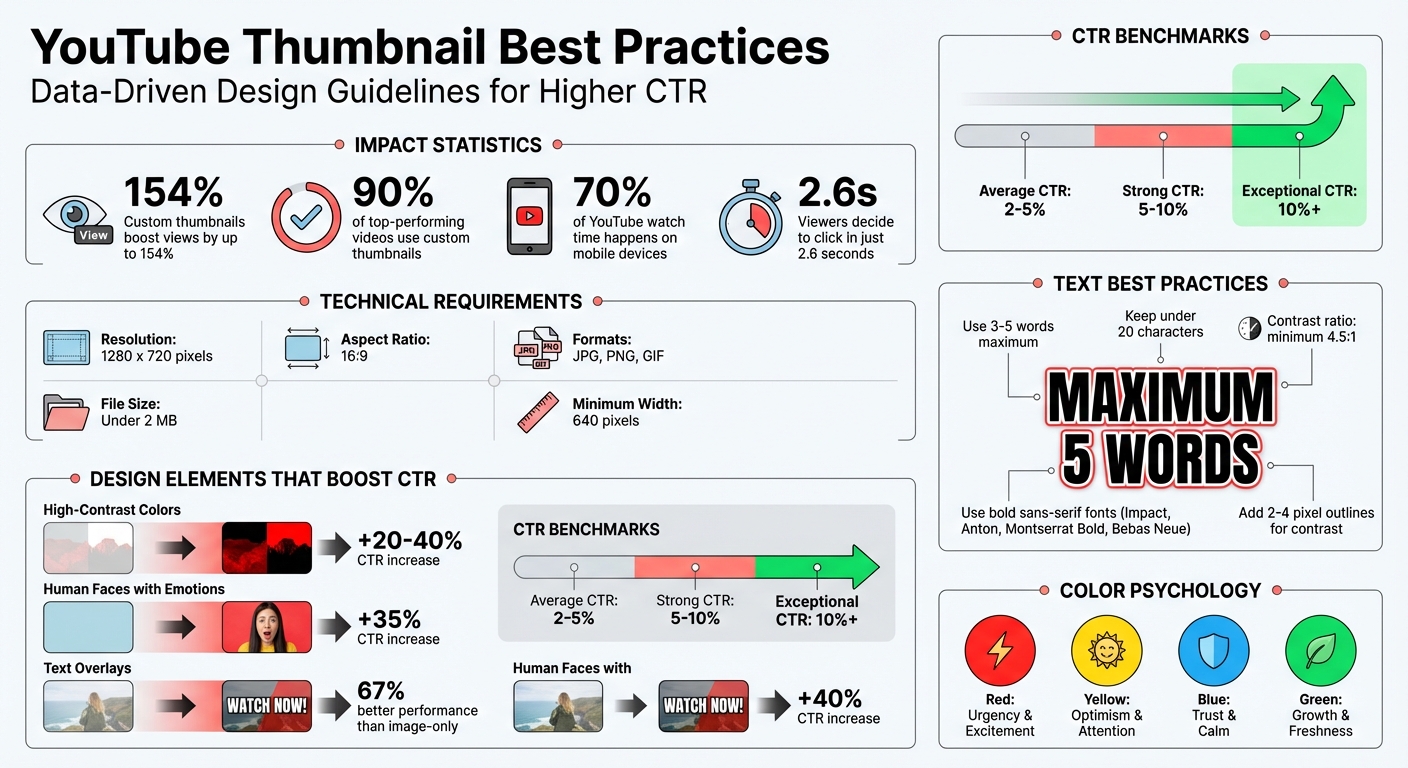
Your YouTube thumbnail is the first thing viewers notice, and it plays a big role in whether they click on your video. Custom thumbnails can boost your video views by up to 154%, and 90% of top-performing videos use them. Here’s a quick breakdown of what makes a great thumbnail:
- Follow YouTube’s specs: Use a resolution of 1280 x 720 pixels, 16:9 aspect ratio, and keep the file size under 2 MB.
- Design for mobile: With 70% of watch time on mobile, test how your thumbnail looks at smaller sizes.
- Use bold colors: High-contrast colors like yellow, red, or blue stand out and can increase click-through rates by 20–40%.
- Keep it simple: Feature one clear subject and avoid clutter. Human faces with strong emotions boost clicks by up to 35%.
- Text matters: Use 3–5 bold, readable words. Add outlines or shadows to make the text pop.
Want to save time? Tools like ThumbnailCreator use AI to help you design thumbnails optimized for engagement, offering features like background removal and pre-made templates.
A strong thumbnail grabs attention, improves click-through rates, and helps YouTube’s algorithm promote your video. Let’s dive into the details.
YouTube Thumbnail Best Practices: Key Statistics and Design Guidelines
YouTube Thumbnail Requirements and Guidelines
Technical Requirements
To make sure your thumbnails look great on all devices, stick to YouTube's technical specs. The ideal resolution is 1280 x 720 pixels with a 16:9 aspect ratio, which works seamlessly across desktops, mobile devices, and TVs. The minimum width is 640 pixels - anything smaller might end up looking blurry.
Keep the file size under 2 MB for standard videos. YouTube supports JPG, PNG, and GIF formats. For text-heavy or graphic-rich thumbnails, PNG is the way to go for sharper detail. For thumbnails with lots of photos, JPG helps keep the file size lower. Just remember, uploading custom thumbnails requires a verified YouTube account.
Here's a quick reference table for thumbnail specs:
| Specification | Standard Videos | Podcasts |
|---|---|---|
| Resolution | 1280 x 720 pixels | 1280 x 1280 pixels |
| Aspect Ratio | 16:9 | 1:1 |
| File Size Limit | Under 2 MB | Under 10 MB |
| Accepted Formats | JPG, PNG, GIF | JPG, PNG, GIF |
Before finalizing, test your thumbnail at a smaller size (around 320 x 180 pixels) to make sure it’s clear on smartphones. With 70% of YouTube watch time happening on mobile, clarity on smaller screens is crucial. Also, avoid placing important elements in the bottom-right corner, as the timestamp overlay could obscure them. Following these guidelines ensures your thumbnail looks professional and boosts your video's chances of attracting clicks.
How Thumbnails Affect Click-Through Rates
A properly designed thumbnail isn’t just about aesthetics - it’s a key factor in driving clicks. Think of it as your video’s digital billboard. With viewers deciding in just 2.6 seconds, your thumbnail has to grab attention and communicate value instantly. When people click, YouTube’s algorithm picks up on the engagement and promotes your video to more users.
"A high CTR signals to YouTube that your video is relevant and engaging, leading the algorithm to promote it to a wider audience." – UseVisuals
A well-crafted thumbnail can double or even triple your click-through rate (CTR). On YouTube, average CTRs range from 2–5%, while 5–10% is considered strong. Anything above 10% is exceptional. Even a small improvement, like increasing your CTR from 4% to 6%, can significantly expand your reach.
Thumbnails with text overlays perform 67% better than image-only designs, while those featuring human faces can improve CTR by up to 35%. To maximize impact, create a curiosity gap vs direct value strategy that teases the content without giving everything away. This hint of mystery encourages viewers to click and find out more.
how to make a killer thumbnail (for the 2025 algorithm)
Design Principles for High-Performing Thumbnails
Creating a thumbnail that grabs attention in a crowded feed boils down to three key design strategies. These principles work together to make your video stand out in just a split second.
Use Bold Colors and High Contrast
Bold, contrasting colors are your best bet for catching the eye. Since YouTube’s interface leans heavily on white and dark gray, colors like yellow, red, green, and blue naturally pop against the background [3, 19]. In fact, thumbnails with high-contrast designs can boost click-through rates by as much as 20% to 40%.
A great way to achieve this is by using complementary colors - like blue and orange or purple and yellow - from opposite sides of the color wheel. Keep your palette simple by following the Three-Color Rule: stick to two contrasting hues and one base color to avoid overwhelming the viewer [6, 19]. For mobile devices, where 70% of YouTube traffic comes from, pair yellow text with black backgrounds for readability or use red and white to emphasize urgency.
Real-world examples highlight the power of this approach. In December 2025, Alicja Suska, Senior Product Designer at Buffer and creator of the Outdraw Design YouTube channel, revamped her thumbnails by ditching her consistent but dull dark backgrounds for vibrant and varied ones. This tweak led to a 10× increase in views compared to her older designs.
Colors also evoke emotions: red sparks urgency and excitement, yellow conveys optimism, blue builds trust, and green suggests growth. Always double-check how your colors look on mobile screens to ensure they work as intended.
Feature One Clear Subject
While bold colors grab attention, simplicity ensures your message is clear. A cluttered thumbnail can confuse viewers, so it’s crucial to feature one dominant subject that instantly communicates the video's topic. When multiple elements compete for attention, viewers may feel overwhelmed and scroll past. Clarity matters, especially on smaller screens.
"A good thumbnail is simple and speaks for itself. Almost so clear that the video doesn't even need a title."
– Isaac Carlton, YouTuber and Content Creator
To make your subject stand out, highlight it as the focal point of the thumbnail. Use the Rule of Thirds to position your subject along grid lines or intersection points for a balanced, professional feel. Consider blurring or muting the background to make the main subject pop. Keep text minimal so it complements the visual rather than competing with it.
"It seems from our conclusive tests that 1 large image that fills the entire screen and has a clear/interesting focal point works better than multiple, smaller images."
– Ali Tomek, Lead Visual Designer, Storyblocks
For best results, plan ahead by capturing high-quality photos during your video shoot. This gives you full control over lighting, composition, and clarity. Always test your design on a mobile device to ensure the subject and any text remain clear and readable.
Apply Directional Cues and Facial Expressions
Once you’ve nailed the bold colors and clear subject, guide the viewer’s attention with smart cues and engaging expressions. A human face with clear, expressive emotions can instantly connect with viewers. Direct eye contact is especially powerful, as it creates a sense of personal engagement.
To enhance this connection, use directional cues like arrows, circles, or pointing gestures to guide the viewer’s eye toward the most important part of your thumbnail. These visual markers not only draw attention but also build curiosity and reinforce your message. The key is to make these cues feel natural, so they seamlessly blend into the overall design.
sbb-itb-b59debf
How to Use Text in Thumbnails
Text in thumbnails can make or break their effectiveness. When done right, it grabs attention, complements the visuals, and reinforces your message. The key? Keep it simple, clear, and well-integrated with your design.
Keep Text Brief and Readable
Thumbnail text should work alongside your video title, not replace it. Aim for 3–5 words or fewer than 20 characters to make your message instantly clear. Longer text risks overwhelming viewers, especially on mobile screens.
"Your YouTube thumbnail text isn't meant to replace your title, it should complement it. Use just a few words (ideally 3–5) to highlight the emotional hook or value of your video."
– Audrey Marshall, Co-Founder & COO, Thematic
Stick to bold, sans-serif fonts like Impact, Anton, Montserrat Bold, or Bebas Neue. These fonts ensure readability even at small sizes. Avoid decorative or thin fonts - they tend to blur and become unreadable on smaller screens. Using all-caps for short phrases can also improve clarity by making the text more visually striking.
To emphasize important words, make them larger and bolder than the supporting text. A quick tip: shrink your thumbnail to 10% of its size - if the text is hard to read, adjust the font size or improve the contrast.
Add Shadows and Outlines for Clarity
Even the best fonts can disappear against a busy background. To make your text stand out, add a 2–4 pixel outline in a contrasting color. For example, pair black outlines with yellow text or white outlines with dark text. This technique separates the text from the background, ensuring it’s readable across all screen sizes.
Drop shadows can add depth and help your text pop without looking messy. Another option is placing your text on semi-transparent shapes or color blocks, which keeps it clear without overpowering the design.
High-contrast color combinations are a must. Pair yellow text with a black background or white text with dark colors for maximum impact. For accessibility, aim for a contrast ratio of at least 4.5:1 between your text and its background.
Balance Text with Visual Elements
Text should complement your thumbnail’s visuals, not overshadow them. Avoid shrinking text to fill empty spaces, as this can create a cluttered look. Instead, make the text bold and large, and don’t hesitate to let it overlap slightly with your subject. Use outlines or background highlights to keep it readable.
Apply the Rule of Thirds to position your text along natural grid lines or intersection points, creating a balanced, visually appealing layout. You can also align critical words along the Z-pattern - starting from the top-left, moving to the top-right, and then diagonally to the bottom-left and bottom-right - to match how viewers naturally scan images.
Avoid placing text in the bottom-right corner, as it’s often obscured by platform overlays. Stick to the top-left, top-right, or center for better visibility. By positioning your main subject slightly off-center, you create negative space that allows your text to stand out without overwhelming the design. This approach ties together text and visuals seamlessly, enhancing the overall impact.
Create Thumbnails Faster with ThumbnailCreator
ThumbnailCreator takes the hassle out of designing professional thumbnails. Forget about spending hours or investing in expensive software - this platform simplifies the entire process with AI-powered algorithms. In just seconds, you can create thumbnails that are not only visually appealing but also designed to grab attention and boost clicks. It’s tailor-made for YouTube creators who want polished results without needing a background in design. Let’s dive into how ThumbnailCreator makes thumbnail creation faster and easier with its smart, feature-packed tools.
With over 10,000 users already on board and helping creators achieve up to a 73% increase in click-through rates (CTR), ThumbnailCreator’s AI - trained on millions of successful thumbnails - ensures every design decision is optimized to enhance your video’s visibility.
AI-Powered Design Features
ThumbnailCreator is all about speed and simplicity, but it doesn’t skimp on creativity. Its AI-powered features are designed to take the guesswork out of thumbnail design. For instance, the platform generates multiple layout and color scheme options tailored to your niche, using data from top-performing videos. Simply paste your YouTube link, and you’ll get ready-to-use templates. Plus, tools like face swapping and object swapping let you create eye-catching visuals that stand out.
Other standout features include automated background removal, which isolates your subject for high-contrast designs that pop on YouTube’s interface. Need to refine facial details? The platform’s face enhancement tools - available in basic, advanced, and batch modes - help emphasize emotions and expressions that drive clicks. Text editing tools ensure your titles are bold and readable, complete with outlines and shadows, following the proven 3–5 word guideline. Every feature is designed to maximize engagement by making sure each visual element works hard to attract viewers.
"The real power of AI isn't just making things faster. It's giving you the ability to test multiple high-quality concepts without the massive time sink." – Revid.ai
Pricing Plans
ThumbnailCreator offers flexible pricing options to meet the needs of creators at every level:
| Plan | Price | Key Features |
|---|---|---|
| Starter | $9/month | 50 AI thumbnails, basic face enhancement, 20 background removals per month |
| Creator Pro | $29/month | 500 AI thumbnails, advanced face enhancement, unlimited background removal, brand kit storage |
| Agency | $90/month | 2,000 AI thumbnails, batch face enhancement, unlimited background removal, API access, team collaboration, 24/7 priority support |
With an overall user rating of 4.3 out of 5, ThumbnailCreator earns high praise for its ease of use (4.8/5) and performance (4.7/5). The platform’s biggest draw? It saves creators significant time while enabling even non-designers to craft professional-quality thumbnails that drive engagement. Whether you’re a solo creator or part of a team, these plans are designed to help you create standout visuals quickly and effectively.
Conclusion
Designing YouTube thumbnails that attract more clicks comes down to nailing a few key fundamentals and consistently applying them. First, make sure you follow YouTube's technical requirements to ensure your thumbnail looks sharp on any device. Every design choice should serve a purpose - nothing should feel random.
Equally important are the design principles. Use high-contrast colors to make your thumbnail pop against YouTube's interface. Highlight one clear subject with an expressive, authentic emotion to grab attention. Keep any text short and impactful - stick to 3–5 words in bold, easy-to-read sans-serif fonts. Adding shadows or outlines can make the text stand out even more.
Custom thumbnails outperform auto-generated ones by a wide margin, often leading to much better engagement and video performance. However, even small thumbnail mistakes can quickly tank your CTR.
"Thumbnails are absolutely critical. They're often the first thing viewers see, and a compelling thumbnail is the often difference between someone clicking on your video or scrolling past it."
FAQs
How do I design a YouTube thumbnail that looks great on mobile?
Creating a YouTube thumbnail that grabs attention on mobile devices requires careful design. Start by zooming out while working on your thumbnail to check how it looks at smaller sizes. This ensures that text and visuals remain crisp and easy to understand, even when viewed as a tiny image.
Choose bold, straightforward fonts and center your design around a strong, eye-catching image. Use high-contrast colors for the text, visuals, and background to make the thumbnail stand out. And don't forget to stick to YouTube's recommended dimensions of 1280 x 720 pixels for a polished look across all devices.
What color combinations work best for creating eye-catching YouTube thumbnails?
The best color combinations for YouTube thumbnails are those that create strong contrast and catch the eye immediately. Pairing bright, contrasting colors - like red with green, blue with orange, or yellow with purple - can make your thumbnail stand out in a sea of content. These contrasts not only draw attention but also make any text on the thumbnail easier to read.
Colors also play a role in shaping emotions and influencing viewers' decisions. For instance, warm colors such as red and yellow can evoke feelings of excitement or urgency, while cool colors like blue convey a sense of calmness and trust. By choosing colors that reflect your content's mood and ensuring they contrast effectively, you can create thumbnails that are more appealing and encourage higher click-through rates.
How can ThumbnailCreator help me design thumbnails that attract more clicks?
ThumbnailCreator takes the hassle out of designing YouTube thumbnails by leveraging advanced AI to speed up the process. Whether you’re just starting out or have been creating content for years, this tool makes it simple to produce high-quality thumbnails in a matter of seconds.
By incorporating key design elements - like bold color contrasts, clear, readable text, and attention-grabbing visuals - ThumbnailCreator helps you create thumbnails that not only catch the eye but also improve click-through rates. With its user-friendly interface and efficient tools, you can consistently design thumbnails that stand out and encourage more viewers to engage with your content.