
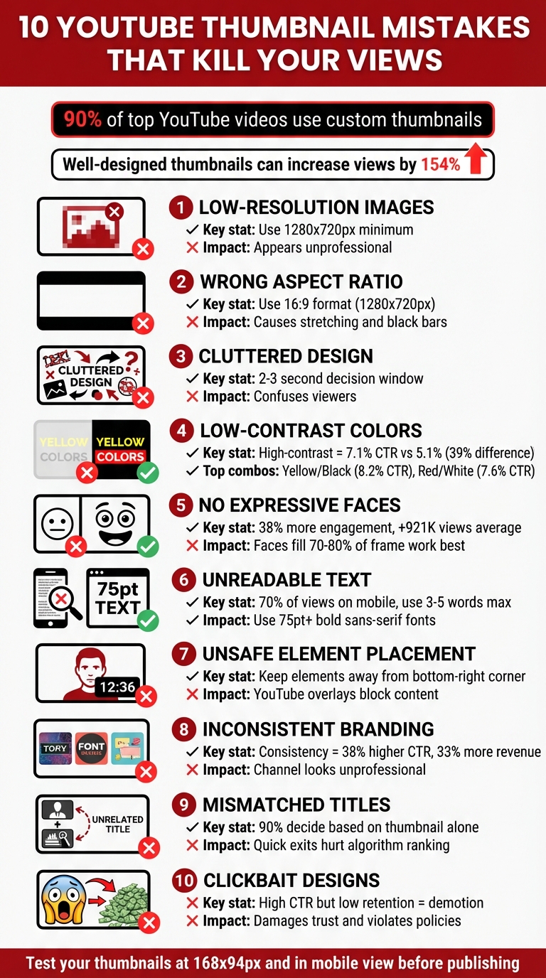
10 YouTube Thumbnail Mistakes That Kill Your Views
Your YouTube thumbnail is often the first thing viewers notice, and it directly impacts whether they click on your video. A poorly designed thumbnail can hurt your click-through rate (CTR), reduce views, and harm your channel's growth. Here are 10 common mistakes that creators make with thumbnails - and how to fix them:
- Low-Resolution Images: Blurry thumbnails appear unprofessional. Use the correct YouTube thumbnail size of 1280x720 pixels or higher for sharp visuals.
- Wrong Aspect Ratio: Stick to the 16:9 format to avoid stretching, cropping, or black bars.
- Cluttered Design: Too many elements confuse viewers. Focus on one main subject and keep it simple.
- Low-Contrast Colors: Weak color combinations reduce visibility. Use high-contrast colors like yellow/black or red/white.
- Lack of Expressive Faces: Thumbnails with emotional faces perform better. Close-ups with clear expressions grab attention.
- Unreadable Text: Avoid small or decorative fonts. Use bold, sans-serif text with 3–5 impactful words.
- Unsafe Element Placement: Keep key visuals away from areas like the bottom-right corner, where YouTube overlays timestamps.
- Inconsistent Branding: Thumbnails with no consistent style make your channel look forgettable. Use the same colors, fonts, and logo placement.
- Mismatch with Titles: Thumbnails that don’t align with video titles mislead viewers, hurting trust and retention.
- Clickbait Designs: Overpromising thumbnails lead to quick exits, damaging your video’s performance.
Quick Fix: Review your thumbnails on mobile devices. If they look blurry, cluttered, or unclear, redesign them with high-resolution images, bold text, and a clean layout. Test CTR in YouTube Studio and adjust underperforming designs. Focus on creating thumbnails that are clear, engaging, and truthful.
10 YouTube Thumbnail Mistakes That Kill Your Click-Through Rate
10 Thumbnail Mistakes 90% of YouTubers Make & How to Avoid Them
sbb-itb-b59debf
1. Using Low-Resolution Images
A blurry thumbnail can make your content seem unpolished and might even deter viewers from clicking on your video. It’s a small detail, but it plays a big role in how your video is perceived. Clear, high-quality thumbnails are essential for maintaining a professional look across all devices.
While YouTube allows a minimum thumbnail width of 640 pixels, that size often looks blurry when scaled up. To avoid this, aim for a resolution of 1280 x 720 pixels, or go even higher with 1920 x 1080 pixels for HD displays. This ensures your thumbnails remain sharp, even in enlarged "Up Next" previews.
Here’s an example of how this strategy pays off: The cooking channel Tasty Creations saw its click-through rate (CTR) jump from 2.8% to 7.1% after switching to high-resolution thumbnails (well above average CTR benchmarks) featuring close-ups of their dishes. Similarly, Science Explained gained 78% more new subscribers by updating their thumbnails to showcase striking visuals of experiment results.
When creating thumbnails, always work with high-resolution images. Instead of grabbing low-quality screenshots from your video, take dedicated high-resolution photos during filming. Save your thumbnails as PNG files for graphics or high-quality JPGs for photos, keeping the file size under 2MB to comply with YouTube’s upload limits.
With about 70% of YouTube views coming from mobile devices, clarity isn’t just nice to have - it’s non-negotiable.
"Blurry or pixelated thumbnails instantly signal unprofessionalism and reduce click-through rates." - YouTube Creator Toolkit
2. Ignoring the 16:9 Aspect Ratio
Using the wrong dimensions for your thumbnail can instantly make it look messy and unpolished, which is a surefire way to turn viewers away. YouTube’s video player and preview windows are designed specifically for the 16:9 widescreen format - that’s 1280 x 720 pixels. Deviating from this standard can cause your thumbnail to stretch, crop awkwardly, or even end up with black bars around it, none of which make for a good first impression.
This issue becomes even more apparent when your video appears as a suggested "Up Next" option. Thumbnails that look fine in search results can become distorted when enlarged, making any quality flaws glaringly obvious. And with 63% of YouTube traffic coming from mobile devices, poorly designed thumbnails can result in text getting cut off, faces being cropped, or the entire layout falling apart.
"A ratio of 16:9 is recommended, as it's used in YouTube players and previews." - Snappa
To avoid these pitfalls, design your thumbnails at 1280 x 720 pixels using a thumbnail generator using preset templates. Keep the file size under 2MB and save it as a JPG or PNG format. When adding text or key visuals, leave some space around the edges. This ensures that nothing important gets obscured by YouTube’s video duration overlay in the bottom-right corner.
Getting the dimensions right is a simple but essential step that sets the stage for a professional-looking thumbnail. Up next, we’ll tackle how a cluttered design can further weaken your thumbnail’s impact.
3. Overloading with Clutter and Multiple Focal Points
Packing too many elements into a thumbnail forces viewers to make a decision in just 2–3 seconds - the tiny window where they decide whether to click on your video or move on.
A cluttered thumbnail struggles to communicate because it lacks a clear focal point. When you throw in multiple images, mismatched fonts, clashing colors, and excessive text, everything competes for attention, leaving viewers confused. As Unity Films explains, "The cluttered design causes confusion to the viewers and they find it difficult to understand the main thought of the video."
This problem gets even worse on mobile devices, where 70% of views happen. What might look decent on a desktop screen often turns into an unreadable mess on a smartphone. Small text vanishes, and crucial elements get lost in the chaos of a downsized thumbnail.
The fix? Keep it simple: focus on one primary element, such as centered vs rule of thirds compositions. This could be a single expressive face, a bold object, or a clear line of text. Stick to the "Rule of Three" - limit your design to three colors and three fonts. Also, make use of negative space (the empty areas around your focal point) to give your design breathing room. This helps viewers instantly understand your message.
"Try not to make the design too complex. Dynamic use of color and composition can help catch the eye, but too much can overwhelm it."
- YouTube Help Center
When it comes to text, keep it short and impactful - 3–6 large, bold sans-serif words work best. Remember, thumbnails drive 90% of click-through decisions, so every element should have a purpose. If it doesn’t support your focal point, cut it out.
Next, we’ll dive into how poor color choices can weaken your thumbnail’s effectiveness.
4. Choosing Low-Contrast Colors
In just 0.1 seconds, your brain processes colors and contrast. That’s why low-contrast thumbnails often fail to grab attention - they simply don’t stand out. When your thumbnail uses weak color combinations, text fades into the background, faces get lost in muted tones, and viewers scroll past without a second thought.
The numbers back this up. A 2026 study analyzing 1,247 videos found that high-contrast thumbnails averaged a 7.1% click-through rate (CTR) compared to just 5.1% for low-contrast designs - a 39% difference. In controlled tests, switching to a Yellow/Black color scheme boosted CTR by a staggering 41%.
How to Fix Low-Contrast Thumbnails
Start with the "Squint Test": squint at your thumbnail. If the subject or text becomes unrecognizable, your contrast needs work. As YouTube Tools Hub advises:
"If you can't read it while squinting, no one can read it while scrolling."
Next, try the "Contrast Sandwich" method. This involves layering your thumbnail in three distinct parts:
- A simple background
- A high-contrast subject with a border or glow
- Bold text that stands out against both
This approach makes sure your key elements remain clear and eye-catching.
Best Practices for Colors
Stick to high-visibility color combinations. For example, Yellow + Black thumbnails achieve an average CTR of 8.2%, while Red + White combinations hit 7.6%. Avoid red-green pairings to ensure accessibility for colorblind viewers. YouTube creator Paul O'Malley captures it perfectly:
"Bold & vibrant colors help your thumbnail stand out in a sea of videos."
Finally, test your thumbnail at 168x94 pixels and in both light and dark modes. If the design fades into either interface, adjust your colors. Remember, color isn’t just decoration - it’s a critical tool.
| Color Combination | Use Case | Average CTR |
|---|---|---|
| Yellow + Black | High energy, tutorials | 8.2% |
| Red + White | Urgency, excitement | 7.6% |
| Blue + Orange | Tech, professional content | 7.1% |
| Green + White | Finance, growth topics | 6.4% |
5. Skipping Expressive Faces or Emotions
When it comes to thumbnails, it’s not just about sharp resolution or striking contrast - emotions are a game-changer. Our brains are wired to process faces faster than any other visual element, thanks to something called the fusiform face area, a specialized part of the brain that detects and interprets facial expressions. By leaving out faces or choosing neutral, emotionless images, you’re passing up one of the most effective ways to grab attention.
Here’s the proof: thumbnails featuring human faces can increase engagement by 38%, nearly double click-through rates, and add an average of 921,000 extra views. Alicja Suska, Senior Product Designer at Outdraw Design, puts it simply:
"I think that showing emotions on your thumbnail, being shocked, happy, or sad, also catches the viewer's attention."
For maximum impact, close-ups that fill 70–80% of the frame work best. This ensures that expressive details - like wide eyes, raised eyebrows, or open mouths - remain clear, even on smaller mobile screens. Direct eye contact in thumbnails can also spark an automatic attention response. Distant or neutral shots, on the other hand, fail to convey these critical emotional cues.
Exaggerated expressions are particularly effective at creating a curiosity gap. A shocked face might convey urgency, a confused look can hint at mystery, and even sadness - associated with an average of 2.3 million views, the highest among all emotional thumbnails - can compel viewers to click. Chucky Appleby, part of MrBeast’s creative team, shared this insight:
"In 2019 we decided to start putting Jimmy's face in every thumbnail because we were branding the videos around him."
Consistency is key. When viewers repeatedly see a familiar, expressive face in your thumbnails, it builds recognition and trust in your content. Instead of relying on generic stock photos or neutral poses, aim for tight shots with clear, exaggerated emotions that tell a story before the video even begins. This approach not only draws clicks but also strengthens your overall thumbnail strategy.
6. Using Unreadable or Excessive Text
Your thumbnail might look sharp on a desktop, but keep in mind: 70% of YouTube views come from mobile devices. That means small or overly decorative fonts can become impossible to read on a smartphone screen, causing viewers to scroll past your video without a second thought.
To keep your text effective, stick to just 3–5 words. YouTube creator Paul O'Malley shares his approach:
"Ideally, I try to keep this to six words or less but still interest the audience. More than that tends to result in a font that is too small to read easily".
For maximum readability, use bold sans-serif fonts like Montserrat or Bebas Neue, with a minimum size of 75pt. Steer clear of thin, italicized, or decorative fonts - they might look stylish, but choosing the wrong YouTube thumbnail styles often fails to translate well on smaller screens.
To make your text pop, place it in the upper third or center-left of your thumbnail. A simple 2–4 pixel outline or drop shadow can help your words stand out, especially against busy backgrounds. Chucky Appleby emphasizes this point:
"If viewers struggle to grasp your thumbnail in seconds, they'll keep scrolling".
Also, avoid using your thumbnail text to repeat your video title. Instead, focus on highlighting the most attention-grabbing aspect of your content. Words like "Secrets", "Tips", or "How To" can spark curiosity and draw viewers in.
For contrast, aim for a 5:1 ratio to ensure your text stands out clearly. White or yellow text on dark backgrounds works particularly well. If your background image is too busy, consider darkening it with a subtle color overlay to enhance readability. The priority here isn't artistic flair - it's making sure your message is instantly clear.
Up next, we’ll look at how poor element positioning can hurt your thumbnail design.
7. Placing Elements in Unsafe Areas
YouTube's interface naturally overlays certain parts of your thumbnail - the bottom-right corner shows the timestamp, the center displays the play button, and the bottom edge features the progress bar. To avoid interference with these overlays, it’s best to keep key elements out of these areas.
Shannon Craig from Custom Thumbnails shares this advice:
"We recommend placing your watermark or logo away from the bottom right hand corner in order to avoid the time stamp that appears on all YouTube videos."
To make sure your thumbnail design stays intact, focus on placing critical visuals - like faces, important objects, or standout text - on the left side and within the upper third of the frame. Additionally, leave some space around the edges to account for cropping on different devices. Considering that 70% of YouTube views happen on mobile, this step is especially important.
The SocialRails Team emphasizes this further:
"YouTube app overlays duration in the bottom right, and the progress bar appears at the bottom. Your thumbnail must work around these elements."
Another essential step is to preview your thumbnail at a smaller size. A design that looks flawless at full resolution can lose its impact if the timestamp covers key text or if the play button obscures your focal point. By testing at various sizes, you can ensure your thumbnail remains effective and contributes to consistent branding.
Continue to the next section on inconsistent thumbnail branding.
8. Inconsistent Branding Across Thumbnails
If your video thumbnails are all over the place in terms of design, your channel can come across as unpolished and forgettable. Worse, it might get lost in the sea of content competing for attention. Without a consistent style, viewers may struggle to recognize your videos at a glance, which is key for building a loyal audience.
Here’s the kicker: consistent thumbnail branding can boost click-through rates by up to 38% and even drive a 33% increase in revenue. Why? Because visuals speak louder - and faster - than words. The human brain processes visuals 60,000 times faster than text. A well-branded thumbnail taps into this, creating familiarity and trust while encouraging viewers to click.
To nail consistency, focus on three essentials: stick to 2–3 colors, use 1–2 fonts, and keep your logo in the same spot across all thumbnails. A handy tip? Follow the 60-30-10 rule: dedicate 60% of the space to content visuals, 30% to branding elements, and 10% to your logo.
"Consistent visuals serve as a mental bookmark that builds trust." – Sacha Dumay, Founder, DataFuel
Want to test your branding game? Lay out your last 10 thumbnails side by side. If they don’t look like they’re from the same creator, it’s time to refine your approach. But don’t confuse consistency with uniformity - your thumbnails don’t need to be carbon copies. You can mix up subjects, emotions, and backgrounds while sticking to your core colors, fonts, and layout style.
Next, make sure your thumbnails and video titles work together to deliver a cohesive message.
9. Mismatched Thumbnails and Video Titles
Getting your thumbnail and video title to work together is a must. When they don’t match, viewers feel misled, and this can lead to a quick exit. That kind of mismatch doesn’t just hurt your watch time - it also sends a signal to YouTube’s algorithm that your video isn’t worth recommending.
Here’s a key stat: 90% of viewers decide whether to click based on the thumbnail alone. If your thumbnail sets up false expectations, viewers are likely to leave within seconds. This bounce rate can hurt your video’s visibility in search results and recommendations. The solution? Make sure your thumbnail and title complement each other seamlessly.
"Misleading viewers excessively is a quick way to tank not only audience trust but your channel's performance, as YouTube's algorithm notices when people bounce quickly from a video." – Podcastle
To avoid this pitfall, think of your thumbnail as a teaser—whether using before/after vs single image thumbnails or other styles—not a duplicate of your title. It should highlight the most exciting part of your video visually, while the title provides the full context. For instance, if your title is "How I Lost 20 Pounds in 3 Months", your thumbnail might feature a striking before-and-after image with a simple label like "20 LBS" - not a word-for-word repeat of the title. This creates curiosity while staying truthful.
Before publishing, take a moment to verify: Does the main element in your thumbnail - a product, person, or outcome - actually appear in your video? If not, rework it. A well-matched thumbnail builds trust, keeps viewers coming back, and ensures your content delivers on its promise.
10. Relying on Clickbait Designs
Using clickbait designs might grab attention initially, but it can backfire in a big way. When your thumbnails make promises your content doesn’t deliver, viewers feel misled and leave almost immediately. This quick exit drives up your bounce rates, sending a red flag to YouTube’s algorithm that your content isn’t worth recommending. That means fewer appearances in search results and suggested videos, which can hurt your channel’s growth over time .
But the issue doesn’t stop there. Overusing clickbait damages your reputation. Viewers who feel duped are less likely to subscribe, return, or engage positively with your content. Worse, they might leave negative comments warning others about your tactics. Plus, if your thumbnails or titles cross the line into manipulated or misleading imagery, you could violate Google’s misinformation policies. This could lead to formal warnings or even a suspension of your account.
"Clickbait thumbnails may get initial clicks, but they hurt retention. YouTube may demote videos with misleading content." – YouTube Creator Toolkit
So, how do you grab attention without resorting to deception? Focus on creating a curiosity gap. Instead of exaggerating or misleading, hint at the value your video offers. For example, if your video shows how to fix a common tech issue, your thumbnail could feature a frustrated expression alongside a broken gadget with text like "FIXED IT." This approach teases the solution without overpromising or being dishonest .
Lastly, keep an eye on your metrics in YouTube Studio. If your click-through rate (CTR) is high but viewers drop off within the first 10–20 seconds, it’s a sign your thumbnail may have set unrealistic expectations . A great thumbnail and title work together to pose a question or spark curiosity that your video delivers on.
Conclusion
Your thumbnail is your one shot to grab a viewer's attention. According to Google, 90% of top-performing YouTube videos use custom thumbnails, and well-designed thumbnails can increase your views by as much as 154%. By steering clear of common pitfalls like low resolution, cluttered designs, and misleading clickbait, you can create thumbnails that genuinely attract viewers.
Start by reviewing your current thumbnails. Use YouTube Studio to spot videos with high impressions but low click-through rates (CTR) - these are prime candidates for improvement. Try the squint test: open your thumbnail on a mobile device and squint. If the subject is unclear or the text is unreadable, chances are it’s either too busy or the font size is too small. Always think mobile-first when designing.
Next, ensure your thumbnails meet YouTube's technical requirements. Double-check the basics: use the correct resolution, aspect ratio, and file size, and stick with concise text and bold, high-contrast colors to make your thumbnail pop. Avoid placing key elements in the bottom-right corner, where YouTube's timestamp might block them.
Consistency is key. Update thumbnails on underperforming videos and track the results over the next 24–72 hours. If your CTR is below 2%, it’s a clear sign the thumbnail needs a redesign. Remember, your thumbnail and title should work together to spark curiosity while keeping the content a mystery.
FAQs
How can I make sure my YouTube thumbnail looks great on mobile?
To make sure your YouTube thumbnail grabs attention on mobile devices, focus on a design that’s bold, clear, and easy to spot on smaller screens. Stick to a resolution of 1280x720 pixels with a 16:9 aspect ratio - this format works well across all devices.
Use text that’s large, bold, and high-contrast, so it’s readable without any zooming. Aim for 3-5 words max to keep things clean and avoid a cluttered look. Keep the layout simple, with minimal distractions, and make sure the main subject pops and remains recognizable, even when the thumbnail is shrunk down.
Before hitting publish, take a moment to view your thumbnail on your phone. This quick test ensures it’s sharp, clear, and attention-grabbing at a glance.
How can I create consistent branding for my YouTube thumbnails?
To make your YouTube thumbnails stand out and reinforce your brand, stick with the same logo, color schemes, and font styles across all your designs. This consistent approach allows your audience to quickly identify your content in a busy feed, while also building trust and recognition over time.
Create a unified visual identity by using a well-defined color palette and reusing graphic elements that reflect your channel's theme. A polished and consistent design not only gives your channel a professional edge but also makes your videos more inviting to viewers who value familiarity and reliability.
Why should you avoid using clickbait in your YouTube thumbnails?
Using clickbait in your YouTube thumbnails might seem like a quick way to grab attention, but it can cause serious problems for your channel over time. When thumbnails misrepresent your content, viewers who feel misled are likely to leave your video almost immediately. This quick exit increases your video's bounce rate, which can hurt its performance in YouTube’s algorithm.
Even worse, misleading thumbnails can damage your credibility. When viewers stop trusting your content, they’re less likely to engage with your videos or return to your channel. Instead, focus on creating thumbnails that are accurate and align with your content. Honest thumbnails not only set the right expectations but also help you build a loyal and engaged audience.