
7 Best Fonts for YouTube Thumbnails in 2026
Your YouTube thumbnail font can make or break your click-through rate. Why? Over 80% of viewers watch on mobile, where text must stay clear even at tiny sizes like 168x94 pixels. Plus, 90% of top-performing videos use custom thumbnails, and adding text significantly boosts engagement. Picking the right font ensures your message is bold, readable, and aligned with your brand.
Here are the 7 best fonts for YouTube thumbnails in 2026:
- Impact: Bold, compact, perfect for gaming or action-packed content.
- Bebas Neue: Sleek, modern, and ideal for lifestyle or recipe videos.
- Anton: Heavy and blocky, great for fitness, sports, and high-energy topics.
- Montserrat: Clean and geometric, perfect for beauty, travel, and design.
- Playfair Display: Sophisticated serif font for fashion or luxury content.
- Roboto: Neutral and professional, widely used for tech and educational content.
- Gotham: Urban and polished, great for making bold statements.
Pro Tips:
- Keep text short (3–5 words) for clarity.
- Use high-contrast colors like white text with black outlines.
- Test thumbnails at small sizes to ensure readability.
- Tools like ThumbnailCreator can help you preview and refine designs.
Choosing the right font isn’t just about style - it’s about making your content stand out in a crowded feed. Let’s dive into what makes each of these fonts a top choice.
YouTube Thumbnail Fonts to Use
1. Impact
Impact is a powerhouse when it comes to YouTube thumbnails. Designed by Geoffrey Lee in 1965, this bold, sans-serif font has become a favorite among creators looking for text that stands out. Its thick, compact design ensures clarity, even when viewed on smaller screens like smartphones.
Readability at Small Sizes
The font’s thick strokes and condensed structure make it easy to read, even at reduced sizes. For an extra boost in clarity, try adding a subtle stroke or drop shadow to the text. This simple adjustment helps the letters pop against busy or colorful backgrounds.
Attention-Grabbing Design
Impact’s boldness grabs attention instantly without overwhelming the thumbnail’s visual elements. As Wyzowl explains:
"Impact is a simple and bold font used to capture attention... without taking too much attention away from the actual thumbnail image".
This balance is essential when you have only about 1.5 seconds to make someone click.
Versatility Across Genres
Impact’s strong presence makes it a fit for a variety of content types. It’s widely used by creators in gaming, reaction videos, tech reviews, makeup tutorials, news commentary, and even meme-centric content. Notable creators like PewDiePie and Mark Rober have used this font to establish a consistent and recognizable style across their channels.
Contrast and Visual Appeal
For maximum impact, use high-contrast color combinations - like white text with a black outline - to ensure readability on any background. The font’s bold design allows it to stand out against both simple and complex visuals. Plus, since Impact is pre-installed on most Windows and Mac systems, it’s an accessible and budget-friendly option for creators.
Up next, let’s dive into another modern choice: Bebas Neue.
2. Bebas Neue
Bebas Neue offers a sleek and modern aesthetic that combines boldness with a touch of elegance. Originally introduced as "Bebas" in 2005 and later refined into "Bebas Neue" in 2010, this all-caps sans-serif display font gained even more versatility with a five-weight expansion by Fontfabric. Its tall, condensed design has made it a go-to choice for many creators.
Readability at Small Sizes
Bebas Neue's tall and narrow structure is perfect for fitting larger text into tight spaces, especially on mobile screens. Thanks to its clean, geometric design, the letters remain distinct even at smaller sizes. To ensure your design is mobile-friendly, try testing it at 25% zoom - if the text stays clear, you're good to go.
Eye-Catching Design
This font strikes a balance between simplicity and impact. As Lenos puts it:
"Bebas Neue is a sleek and clean sans‑serif font that is impossible to ignore, even on small mobile screens".
Its vertical emphasis makes it ideal for creating bold headlines that stand out without overpowering your design. Plus, it pairs beautifully with effects like drop shadows, outlines, and color gradients for added flair.
Versatility Across Content Types
Bebas Neue is incredibly adaptable, working well across various content genres. Wyzowl highlights its popularity:
"Bebas is the go-to for thumbnails on make-up tutorials, recipe walkthroughs and other videos in that same category".
Lifestyle creator Aspyn Ovard has been using Bebas Neue in her thumbnails since August 2025, maintaining a polished and professional look. Beyond lifestyle content, it’s also a great fit for tech reviews, gaming, sports, and educational videos.
Enhancing Contrast and Visibility
For optimal visibility, try pairing white Bebas Neue text with a black outline. This combination ensures your words pop against any background. Keep your headlines concise - 3 to 5 impactful words work best for clarity and instant recognition. And here’s the best part: Bebas Neue is free and open-source under the SIL Open Font License. Up next, we’ll explore another standout font that can elevate your thumbnails further.
3. Anton
Building on the boldness of Bebas Neue, Anton steps up the intensity for content that needs to grab attention instantly. With its heavy, blocky design, this sans-serif font is purpose-built for digital titles. Its condensed structure allows you to fit strong, impactful headlines into tight thumbnail spaces without losing visual weight or clarity.
Readability at Small Sizes
Anton excels in readability, even when scaled down for mobile screens. Its wide, chunky letterforms and thick strokes ensure characters remain distinct, even on busy backgrounds. If you're designing thumbnails, test them at a width of 120px to see how well Anton holds up - it’s designed to shine in these scenarios.
Attention-Grabbing Design
This font strikes the perfect balance between bold impact and clean aesthetics. It works best with short, punchy phrases like "DAY 30" or "SHOCKING", rather than longer sentences. To make your text pop, pair white Anton lettering with a thick black outline or a drop shadow - especially effective over colorful or complex backgrounds.
Ideal Content Genres
Anton thrives in high-energy, action-packed settings. Think fitness transformations, gaming highlights, sports commentary, reaction videos, and motivational content. Its uppercase-only style delivers maximum impact but may feel too intense for softer, corporate, or educational themes. For channels focused on dynamic, attention-demanding topics, Anton is a go-to choice.
Contrast and Visual Appeal
When it comes to cutting through visual clutter, Anton delivers. Around 90% of top-performing YouTube videos rely on custom thumbnails to stand out, and with viewers making their click decisions in just 1.5 seconds, every design element matters. Anton's bold weight ensures your message is seen instantly, even in crowded feeds. Plus, it’s free to download from Google Fonts, making it an accessible tool for creators working with any budget. If you want your thumbnails to be both legible and eye-catching, Anton is a strong contender.
4. Montserrat
Montserrat stands out by offering a clean and modern geometric design, making it a favorite choice for YouTube thumbnails. Unlike fonts that rely on bold intensity, this sans-serif typeface exudes a sleek, urban feel. It's often labeled as a "Tier 1" option for thumbnails due to its ability to improve click-through rates with clear, readable text. Its balanced proportions and sharp letterforms make it adaptable to a wide range of content styles.
Readability at Small Sizes
One of Montserrat's key strengths is its clarity, even at smaller sizes. It performs exceptionally well on mobile thumbnails, maintaining legibility at YouTube's smallest display size of 168x94 pixels. Its geometric structure and lack of excessive decoration ensure text remains crisp. With 18 weights to choose from, Extra Bold or Black are ideal for creating a strong visual impact. For 1280x720 thumbnails, a font size of 150–200px works best for headlines. This combination of clarity and attention-grabbing design makes Montserrat a standout choice.
Attention-Grabbing Design
Montserrat strikes a balance between visual impact and professional style. Its clean lines cut through cluttered backgrounds effectively, especially when paired with a 4–8px outline or a subtle drop shadow. Considering that 90% of top-performing YouTube videos use custom thumbnails and viewers often decide to click within 1.5 seconds, Montserrat's precision can help your content stand out.
Suitability for Content Genres
This font is particularly well-suited for channels focused on lifestyle, travel, fashion, beauty, and design. Unlike Impact's urgency or Bebas Neue's bold, all-caps style, Montserrat offers both uppercase and lowercase options, making it versatile for everything from casual vlogs to more serious, educational content. Its modern, geometric design also appeals to tech-savvy and design-conscious audiences.
Contrast and Visual Appeal
Montserrat's precise and clean geometry allows it to stand out against photographic backgrounds. For the best results, pair white text with a dark background to ensure maximum legibility. Plus, being available for free through Google Fonts means you can create professional-quality thumbnails without spending a dime.
sbb-itb-b59debf
5. Playfair Display
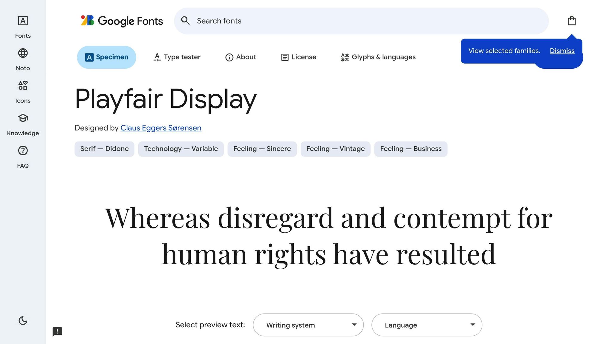
Playfair Display is a serif font that exudes sophistication, thanks to its bold contrast between thick and thin strokes. This striking design element makes it perfect for creating eye-catching thumbnails. Designed in 2011 and inspired by 18th-century typefaces like Baskerville, Playfair Display combines a classic aesthetic with a modern touch.
Bold and Elegant Appeal
The dramatic contrast in its letterforms gives Playfair Display a commanding presence, helping your thumbnails stand out in crowded feeds. It’s particularly effective for channels aiming to project a sense of luxury or artistry. However, as David Ch, Chief Editor at ThumbnailTest, points out:
"Not ideal for longer text due to its decorative nature".
Best for Specific Content Types
Playfair Display shines in niches like beauty, fashion, lifestyle, art, and history. Teamtown highlights its suitability for these genres:
"Playfair Display might just be the best option out there for fashion, beauty, and lifestyle content".
Unlike the bold urgency of fonts like Impact, Playfair Display communicates elegance and a refined brand identity, appealing to audiences with a keen eye for design.
Tips for Readability
This font works best for short headlines of 1–3 words, ensuring legibility even on smaller screens. Always test your thumbnail designs on mobile, where sizes can shrink to as small as 168×94 pixels. Playfair Display is available for free on Google Fonts, making it an accessible choice for creators.
Up next, let’s explore how Roboto’s sleek and adaptable design can enhance your thumbnails.
6. Roboto
Roboto is another excellent choice for creators seeking a font that balances design precision with digital functionality. Designed by Christian Robertson, this sans-serif typeface is YouTube's official font for its website and branding. Using it can give your thumbnails a familiar and platform-native feel, helping them stand out on YouTube.
Readability at Small Sizes
Roboto was crafted specifically for digital screens, and its performance reflects that. Even at the smallest mobile display sizes, the font remains crisp and easy to read. Its clean and neutral letterforms ensure clarity at small scales, which is crucial for thumbnails that need to look sharp across all devices. Adam Enfroy highlights this strength:
"Roboto is a standout choice for those seeking clarity. This clean, neutral font works well across all screen sizes."
Eye-Catching Yet Professional
While Roboto is known for its clarity, it also brings a professional edge to your designs. Tech creator Marques Brownlee (MKBHD) often uses Roboto Bold in his thumbnails, relying on its clean, bold lines to create a sleek and authoritative look. For text that needs to stand out against busy backgrounds, Roboto Bold or Roboto Black offers the necessary weight without losing its modern, polished feel.
Ideal for Various Content Types
Roboto strikes a balance between clarity and professionalism, making it a go-to option for creators in tech reviews, vlogs, educational content, and professional tutorials - essentially, any channel where a straightforward and modern aesthetic is key. Alex Stewart sums it up well:
"Roboto's sleek style is a perfect match for informational channels that need to be straightforward."
Unlike the bold energy of Impact or the upscale vibe of Playfair Display, Roboto offers versatility and neutrality. It works seamlessly across different backgrounds and visual styles, making it an excellent starting point for beginners. Plus, it's free to download through Google Fonts.
7. Gotham
Gotham is a sans-serif typeface known for its bold, urban appeal, making it a strong choice for creating impactful thumbnail text. Its role in the famous "HOPE" poster from Barack Obama's presidential campaign highlights its powerful design.
Bold and Eye-Catching
With its clean, geometric letterforms, Gotham grabs attention effortlessly. It delivers a modern and polished look, perfect for headlines that need to make a statement.
Versatile for Various Content Styles
If you're aiming for a professional yet stylish vibe, Gotham fits the bill. Its design strikes a balance between flair and credibility, making it suitable for content where both are important.
Easy to Read, Even Small
Gotham's design ensures it remains clear and legible, even at smaller sizes on screens. Plus, it’s available to download for free, adding to its accessibility.
Up next, let’s explore how these fonts compare in their ability to enhance your thumbnails for different purposes.
Font Comparison by Use Case
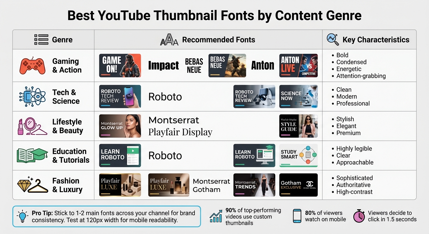
Best YouTube Thumbnail Fonts by Content Genre Comparison Chart
Let’s dive deeper into how different fonts align with specific content needs and why choosing the right one can make all the difference.
For gaming and action channels, bold and energetic fonts like Impact, Bebas Neue, and Anton are the go-to options. These fonts grab attention instantly, delivering the intensity and excitement that gaming audiences crave.
Tech and science creators typically lean toward clean, modern sans-serif fonts. Roboto stands out here with its sleek design and readability, projecting professionalism without overwhelming the viewer.
When it comes to lifestyle and beauty content, fonts like Montserrat and Playfair Display create a polished, stylish look. These choices exude a premium feel, aligning with the high-quality aesthetic that viewers expect from these genres.
For education and tutorial channels, readability is king. Fonts need to be clear and approachable, ensuring that even quickly scanned text remains easy to understand. Roboto excels in this area, offering a perfect balance of clarity and trustworthiness.
Here’s a quick summary of the best font choices by genre:
| Genre | Best Fonts from This List | Key Characteristics |
|---|---|---|
| Gaming & Action | Impact, Bebas Neue, Anton | Bold, condensed, energetic, attention-grabbing |
| Tech & Science | Roboto | Clean, modern, professional |
| Lifestyle & Beauty | Montserrat, Playfair Display | Stylish, elegant, premium |
| Education & Tutorials | Roboto | Highly legible, clear, approachable |
| Fashion & Luxury | Playfair Display, Montserrat, Gotham | Sophisticated, authoritative, high-contrast |
To maintain a cohesive look, stick to 1–2 main fonts across your channel. And don’t forget to test your thumbnails at 120px wide - this ensures your text remains sharp and readable, especially on mobile devices.
Conclusion
Choosing the right font is all about blending design, clarity, and understanding your audience. Bold, condensed fonts like Impact and Bebas Neue work perfectly for high-energy gaming or action content. On the other hand, clean sans-serif fonts such as Roboto are ideal for tech and educational channels. For lifestyle or beauty themes, fonts like Playfair Display and Montserrat can create the polished, premium look viewers expect.
"The right font can be the difference between a scroll and a view." - Figma
Readability is crucial, especially since nearly 80% of YouTube viewers are on mobile devices. Your text must remain clear even at smaller sizes, like 168x94 pixels. Always test your thumbnails at reduced scales - if the text isn’t instantly legible, adjust by simplifying or enlarging it.
Font pairing with high-contrast colors is another key factor. For instance, white text with a black outline is a reliable choice, while yellow on black grabs attention immediately. Position your text strategically, such as along the sides or in the lower third of the thumbnail, avoiding interference with the main subject's face. Keep text short - 3 to 5 words max - for quick recognition, and use varying font weights to guide the viewer's eye to the most important message.
Tools like ThumbnailCreator simplify this process, allowing you to experiment with different font combinations and layouts. The platform's preview features help you ensure your thumbnails are readable on all devices, especially mobile. Testing multiple versions and tweaking fonts, sizes, or placements can significantly improve click-through rates. Small changes in typography can truly transform how your content is perceived, turning casual scrollers into engaged viewers.
FAQs
What’s the best way to pick a font for my YouTube thumbnail?
Choosing the right font for your YouTube thumbnail comes down to readability, style, and grabbing attention. Fonts that are bold and easy to read work best because they stay clear even when thumbnails are shrunk down. Match your font to your content’s vibe - something classic like Georgia or Garamond works for formal topics, while lively fonts like Impact or Bebas Neue fit energetic, upbeat content.
To make your thumbnail pop, choose fonts that stand out against the background and align with your channel’s branding. A clean, bold font ensures your text catches the eye in a busy feed, drawing in more viewers.
Why is it important to use readable fonts on YouTube thumbnails?
Readable fonts play a key role in YouTube thumbnails. They make it easier for viewers to grasp your message instantly, even when the thumbnail is displayed at smaller sizes. Clear, legible text ensures your content catches the eye and stands out in a sea of videos.
Choosing easy-to-read fonts doesn’t just improve clarity - it also boosts accessibility and enhances the visual impact of your thumbnails. This combination can help attract more potential viewers to your content.
What are the best tools for designing eye-catching YouTube thumbnails?
Designing visually appealing YouTube thumbnails becomes a breeze when you have the right tools at your disposal. Thumbnail Creator, for instance, is an AI-powered platform built to help you craft professional, attention-grabbing thumbnails quickly. Its intuitive customization features make it easy to design thumbnails that can boost both click-through rates and viewer engagement.
If you're looking for more control and advanced editing options, tools like Adobe Photoshop or Canva are excellent choices. These platforms offer a wide variety of fonts, colors, and design elements, making it simple to create thumbnails that match your brand and content style seamlessly.
For an added touch, try incorporating popular fonts like Impact, Bebas Neue, or Montserrat. Pairing the right tools with trending fonts can elevate the visual appeal of your thumbnails, drawing more viewers to your channel and leaving a lasting impression.