
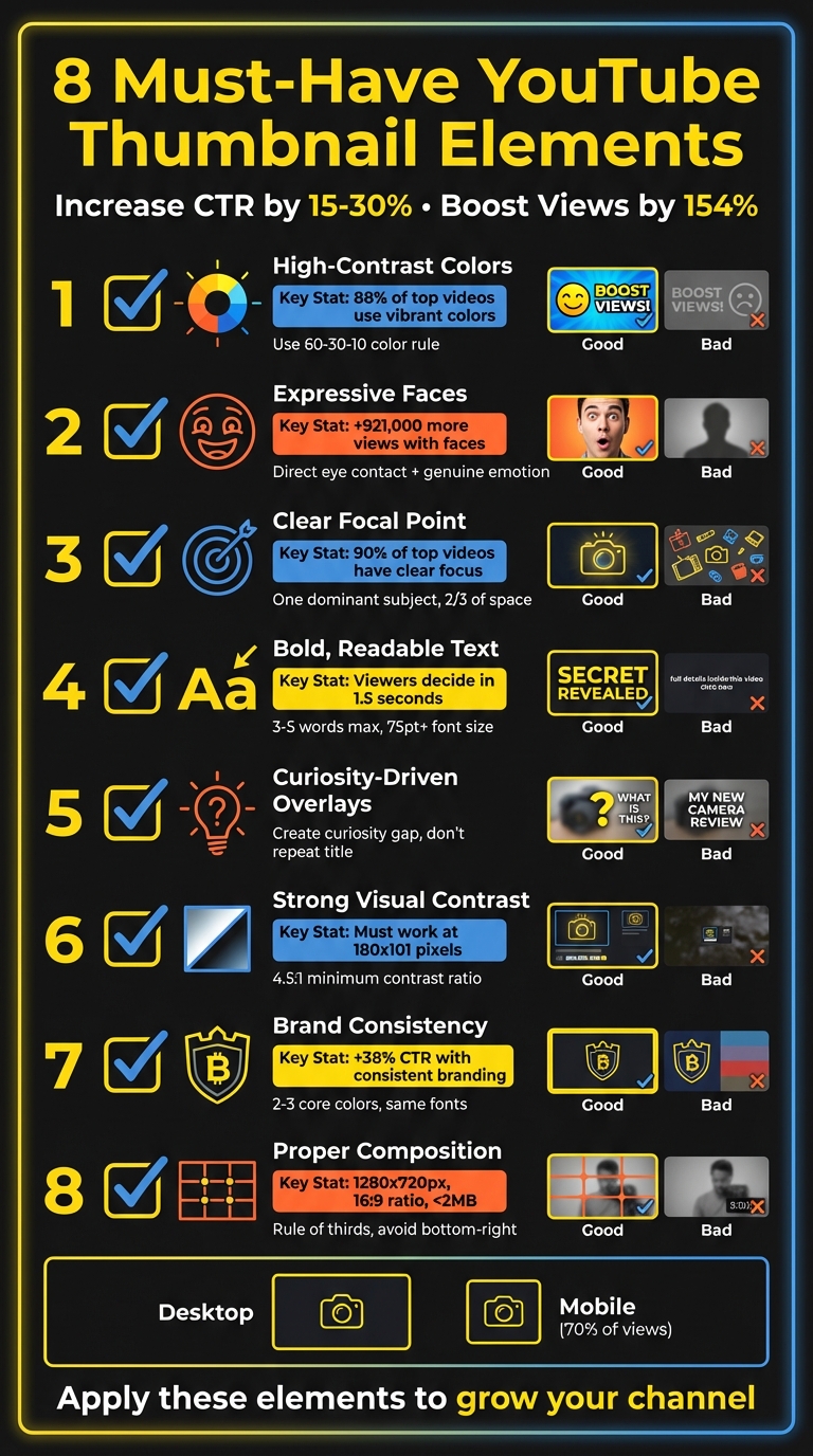
YouTube Thumbnail Checklist: 8 Must-Have Elements
Your YouTube thumbnail can make or break your video's success. It’s the first thing viewers notice, and it influences their decision to click. A well-designed thumbnail can increase click-through rates by 15–30% and boost viewership by up to 154%. Here’s a quick overview of the 8 essential elements every thumbnail needs:
- High-Contrast Colors: Use bold combinations (e.g., yellow on black) to stand out.
- Expressive Faces: Thumbnails with faces get significantly more views.
- Clear Focal Point: Avoid clutter; focus on one main subject.
- Bold, Readable Text: Stick to 3–5 words in large, sans-serif fonts.
- Curiosity-Driven Text Overlays: Tease a benefit or secret to spark interest.
- Strong Visual Contrast: Ensure every element is clear, even on small screens.
- Brand Consistency: Use consistent colors, fonts, and logos for recognition.
- Proper Composition: Follow the rule of thirds and avoid covering key elements with YouTube’s interface.
These principles help your thumbnails grab attention, improve visibility, and encourage clicks. Tools like ThumbnailCreator can simplify the design process by applying these strategies with ease. Start optimizing your thumbnails today to grow your channel faster.
8 Essential YouTube Thumbnail Elements Checklist
how to make a killer thumbnail (for the 2025 algorithm)
1. High-Contrast Colors for Better Visibility
If you want your thumbnail to grab attention in a crowded YouTube feed, high-contrast colors are your secret weapon. These color combinations, like bright yellow on black or neon orange on deep blue, create a sharp visual difference that naturally draws the eye. As you scroll through YouTube, these striking contrasts make certain thumbnails pop while others fade into the background.
The stats don’t lie: 88% of the most-watched YouTube videos feature vibrant, colorful thumbnails. Plus, using high-contrast color palettes can increase click-through rates by up to 30% compared to low-contrast designs. Since thumbnails shrink significantly on mobile devices, strong contrast becomes even more critical to ensure your design remains eye-catching.
"Bold, bright colors make your thumbnail stand out." - Paul O'Malley, YouTube Creator
To create a balanced yet visually engaging thumbnail, try the 60-30-10 rule: dedicate 60% of your design to a dominant color, 30% to a secondary color, and 10% to a contrasting accent. For example, blue and orange work well for tech content, yellow and black convey urgency, and black with neon accents suits gaming videos. Avoid using red, white, or black as your primary background, as they may blend too much with YouTube’s interface.
Before finalizing your design, perform the "squint test." Shrink your thumbnail to 168x94 pixels - the size it appears on mobile - and check if the key elements remain clear. If they don’t, the contrast might need adjusting. Also, for better readability and accessibility, ensure a minimum contrast ratio of 4.5:1 between your text and background. Be cautious with clashing colors like pure red and pure blue; placing them side by side can create a distracting vibration effect.
While some creators prefer face thumbnails vs no face designs, Up next, we’ll explore how expressive faces can make your thumbnails even more engaging.
2. Expressive Faces to Connect with Viewers
Humans are naturally drawn to faces. Our eyes instinctively gravitate toward thumbnails featuring faces, especially those with direct eye contact. In fact, thumbnails with human faces get an average of 921,000 more views than those without, and 72% of the most popular YouTube videos prominently feature a face.
Close-ups paired with genuine emotions can significantly boost engagement. Including a face in your thumbnail can increase click-through rates by as much as 25%. When someone looks directly into the camera, it creates a psychological connection, almost like real-life interaction. This is why creators like MrBeast consistently use close-up face shots in their thumbnails.
"If you trusted Jimmy on the last video that he uploaded, and he delivered on the content, then the next video you see his face, and you'd be like, 'Oh, that's the guy that delivered on the last video I enjoyed so I'm going to click on this video as well.'" - Chucky Appleby, MrBeast's creative team
This sense of connection encourages viewers to engage further, as they resonate with the emotions displayed. The specific emotion in the thumbnail also plays a big role in viewer response. Research shows that sadness generates the highest average view count at 2.3 million views, followed by joy and humor at 1.5 million views, and anger or fear at 818,000 views. Authenticity is crucial - genuine smiles, where the eyes crinkle naturally, outperform forced ones. To capture these moments, try recording at 60 FPS and experiment with expressions like surprise, shock, or excitement. Then, pick the perfect frame for your thumbnail.
When positioning the face, use the rule of thirds: align the eyes along the top horizontal third of the thumbnail and crop tightly around the face to amplify emotional impact. This approach is especially important for mobile viewers. Make sure the face isn’t blocked by YouTube’s play button or duration timestamp. Combining expressive faces with other visual techniques can help create thumbnails that are not only eye-catching but also irresistible to click.
3. Clear Focal Point to Prevent Confusion
Your thumbnail needs to communicate its message instantly - otherwise, viewers will scroll right past it. If your design is packed with multiple competing elements, it becomes confusing, and most people won’t take the time to figure it out. They’ll just move on.
To avoid this, stick to a single dominant subject. Overcrowding your thumbnail with too many faces, objects, or a chaotic background makes it harder for viewers to grasp your message quickly. As Chucky Appleby from MrBeast’s creative team puts it: "If they have to spend 10 or 20 seconds to try to understand what’s going on in your thumbnail, they’re probably not going to be that invested, and they’re going to keep scrolling".
Having a clear focal point doesn’t just simplify your message - it also makes your thumbnail easier to read on mobile devices. With 90% of top-performing videos featuring custom thumbnails designed with a clear focus, this approach is proven to work. To achieve this, ensure your main subject takes up at least two-thirds of the thumbnail space. Position it strategically using a 3x3 grid, aiming for the vertical lines or intersection points - these are the areas where viewers naturally focus first.
Negative space is another powerful tool. By keeping your design uncluttered, you naturally draw attention to the focal point. Simple visual cues like arrows or circles can also guide the viewer’s eye to the main element. Adding a subtle vignette effect - darkening the edges - further emphasizes the center of the thumbnail.
Before finalizing your design, apply the "glance test." Shrink your thumbnail down to mobile size and check if the main subject is instantly recognizable. If it’s not, simplify the design. YouTube Creators also advises: "Try not to make the design too complex. Dynamic use of color and composition can help catch the eye, but too much can overwhelm it". Build your thumbnail around one standout feature - whether that’s an expressive face, a key object, or a bold word - and let everything else support that central element.
4. Bold, Readable Text for Quick Communication
Your thumbnail text needs to grab attention instantly - viewers decide in just 1.5 seconds whether to engage or scroll past. If your message isn’t easy to read at a glance, you’ve already lost them. Keep it short and snappy: 3–5 impactful words max. Adding extra words? That only waters down the effect.
For maximum clarity, use fonts that stay crisp on mobile screens. Sans-serif fonts are your best bet - they maintain sharpness even when scaled down, unlike decorative serif fonts that can blur at smaller sizes. Some reliable options include Impact, Anton, Montserrat Bold, Bebas Neue, and Oswald. Go for Extra Bold weights and set your font size to at least 75 points to ensure readability on smaller devices.
"Readability in YouTube fonts can help viewers easily understand the content, making it a key factor for success."
– Approachable Design
Placement matters too. Avoid the bottom-right corner - YouTube’s timestamp will cover it. Instead, position your text in the top-left area or align it along the rule of thirds grid lines. To make your text pop, try adding a 2–4 pixel contrasting outline or a subtle drop shadow to separate it from the background.
Always test your thumbnail at mobile size (around 180×101 pixels) to see if your 3–5 words are instantly readable. If they’re not, tweak the size or adjust the contrast. Also, your thumbnail text should enhance your video title, not repeat it. Use it to spark curiosity or provide context that makes viewers want to click.
5. Text Overlays That Create Curiosity
Your text overlay should do more than just sit there - it needs to spark curiosity. By hinting at a solution or teasing a little-known secret, you can create a "curiosity gap" that encourages viewers to click without giving everything away.
Make sure the overlay complements your title rather than repeating it. For example, if your video is titled "How to Grow Tomatoes", pair it with an overlay like "The $2 Trick" or "Why Mine Doubled." These phrases add intrigue and make viewers wonder, "What’s the secret?"
"Your thumbnail's #1 job, which it shares with your title, is to put a burning question in the mind of your viewer."
– Thomas Frank, Creator
Keep your hooks short, specific, and value-driven, following proven YouTube thumbnail guides. Phrases like "Double Your Views", "Easy Hack", or "Save Money" clearly highlight the benefit for the viewer. You can also pose an engaging question, but it’s crucial that your video delivers on the promise - otherwise, you risk losing retention and hurting your rankings.
Before finalizing, test your overlay on mobile devices to ensure it’s readable in under two seconds. Stick to 3–5 words, use bold sans-serif fonts, and choose high-contrast colors (like yellow on black) to grab attention instantly. When done right, this approach not only draws viewers in but also complements the overall design of your thumbnail for maximum impact.
sbb-itb-b59debf
6. Strong Visual Contrast for Better Clarity
When it comes to visual design, clarity is just as important as compelling text overlays. Strong visual contrast ensures every element of your design stands out, even on smaller screens. Think about this: your thumbnail has to work across multiple sizes - from a large desktop display to a tiny mobile icon as small as 180x101 pixels. If your subject blends into the background, someone scrolling on their phone might completely overlook your video.
The fix? Keep it straightforward - place your subject on a clean, uniform background. This could be a solid color, a blurred scene, or darkened edges that naturally guide the viewer’s attention to the center. When you eliminate unnecessary visual noise, your subject "pops" off the screen, making it instantly recognizable - even at those small mobile preview sizes.
"High-contrast images are more noticeable than low-contrast images."
– Backlinko
Want to test your design? Try a quick Glance Test. Shrink your thumbnail to mobile dimensions and see if the focal point is immediately clear. If you find yourself squinting to figure out what’s going on, it’s time to boost the contrast or simplify the background.
To add even more separation, consider outlining your subject with a 2–4 pixel border in a contrasting color - like a white outline around a dark figure - or use a soft drop shadow to create depth. These small tweaks, combined with higher contrast and a clean background, will make sure your subject stays sharp and noticeable, no matter the size.
7. Brand Consistency for Channel Recognition
When people scroll through their YouTube feed, they’re hit with a sea of thumbnails all vying for attention. Brand consistency is what makes your content pop out of the crowd. Think of it like spotting a familiar face in a busy room - you recognize it instantly. By using the same colors, fonts, and design elements across your thumbnails, viewers will know it’s your video before they even glance at the title.
And this isn’t just about aesthetics - it directly affects performance. Thumbnails with consistent branding can boost click-through rates by as much as 38% and increase revenue by 33%. Familiarity builds trust. If a viewer has enjoyed your content before, they’re more likely to click again when they recognize your style.
To create this recognition, keep your color palette tight - stick to 2–3 core colors and use them consistently. Choose one or two bold, sans-serif fonts like Impact, Montserrat, or Anton, and make them your go-to. Add your logo or a watermark in a consistent spot, but avoid the bottom-right corner where YouTube’s timestamp appears. These small choices form your visual identity while still leaving room to play around with image styles or text placement.
Here’s a quick way to test your branding: shrink your thumbnail down to mobile size and place it next to another video. Can you spot your brand in under a second? If not, it’s time to tighten up your design. When your videos show up together in search results or the sidebar, a consistent style grabs attention far better than a random assortment of designs. Plus, YouTube’s algorithm might reward that extra engagement.
In short, a cohesive look isn’t just about looking good - it’s about building recognition and trust that turn casual viewers into loyal fans. Up next, we’ll dive into how to structure your thumbnails for even better visibility.
8. Proper Composition and YouTube Compliance
Even if your thumbnail has the perfect colors, faces, and text, it won't make an impact if it's poorly composed or doesn't meet YouTube's compliance standards. To start, make sure your thumbnail is 1280 x 720 pixels with a 16:9 aspect ratio, and keep the file size under 2MB. Stick to formats like JPG, PNG, or WebP for uploading.
A great way to achieve a balanced composition is by applying the rule of thirds. Picture your thumbnail divided into a 3×3 grid with two horizontal and two vertical lines. The four intersections of these lines are ideal spots for placing key elements, such as a subject's eyes. Research shows that viewers often scan images in an F-shape, with about 40% of their focus landing on the top-left intersection. This slight shift away from centering your subject helps create a more visually appealing and balanced design. Plus, it ensures that your focal points remain visible even with YouTube’s interface overlays.
Speaking of overlays, remember that YouTube's interface can obscure parts of your thumbnail. The play button typically sits in the center, while the timestamp occupies the bottom-right corner. This means centered faces or important text in these areas could get covered. Position your key elements strategically to avoid this issue.
Following YouTube's guidelines is just as important as good design. Thumbnails deemed inappropriate - whether they contain nudity, sexually suggestive imagery, hate speech, violence, or harmful content - might be hidden from search results, even if no strike is issued. To stay on the safe side, avoid using copyrighted images or unlicensed fonts. Opt for system fonts or free alternatives instead. If you're unsure about compliance, tools like the Google Cloud Vision API can help you test your thumbnail before uploading.
Finally, steer clear of using "YouTube red" for icons or graphics, as it can blend into the play button and reduce visibility. Focus on creating a clean, eye-catching composition that meets compliance standards and keeps all critical elements visible.
How ThumbnailCreator Helps You Apply These Elements
Now that you’re familiar with the eight key elements for effective YouTube thumbnails, you might be wondering how to bring them to life without wrestling with complicated design tools. That’s where ThumbnailCreator steps in, simplifying the entire process with its AI-powered features that apply proven design principles in just a few clicks.
Take color grading, for instance. The AI analyzes your video and recommends the best color schemes to grab attention. It might suggest warm tones like red and orange to evoke urgency or pair complementary colors like blue and orange to naturally guide the viewer’s gaze. This intelligent approach ensures your thumbnails stand out while you focus on creating great content. If you're just starting out, our YouTube thumbnail beginners guide can help you master the basics.
But it doesn’t stop at colors. ThumbnailCreator offers pre-designed templates with bold, easy-to-read fonts like Impact, Anton, or Montserrat - perfect for mobile screens. Subtle touches like 2–4 pixel outlines and drop shadows enhance readability while keeping your text within the ideal 3–5 word range. Plus, it ensures your thumbnails meet the recommended high contrast vs low contrast ratios for accessibility.
Another standout feature is its face swapping and object swapping tools, which tackle common design challenges head-on. Want to include expressive faces with direct eye contact? Face swapping makes it easy, and studies show this can boost click-through rates by up to 25%. Meanwhile, object swapping helps remove distracting backgrounds, keeping the focus sharp and clear.
ThumbnailCreator also enhances brand consistency by saving your go-to color palettes, fonts, and logo placements. For example, a 2025 case study revealed that Tasty Creations increased their click-through rate from 2.8% to 7.1% by standardizing their branded elements.
Conclusion: Build Thumbnails That Get Clicks
Think of your thumbnail as your video's storefront - it’s the first thing viewers notice, and it needs to make an instant impact. By incorporating eight key elements - high-contrast colors, expressive faces, clear focal points, bold text, curiosity-driven overlays, strong visual contrast, brand consistency, and proper composition - you can create thumbnails that grab attention in just seconds. Custom thumbnails aren’t just about aesthetics; they can boost click-through rates by 15–30% and increase viewership by as much as 154%.
"Thumbnails are absolutely critical... they're often the first thing viewers see, and a compelling thumbnail is often the difference between someone clicking on your video or scrolling past it." – Paul O'Malley, YouTube Creator
Start applying these strategies today. Make sure your thumbnails are easy to read even at small sizes, as over 70% of YouTube views come from mobile devices. Use the Rule of Thirds to position key elements, keep text concise with 3–5 impactful words, and maintain consistent branding across your channel to build recognition.
For a streamlined approach, tools like ThumbnailCreator can help. With AI-powered features, pre-designed templates, and options like face swapping and object swapping, you can save hours of work while ensuring your thumbnails meet YouTube’s technical standards. Nail these principles, and you’ll be well on your way to capturing attention and growing your channel. Your next click-worthy thumbnail is just a few steps away. You can also browse trending YouTube thumbnails for more inspiration.
FAQs
Why do high-contrast colors make YouTube thumbnails more noticeable?
High-contrast colors are a game-changer for YouTube thumbnails, helping them pop in a sea of competing visuals. By combining bright tones with dark backgrounds or pairing complementary shades, you create a striking look that immediately catches the eye.
These bold color choices also highlight important elements like text or facial expressions, making them stand out. This sharp contrast improves readability and ensures viewers quickly grasp what your video is about, increasing the likelihood they'll click. If you're looking to make your thumbnails more noticeable and engaging, high-contrast colors are a simple yet powerful tool.
Why are expressive faces so effective in YouTube thumbnails?
Expressive faces work wonders in YouTube thumbnails because they instantly catch the eye and spark curiosity. People are naturally attracted to visible emotions, which makes it easier to build a quick connection and draw them in.
Including expressive faces also gives your thumbnail a personal touch, making your content feel more inviting and approachable. A carefully chosen facial expression can quickly convey the mood or message of your video, making viewers more likely to click and explore further.
Why is brand consistency important for YouTube thumbnails?
Brand consistency plays a key role in creating effective YouTube thumbnails. By sticking to the same colors, fonts, logos, and overall design style, you establish a recognizable and professional look for your channel. This consistency makes it easier for viewers to spot your content, building trust and familiarity over time. And when people recognize your brand quickly, they’re more likely to click on your videos.
Having a unified thumbnail style also helps your channel stand out in YouTube’s crowded sea of content. When viewers can immediately associate your thumbnails with your channel, it not only boosts click-through rates but also strengthens audience loyalty. In short, a consistent style doesn’t just make your channel look polished - it reinforces your brand identity and helps grow your audience and engagement.