
How to Increase YouTube CTR With Better Thumbnails
Thumbnails are the first thing viewers see, and they directly impact your click-through rate (CTR). Here’s what you need to know:
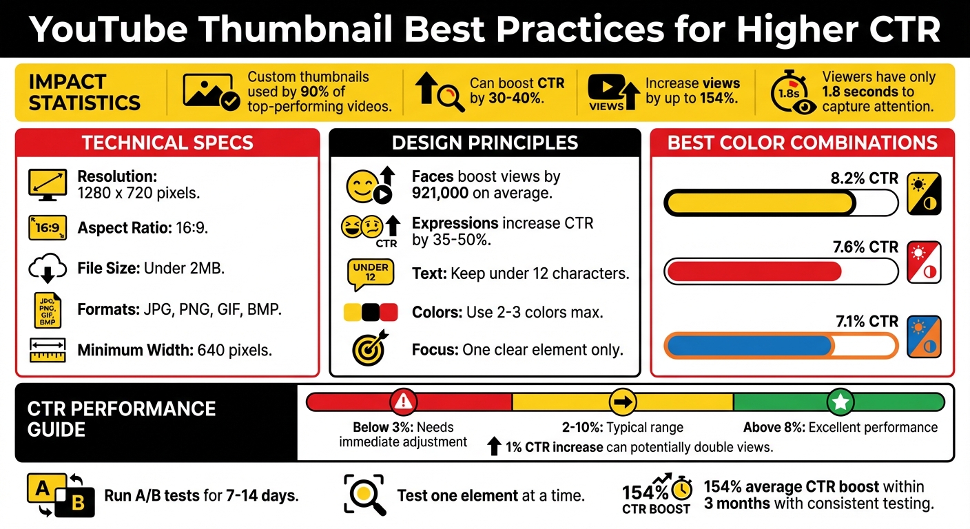
- Custom thumbnails outperform auto-generated ones - used by 90% of top-performing videos.
- They can boost CTR by 30–40% and increase views by up to 154%.
- Misleading thumbnails hurt performance. Align your thumbnail with your video content to keep viewers engaged.
Key thumbnail tips:
- Use 1280 x 720 pixels resolution (16:9 ratio) and keep the file under 2MB.
- Add faces and bold expressions to grab attention - videos with faces get more clicks.
- Stick to high-contrast colors like yellow/black or red/white for better visibility.
- Keep text minimal (under 12 characters) with bold fonts for mobile readability.
Tools like ThumbnailCreator can simplify the process with AI-generated designs, templates, and A/B testing to refine your thumbnails for maximum impact.
Bottom line: A strong thumbnail can drive clicks, improve video visibility, and grow your channel. Focus on clarity, color, and alignment with your content.
YouTube Thumbnail Best Practices: Key Statistics and Design Guidelines for Higher CTR
How to Make GOOD YouTube Thumbnails (Boost CTR)
YouTube Thumbnail Requirements for 2026
To make sure your thumbnails look great on all devices, it's essential to follow YouTube's technical guidelines. Here's a breakdown of the key specs and design tips for 2026.
Thumbnail Dimensions and Resolution
YouTube recommends creating thumbnails at 1280 x 720 pixels with a 16:9 aspect ratio. While the minimum width allowed is 640 pixels, sticking with 1280 x 720 ensures your thumbnail appears sharp across desktops, mobile devices, and TVs.
Supported file formats include JPG, PNG, GIF, and BMP. For designs with text or flat graphics, PNG is a solid choice because it preserves crisp details. On the other hand, JPG is ideal for photo-heavy designs, thanks to smaller file sizes. Some creators even design at 1920 x 1080 pixels and then downscale to improve sharpness.
File Size Limits
Your thumbnail file must be under 2MB. Staying within this limit ensures faster loading times, which is critical for catching viewers' attention before they scroll past. Looking at trending YouTube thumbnails can provide inspiration for high-performing layouts. For photo-based thumbnails, exporting JPGs at 80–92% quality strikes a good balance between clarity and file size. If your design includes bold text or flat graphics, opt for PNG instead.
To keep file sizes manageable, simplify backgrounds and use the sRGB color profile. This not only maintains visual quality but also ensures compatibility across devices.
Safe Zones for Text and Graphics
YouTube overlays certain elements on thumbnails, which can obscure important parts of your design. For example, the bottom-right corner displays the video duration, so avoid placing key text or graphics there. Additionally, mobile devices might crop or round the corners, so keep crucial elements away from the edges.
To ensure your design works well on smaller screens, test it at 10% scale. This helps you check text readability and maintain clear focal points. Placing faces or key visuals slightly off-center can also prevent interference from YouTube's interface overlays in preview modes.
| Requirement | Specification |
|---|---|
| Recommended Resolution | 1280 x 720 pixels |
| Minimum Width | 640 pixels |
| Aspect Ratio | 16:9 |
| Maximum File Size | 2MB |
| Supported Formats | JPG, PNG, GIF, BMP |
Design Principles for Higher CTR
Creating a thumbnail that grabs attention and drives clicks isn't about overloading it with details. It's about making smart, eye-catching design choices that spark curiosity in an instant. Here's what works.
Using Faces and Expressions
Our brains are naturally drawn to faces, which is why videos featuring faces average 921,000 more views than those without them. Close-up shots of genuine expressions - whether shocked, confused, or excited - can boost CTR by as much as 35–50%. Interestingly, while happy faces appear in 25.3% of thumbnails, sad faces, though rarer (just 1.8%), achieve the highest average views at 2.3 million.
The secret? Use bold, clear expressions that are unmistakable, even on mobile screens. As Chucky Appleby from MrBeast's creative team explains:
"If you trusted Jimmy on the last video that he uploaded, and he delivered on the content, then the next video you see his face, and you'd be like, 'Oh, that's the guy that delivered on the last video I enjoyed so I'm going to click on this video as well'".
Strategic use of color can further emphasize these expressions, helping them stand out even more.
Applying High-Contrast Colors
Color contrast is another powerful tool for grabbing attention. Your thumbnail needs to pop against YouTube's white and dark gray interface. Complementary colors - those directly opposite on the color wheel - work especially well. For example, yellow and black combinations lead with an average CTR of 8.2%, followed by red and white at 7.6%, and blue and orange at 7.1%.
| Color Combination | Average CTR | Best Use Case |
|---|---|---|
| Yellow + Black | 8.2% | High energy, warnings, tutorials |
| Red + White | 7.6% | Urgency, importance, news |
| Blue + Orange | 7.1% | Tech, professional, business |
Stick to 2–3 colors, plus black and white, for a clean and focused look. For example, red can highlight action-packed content, blue can convey trust in educational videos, and yellow can draw attention to how-to guides. Always test your thumbnail at smaller sizes to ensure the colors remain vibrant when optimizing for mobile devices.
Optimizing Text and Fonts
When it comes to text, less is definitely more. Thumbnails with fewer than 12 characters perform much better than text-heavy designs. Think of the text as a teaser, not a summary - it should spark curiosity.
For maximum readability on mobile, use bold sans-serif fonts like Impact, Bebas Neue, or Montserrat. Adding a 2–4 pixel outline or drop shadow ensures the text stands out against any background. The goal is to make sure your message is clear and enticing at a glance.
Clarity and Simplicity in Design
A cluttered thumbnail can confuse viewers and lower your CTR. The best designs focus on one clear element, with a simplified or blurred background to minimize distractions. This approach directs attention exactly where you want it.
You can use visual cues like arrows, circles, or highlights sparingly to guide the viewer's eye. Techniques like blurring, darkening, or desaturating the background help your main subject pop, ensuring your video's value is communicated in just a fraction of a second. Clear, focused designs not only capture attention but also make your content instantly appealing.
sbb-itb-b59debf
Using ThumbnailCreator to Create Better Thumbnails
Now that you’ve got the basics of design down, let’s dive into how ThumbnailCreator brings these principles to life.
Boosting your YouTube click-through rate (CTR) can feel overwhelming, especially if you’re not a designer. That’s where ThumbnailCreator steps in. It simplifies the process, letting you apply key design insights without breaking a sweat.
AI-Powered Thumbnail Generation
Just enter your video title, and ThumbnailCreator’s AI takes it from there. It generates multiple thumbnail variations by analyzing your title and applying proven design strategies. Expect bold, high-contrast color combinations, perfectly placed text, and emotional hooks that grab attention - all without needing to master complex design concepts like color theory or visual psychology. It’s like having a professional designer at your fingertips.
Face Swapping and Object Swapping
Did you know that adding a human element to your thumbnails can boost CTR by 35–50%? For faceless channels, ThumbnailCreator’s FaceSwap feature is a game-changer. It allows you to add expressive faces that convey emotions like shock, joy, or curiosity, helping your audience connect with your content on a more personal level - even if you’re not on camera.
Similarly, the Object Swap tool makes it easy to update specific elements in your thumbnail, like products or locations. This ensures your thumbnail aligns perfectly with your video’s content, giving viewers a clear idea of what to expect.
Text Editing and Ready-to-Use Templates
ThumbnailCreator also offers a variety of pre-designed templates tailored to different types of content - whether it’s tutorials, gaming, vlogs, product reviews, or news commentary. These templates are built using tried-and-true design principles, so you’re starting with a solid foundation.
The built-in text editor helps you keep your copy short and impactful - ideally under 4 words. Why? Because concise text has been shown to deliver a 30% higher CTR compared to cluttered designs. Bold, legible fonts ensure your message stands out, even on smaller screens.
Speaking of screens, ThumbnailCreator lets you preview your design at mobile size. Since over 70% of YouTube views come from mobile devices, this feature ensures your thumbnail stays clear and readable no matter where it’s seen. With easy-to-use editing tools, you can create, refine, and test multiple thumbnail variations in just minutes. Once you’ve nailed the design, track its performance to push your CTR even higher.
Testing and Improving Thumbnail Performance
Testing is where the magic happens. By experimenting with different thumbnail versions and relying on data to guide decisions, creators can make big strides in performance.
A/B Testing Thumbnails
YouTube offers a free "Test & Compare" tool that lets you test up to three thumbnail variations on the same video simultaneously. Instead of focusing solely on clicks, YouTube determines the winner based on watch time share. This approach prioritizes thumbnails that represent your content accurately, discouraging clickbait tactics.
Run tests for 7–14 days to gather enough data. Focus on changing one element at a time - like comparing a close-up shot to a wide-angle image or testing red text against yellow. Tweaking too many things at once makes it impossible to pinpoint what’s working.
For example, in August 2025, the vidIQ team tested three thumbnails for a video about AI advancements. The winning version - a simple image of an AI robot - captured a 59.7% share of total watch time. After switching to this thumbnail permanently, the video’s views nearly tripled.
Once your tests are complete, dive into the data to evaluate click-through rate (CTR) and view duration metrics.
Analyzing CTR Metrics
CTR is a direct measure of how well your thumbnail grabs attention. YouTube Studio calculates it using this formula: (Number of clicks / Number of impressions) x 100. For most channels, a CTR between 2% and 10% is typical. Thumbnails with a CTR below 3% need immediate adjustments, while CTRs above 8% are considered excellent.
But CTR alone isn’t the full story. Pair it with average view duration to spot misleading thumbnails - those that attract clicks but fail to hold attention. Dive deeper by analyzing CTR by traffic source. Pay special attention to "Home" and "Suggested" feeds to gauge how well your thumbnails are performing with new audiences.
"Great thumbnails don't just get viewers to click. They also help viewers understand what the video is about, so that they can make informed decisions about what to watch." - YouTube Official Support
Use these insights to refine and improve your thumbnails for future videos.
Iterating Based on Data
When your data points to a winning thumbnail with at least 95% statistical confidence, take note of what worked. Did a bright red background outperform others? Apply that insight to your next video. Creators who consistently test and tweak their thumbnails report an average 154% boost in CTR within three months.
Even evergreen content benefits from thumbnail updates. Refresh these thumbnails every 4 to 6 months to give the video a fresh push in YouTube's algorithm. For instance, creator JackSucksAtLife replaced a cluttered thumbnail with a cleaner design and saw a 978% increase in views. Even minor changes matter - a mere 1% boost in CTR can potentially double your video views.
Conclusion
Your thumbnail holds the power to determine whether a viewer clicks or scrolls past. With just 1.8 seconds to capture their attention, every design choice counts. Research shows that videos with custom thumbnails - used by 90% of top-performing content - can achieve up to a 154% increase in click-through rates (CTR) within three months.
The strategies we’ve discussed - like using high-contrast colors, expressive faces, minimal text, and designs optimized for mobile - aren’t just nice-to-haves. They are the backbone of thumbnails that grab attention in busy feeds and signal quality to YouTube’s algorithm. A higher CTR not only boosts visibility but also triggers YouTube to promote your content to a broader audience, creating a growth loop that builds momentum over time.
ThumbnailCreator simplifies this process by combining AI-driven tools, face-swapping features, and pre-designed templates. It’s built around proven techniques like bold color contrasts and mobile-friendly layouts to help you create thumbnails that drive engagement. With features like built-in previews for cross-device compatibility and A/B testing, it removes the guesswork from optimizing your designs.
Think of your thumbnails as more than just visuals - they’re strategic tools. Test them, analyze performance, and refine your approach based on what resonates with your audience. The gap between a 2% CTR and an 8% CTR can completely change your channel’s growth trajectory. With tools like ThumbnailCreator, you have everything you need to fine-tune your strategy and take your channel to the next level.
FAQs
How can I make sure my thumbnail matches my video content?
When designing a thumbnail that aligns with your video content, aim to create visuals that clearly convey the main idea. Use sharp, high-quality images paired with bold, contrasting colors that match your video's theme and tone. Keep any text brief but striking, emphasizing key points without giving viewers the wrong impression.
Your thumbnail should spark the right emotions and create a connection with your audience. Take time to review how your thumbnails perform and adjust them based on what grabs viewers' attention the most. By consistently testing and tweaking, you can ensure your thumbnails remain in sync with both your content and your audience's expectations.
What are the best colors to use for YouTube thumbnails to increase CTR?
When it comes to YouTube thumbnails, bold and contrasting colors are your best bet for grabbing attention. Pairing colors like red with green or yellow with purple creates a striking visual impact, making your thumbnail pop against the crowded YouTube interface.
These bright, high-contrast colors are especially effective on mobile screens, where the majority of YouTube views happen. To boost engagement even further, combine these vibrant colors with expressive faces and short, bold text. This mix not only draws the eye but also adds an emotional connection that encourages clicks.
How does ThumbnailCreator make designing YouTube thumbnails easier?
ThumbnailCreator takes the hassle out of designing YouTube thumbnails by providing personalized design services that help you save time and energy. Even without expert design knowledge, you can easily craft professional and striking thumbnails thanks to its straightforward tools.
The service is all about creating visually striking thumbnails that align with your brand, making it easier to grab attention and improve click-through rates. With ThumbnailCreator handling the design process, you can dedicate more time to producing amazing content while ensuring your thumbnails make a strong impression in a busy feed.