
Case Studies: Thumbnails That Boosted Series Views
Thumbnails are critical for increasing video views. They are your content’s first impression, often viewed before the title. With over 70% of YouTube watch time on mobile devices, thumbnails must be clear, attention-grabbing, and recognizable even at small sizes.
Key insights from the article:
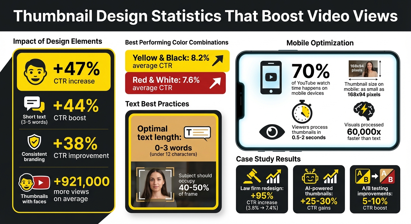
- Human faces with strong expressions can increase click-through rates (CTR) by 47%.
- Short text (3–5 words) boosts CTR by 44%.
- High-contrast colors like yellow/black or red/white stand out on YouTube’s interface.
- Consistency in design builds trust and helps viewers identify your series.
- AI tools can streamline thumbnail creation and improve performance through A/B testing.
Small changes, like simplifying text or adding expressive faces, can lead to significant CTR improvements. For example, a law firm increased their CTR by 95% by redesigning their thumbnails, while BuzzFeed's consistent branding maintained high click-through rates. Tools like ThumbnailCreator make it easier to test and refine designs effectively.
Takeaway: Strong thumbnails are essential for growing your video series. Use bold visuals, clear text, and consistent branding to drive more views.
Key Thumbnail Design Statistics That Boost Video CTR
YouTube Experts Break Down Iconic Thumbnails
sbb-itb-b59debf
Case Study 1: Law Firm Series Increases CTR by 95% with High-Contrast Thumbnails
A law firm producing a client testimonial video series realized their thumbnail design was holding them back. Despite delivering strong content, their videos couldn't push past a 3.8% click-through rate (CTR), which was below the platform average. The issue wasn’t the videos themselves - it was how they were presented to viewers. This led the team to reevaluate their design strategy.
Before: Text-Heavy Thumbnails That Missed the Mark
Initially, the thumbnails followed a traditional corporate style that fell flat on YouTube. Each design featured 6–8 words of text on muted backgrounds like gray or beige - colors chosen to align with their brand guidelines. Typical text included phrases like "Client Testimonial: Personal Injury Case Success Story." While professional, these designs lacked visibility, especially on mobile devices. The subtle gradients and low-contrast colors made the text nearly impossible to read at smaller sizes, failing to grab attention within the critical 0.5-second window viewers typically spend processing thumbnails.
Another major issue was the absence of human faces. Instead of showing people, the thumbnails relied on the firm’s logo and case descriptions. Given that over 70% of YouTube viewing happens on mobile at resolutions as small as 168x94 pixels, these thumbnails blended into the interface, making them easy to overlook.
After: Eye-Catching Visuals and Human Faces Transform Results
To address these shortcomings, the team made three key changes: incorporating expressive human faces, using high-contrast colors, and simplifying text to 3–4 words. The redesigned thumbnails showcased close-ups of happy, relieved, or confident clients, creating an emotional connection. They also introduced a bold blue and orange color scheme and used larger, clearer text like "We Won" or "Justice Served" in bold fonts with white outlines. These updates ensured the thumbnails were not only attention-grabbing but also professional and easy to understand.
A/B testing was conducted over 7 days, with each design variant receiving over 2,000 impressions. The results were striking: the CTR jumped from 3.8% to 7.4%, marking a 95% increase. Importantly, the average view duration stayed consistent, proving that the new thumbnails attracted the right audience without misleading them. This case highlights how thoughtful design adjustments can significantly enhance video performance.
Case Study 2: BuzzFeed's 'Worth It' Series Uses Consistent Themes to Maintain High CTR
BuzzFeed's 'Worth It' series became a standout success largely due to its consistent thumbnail design. This visual approach helped the show maintain strong click-through rates (CTR) by creating a recognizable and trusted visual identity for its audience.
Consistent Branding Helps Viewers Recognize Series Content
The team behind 'Worth It' understood a key principle: visuals are processed much faster than text - about 60,000 times faster. This means viewers often decide to click based on what they see, even before reading a title. By sticking to a cohesive design for every episode - bright colors, a structured layout, and the familiar faces of its hosts - the thumbnails became what Sacha Dumay, Founder of DataFuel, calls a "mental bookmark".
"Your visual consistency acts like a mental bookmark, making it easier for people to find and trust your content." - Sacha Dumay, Founder of DataFuel
This consistency reduced cognitive effort for viewers, turning the thumbnails into reliable indicators of content quality. If someone enjoyed a previous episode, the familiar style acted as a positive trigger, signaling that the new video would likely meet their expectations. The results were striking: maintaining consistent thumbnail branding can boost CTR by as much as 38%, and thumbnails featuring human faces typically attract 921,000 more views than those without.
By building this trusted visual identity, the series not only retained its audience but also intrigued new viewers.
Design Elements That Drive Curiosity
Once the visual identity was established, the team focused on making each thumbnail stand out and spark interest. The hosts’ expressive faces were a key feature, creating an emotional connection with viewers. They also used bold, saturated primary colors that popped against YouTube’s otherwise neutral interface, drawing attention instantly.
Each thumbnail included clear, bold text highlighting the episode’s theme - like "Pizza", "Sushi", or "Tacos" - in a font size that stayed legible even on small mobile screens (as tiny as 168x94 pixels). Together, the vivid colors, engaging facial expressions, and clear text ensured the thumbnails communicated both the series’ identity and the specific episode's content in the 1-2 seconds it takes for viewers to decide whether to click.
This approach, often referred to as "consistent flexibility", allowed the show to maintain its core branding while tailoring each thumbnail to the topic at hand. This balance of familiarity and adaptability helped the series remain engaging and highly clickable across its entire run.
Case Study 3: MKBHD's Minimalist Tech Review Thumbnails Boost Series Views
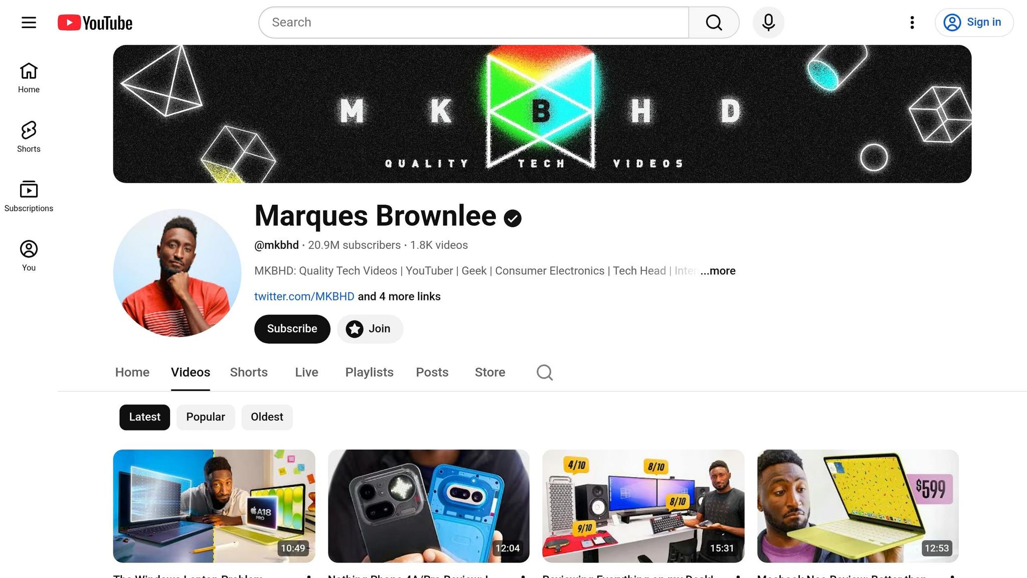
Marques Brownlee, better known as MKBHD, has become a powerhouse in the tech review space on YouTube. A big part of his success? His clean, straightforward thumbnails that highlight products front and center. This approach not only helps him stand out but also builds a sense of trust with his audience.
Why Simple Designs Work for Tech Content
MKBHD's thumbnails rely on sharp 4K product images, enhanced by professional lighting, to make the product the star of the show. This simplicity eliminates distractions, allowing viewers to decide in just a second or two whether to click. By keeping text bold, high-contrast, and minimal, his thumbnails remain easy to read even on smaller screens like smartphones.
"If you're doing tech reviews, you don't need explosions. You need crisp, 4K clarity that says 'I know what I'm talking about.'"
- Riley Santos, Content Creator
This focus on clarity not only grabs attention but also establishes a consistent identity for his videos, reinforcing his brand.
Applying Minimalism Across Multiple Videos
What sets MKBHD apart is how he applies this minimalist strategy across his entire channel. By sticking to a consistent thumbnail style for hundreds of videos, his content is instantly recognizable - no need to even read the title.
"MKBHD's consistent branding across all his platforms ensures that his audience knows what to expect, building trust and loyalty."
- Vishal Thakur, UX Designer
His approach is simple but effective: clean backgrounds, sharp product shots, and minimal text. This cohesive style doesn’t just make his videos look polished - it signals expertise and quality before viewers even hit play. It’s a strategy that not only strengthens his brand but also boosts the performance of his series by keeping viewers engaged and coming back for more.
Case Study 4: Creator Achieves 25-30% CTR Gains with AI-Powered Thumbnails
AI-powered tools are transforming how creators design thumbnails, driving impressive results in performance metrics. In June 2025, one creator used an AI thumbnail generator paired with data-driven A/B testing to analyze viewer preferences. By testing multiple AI-generated designs against each other, the creator achieved a 25% increase in click-through rate (CTR) and a 30% boost in engagement.
During the same period, other creators using AI thumbnail tools reported comparable successes. They were able to cut thumbnail creation time by 30% while improving CTR by 25% and increasing engagement by 15%.
How AI Tools Streamline Thumbnail Creation
AI-powered platforms simplify thumbnail creation by automating much of the design process. Instead of spending hours manually tweaking designs in software like Photoshop, these tools generate 3–5 variations with different crops, color adjustments, and font styles. This not only saves time but also allows creators to focus more on their content.
Some platforms even claim to reduce design time by up to 90%. Features like batch processing, facial recognition for highlighting expressive faces, and text optimization tailored to audience preferences make the process faster and more consistent. These time savings also free up creators to conduct more thorough A/B testing to refine their designs further.
A/B Testing Results with AI-Generated Thumbnails
AI-generated thumbnails excel when tested through A/B experiments, as they allow creators to rely on data rather than guesswork. Instead of making small adjustments, testing "big swings" - such as entirely different concepts or color schemes - tends to yield clearer insights.
"AI isn't 'doing design' for you; it's accelerating iterations so you can spend your energy on the concept."
- Riley Santos, Creative Storyteller
For reliable A/B testing results, it’s essential to let each variation accumulate at least 1,000 impressions and run tests for 7–14 days to ensure statistical accuracy. Changing only one design element at a time - be it color, text, or facial expression - helps identify what specifically drives the CTR improvement. Additionally, tracking watch time alongside CTR is critical. A thumbnail that gets clicks but leads to shorter watch durations might mislead viewers, potentially harming long-term performance.
Common Patterns in Successful Thumbnails
When analyzing successful thumbnails, certain design elements consistently emerge as key drivers of higher click-through rates (CTR). For starters, expressive faces tend to captivate viewers. Thumbnails featuring faces with sad or concerned expressions average 2.3 million views, while happy faces appear in 25.3% of thumbnails, indicating their widespread appeal.
High-contrast color combinations also play a big role in catching attention. For example, yellow and black combinations achieve an average CTR of 8.2%, while red and white deliver 7.6%. These bold color pairings are effective because they stand out against YouTube's light and dark modes.
When it comes to text, less is more. Thumbnails with fewer than 12 characters - ideally just 0–3 impactful words - perform much better than cluttered designs. Using bold text limited to 3–5 words enhances readability and encourages curiosity. Importantly, the text on the thumbnail should complement the video title rather than repeat it, creating a curiosity gap vs direct value strategy that entices viewers to click.
Another proven tactic is A/B testing. Systematically testing variables like facial expressions, background colors, or text placement can lead to a 5–10% improvement in CTR. For meaningful results, each variation should reach at least 1,000 impressions over a 7–14 day period. As FacelessHub puts it:
"Your personal aesthetic preferences are irrelevant. The audience decides. Let the data override your instincts."
These principles form the foundation for tools that simplify the thumbnail creation process.
How ThumbnailCreator Supports These Best Practices
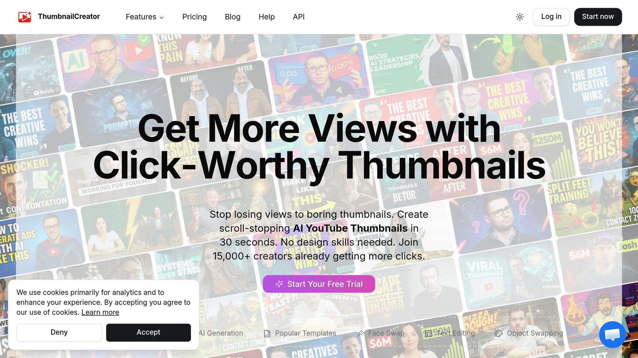
ThumbnailCreator takes these insights and makes them actionable through its AI-powered tools. With its AI generation feature, creators can quickly produce multiple thumbnail variations, saving time and allowing for efficient experimentation. The face swapping tool is particularly useful, enabling creators to test different facial expressions - a critical factor, as expressive faces can boost CTR by 47% compared to thumbnails without faces.
Pre-designed templates help maintain consistent branding, which can improve CTR by up to 24%. The platform’s text editing tools make it simple to stick to the 3-word rule, while the object swapping feature allows creators to try out different visual elements without starting from scratch.
For newcomers, the Free Plan offers access to basic templates and AI tools for experimenting with these principles. Meanwhile, the Pro Plan provides full access to advanced features, unlimited thumbnail creation, and is perfect for creators running frequent A/B tests across multiple videos.
Conclusion: Apply These Lessons to Your Video Series
These examples demonstrate how elements like high-contrast visuals, consistent branding, simple designs, and AI-driven testing can make thumbnails a game-changer for promoting your video series.
To get started, take a close look at your current thumbnails. Use YouTube Studio analytics to identify videos with strong watch time but low click-through rates (CTR). If you spot any, refresh those thumbnails to give them a second wind. Stick to the basics: include expressive faces (which can boost CTR by 47%), keep text short (3–5 words max), and choose bold color combinations such as yellow and black or red and white. As Justin Brown from Primal Video explains:
"It's not about which thumbnail you think is the prettier or better looking thumbnail. It's about which one is actually getting clicked more."
If you're looking for tools to make this process easier, ThumbnailCreator is worth checking out. It offers AI-powered features like rapid thumbnail generation, face swapping, and text editing, helping you design consistent, high-performing thumbnails quickly. The Free Plan includes basic templates and tools to get started, while the Pro Plan adds unlimited creation capabilities and advanced options for A/B testing. With these tools, refining your thumbnail strategy becomes simpler and faster.
Since most YouTube views come from mobile devices, it’s crucial to design for mobile screens. Make sure your subject occupies 40–50% of the frame, and always test your designs at reduced sizes. Regular testing is key - let the data guide your decisions. With the right approach and tools, crafting professional thumbnails becomes a straightforward, results-driven process that can elevate your video series to new heights.
FAQs
What should I change first if my CTR is low?
To grab more attention and boost click-through rates, start by refining your thumbnail design. Use high-contrast colors to make it pop, and incorporate expressive faces that convey emotion and draw viewers in. Keep the text minimal and bold, ensuring it’s easy to read at a glance. Finally, create a clear focal point that immediately tells viewers what your content is about. These small tweaks can make a big difference in attracting more clicks and viewers.
How do I A/B test thumbnails correctly on YouTube?
YouTube makes it simple to A/B test thumbnails with its built-in "Test & Compare" feature. Here's how it works:
- Upload up to three thumbnail variations for your video.
- YouTube will rotate these thumbnails among viewers and track their performance using metrics like click-through rates (CTR).
Once you've collected enough data - typically between 1,000 to 5,000 impressions per variation - you can identify which thumbnail performs the best. To get more precise results, focus on testing one element at a time, such as changing the colors, text, or layout. This approach helps you pinpoint what truly resonates with your audience.
How do I design thumbnails that work on phones?
To make thumbnails effective on phones, stick to bold, sans-serif fonts and keep text short - preferably under 12 characters - for easy reading on smaller screens. Avoid overcrowding the design, opt for high-contrast colors, and include expressive faces to grab attention. Be mindful of overlay areas, like timestamps, by keeping key elements within safe zones. These tips help ensure your thumbnails are clear and enticing, driving more clicks from mobile users.