

Study: How Thumbnails Shape Viewer Preferences
Thumbnails can make or break your video’s success on YouTube. A new study analyzing 323,000 videos and 62.6 billion views reveals how specific design elements impact clicks and engagement. Here’s what matters most:
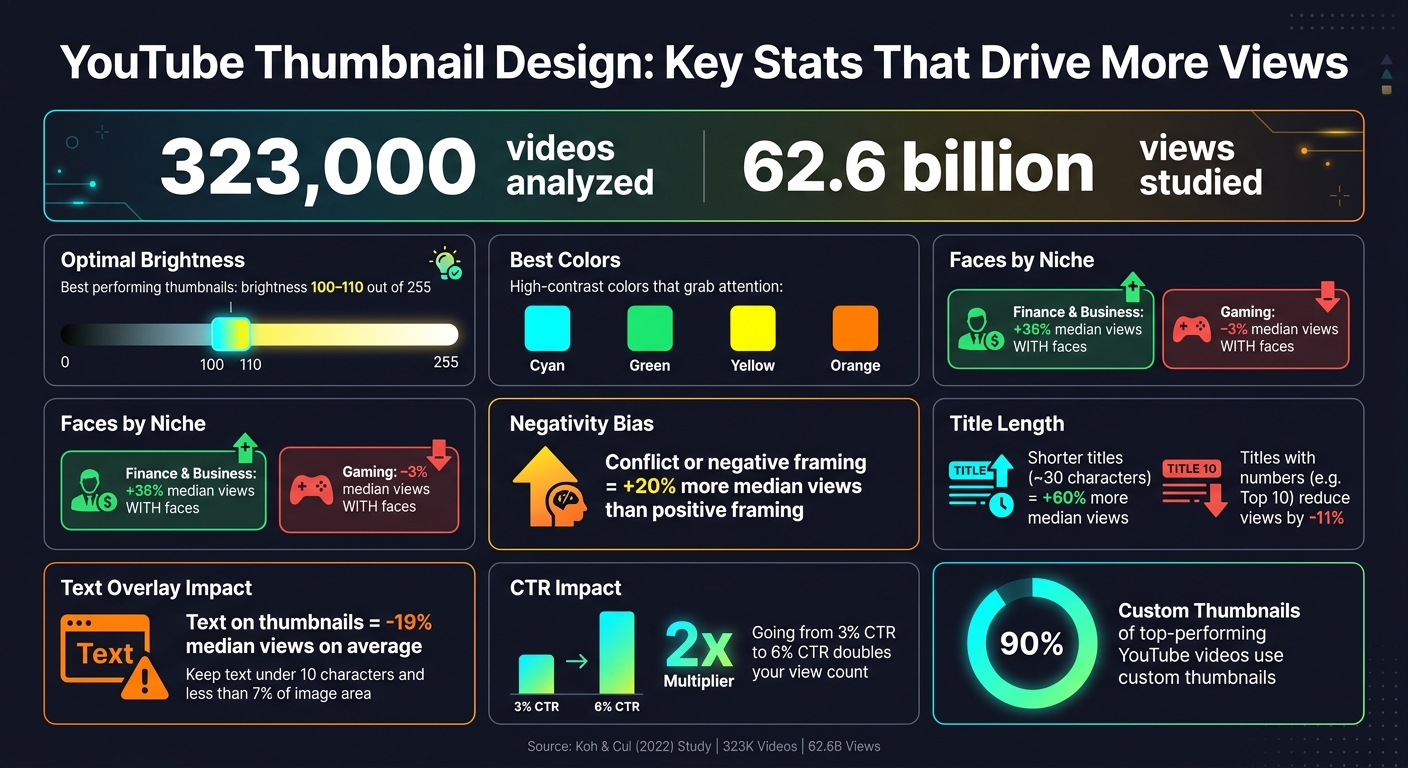
- Brightness: Thumbnails with brightness levels between 100-110 (on a 255-point scale) perform best.
- Colors: High-contrast colors like cyan, green, yellow, and orange grab attention.
- Faces: Including faces boosts views in niches like Finance (+36%) but can hurt Gaming (-3%).
- Text: Too much text reduces clicks by 19%. Keep it under 10 characters and less than 7% of the image area.
- Negativity Bias: Thumbnails with conflict or negative framing outperform positive ones by 20%.
- Titles: Shorter titles (around 30 characters) increase views by 60%.
Key takeaway: Simplicity, clarity, and emotional appeal drive better results. Use bright, contrasting visuals, limit text, and tailor your approach to your audience. Even small improvements in click-through rates can double your video views.
For creators, tools like ThumbnailCreator simplify applying these principles, helping you test and refine designs faster.
YouTube Thumbnail Design: Key Stats That Drive More Views
Study Methodology: How Viewer Preferences Were Measured
Research Design and Approach
To understand how thumbnail features influence viewer engagement, researchers combined controlled online experiments with automated image mining. In 2022, Byungwan Koh and Fuquan Cui applied the Elaboration Likelihood Model (ELM) to structure their analysis. This psychological framework divides decision-making into two routes: the central route, which focuses on logical, content-driven factors, and the peripheral route, which emphasizes emotional and aesthetic appeal. Using this model, they categorized thumbnail elements and evaluated their impact on viewer behavior.
Thumbnail Variables Tested
The study explored various visual and informational elements of thumbnails. Researchers examined brightness, colorfulness, and image quality, alongside factors like object and element complexity. They also studied the emotional weight of thumbnails, comparing positive and negative imagery to determine if a negativity bias influenced clicks. This highlights the ongoing debate regarding clickbait vs authentic thumbnails and their impact on long-term viewer trust.
Social proof signals, such as celebrity endorsements and displayed view counts, were another focus. As Koh and Cui noted:
"A thumbnail needs to be able to tell potential viewers what the video is about (i.e., be informative), and at the same time, a thumbnail needs to grab potential viewers' attention (i.e., be visually appealing)."
The study also considered thematic content, analyzing whether topics like mystery, fantasy, science, or military themes consistently attracted viewers, regardless of the thumbnail's technical quality.
In addition to these variables, researchers accounted for differences in participant demographics and data collection methods to ensure a comprehensive analysis.
Participant Demographics
Koh and Cui analyzed engagement data from 3,745 marketing videos produced by 38 global brands across industries like automotive, beverages, restaurants, and toys. This large-scale dataset provided insights into real-world viewer behavior.
Meanwhile, smaller-scale studies offered a more controlled perspective. For example, in March 2022, Junho Park at Florida State University conducted an experiment with 95 participants. Using a 2×2 within-subjects design, the study tested how emotional tone and view count levels influenced video selection. This approach allowed researchers to isolate the effects of each variable, complementing the broader findings from data mining.
sbb-itb-b59debf
Key Findings: What Makes a Thumbnail Work?
Visual Elements That Draw Attention
Brightness plays a huge role in thumbnail success. Research shows that thumbnails with a brightness level between 100 and 110 (on a 255-point scale) tend to perform best, while darker thumbnails tend to struggle. Color selection is also crucial - high-contrast colors like cyan, green, yellow, and orange pop against YouTube’s white and gray background, grabbing attention.
Including faces can significantly boost engagement, but it depends on the niche. For Finance and Business content, thumbnails featuring faces result in a +36% increase in median views, likely because they convey trust. On the flip side, in Gaming, faces actually reduce performance by 3%, as viewers in this category are more drawn to action shots or gameplay imagery. Interestingly, thumbnails with multiple faces tend to perform better than those with just one, providing a sense of social validation.
How Text and Layout Affect Viewer Perception
Adding text to thumbnails can be a double-edged sword. On average, text reduces views by 19%. If text is necessary, the key is to keep it short and minimal. Research suggests sticking to under 10 characters and ensuring text occupies less than 7% of the total image area. Thumbnails cluttered with more than 5 words often become unreadable, especially on mobile devices.
"The best thumbnails aren't the prettiest. They're the most noticeable and readable in a split second." - Viacheslav Vasipenok, Author, YouTube Blog
These findings emphasize the power of simplicity and clarity in thumbnail design.
Patterns and Trends in the Data
Thumbnails framed with negativity or conflict outperform positive ones by 20% in median views. For example, a "why this fails" narrative tends to attract more clicks than a "how this works" angle. Additionally, shorter video titles - around 30 characters - deliver 60% more median views, while titles featuring numbers (like "Top 10") surprisingly reduce performance by 11%.
"The algorithm doesn't reward usefulness - it rewards the feeling that you have to click." - Viacheslav Vasipenok, Author, Quasa.io
These patterns highlight the importance of designing thumbnails that are instantly clear, emotionally engaging, and impossible to ignore.
Design Takeaways: Putting the Research Into Practice
Research-Backed Thumbnail Design Tips
Thumbnails are your first impression, and they need to grab attention instantly - often in less than a second. Every choice you make, from colors to text placement, should prioritize clarity over artistic flair. Here's how to simplify the process using research-backed strategies.
Start by choosing between bright vs dark thumbnails. Aim for a luminance value between 100 and 110 on a 255-point scale. Pair your subject with a high-contrast background to ensure the silhouette remains sharp, even when thumbnails are reduced to around 120 pixels wide on mobile. Bright colors like cyan, green, yellow, and orange stand out well against YouTube's white and gray interface, making them ideal choices.
When it comes to faces, adjust your approach based on your niche. For Finance and Business content, use close-up shots that focus on expressions and eyes. These should occupy 8% to 10% of the total frame to remain clear on smaller screens. Gaming creators, on the other hand, often see better results by emphasizing the action rather than the streamer’s reaction.
"The thumbnail wins or loses the visual scan, the title closes the click decision." - Creaticalc
Minimize text overlays whenever possible. If you must include text, keep it short - under 10 characters and less than 7% of the image area. Often, a single strong hook will outperform a full sentence, especially when it sparks curiosity.
Here’s a quick breakdown of these design guidelines in table form:
| Design Element | Research Finding | What to Do |
|---|---|---|
| Brightness | Peak at 100–110/255 | Avoid dark or muddy visuals |
| Thumbnail Text | –19% median views | Use fewer than 10 characters, <7% of the frame |
| Face Size | 8–10% of frame | Use tight, shoulder-up crops for clarity |
| Color Palette | High contrast wins | Use cyan, green, yellow, or orange for visibility |
| Negative Framing | +20% median views | Lead with conflict or failure hooks |
How ThumbnailCreator Can Help
Applying these principles manually can be tedious, but ThumbnailCreator is designed to make the process faster and easier. With its AI generation feature, you can create eye-catching visuals without starting from scratch. For example, if you’re unsure whether a Finance video will perform better with one face or two, the face swapping tool allows you to test variations quickly. Similarly, the object swapping feature helps remove unnecessary background elements, ensuring your main subject stays sharp and focused - even on mobile screens.
"A thumbnail that goes from 3 percent CTR to 6 percent doubles your view count from the same algorithmic surface." - Creaticalc
These tools not only save time but also make it easier to refine your designs for better engagement and consistent results.
How to design GREAT thumbnails (even if you’re not a designer)
Conclusion: Using Thumbnails to Grow Viewer Engagement
Thumbnails play a huge role in shaping viewer decisions. With 90% of top-performing videos featuring custom thumbnails and even minor increases in click-through rates (CTR) potentially doubling views from the same algorithmic exposure, crafting effective thumbnails is more than just a detail - it’s a necessity.
What sets great thumbnails apart isn’t just their aesthetic quality - it’s their purpose. For example, thumbnails with conflict-focused framing see a +20% boost in median views, while those overloaded with text can lead to an average -19% drop in performance. These trends highlight actionable strategies for creators aiming to make an impact.
"A professionally designed thumbnail that doesn't create curiosity will lose to an amateur thumbnail that does." - Rahaman Bin Ujit
The key takeaway? Think of your thumbnail as a marketing tool, not just a decorative image. Data consistently shows that thumbnails designed with clarity, emotional impact, and mobile-friendly readability in mind yield better results. Prioritizing contrast and creating designs that are instantly recognizable can make all the difference.
For creators looking to streamline the process, tools like ThumbnailCreator can help. With features like AI generation, face swapping, and object swapping, it simplifies the process of applying proven design principles - no design experience required. Whether you’re testing new ideas or revamping older content, it bridges the gap between knowing what works and putting it into action.
FAQs
How do I measure my thumbnail brightness?
To gauge how bright your thumbnail should be, you can use AI tools like ThumbnailCreator. These tools assess visual saliency and attention zones, helping you adjust brightness and contrast to better catch a viewer's eye. Another option is YouTube Studio’s Test & Compare feature, which allows you to A/B test thumbnails with varying brightness levels. By comparing metrics like click-through rates and watch time, you can identify the most effective brightness settings to draw in more viewers.
Should I use a face in my niche?
Including a face in your thumbnail can significantly increase its click-through rate. Faces showing expressive emotions - like surprise or happiness - tend to catch viewers' eyes and draw them in. These emotions naturally grab attention, making your content more appealing and encouraging more people to engage with it.
What thumbnail changes boost CTR fastest?
The fastest way to boost your CTR is by running A/B tests on key thumbnail elements, such as facial expressions, colors, and text. Make bold adjustments - like comparing a thumbnail with a face to one without or testing bright color schemes against darker ones - to determine what grabs viewers' attention. Platforms like YouTube's Test & Compare feature are great for pinpointing which variations work best.