
How Demographics Impact Thumbnail CTR
Your YouTube thumbnail has just two seconds to grab attention. But not all viewers respond the same way. Demographics - like age, gender, and device type - play a huge role in shaping click-through rates (CTR). Here’s what the research shows:
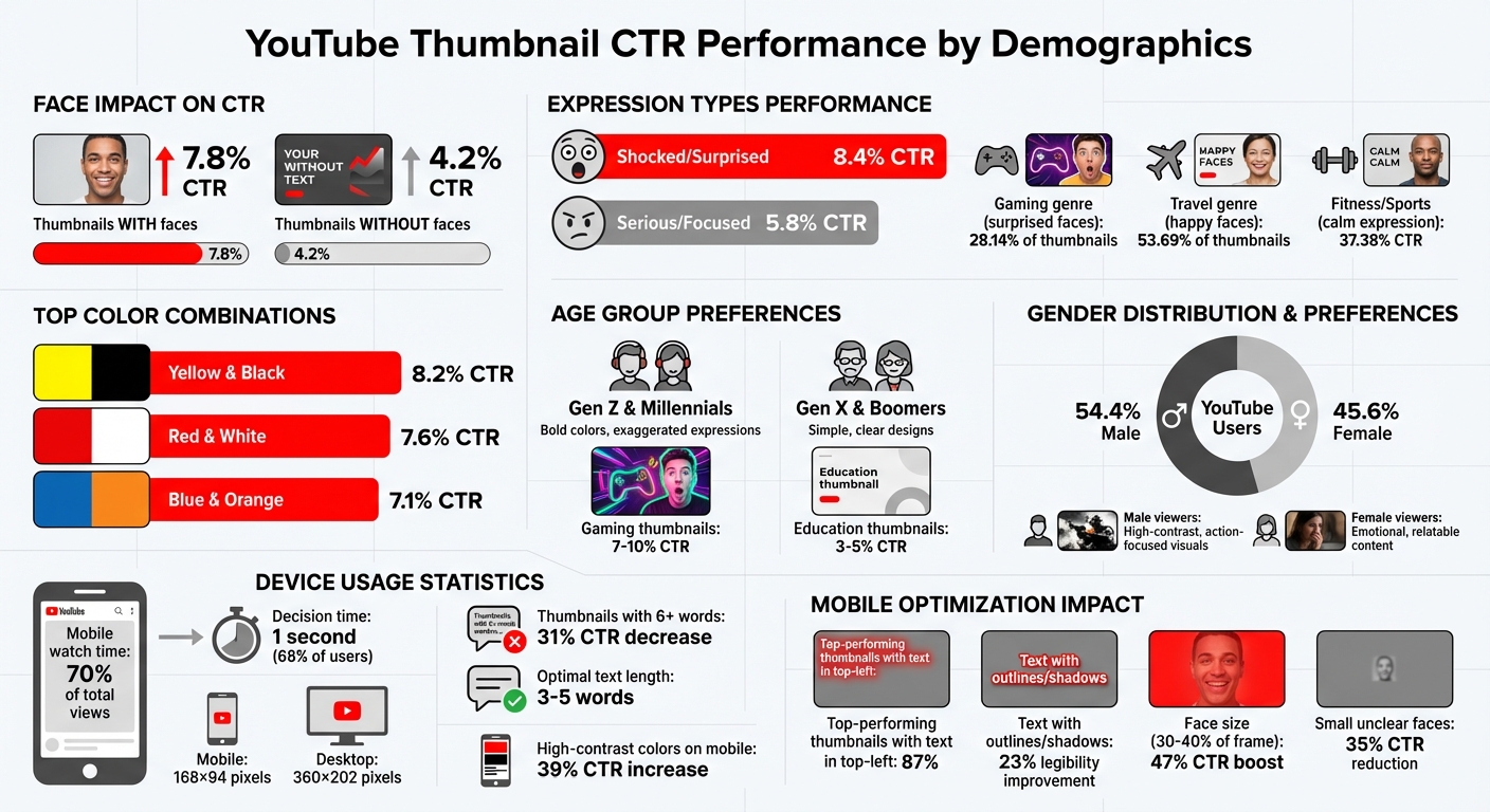
- Thumbnails with faces perform better: They average a 7.8% CTR, compared to 4.2% for those without. But the type of expression matters - “surprised” works for gamers, while “calm” resonates with fitness audiences.
- Age influences preferences: Gen Z and Millennials prefer bold colors and exaggerated expressions, while Gen X and Boomers favor simple, clear designs.
- Gender impacts visuals: Men engage with high-contrast, action-focused thumbnails, while women are drawn to emotional and relatable designs.
- Mobile optimization is critical: With 70% of views happening on mobile, thumbnails must be legible and impactful even at small sizes (168×94 pixels).
- Regional differences exist: Preferences vary by location, like car imagery in the U.S. versus trains in India.
To improve your CTR, use YouTube Analytics to track audience trends and test thumbnail elements like colors, text placement, and expressions. Using a structured thumbnail A/B testing guide can help you identify which specific variations drive the most clicks. Small tweaks, like reducing text or adjusting face placement, can significantly boost engagement. Tools like ThumbnailCreator can help refine designs for specific demographics and devices.
YouTube Thumbnail CTR by Demographics: Age, Gender, and Device Statistics
How To A/B Test YouTube Thumbnails (Pro Tips for Beginners)
How Age Affects Thumbnail Click-Through Rates
Age plays a big role in how viewers react to thumbnail designs. Research from the NoteLM Team, which reviewed 1,247 videos across 20 channels, found that thumbnails with "shocked/surprised" expressions had an average click-through rate (CTR) of 8.4%, while "serious/focused" expressions only managed 5.8%. This indicates that younger audiences are drawn to dynamic and energetic visuals, while older viewers lean toward designs that highlight clarity and professionalism.
For example, younger viewers, who tend to scroll quickly, are more likely to engage with gaming thumbnails, which boast CTRs between 7–10%. On the other hand, education-focused thumbnails typically see lower CTRs, around 3–5%. Younger audiences often click impulsively based on a thumbnail's visual appeal, whereas older viewers take a more deliberate approach, evaluating both the thumbnail and the title.
Gen Z and Millennials: Bold Colors and Expressive Designs
Younger audiences, especially Gen Z and Millennials, are highly responsive to eye-catching visuals that stand out in a sea of content. Bright, bold colors and expressive designs work wonders here. For instance, the combination of Yellow and Black achieves an average CTR of 8.2%, with Red and White close behind at 7.6%. Exaggerated facial expressions, particularly "surprised" looks, are especially effective in the Gaming genre, where they appear in 28.14% of thumbnails.
As Creator Ali Abdaal shared, "I reduced my thumbnail text from 12 words to 3. My CTR jumped from 3.2% to 7.8% overnight".
These bold tactics are especially impactful on mobile devices, where attention spans are short, and visuals need to grab attention instantly.
Gen X and Boomers: Simple and Clear Designs
For older audiences like Gen X and Boomers, simplicity and clarity are key. Thumbnails that focus on communicating value without overwhelming the viewer tend to perform better. For example, Blue and Orange combinations average a 7.1% CTR and are particularly effective in tech and business content. In Fitness & Sports, thumbnails featuring a "calm" expression - often signaling authenticity - achieve an impressive 37.38% CTR.
YouTube Strategist Paddy Galloway explains it best: "Your thumbnail is a promise. Your video is the fulfillment. If they don't match, viewers leave and the algorithm punishes you".
For these audiences, a clean design with a visual hierarchy and layout helps ensure the thumbnail delivers on its promise.
How Gender Influences Thumbnail Engagement
Gender significantly shapes how viewers interact with YouTube thumbnails, influencing emotional and visual preferences. With YouTube's global user base being approximately 54.4% male and 45.6% female, understanding these differences can help creators craft thumbnails that resonate with specific audiences. Studies reveal that women are generally drawn to colorful, visually appealing images and are less likely to engage with thumbnails featuring "disgusting" or "gross" visuals. On the other hand, men often prefer technical, action-oriented, or "gritty" imagery, which may not appeal as much to female viewers.
Take the science series Deep Look, for example. With its focus on macro photography of insects and parasites, the show attracts an audience that is 70% male and 30% female. Certain episodes even see male viewership exceeding 90%, underscoring how thumbnail design directly impacts audience demographics and CTR benchmarks. These insights pave the way for tailored strategies to better connect with male and female viewers.
Male Viewers: High-Contrast and Action-Focused Visuals
For male-heavy niches like gaming and tech, high-contrast, dynamic thumbnails are key. Research shows that gaming thumbnails often feature surprised faces, appearing in 28.14% of cases, to convey intense emotions and action-packed content. This approach mirrors trends seen in younger demographics, where bold visuals trigger curiosity and urgency.
Color combinations like Red/Black and Blue/Orange stand out in crowded feeds, making them popular choices in gaming and tech. Pairing these palettes with action shots, exaggerated reaction faces, and bold text creates the kind of visual impact that male audiences find hard to ignore.
Female Viewers: Emotional and Relatable Content
Thumbnails aimed at female viewers tend to focus on emotional connections and relatability. For example, travel content, which often attracts a broader and more female-skewed audience, features "happy" faces in 53.69% of thumbnails. These positive expressions build trust and promise an enjoyable emotional experience.
"Positive emotions are the most surefire way of gaining views - but it depends whose views you're trying to win." - Kapwing Study
Creators like SSSniperWolf demonstrate the power of emotional relatability. Her thumbnails, often featuring a "surprised" expression, appeal to her primarily female audience by emphasizing connection over intensity. For lifestyle and beauty niches, palettes such as Pink and Gold convey elegance and aesthetic appeal, while close-up faces with direct eye contact activate mirror neurons, fostering a sense of personal connection. Interestingly, behind-the-scenes imagery often outperforms overly polished designs, as it communicates a sense of authenticity and genuine value. By leveraging YouTube Analytics, creators can refine their thumbnail strategies to better align with these preferences.
Device Type and Thumbnail Performance Across Demographics
With over 70% of YouTube watch time happening on mobile devices, designing with mobile users in mind is no longer optional - it's essential. Here's the kicker: 68% of mobile viewers make their click decision in just 1 second, while desktop users generally take a bit longer to evaluate thumbnails. This difference in behavior calls for tailored design strategies.
Why Mobile Optimization Matters
Mobile-optimized thumbnails can double click-through rates compared to designs that aren’t built for smaller screens. Yet, many creators struggle with this. A whopping 52% of creators cite "illegible text on mobile" as their biggest issue, and 62% of complaints point to important details being obscured by mobile UI elements like the timestamp overlay.
"Most creators are designing for a billboard when they should be designing for a postage stamp."
– Alex Rivera, Author
Take MrBeast, for example. In February 2026, he boosted his click-through rate by 34% - jumping from 8.2% to 11.0% - by using AI-generated, mobile-friendly thumbnail variations. This tweak brought in an additional 15 million views in just 30 days. The secret? Adjusting every element - text size, face placement, and color contrast - specifically for mobile screens.
Mobile Users: Designing for Tiny Real Estate
Mobile thumbnails often appear as small as 168×94 pixels in search results, so every pixel counts. In 2025, 87% of top-performing thumbnails featured text in the top-left corner, avoiding the "Timestamp Trap" caused by YouTube’s timestamp overlay in the bottom-right.
Here are some tips for mobile thumbnail success:
- Text: Keep it short and bold. Thumbnails with more than six words can slash CTR by 31%. Stick to 3–5 words with a font size of 100–200px (at 1280×720 resolution) for clarity. Adding outlines or shadows can improve legibility by 23%, especially in varied lighting conditions.
- Face Placement: Faces should take up 30–40% of the frame, with exaggerated expressions to grab attention. Small, unclear faces can reduce CTR by 35%, while bold, clear expressions can boost it by up to 47%.
- Colors: High-contrast color combos - think neon yellow, red, or green - shine on mobile OLED screens, increasing CTR by 39%.
To ensure your design works on mobile, try the "squint test." If details blur when you squint at a desktop screen, they’ll likely disappear on mobile. Another trick? Zoom out to 10% during editing to simulate the mobile viewing experience.
Desktop Users: Embracing Detail Without Overcomplicating
While mobile demands simplicity, desktop thumbnails allow for more intricate designs. At roughly 360×202 pixels, desktop thumbnails can showcase finer details. Desktop users, with their larger screens and mouse navigation, tend to take a bit more time to process thumbnails. But don’t get too comfortable - designing solely for desktop risks alienating the majority of viewers who watch on mobile.
A smart strategy is to adopt a mobile-first approach while ensuring thumbnails still look sharp on larger screens. Following a YouTube thumbnail size guide to maintain a resolution of 1280×720 pixels ensures the 16:9 ratio and keeps file sizes under 2MB, ensuring fast mobile load times while delivering crisp visuals on desktop.
For content aimed at desktop-heavy audiences - like professional tutorials or detailed product reviews - creators can include extra text or intricate visuals. However, the core elements (main text, primary face, and key visual hook) should still follow mobile-first principles to appeal to a broader audience.
To make this process easier, AI tools like ThumbnailCreator can automatically adjust key elements for optimal performance across both mobile and desktop platforms.
Fine-tuning thumbnails for different devices builds on strategies shaped by demographic insights like age and gender. Up next, we'll dive deeper into how these factors influence thumbnail design.
sbb-itb-b59debf
Regional and Cultural Factors in Thumbnail Preferences
When designing thumbnails, understanding regional and cultural nuances can make a big difference in connecting with your audience. Visual preferences vary widely across different cultures, and tailoring your designs to these expectations can significantly boost engagement.
Regional Differences in the United States
In the United States and Canada, thumbnails for transportation-related content tend to perform better with car imagery. Meanwhile, audiences in India show a stronger preference for visuals featuring trains. Similarly, food thumbnails reveal distinct preferences: US viewers are drawn to high-calorie treats like doughnuts, cakes, and hot dogs, while audiences in other regions gravitate toward images of vegetables and fruits.
These regional trends highlight how culturally specific visuals can make thumbnails feel more relatable and engaging.
How Culture Shapes Visual Preferences
In the US, bold and high-contrast designs tend to stand out in crowded feeds. Thumbnails featuring strong color combinations - like black backgrounds with lime green text or red accents - work well across both light and dark mode interfaces. This is especially important in a fast-paced environment where viewers decide whether to click on a thumbnail in just 1.3 seconds.
"The colours that perform best in YouTube thumbnails are not the most aesthetically refined colours. They are the most visually aggressive: saturated primaries, high contrast pairings, and neon accents." - TubeVertex
Facial expressions also play a key role in cultural preferences. For US viewers, thumbnails featuring faces with emotions like surprise, concern, or disbelief tend to perform better than those with neutral or smiling expressions. A great example of this is a personal finance creator, Aisha, who revamped her thumbnail strategy between October 2025 and January 2026. By switching from pastel tones and neutral expressions to high-contrast designs with "shocked or concerned" faces, she boosted her channel-wide click-through rate (CTR) from 2.1% to 8.6%. This shift led to a 312% increase in average video views and doubled her monthly subscriber growth.
Color palettes also convey specific messages based on cultural expectations. For instance:
- Black and lime green are popular for finance and AI channels, signaling modernity.
- Deep navy and electric blue suggest trustworthiness for tech and professional content.
- Red and white create a sense of urgency, making them effective for news or commentary.
Using Data to Improve Thumbnails for Different Demographics
Tracking Demographics in YouTube Analytics
YouTube Studio offers valuable insights into how different demographics interact with your thumbnails. To get started, head to the Reach tab in your Analytics dashboard. Here, you can review metrics like Click-Through Rate (CTR) and Impressions. As a general guideline, a CTR of 4–5% is average, 6–10% is strong, and anything above 10% suggests viral potential.
Keep an eye on how your CTR shifts as your video reaches beyond your core audience. For example, if your CTR drops from 9% to 3.5% as impressions increase, it may indicate your content resonates differently with new demographic groups. Always break down CTR by traffic source for a clearer picture. Search traffic typically has a higher CTR due to specific viewer intent, while Homepage placements often face more competition.
YouTube Studio's Test & Compare feature is a powerful tool for thumbnail optimization. It allows you to test up to three thumbnail variations simultaneously using thumbnail testing at scale. To get accurate results, run these tests for at least two weeks, or up to a month if your videos average fewer than 10,000 impressions per week. Be sure to tweak only one element at a time - like adding a face, changing colors, or adjusting text - to pinpoint what works best for specific demographics.
Don’t forget to cross-reference your thumbnail performance with Average View Duration (AVD) in the Engagement tab. A high CTR paired with a low AVD might mean your thumbnail is attracting viewers who aren’t staying engaged or that it’s over-promising on the video’s content. As Rene Ritchie, Head of Editorial at YouTube, puts it:
"The thumbnail that makes the best promise that the video then delivers on is the one that we measure as the winner for you."
Once you’ve analyzed these metrics, you can move on to using AI-driven tools to fine-tune your thumbnail designs.
Tools for Creating Demographic-Targeted Thumbnails
After identifying which design elements resonate with your audience, tools like ThumbnailCreator can help you quickly create and test thumbnails tailored to specific demographics. This AI-powered platform offers features like customizable templates, face-swapping for relatability, and text editing optimized for both mobile and desktop viewers.
Using insights from your analytics, you can streamline the process of designing thumbnails that connect with your audience. For example, if your data shows that Gen Z viewers prefer bold colors and expressive faces, you can use face-swapping to try different expressions while sticking to high-contrast color schemes. Since most YouTube views come from mobile devices, ThumbnailCreator’s text editing tools ensure your text remains clear and readable on smaller screens - a key factor for younger viewers .
When creating thumbnails for specific demographics, use the "Shrink Test" by viewing your designs at just one inch wide. This ensures they remain clear and legible on mobile devices. Limit text to four words, and choose bold sans-serif fonts with drop shadows or outlines for maximum readability across all age groups . With its extensive template library, ThumbnailCreator simplifies applying these best practices, allowing you to focus on aligning your visuals with the data-driven insights from YouTube Analytics.
Conclusion
The research and data shared here highlight how you can fine-tune your thumbnail strategy to connect with your audience more effectively. By recognizing how demographics influence thumbnail preferences, you can move beyond creative guesswork vs. data-informed approaches. Tailoring your designs - like using bold colors for Gen Z or clean, straightforward visuals for Boomers - leverages psychological cues that naturally encourage clicks.
For instance, a "surprised" expression might strike a chord with gaming audiences, as seen in 28.14% of top thumbnails, while "happy" faces resonate more with travel enthusiasts, appearing in 53.69% of their leading thumbnails. These insights underline the importance of aligning your visuals with audience expectations.
Additionally, with over 70% of YouTube watch time happening on mobile devices, designing for small screens is essential. Your thumbnail needs to clearly communicate its message even at a reduced size of 168×94 pixels.
Tools like ThumbnailCreator make this process easier by offering demographic-specific templates, features like face-swapping to test various expressions, and mobile-friendly text editing. This allows you to create and test multiple thumbnail variations based on your analytics, helping you discover what resonates most with your audience.
FAQs
How do I find CTR by age and gender in YouTube Analytics?
To check CTR by age and gender in YouTube Analytics, head to the Reach tab. This section offers demographic details, including a breakdown of your audience by age and gender. These insights help you understand how various groups respond to your thumbnails and content.
What’s the fastest way to make thumbnails readable on mobile?
To ensure thumbnails are easy to read on mobile devices, focus on high contrast and bold text (keeping it under 12 characters). Include clear, expressive faces to grab attention, and make sure all key elements are within the "safe zone" to avoid cropping. Always test your thumbnails on a mobile screen to confirm they look good. Using bright, contrasting colors like yellow with black or red with white can make them stand out even more and boost clickability.
How can I test thumbnails without hurting watch time?
YouTube's Test & Compare feature is a great tool for A/B testing thumbnails without risking your watch time. To get the most accurate results, run your tests over a period of 7–14 days. Make sure the differences between your thumbnail variants are clear - experiment with elements like colors, facial expressions, or text.
When analyzing the results, don't just focus on click-through rate (CTR). Pay close attention to metrics like watch time and engagement. This ensures your thumbnails not only attract clicks but also support the overall performance of your videos.