
10 Lifestyle Channels with Great Thumbnails
Thumbnails are the key to grabbing attention on YouTube. Around 80% of YouTube clicks come from thumbnails and titles, and viewers decide in just 1–2 seconds. For lifestyle creators, effective thumbnails are a must - they convey trust, spark curiosity, and encourage clicks.
Here’s what works:
- High-Contrast Colors: Bright, bold combinations like yellow/black or red/white increase click-through rates (CTR) by up to 50%.
- Readable Text: Keep it short (3–5 words) and bold for mobile viewers.
- Expressive Faces: Thumbnails with clear emotions boost CTR by 47%.
- Consistent Branding: Stick to the same colors, fonts, and layouts to make your channel recognizable.
These 10 YouTube lifestyle channels excel at thumbnail design:
- Yoga With Adriene: Soft colors and calm visuals reflect her yoga style.
- Blogilates: Bright colors and energetic poses match her fitness vibe.
- Michelle Phan: Polished, clean designs highlight her beauty expertise.
- Jackie Aina: Bold colors and confident expressions grab attention.
- NikkieTutorials: Playful makeup transformations with vibrant backgrounds.
- Huda Beauty: Luxurious close-ups with rich lighting and textures.
- Christen Dominique: Layered designs with subtle 3D effects.
- Pink Shirt Girl: Simple, relatable thumbnails with expressive faces.
- SMOL: Minimal designs with everyday, genuine moments.
- TED (Lifestyle Talks Focus): Speaker close-ups with bold, iconic branding.
Pro Tip: Use tools like ThumbnailCreator to save time and test designs for better results. With over 70% of YouTube views on mobile, ensure your thumbnails stand out even at small sizes.
HOW TO MAKE AN AESTHETIC THUMBNAIL FOR VLOGS USING PHONTO & CANVA !
sbb-itb-b59debf
What Makes a Good Lifestyle Thumbnail

YouTube Thumbnail Design Statistics: CTR Impact of Colors, Text, and Faces
Creating a standout lifestyle thumbnail is all about grabbing attention with bold visuals, clear text, and relatable expressions. A great thumbnail strikes a balance between visual appeal and emotional connection. Did you know the human brain processes color in just 0.13 seconds? That means your color choices are the very first thing viewers notice. High-contrast combinations like yellow with black or red with white can make your thumbnail pop in a crowded feed. In fact, 92% of top-performing YouTube thumbnails use high-contrast color schemes, and smart color choices can boost click-through rates (CTR) by 20% to 50%.
High Contrast and Bright Colors
Strong contrast is key to making your thumbnail stand out against YouTube’s white or dark gray background. Thumbnails with high-contrast colors see a 39% increase in CTR. Plus, 88% of the most-watched videos feature bold, colorful designs. For example, yellow and black pairings average an 8.2% CTR, while red and white combinations reach 7.6%.
A good rule of thumb is the 60-30-10 color split: dedicate 60% of your thumbnail to a dominant color, 30% to a secondary color, and 10% to an accent. Avoid dull tones like desaturated browns and grays, which can reduce CTR by 28%. To test your design’s contrast, view it in grayscale - if elements blur together, the contrast isn’t strong enough. And don’t forget: with over 70% of YouTube views happening on mobile devices, your thumbnail must still look sharp when reduced to just 168×94 pixels.
While vibrant colors grab attention, clear text and consistent branding are what keep it.
Readable Text and Consistent Branding
Keep text short and bold - 3 to 5 words max - using high-contrast fonts sized between 100 and 200 pixels. This approach can push CTR to 6.9%, compared to 4.8% for thumbnails without text. Longer text, especially over six words, becomes unreadable on mobile screens and can lower CTR by 31%.
Consistency in branding is another crucial element. Sticking to the same color schemes, fonts, and layouts helps viewers instantly recognize your channel in their feed. Add bold outlines or drop shadows (8–15 pixels) to make text stand out against busy backgrounds. When positioning key elements, use the rule of thirds - align important details at the intersections of a 3×3 grid for better visual balance.
While colors and text set the stage, the right image seals the deal.
Emotional and Relatable Images
A thumbnail with a clear, expressive face can make all the difference. Faces should occupy 30% to 40% of the thumbnail and maintain direct eye contact with the camera, which can increase CTR by 47%. Shocked or surprised expressions perform the best, with an average CTR of 8.4%, followed by confused or questioning looks at 7.9%.
"People respond to human faces. It's biology. Emotionally resonant thumbnails... create a direct connection with viewers."
- Andrew Moore-Crispin, TubeBuddy
For lifestyle content, authenticity is everything. Real photos taken in your filming space outperform stock images, which typically see a 42% lower CTR. Amplify emotions so they stand out even at small sizes, and apply the 10% test: zoom out to 10% of your canvas - if the emotion isn’t obvious, it won’t be effective on mobile.
10 Lifestyle Channels with Strong Thumbnails
These channels have mastered the art of creating thumbnails that grab attention while staying true to their brand. By using smart design choices, they make their content stand out and instantly recognizable. Here's how they do it:
Yoga With Adriene
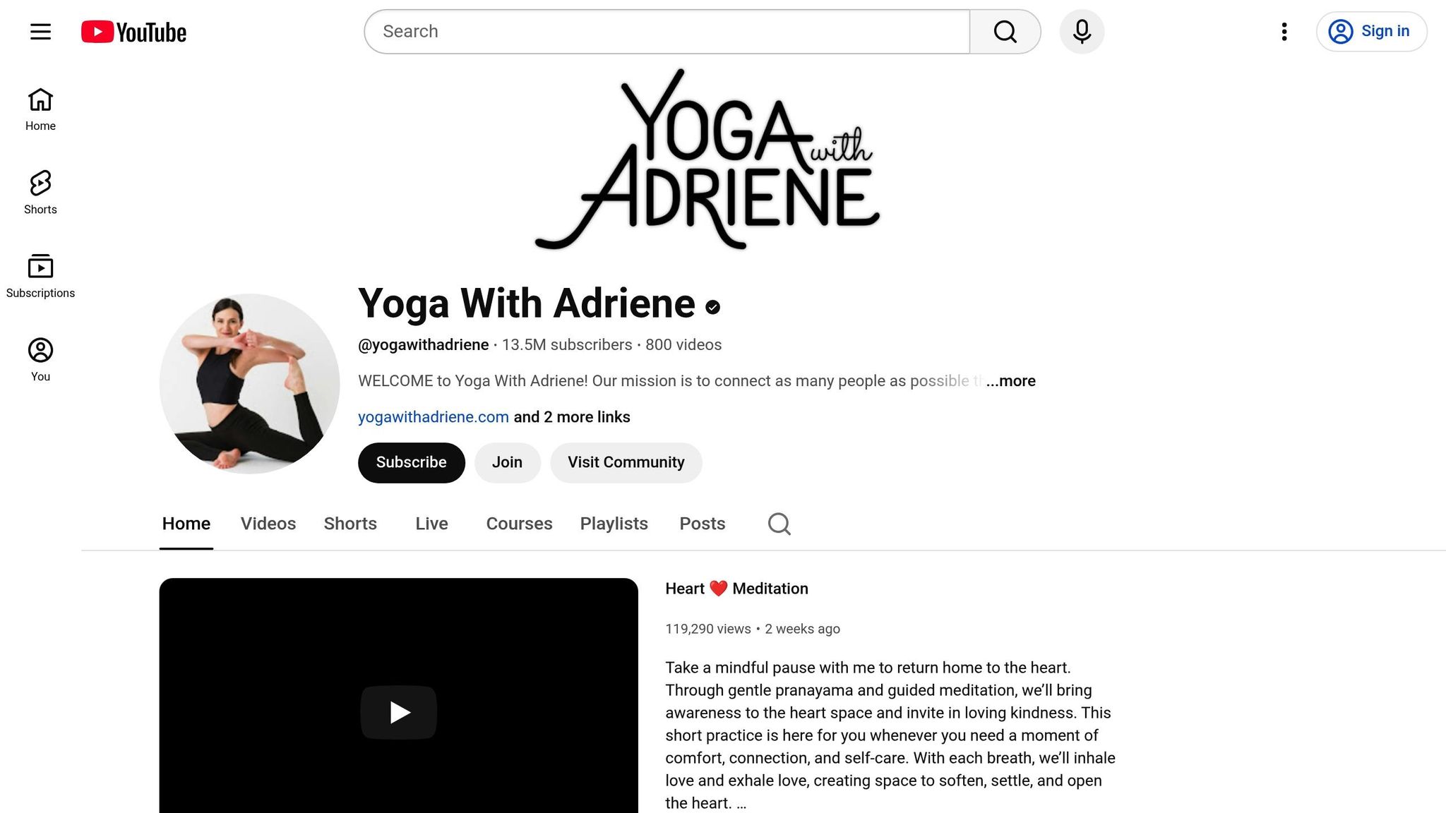
Adriene Mishler's thumbnails radiate calm and simplicity. She uses soft, soothing colors like muted blues and greens, paired with natural lighting. Her poses, often classic yoga postures, are set against clean, uncluttered backgrounds with minimal text. This approach reflects her brand's focus on accessible, no-pressure yoga, giving viewers a clear idea of the relaxing experience her videos offer.
Blogilates
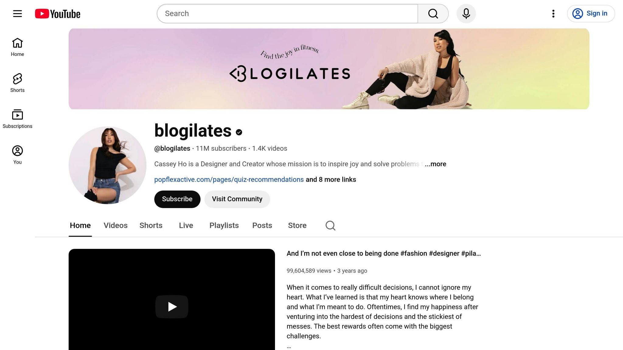
Cassey Ho's Blogilates channel bursts with energy. Her thumbnails are filled with bright, cheerful colors - think pinks, oranges, and yellows - and dynamic action shots of her mid-workout. The combination of her expressive face, bold typography, and high-energy poses creates an eye-catching and motivational vibe, perfectly aligned with her fitness-oriented content.
Michelle Phan
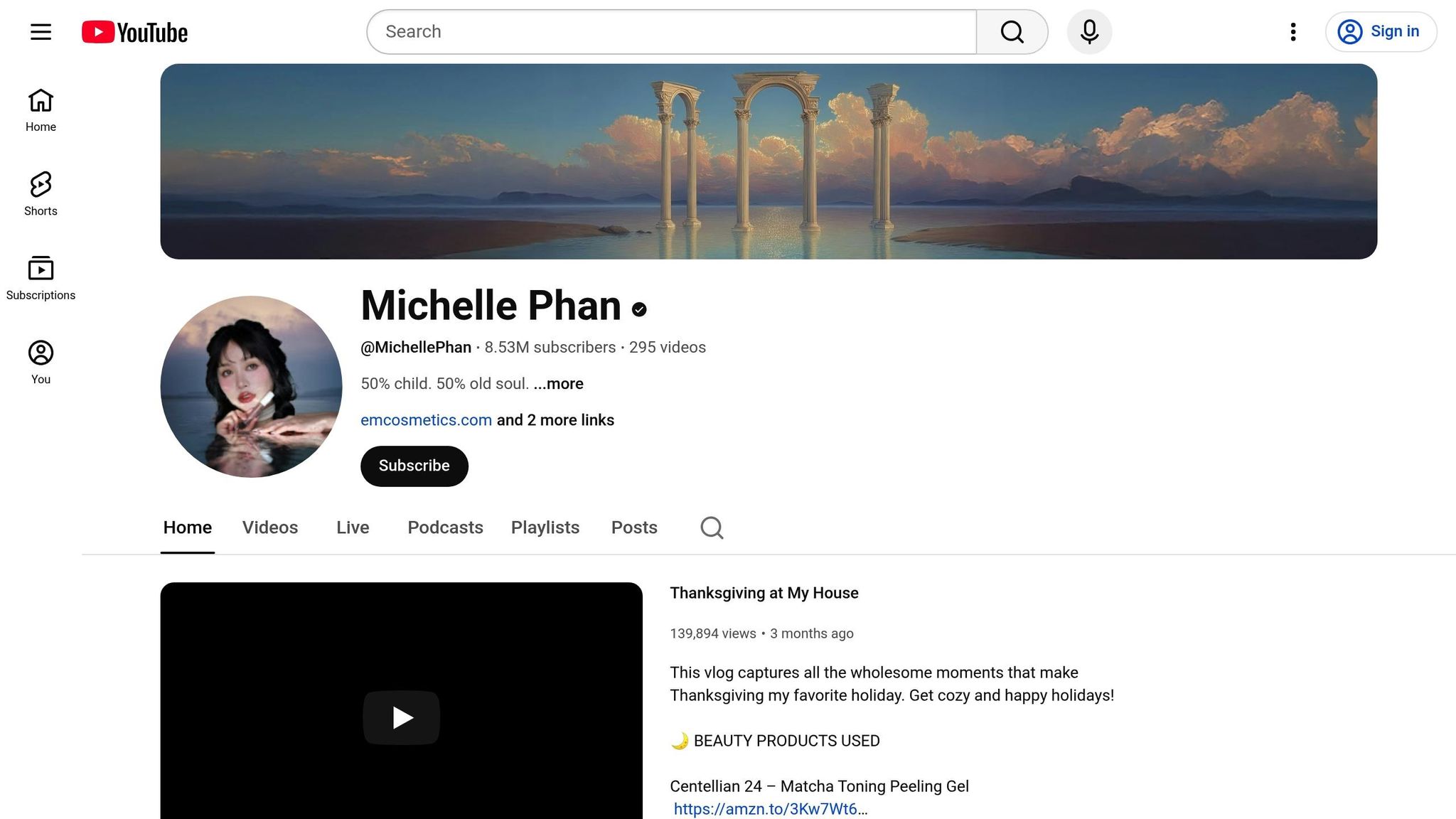
Michelle Phan's thumbnails exude elegance and sophistication. With soft focus, subtle gradients, and clean backgrounds, she creates a polished "tech minimalist" look. Whether featuring close-ups of beauty products or her own face, her thumbnails reinforce her expertise in beauty and style, making her content feel refined and professional.
Jackie Aina
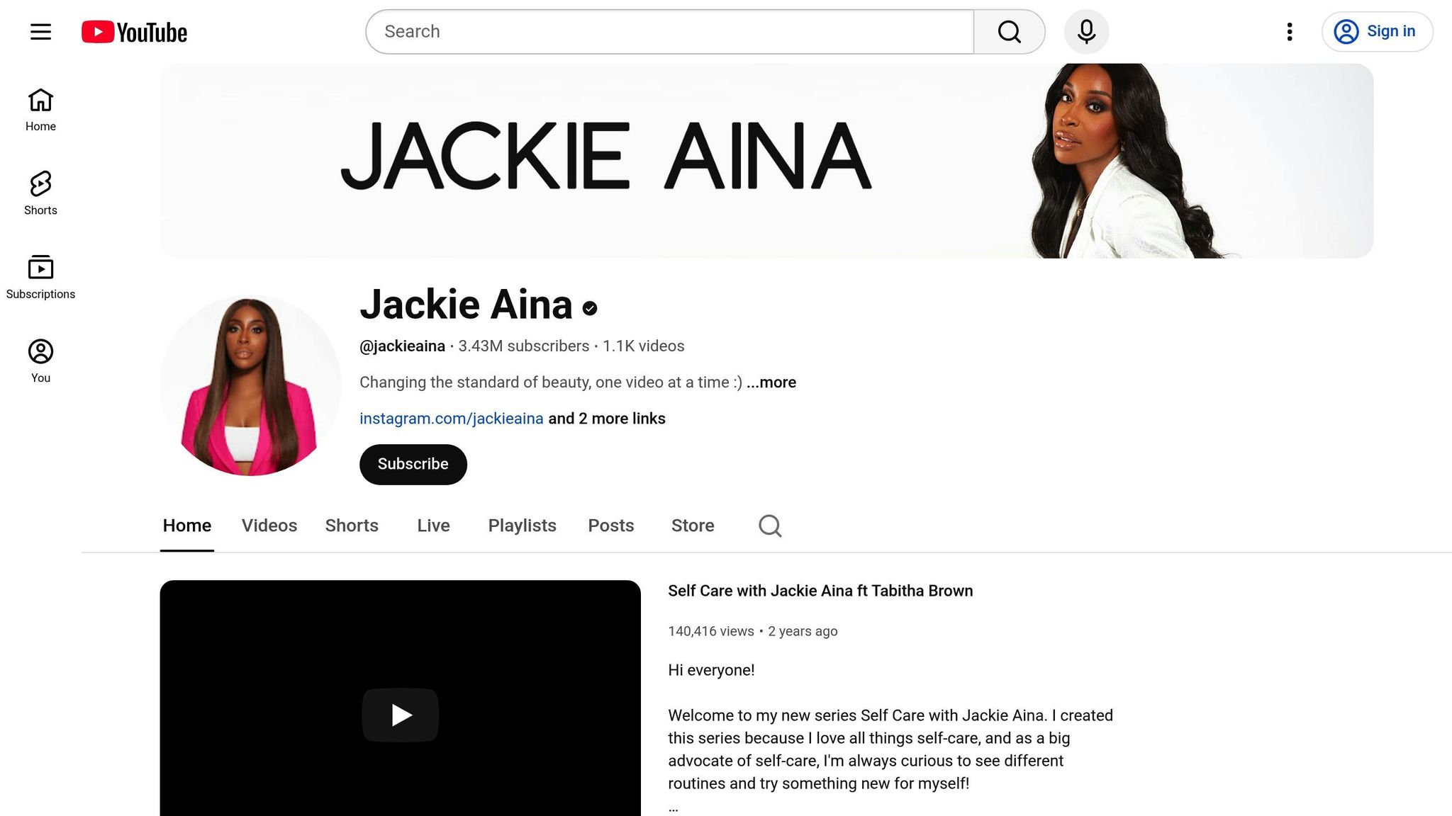
Jackie Aina's thumbnails are all about boldness and confidence. She uses vibrant colors like reds, purples, and golds to create strong contrasts that pop on YouTube's interface. Her expressive poses and empowering text reflect her personality and authority in beauty content. The combination of striking visuals and engaging text draws viewers in while celebrating her authentic voice.
NikkieTutorials
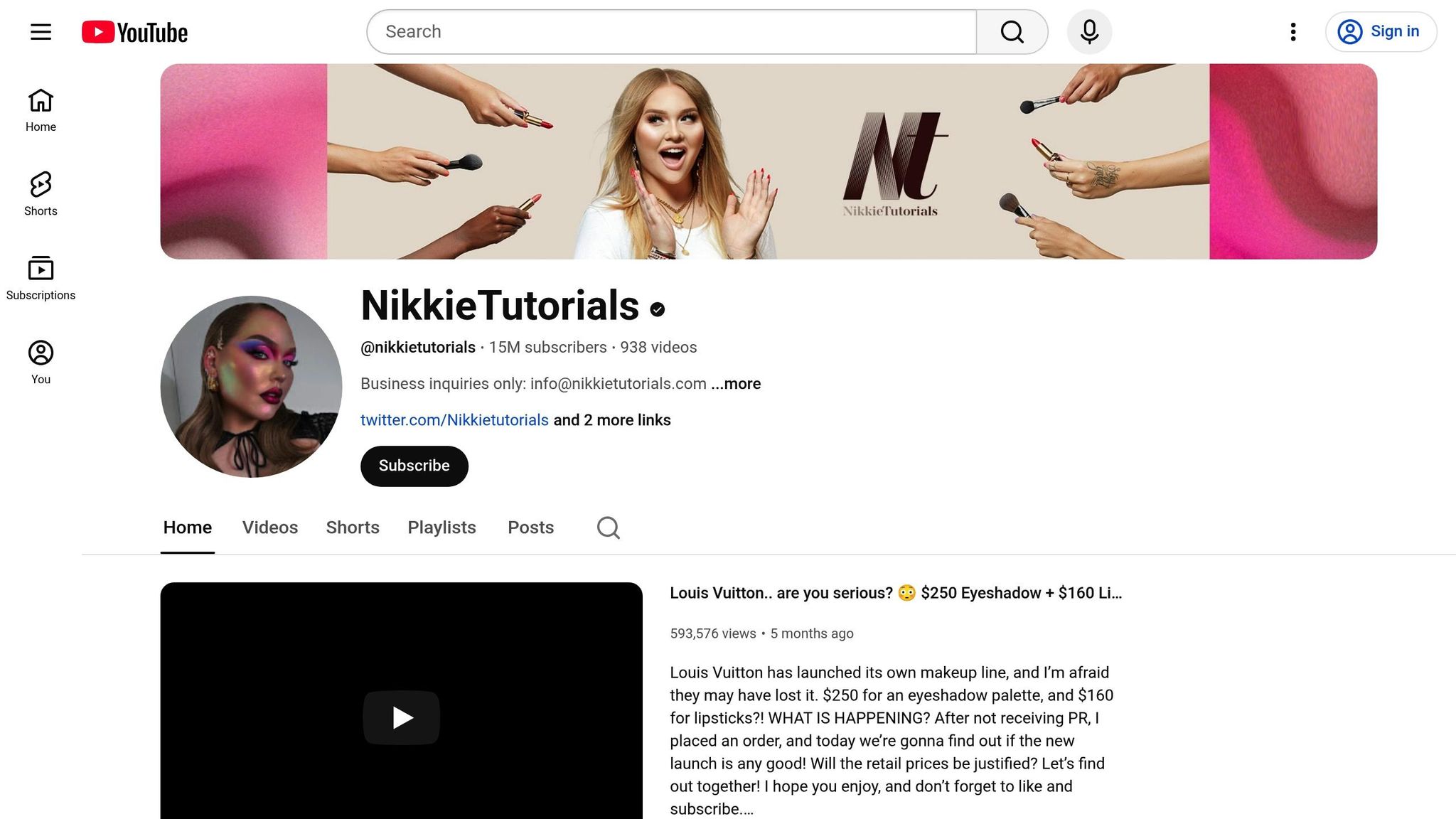
Nikkie de Jager's thumbnails are dynamic and playful. She often highlights dramatic makeup transformations, like before-and-after shots, paired with bright, colorful backgrounds. Her close-up expressions create an instant emotional connection, while the fun, dramatic visuals showcase her creativity and expertise in makeup.
Huda Beauty
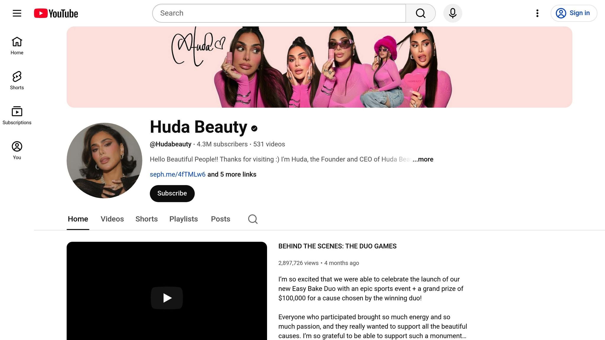
Huda Kattan's thumbnails scream luxury. Close-ups of products and textures, combined with glamorous lighting and a rich color palette of blacks, golds, and deep reds, signal premium quality. Her thumbnails not only reflect her status as a beauty industry leader but also highlight the high-end nature of her content.
Christen Dominique
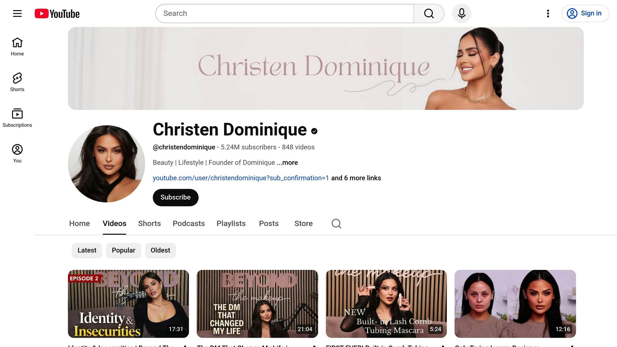
Christen Dominique's thumbnails focus on her face and use layered design elements to add depth. Text is often integrated subtly, wrapping around or sitting behind her, creating a gentle 3D effect. By previewing the look or routine featured in the video, she gives viewers a reason to click. Her attention to lighting, makeup, and composition highlights the thoughtful effort behind her content.
Pink Shirt Girl
This channel keeps things quirky and relatable. The thumbnails feature expressive faces and simple props, with minimal editing or elaborate layouts. This down-to-earth style resonates with viewers who appreciate authenticity and a more personal touch in lifestyle content.
SMOL
SMOL takes a minimalist approach with clean designs and everyday scenarios. The thumbnails feel like snapshots from real life, relying on subtle emotional cues like a thoughtful look or a gentle smile. This approach avoids clickbait and builds trust with viewers through its relatable, genuine visuals.
TED (Lifestyle Talks Focus)
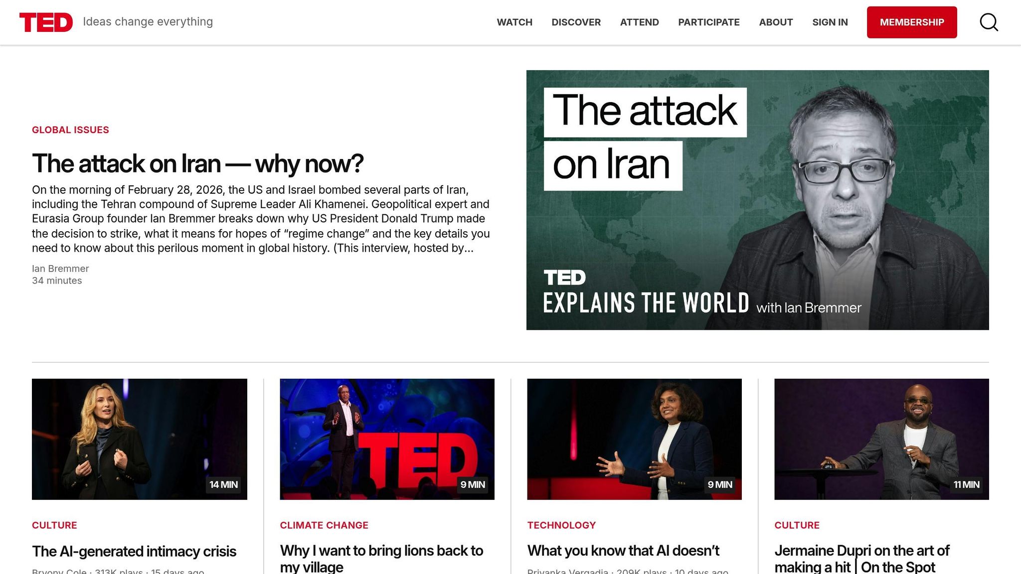
TED's lifestyle-focused thumbnails combine close-ups of speakers with symbolic imagery and bold typography. The consistent use of the iconic TED red circle reinforces its brand identity while sparking curiosity. These thumbnails promise thought-provoking content, aligning perfectly with TED's reputation for delivering inspiring and intellectually engaging material.
Thumbnail Strategies You Can Use
Drawing inspiration from successful lifestyle channels, these tips can help you fine-tune your thumbnail designs. Human faces with clear emotions are a game-changer - thumbnails featuring expressive faces boast an average CTR of 7.8%, compared to 4.2% for those without faces. That’s a 47% boost in clicks. Among the most effective expressions, shocked or surprised faces lead with an 8.4% average CTR, followed by confused/questioning at 7.9% and excited/happy at 7.2%. These are actionable insights you can start applying right away.
Show Faces and Emotions
Instead of relying on video stills, take dedicated photos after filming to ensure better quality. Go big with your expressions - neutral faces don’t grab attention. Match the emotion to your video’s theme: cheerful expressions work best for vlogs, tutorials, or travel, while calm or focused looks suit fitness content. Keep in mind that over 70% of watch time happens on mobile devices, so your expression needs to stand out even when the thumbnail is reduced to a tiny size.
While facial expressions are key, layout and color also play a vital role in catching the viewer’s eye.
Use Color and Layout to Guide Attention
High-contrast color combinations, like Yellow/Black (8.2% average CTR) or Red/White (7.6% average CTR), are especially effective. Aim for a balanced composition: your main subject should take up 40-50% of the frame, with text occupying 20-30%, and supporting graphics filling 10-20%. Stick to 3-5 words max for text, using bold fonts sized between 100-200px to ensure it’s readable on mobile screens. Adding a 2-4px glow or stroke around text and cutouts can make them pop.
Maintain Consistent Branding
Consistency helps viewers instantly recognize your content in their feed. Stick to 2-3 colors and 1-2 font families across your thumbnails. This approach can boost your CTR by up to 38%. Use the 60-30-10 rule: dedicate 60% of the thumbnail to content visuals, 30% to branding elements like colors and shapes, and 10% to your logo. Test your branding by shrinking 10 of your thumbnails to 168x94 pixels - if they’re not instantly recognizable as yours, it’s time to refine your branding.
"Thumbnails are absolutely critical... they're often the first thing viewers see, and a compelling thumbnail is the often difference between someone clicking on your video or scrolling past it." - Paul O'Malley, YouTube Creator
Design Better Thumbnails with ThumbnailCreator
Want to create thumbnails like the top lifestyle YouTubers? ThumbnailCreator makes it simple. This AI-powered tool helps YouTube creators design professional, eye-catching thumbnails in minutes - saving you up to 20 minutes per thumbnail. By incorporating strategies proven to work for leading channels, it enables you to craft visuals that attract clicks effortlessly.
Features for Lifestyle Creators
ThumbnailCreator uses AI to analyze your video metadata and psychological triggers, recommending layouts designed to grab attention in under a second. Its face-swapping feature ensures a consistent look across your channel, which is key for lifestyle creators whose audiences rely on visual recognition. Pre-built templates follow the 3-Element Rule: one main subject, a clean background, and no more than 3–4 words. This keeps thumbnails simple, visually appealing, and easy to read on mobile devices. Plus, text editing tools make it easy to create bold, readable fonts, while object-swapping options let you experiment with different visuals quickly.
Why Use ThumbnailCreator
Manually creating clean face cutouts can take up to 20 minutes, but ThumbnailCreator’s AI does it in seconds. Considering that 90% of YouTube’s top-performing videos use custom thumbnails instead of auto-generated frames, investing in thumbnail design is a must. The tool also generates 3–5 thumbnail variants for A/B testing, helping you find the most click-worthy design before your video’s momentum fades. Even better, its mobile-optimized designs ensure your thumbnails look sharp and legible at the smallest resolutions, like 168×94 pixels.
For creators aiming to level up their designs, the Pro Plan offers even more tools to streamline the process.
Pro Plan for More Design Options
The Pro Plan unlocks unlimited thumbnail generation, giving you the flexibility to test as many designs as you want. It provides full access to all templates, advanced AI features, and swapping tools - everything you need for cohesive branding and potentially improving your click-through rate by up to 38%. While hiring professional designers can be pricey, ThumbnailCreator’s subscription model offers a budget-friendly way to achieve polished, professional results without the hefty cost.
Conclusion
Your thumbnail serves as the digital storefront for your YouTube channel. It’s the first thing viewers notice, shaping their initial impression and influencing whether they click or scroll past your video content. With viewers deciding in just 1 to 2 seconds, your thumbnail needs to grab attention immediately. The lifestyle channels highlighted in this roundup demonstrate that effective thumbnails are no accident - they’re the result of a thoughtful strategy. Whether it’s Yoga With Adriene’s calming, consistent visuals or NikkieTutorials’ bold, expressive faces, each channel’s thumbnails reflect their brand and create an emotional connection with their audience.
The key takeaways? Show faces with authentic emotions, use high-contrast colors that stand out on mobile screens, and keep your text short - just 3 to 5 words. With over 70% of YouTube watch time happening on mobile devices, your design must remain clear and engaging even at smaller sizes. And don’t rely on auto-generated frames - 90% of top-performing videos use custom thumbnails instead.
"Thumbnails are absolutely critical. They're often the first thing viewers see, and a compelling thumbnail is often the difference between someone clicking on your video or scrolling past it."
– Paul O'Malley, YouTube Creator
If creating thumbnails feels intimidating, tools like ThumbnailCreator can simplify the process. Its AI-powered features handle tasks like face cutouts in seconds, saving you time compared to manual editing. Plus, its templates based on the 3-Element Rule ensure your designs stay clean and optimized for mobile. The Pro Plan even offers unlimited thumbnail generation and built-in A/B testing, so you can experiment with designs to see what resonates with your audience - all without the expense of hiring a designer.
Thumbnails are more than just visuals - they’re the gateway to your content. By applying strategies from successful lifestyle channels and leveraging tools to streamline your workflow, you can create thumbnails that boost your click-through rate and draw viewers into your videos.
FAQs
What thumbnail style fits my lifestyle niche?
The ideal thumbnail style for a lifestyle channel hinges on your content and audience preferences. Thumbnails featuring expressive faces that showcase strong emotions tend to grab attention. Bright colors and bold text can also make your thumbnails stand out, drawing in viewers quickly.
Keeping your visuals consistent with your channel’s tone is equally important. For example, vibrant imagery or before-and-after setups often work well in the lifestyle niche. These elements not only make your content recognizable but can also encourage more clicks and engagement.
Don’t be afraid to try different styles to see what connects with your audience. Experimentation is key to discovering what works best for your viewers.
How can I make thumbnails readable on mobile?
When designing thumbnails, always think about how they'll appear on small screens. Here’s how to make them stand out:
- Use bold, high-contrast colors to grab attention.
- Keep text short and readable - stick to 3-5 words in large, clear fonts.
- Focus on the "safe zone" to ensure key elements don’t get cropped.
A quick test on a mobile device before uploading can help you confirm that your thumbnail is clear, sharp, and effective, even at smaller sizes.
How can I A/B test thumbnails fast?
YouTube's "Test & Compare" feature, introduced in 2024, makes it easier than ever to A/B test thumbnails. This tool helps you compare different thumbnail designs and see which one performs best based on click-through rates (CTR).
To get started, create 3–5 thumbnail variations. Focus on tweaking key elements like faces, colors, or text to see what grabs attention. Run the test for about a week, then review the data to find the design that drives the most clicks. It's a simple way to boost your video's performance!