
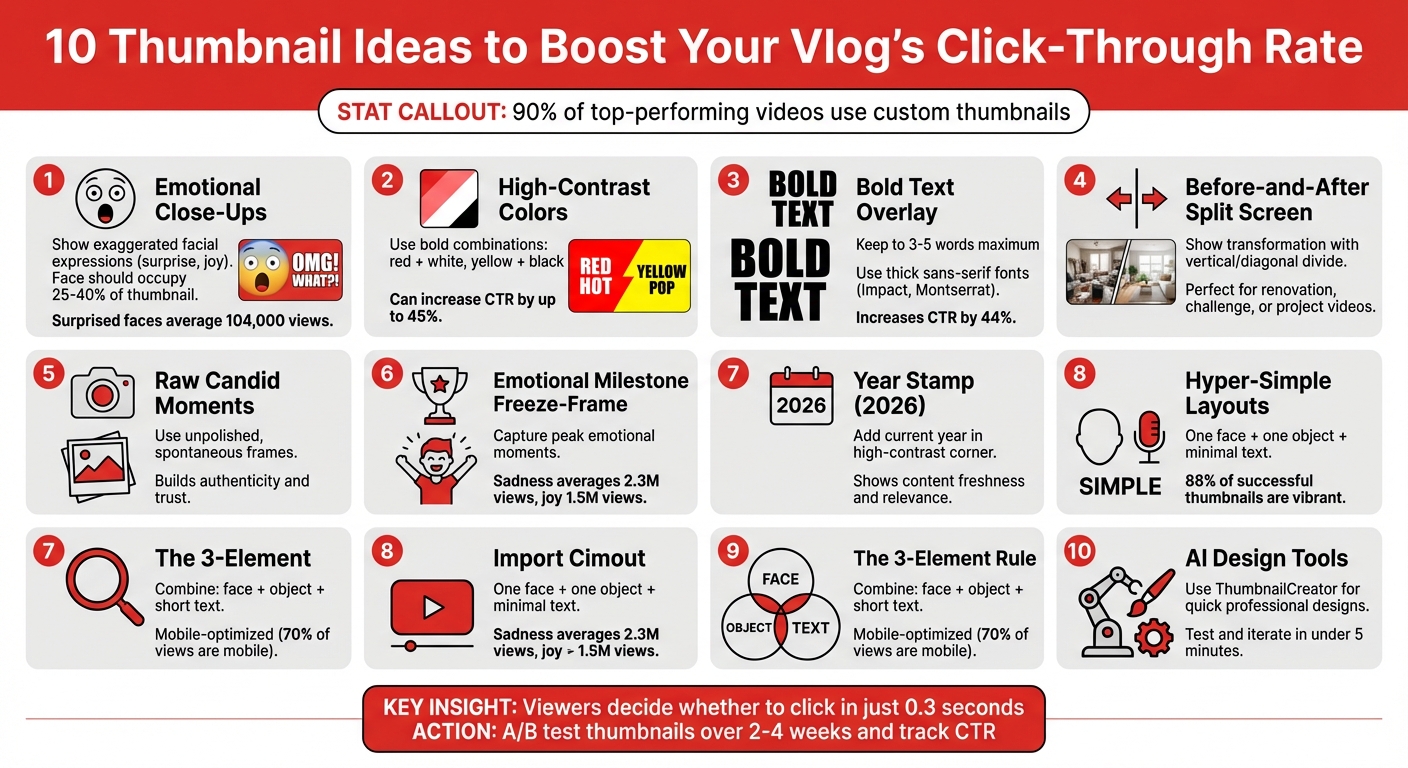
10 Thumbnail Ideas for Vlog Channels
Your YouTube thumbnail is the first thing viewers notice - and it can make or break your video’s success. 90% of top-performing videos use custom thumbnails, and those featuring human faces gain significantly more views. For vloggers, a thumbnail not only grabs attention but also builds a recognizable personal brand.
Here’s a quick overview of 10 thumbnail ideas you can use to boost clicks and stand out:
- Emotional Close-Ups: Show exaggerated facial expressions like surprise or joy.
- High-Contrast Colors: Use bold color combinations like red + white or yellow + black.
- Bold Text: Add short, impactful phrases (3–5 words) with easy-to-read fonts.
- Before-and-After Split Screens: Highlight transformations or progress.
- Raw Moments: Use candid, unpolished frames to show authenticity.
- Milestone Freeze-Frames: Capture moments of strong emotion (e.g., joy, sadness).
- Year Stamps: Add “2026” to show your content is current.
- Hyper-Simple Layouts: Focus on one face, one object, and minimal text.
- The 3-Element Rule: Combine a face, object, and short text for clarity.
- AI Tools: Use tools like ThumbnailCreator for quick, professional designs.
Each idea combines emotional appeal, storytelling, and design strategies to help your videos stand out in crowded feeds. Keep experimenting with different styles and track your click-through rates to find what works best for your audience. Be sure to follow the YouTube thumbnail size guide to ensure your designs look sharp on all devices.
10 High-Converting YouTube Thumbnail Ideas for Vloggers
1. Emotional Engagement
The Expressive Face Close-Up
Your face is one of the quickest ways to grab a viewer's attention. The human brain processes facial images 60,000 times faster than text. A close-up of your face showing a clear emotion - like shock, joy, or confusion - can instantly draw people in. To make it effective, your face should take up 25% to 40% of the thumbnail area, with expressions slightly exaggerated to ensure they’re easy to read on smaller screens like mobile devices. Direct eye contact in the thumbnail creates an immediate connection with the audience.
Take YouTube creator Harry "W2S" Lewis from The Sidemen as an example. In September 2024, he used a disgusted facial expression - wrinkling his nose at a burnt pizza - for a "Come Dine With Me" parody video. This thumbnail choice helped the video amass 6.1 million views in just two weeks. The strong emotion matched the content perfectly, and the close-up made it visually compelling.
Interestingly, surprised (26.95%) and happy (26.65%) are the most popular expressions among successful YouTubers. Thumbnails featuring surprise or shock tend to perform the best, with an average of 104,000 views. For niche channels, different emotions work better: gaming creators often use surprised (28.14%) and angry (10.78%) faces, while travel vloggers see the most success with happy faces (53.69%).
To optimize your thumbnail, position your face in the left two-thirds of the frame. This aligns with how viewers naturally scan thumbnails. Avoid placing the most expressive part of your face in the bottom-right corner, as YouTube’s timestamp could block it. Also, make sure your face is 30% brighter than the background to stand out.
Once your face grabs attention, high-contrast colors can amplify the emotional effect.
High-Contrast Color Psychology
Thumbnail psychology plays a huge role in making your thumbnail pop. Bright, contrasting colors work like visual brakes, stopping users mid-scroll. For example:
- Red conveys urgency or passion.
- Yellow signals alertness or optimism.
- Orange suggests energy and excitement.
Thumbnails with high contrast can increase click-through rates (CTR) by up to 45%. Certain color combinations are especially effective. Yellow + black is excellent for creating high energy or warning vibes, while red + white emphasizes urgency and passion. Combining these colors with an expressive face can boost CTR by 47% compared to thumbnails without faces.
Bold Text as an Emotional Hook
To reinforce your thumbnail’s visual appeal, bold text can quickly communicate the essence of your video. Keep it short - 3 to 5 words - so viewers immediately understand the focus. The text should reflect your facial expression. For instance, if your face shows shock, try phrases like "I CAN'T BELIEVE IT" or "THIS IS INSANE." Use thick, sans-serif fonts like Impact or Montserrat ExtraBold, and add outlines or drop shadows to make the text stand out.
For mobile viewers - who account for over 60% of YouTube traffic - text readability is crucial. Make sure your text is sized between 100–200px and test your thumbnail in grayscale to ensure the design remains clear without relying solely on color. Bold text, when done right, can increase CTR by 44%.
If designing thumbnails feels overwhelming, tools like ThumbnailCreator can make it easier. These platforms help refine facial expressions, adjust colors, and add bold text without requiring advanced design skills.
sbb-itb-b59debf
2. Storytelling
The Before-and-After Split Screen
A split-screen thumbnail tells a visual story in a single glance. It shows where you started and where you ended up, sparking curiosity about the journey that connects the two. This format shines in transformation videos - whether you're renovating, taking on a lifestyle challenge, or documenting a big project.
Take vlogger Bernardo Bacalhau, for example. In August 2025, he used this approach for his video "Converting a Van With No Experience." His thumbnail featured a dramatic side-by-side: an empty, bare van on one side and a sleek, luxurious interior on the other. Instantly, viewers could see the scale of the transformation and knew they'd get to witness the entire process. Similarly, Matt D'Avella nailed this technique in "Minimalism Challenge: 30 Days Before & After!" by using a split-screen that highlighted his dramatic lifestyle change.
To pull this off, use a vertical or diagonal line to divide the two states. Make sure the contrast is striking - like cluttered vs. organized, old vs. new, or bare vs. finished. Thumbnail expert 1of10 sums it up perfectly for various thumbnail use cases:
"A before and after thumbnail is a mini story in one frame. It promises a result".
This format doesn’t just showcase transformation - it teases a story that viewers can’t resist clicking on.
The Raw, Candid Moment
Want to show authenticity? Capture an unpolished, spontaneous moment that feels real. These raw, behind-the-scenes shots resonate deeply with audiences, especially for personal vlogs. They suggest you're offering a genuine glimpse into your life, which builds trust and connection.
Instead of a posed photo, pick a frame from your video where you're mid-laugh, reacting, or caught in action. Even slight imperfections - like motion blur or uneven lighting - add to the feeling of authenticity. This approach works wonders for storytime vlogs, daily life videos, or any content where being relatable is key. A great example is Shelby Church, who used this technique in her August 2025 video, "I Tried $600 Smart Glasses for a Week." Her thumbnail featured a close-up reaction shot that felt spontaneous but still visually engaging with futuristic overlays.
Candid moments not only highlight authenticity but also create an emotional pull that draws viewers in.
The Emotional Milestone Freeze-Frame
Sometimes, a single expression can say it all. Capturing a genuine emotional moment - whether it's surprise, joy, or even sadness - can make your thumbnail unforgettable. Why? Because emotions are contagious. When viewers see a strong feeling, they instinctively want to know the story behind it.
Thumbnails that convey sadness tend to perform exceptionally well, averaging 2.3 million views, while those showcasing joy and humor still pull in an impressive 1.5 million views. To make this work, zoom in on your face and eliminate unnecessary background clutter. The emotion should be exaggerated enough to stand out, even on a small mobile screen. This technique captures a peak emotional moment, creating a compelling visual hook that demands attention.
Whether it’s a tear, a gasp, or a burst of laughter, freezing that exact moment helps tell a story that viewers will feel compelled to explore.
3. Trendy Relevance
The "2026" Freshness Stamp
Keeping your design timely can make a big difference in grabbing attention. Adding the current year - 2026 - in bold, eye-catching text is a simple yet effective way to show that your content is fresh and relevant. This works particularly well for tutorials, reviews, or "best of" videos, where viewers are actively searching for the latest information. To make it stand out, place "2026" in a visible spot, like a corner, and use high-contrast colors such as white on red or black on yellow. This ensures it remains clear even on smaller mobile screens. Viewers are naturally drawn to content that feels current, and this small detail can make your thumbnail more appealing while setting the tone for other modern design trends.
The Raw, Unpolished Screenshot
In 2026, raw and unpolished visuals are making waves in thumbnail design. Slightly grainy, unedited screenshots are being embraced for their authentic and spontaneous vibe. This trend leans into honesty, making it perfect for vloggers sharing daily life, challenges, or behind-the-scenes moments. Unlike overly polished studio shots, these frames feel real and relatable, helping to build trust with viewers. When choosing a screenshot, go for a moment that clearly reflects your video's theme. Combining this raw aesthetic with emotional and storytelling elements can create a thumbnail that feels both trendy and genuine.
Hyper-Simplicity with One Clear Focus
Simplicity continues to dominate as a top trend in 2026. David Ch, Chief Editor at ThumbnailTest, highlights this shift:
"The hottest idea in 2025 is simplicity. All YouTube thumbnails are very simple, yet still raising curiosity".
This approach strips thumbnails down to the essentials: one face, one object, and 1-4 words of text. Eliminating unnecessary clutter ensures your design is clean and impactful. Since 88% of successful thumbnails are vibrant, using high-contrast colors is key to making your content stand out on mobile devices. Tools like ThumbnailCreator can help you experiment with layouts, leveraging AI to test designs and optimize for mobile viewing. A simple, focused thumbnail not only looks modern but also boosts your click-through rate by drawing attention where it matters most.
4. Practical Value
The "3-Element Rule" for Instant Clarity
When people scroll through YouTube on their phones, they decide what to watch in the blink of an eye. This method builds on the emotional and storytelling strategies mentioned earlier by focusing on mobile-friendly design. The idea? Stick to three key elements in your thumbnail: a face, a central object, and a short text overlay. This keeps your design simple and easy to read, even on small screens. Considering that over 70% of YouTube views come from mobile devices, designing with this in mind is crucial.
Here’s how to apply it effectively: Choose one expressive face, one clear object that represents your content, and overlay 3–5 bold words. Use a bold, sans-serif font like Impact or Montserrat for maximum readability. Pair this with high-contrast color combinations, such as yellow on black or white on red, so your text stands out against YouTube’s interface. Be mindful of the bottom-right corner, as YouTube’s timestamp can block important details. Tools like ThumbnailCreator can help you test and refine your designs for mobile screens.
How to design GREAT thumbnails (even if you’re not a designer)
Conclusion
Your thumbnail is your first and sometimes only chance to grab a viewer's attention. Studies reveal that 90% of top-performing videos use custom thumbnails. A strong, attention-grabbing thumbnail can significantly increase your click-through rate (CTR), which directly impacts your YouTube visibility. This makes optimizing your thumbnail design a key part of your strategy.
The secret? Constant experimentation. In 2025, Alicja Suska, Senior Product Designer for the YouTube channel "Outdraw Design", ran a workshop where she tested five to six different thumbnail styles. By stepping away from her usual "dark background with highlighted text" approach and trying brighter, more varied designs, she saw ten times the views on her newer videos compared to older ones. Tools like ThumbnailCreator make it easier to test and iterate quickly. By experimenting with different styles, tracking your CTR and watch time, and adapting based on viewer behavior, you can refine your approach.
"Thumbnails are absolutely critical... they're often the first thing viewers see, and a compelling thumbnail is the often difference between someone clicking on your video or scrolling past it." - Paul O'Malley, YouTube Creator
Testing is the cornerstone of success. Tools like ThumbnailCreator allow you to design professional, click-worthy thumbnails in under five minutes - even if you have no design experience. Features like AI generation, face swapping, and mobile previews help you stay consistent with your brand while experimenting with new designs. Considering that viewers decide whether to click in just 0.3 seconds, every detail matters.
Start small: pick one video and A/B test two thumbnails over 2–4 weeks. Track metrics like CTR, watch time, and audience retention to see which design not only draws clicks but keeps viewers engaged. Over time, this process will help you create a recognizable visual style that builds trust and drives long-term growth for your channel.
FAQs
What’s the best facial expression to use for my thumbnail?
The right facial expression can make your thumbnail stand out and attract more viewers. Expressions like surprise, curiosity, or excitement are especially effective because they immediately grab attention and make people curious. Think of wide eyes, raised eyebrows, or an open mouth - these convey strong emotions that encourage clicks.
When deciding on an expression, consider the mood of your video and how it resonates with your audience. Exaggerated but genuine emotions can cut through the clutter of a busy feed. Try experimenting with various expressions and keep track of which ones lead to more clicks. This trial-and-error approach can help you fine-tune your thumbnails over time. The goal is to choose an expression that not only catches the eye but also matches the vibe of your content.
What are the best color combinations for creating eye-catching YouTube thumbnails?
The best YouTube thumbnails use high-contrast color combinations that immediately catch the viewer's eye. Pairing complementary colors like red and white or blue and orange can make your thumbnail stand out in a sea of options, boosting click-through rates. These combinations not only grab attention but also create a clear and urgent visual message.
Incorporating bright, saturated colors for key elements, such as the main subject, while keeping the background darker or more muted, helps draw focus exactly where you want it. This contrast ensures your thumbnail pops against YouTube's interface. By carefully balancing contrast and leveraging color psychology, you can design thumbnails that are both visually appealing and highly clickable.
What’s the best way to design thumbnails that look great on mobile devices?
When designing thumbnails for mobile devices, keep things simple and clear. Use bold visuals and limit text to just 3-4 words for maximum impact. High-contrast colors work well to make your design pop, and it’s crucial to avoid clutter. Make sure key elements, like faces or objects, are large and easy to recognize, even on small screens.
Before hitting publish, view your thumbnail on an actual mobile device to check that everything looks sharp and attention-grabbing. Prioritizing a mobile-first design ensures your thumbnail catches the eye of viewers scrolling on the go.