
How First Impressions Shape Thumbnail Success
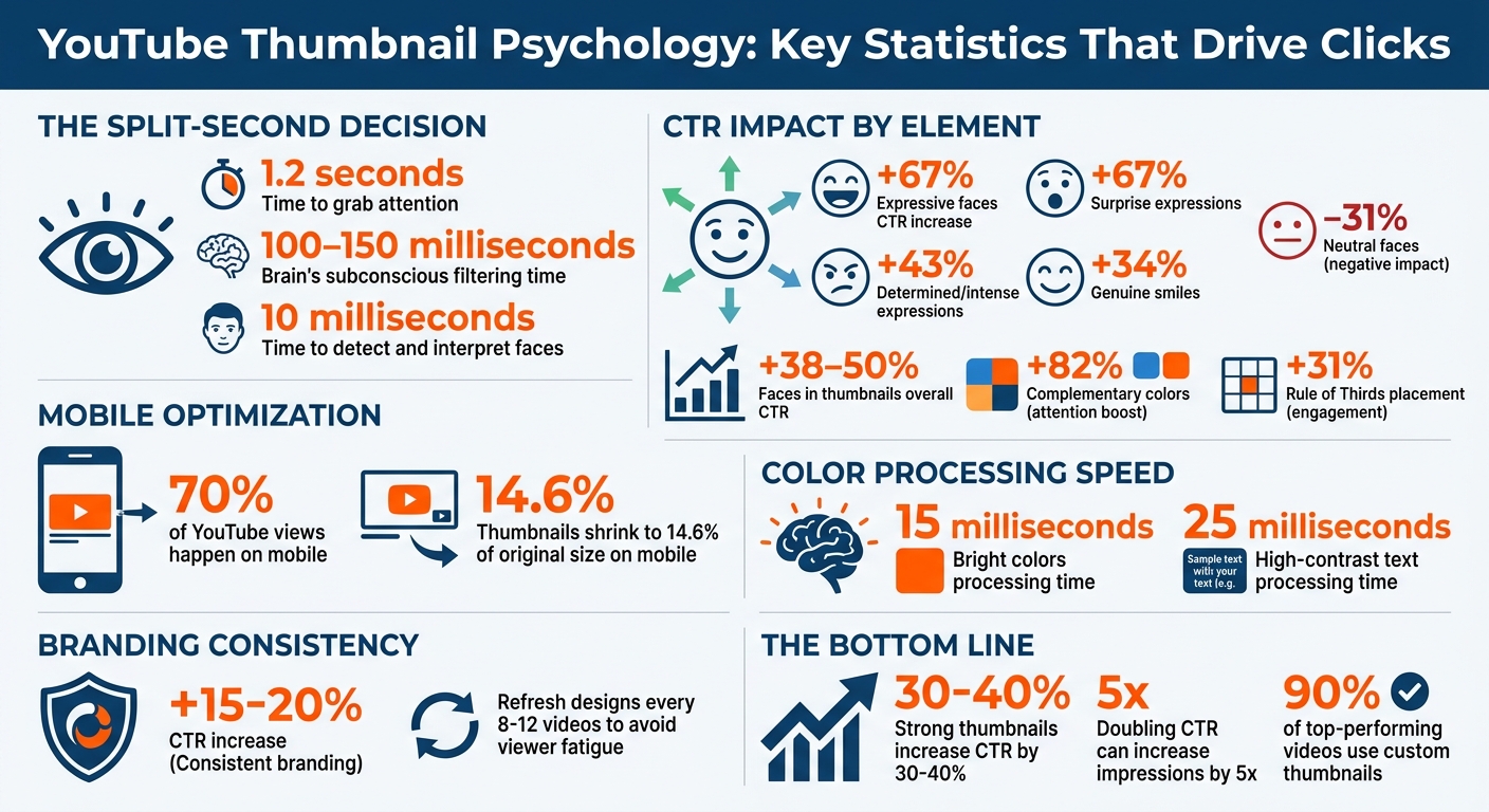
Your thumbnail has 1.2 seconds to grab attention. That split-second decision can determine whether your video gets viewed or ignored. YouTube’s algorithm prioritizes click-through rate (CTR), and a strong thumbnail can increase CTR by 30% to 40%, significantly boosting impressions.
Here’s what matters most:
- Expressive faces: Emotional expressions can increase CTR by up to 67%.
- High-contrast colors: Bright, complementary colors catch the eye in milliseconds.
- Simple layouts: Clutter-free designs work better, especially on mobile (where thumbnails shrink to 14.6% of their original size).
- Short text: Use 3–5 bold words to create curiosity without overwhelming the viewer.
To improve your thumbnails:
- Use A/B testing to compare designs and refine based on performance.
- Track metrics like CTR and watch time to ensure clicks lead to engagement.
- Keep branding consistent, but refresh designs periodically to avoid viewer fatigue.
Key takeaway: A well-designed thumbnail isn’t just about standing out - it’s about driving clicks and keeping viewers engaged.
YouTube Thumbnail Psychology: Key Statistics for Higher CTR
The Problem: Weak Thumbnails Cost You Views
Why Thumbnails Get Ignored in Busy Feeds
Your thumbnail has just 1.2 seconds to grab attention - that’s all the time your audience gives before deciding to engage or scroll past. During this split second, the brain scans for key elements like faces, contrast, and vibrant colors. Thumbnails that are cluttered with multiple faces, props, or fonts can overwhelm the viewer and make it harder to process quickly.
Low-contrast designs are another common issue. The brain’s pre-attentive processing is wired to notice high-contrast elements almost instantly. If your thumbnail fades into the background or uses muted tones, it’s likely to go unnoticed.
Here’s another challenge: over 70% of YouTube views happen on mobile devices. On these smaller screens, thumbnails shrink down to just 14.6% of their original size. What looks sharp and detailed on a desktop often becomes blurry on mobile, making clean, simple designs more important than ever. For those just starting out, following a YouTube thumbnail beginners guide can help ensure these technical basics are met from day one.
"If your thumbnail doesn't grab attention in a split second, the algorithm won't even bother testing your content's quality." - Alex Rivera, Content Creator Tools Expert
When thumbnails fail to stand out, it’s not just about losing clicks - it’s about losing opportunities. Poor design can hurt both viewer engagement and the algorithm’s perception of your content.
What You Lose When First Impressions Fail
A weak thumbnail doesn’t just cost you a click; it can also damage how YouTube’s algorithm treats your video. When a thumbnail underperforms, it signals low interest, which limits your video’s exposure and growth potential.
Another pitfall is the "promise mismatch." If your thumbnail hints at something your video doesn’t deliver—a common trap when balancing clickbait vs authentic thumbnails—viewers are likely to drop off within the first 30 seconds. This early exit sends a negative signal to YouTube’s algorithm, reducing your video’s reach. So, while you might win the initial click, failing to hold attention can hurt your channel’s long-term visibility.
Neutral or uninspired thumbnails also lack the emotional pull needed to stand out. Without a strong emotional hook, your content risks being ignored in favor of more expressive and eye-catching alternatives. This leads to lower click-through rates and fewer impressions overall.
sbb-itb-b59debf
How the Brain Processes Thumbnails in Seconds
How Visual Hierarchy Guides the Eye
Your brain doesn’t take in thumbnails all at once. Instead, it scans them in a specific sequence. In just 100 to 150 milliseconds, your subconscious flags elements like high-contrast colors, faces, and shapes, deciding what deserves attention. Ensuring your design meets the correct thumbnail dimensions is the first step in maintaining this visual clarity. This ultra-fast filtering often means many thumbnails are dismissed before you’re even aware of it.
When scanning, viewers typically follow either a Z-pattern (starting at the top-left, moving to the top-right, then diagonally to the bottom-left, and finishing at the bottom-right) or an F-pattern (a horizontal scan across the top, followed by a vertical glance down the left side). Placing critical elements - like expressive faces or compelling text - at key intersections following the Rule of Thirds can boost engagement by 31%.
"Your brain has already done most of the filtering before you consciously focus on anything."
Colors, especially high-contrast ones, grab attention instantly. Bright colors are processed in around 15 milliseconds, while high-contrast text takes about 25 milliseconds. Using complementary colors can amplify attention by 82%, which is why bold hues like reds, yellows, and blues often dominate successful thumbnails. These visual cues not only guide the eye but also evoke emotional responses, making users more likely to click.
Emotions That Make People Click
While the eyes are drawn to visual elements, emotions ultimately seal the deal. For instance, expressive faces in thumbnails - showing surprise or excitement - trigger a phenomenon called emotional contagion, where your brain mirrors the emotion you see. This automatic response encourages engagement.
Not all emotions are equally effective, though. High-arousal expressions like shock, curiosity, or excitement are far better at grabbing attention than neutral ones. For example, thumbnails showcasing surprise can increase click-through rates (CTR) by 67%, while determined or intense expressions boost CTR by 43%, and genuine smiles add 34%. On the flip side, neutral or blank faces can lower CTR by 31%.
Another major factor is the Curiosity Gap - the tension you feel when there’s a gap between what you know and what you want to know. This psychological pull motivates clicks. Similarly, the Zeigarnik Effect, which highlights an unfinished action or process, creates a “cognitive itch” that can drive engagement up by 67%.
"The goal isn’t information; it’s intrigue. It’s about creating a 'cognitive itch' that the viewer can only scratch by clicking."
- Jamie Chen, BananaThumbnail
Why Faces Increase Click-Through Rates
The human brain is wired to recognize faces. The fusiform face area, a part of the brain dedicated to face processing, can detect and interpret faces in as little as 10 milliseconds.
This explains why thumbnails featuring expressive faces can boost CTR by 38% to 50%. For example, in an A/B test conducted by GrowthOS in March 2026 for the WONE channel, a thumbnail with a close-up, emotional face captured 59.4% of the watch time share, compared to just 40.6% for a text-focused alternative.
Faces also guide attention through the gaze-cueing effect. When a subject looks directly at the viewer, it creates a sense of connection. If their gaze is directed toward text or an object in the thumbnail, viewers naturally follow that direction. This makes faces a powerful tool for directing attention to key elements within a thumbnail.
How First Impressions Shape Thumbnail Success
Use Expressive Faces and Direct Eye Contact
Your face should take up at least one-third of the thumbnail frame to ensure it’s clear and noticeable, especially on mobile screens - where more than 70% of YouTube views happen. Faces that show emotions like surprise, curiosity, or excitement tend to grab attention and boost click-through rates.
Direct eye contact is another key factor. When the subject in the thumbnail looks straight at the camera, it creates a sense of connection, making viewers feel personally addressed. If you want to draw attention to specific elements, like text or objects, you can angle the gaze toward them, encouraging viewers to follow that visual cue.
To simplify the process, tools like ThumbnailCreator offer features like face-swapping, letting you tweak expressions without reshooting. This ensures your thumbnails deliver the emotional impact needed to stand out in a crowded feed.
Choose High-Contrast Colors and Simple Layouts
After nailing facial expressions, the next step is to use color psychology and layout effectively. High contrast between your subject and the background makes your thumbnail more noticeable. Warm colors like red, orange, and yellow are particularly effective at grabbing attention. Pairing complementary colors, such as blue and orange, adds visual tension that can stop viewers mid-scroll.
"Contrast is communication, and on a platform where your thumbnail competes with hundreds of others in a single feed view, communication speed is everything."
Keep the design simple by focusing on one main element - whether it’s a face, an object, or a concept. Avoid clutter, as it can dilute your message. Always test your design by shrinking it down to roughly 168 pixels wide (about 10% of its full size). If the key elements - like faces or text - aren’t clear at that size, simplify the layout.
Also, steer clear of placing important text or visuals in the lower right corner. YouTube’s timestamp overlay often covers this area, making it less visible.
Keep Text Short and Readable
When it comes to text, less is more. Stick to 3–5 bold words, with no more than 12 characters in total. Thumbnails with minimal text typically outperform those that are text-heavy.
Instead of repeating the video title, use the text to create curiosity or provide extra context. For instance, if your video title is "How to Bake Sourdough Bread", the thumbnail text could simply say "No Knead" or "3 Ingredients" to intrigue viewers.
ThumbnailCreator includes tools for professional text editing, ensuring your fonts are legible on any screen. Test your design against both light and dark backgrounds to make sure it stands out in YouTube’s various display modes.
Create Consistent Branding Across Videos
Consistency in your thumbnails can strengthen your channel’s identity and make your content instantly recognizable. Using the same color schemes, fonts, and layouts helps your audience quickly identify your videos, which can lead to higher click-through rates - channels with strong branding see an increase of 15% to 20% in clicks.
However, consistency doesn’t mean sticking to the same design forever. Every 8 to 12 videos, consider shaking things up with a fresh look - like changing the color palette or layout orientation. This prevents “subscriber blindness,” where viewers start to overlook your content due to overly repetitive designs.
How to Test and Improve Your Thumbnails
Run A/B Tests on Different Designs
YouTube Studio's "Test & Compare" tool is a game-changer for testing thumbnails. Unlike manually swapping thumbnails every couple of days, this tool divides your audience into segments and shows them different thumbnails at the same time. This eliminates any bias caused by the time of day or other external factors.
The tool doesn't just stop at measuring click-through rates (CTR). It also tracks watch time per impression, which combines impressions, CTR, and average view duration. For instance, an 8% CTR with a 3-minute view duration can outperform a 10% CTR with only 2 minutes of viewing. This ensures you're not just attracting clicks but also keeping viewers engaged - a critical factor in avoiding clickbait strategies.
"YouTube favors combinations that get viewers to click AND keep them watching."
For reliable results, aim for a minimum of 1,000 impressions per thumbnail variant and at least 5,000–10,000 total impressions before making decisions. Avoid jumping to conclusions in the first 24–48 hours; instead, run tests for 7–14 days to capture traffic patterns across weekdays and weekends.
When testing, focus on big-picture differences rather than small tweaks. For example, compare facial close-ups to product shots or entirely different design styles. A study of 127 tests found that changing facial expressions improved CTR by 42%, while simply adding or removing a face increased CTR by 47%. Use a three-pronged testing approach: one standard design, a variation of that design, and something unexpected. This strategy helps uncover new ideas and audience preferences.
Once you've identified strong design concepts, dive deeper into performance metrics to refine your approach.
Track These Performance Metrics
Winning an A/B test is just the beginning. To ensure long-term success, monitor additional metrics to see if those clicks translate into meaningful engagement. A high CTR won’t help if viewers leave seconds after clicking, and YouTube may penalize videos with poor retention rates.
Also, pay attention to where your traffic is coming from. For example, search traffic often achieves a 12.5% CTR, while browse traffic typically ranges from 4% to 6%. If your test coincides with a spike in search traffic, your results might look better than they actually are in the long run.
To build a more consistent thumbnail strategy, track trends across 10–15 tests. Look for patterns like which colors work best or which facial expressions connect with your audience. Over time, this data can serve as a style guide, helping you create effective thumbnails without relying on guesswork. Creators who test consistently have reported CTR improvements of 3–7% over time.
By aligning your metrics with how viewers make snap decisions, you can design thumbnails that not only grab attention but also keep audiences engaged.
| Scenario | Share Gap | Impressions | Time | Action |
|---|---|---|---|---|
| Clear winner | 60%+ | 5,000+ total | 7+ days | Stop test and apply winner |
| Marginal lead | 51–55% | 5,000+ total | 7+ days | Continue for 7 more days |
| Dead heat | 49–51% | 10,000+ total | 14+ days | Pick based on preference |
| Low data | Any | Under 2,000 | Under 7 days | Wait for more data |
Once you've determined the winning designs, tools like ThumbnailCreator make it easy to implement thumbnails that not only attract clicks but also maintain viewer interest.
How I consistently get 15%+ CTR on all my thumbnails (NO B*S GUIDE)
Conclusion
Thumbnails are your video's first impression, and they have only milliseconds to grab attention. Their design - expressive faces, bold colors, and concise text - decides whether someone clicks or keeps scrolling. Doubling your click-through rate (CTR) can increase impressions by up to 5x.
The formula is simple but effective: expressive faces should take up 30–40% of the frame, three bold colors should dominate the design, and text should be kept short - under five words. Despite the fact that 90% of top-performing videos use custom thumbnails, many creators still overlook their importance.
"The best video in the world gets zero views with a bad thumbnail. YouTube cannot recommend what people do not click on."
This is where tools like ThumbnailCreator come in handy. Instead of spending hours navigating complicated design software or second-guessing color choices, this AI-powered tool does the heavy lifting. It applies proven psychological principles - like visual hierarchy and high-contrast palettes - to deliver professional, mobile-optimized designs in seconds. This is critical, especially since over 70% of YouTube views happen on mobile devices.
To take it a step further, use A/B testing and track metrics like CTR to refine your thumbnails over time. By combining the science of first impressions with data-driven adjustments, you can ensure your thumbnail doesn’t just catch attention - it drives clicks.
FAQs
How can I check if my thumbnail is readable on mobile?
To make sure your thumbnail works well on mobile devices, check how it looks at smaller sizes - most YouTube views happen on mobile. A good way to test this is by previewing it at 280×157 pixels to see if everything is easy to read. Use large, bold text and keep the design simple, with strong contrast to make it stand out. You can also try AI tools to evaluate things like contrast, layout, and mobile compatibility for improved performance.
How can I avoid clickbait while still boosting CTR?
To improve your click-through rate (CTR) while staying authentic, focus on creating thumbnails that are clear, honest, and directly tied to your content. Incorporate psychological elements like curiosity, emotional expressions, and high-contrast visuals to catch the viewer's eye. This method not only makes your thumbnails more appealing but also builds trust with your audience. The result? Engaging visuals that drive clicks and nurture long-term loyalty.
What should I A/B test first in a new thumbnail?
Start by testing different elements like facial expressions, text hooks, and color schemes. These factors often play a huge role in grabbing attention and boosting click-through rates. Small tweaks here can lead to noticeable improvements in performance.