
Psychology of Relatable Thumbnails
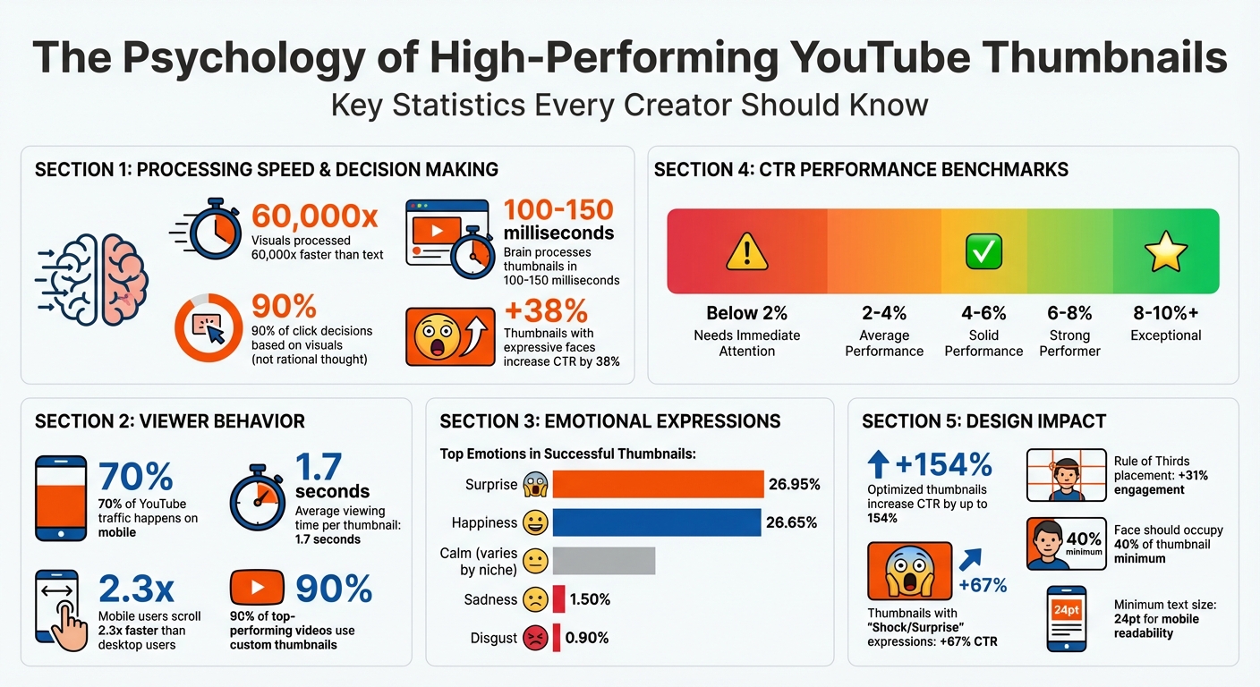
Your YouTube thumbnail has milliseconds to grab attention - literally. Research shows that visuals are processed up to 60,000 times faster than text, and 90% of click decisions are based on visuals, not rational thought. Thumbnails with expressive faces, emotional cues, and bold contrasts can increase click-through rates (CTR) by 38%. But it’s not just about looking good; your thumbnail needs to align with your video’s content or risk losing viewer trust and hurting algorithm performance.
Here’s what works:
- Curiosity Gap vs Direct Value: Tease information without giving it all away to spark curiosity.
- Emotional Faces: Surprise and happiness dominate successful thumbnails, but authenticity matters.
- Color & Contrast: Use bold, high-contrast colors to stand out in crowded feeds.
- Relevance: Align thumbnails with video content to avoid misleading viewers.
Pro Tip: Test your designs. A/B testing can reveal what resonates with your audience, like shorter text or specific facial expressions. Tools like ThumbnailCreator can simplify the process, helping you fine-tune emotional cues and optimize for mobile viewers, where 70% of YouTube traffic happens.
Your thumbnail isn’t just an image; it’s your first impression. A strong design can turn casual scrollers into engaged viewers.
YouTube Thumbnail Psychology: Key Statistics and Performance Metrics
How to Make YouTube Thumbnails That Get Clicked (COPY THIS)
sbb-itb-b59debf
Psychological Triggers Behind Relatable Thumbnails
Understanding the psychology behind thumbnails is crucial for creating designs that grab attention and drive clicks. Let’s break down the key triggers.
Curiosity and Intrigue
The urge to fill in the gap between what we know and what we want to know is a powerful motivator. Psychologist George Loewenstein’s Information Gap Theory explains this well: "When people perceive a gap between what they know and what they want to know, it creates a form of psychological discomfort that motivates them to close it". Thumbnails that tease an answer or hint at something intriguing - without fully revealing it - tap into this natural curiosity.
Interestingly, your brain processes a thumbnail in just 100 to 150 milliseconds. During this split-second scan, it prioritizes unusual shapes, bold contrasts, or anything visually striking. This is why creators like MrBeast use thumbnails with extreme contrasts, such as "$1 vs $100M", to spark curiosity and encourage clicks. Adding elements like blurred "after" shots or directional arrows can further amplify this effect, compelling viewers to click to resolve the mystery.
"The curiosity gap is the psychological space between what we know and what we want to know. A great thumbnail opens this gap and makes the viewer feel like they must click to close it." - Zoey Angelina
However, curiosity alone isn’t enough. If the video fails to deliver on the promise of the thumbnail, it risks being labeled as clickbait, which can harm watch time and reduce algorithmic visibility. Beyond curiosity, thumbnails also need to connect emotionally, which we’ll explore next.
Emotional Connection
Human faces are processed faster by the brain’s fusiform area, making them a powerful tool for creating an emotional bond. Expressive faces - whether showing shock, joy, or frustration - trigger emotional contagion, where viewers subconsciously mirror the emotion they see. This instant connection encourages engagement.
By February 2026, creators like MrBeast shifted from generic shock expressions to more nuanced storytelling emotions like exhaustion or determination. These specific expressions better matched the stakes of each video, resonating more deeply with audiences who had grown savvy enough to spot fake reactions. As Jamie Chen from Banana Thumbnail notes, "Audiences in 2026 are smarter... They can smell a fake reaction a mile away".
Direct eye contact in thumbnails builds a personal connection, while eyes looking toward key elements can guide the viewer’s focus. Pair this with high-contrast backgrounds to ensure the emotion registers during the critical 100 to 150 milliseconds when viewers are deciding whether to click.
Social Proof and Familiarity
Each niche has its own visual language, but sticking too closely to these conventions can make thumbnails blend into the crowd. Familiarity helps the brain quickly categorize content, but overusing common patterns risks losing attention due to habituation. The trick? Pattern interruption. Analyze the top thumbnails in your niche and intentionally design something that breaks the mold to stand out.
"The best thumbnail designers aren't more creative than everyone else. They just understand their audience's brain better." - Thumbnailr.io
Familiar visual cues build trust, but authenticity is key. Thumbnails should feature genuine, context-specific expressions to create an immediate connection. Striking a balance between familiarity and disruption is essential: stick to enough niche conventions for recognizability, but introduce unexpected elements to grab attention. To avoid overwhelming viewers, focus on a single, clear focal point that the brain can process in under 0.3 seconds. This balance lays the groundwork for using AI tools effectively in thumbnail design. For a deeper dive into automation, see our AI thumbnail generation guide.
Design Elements That Increase Relatability
When it comes to creating relatable thumbnails, design elements like facial expressions, color, and relevance play a big role. These elements work hand-in-hand with psychological triggers to make thumbnails more effective and engaging.
Expressive Faces and Reactions
Our brains are wired to notice faces. Specifically, the fusiform face area in the brain is dedicated to processing facial features, making expressive faces a powerful tool in a crowded feed. The expressions you choose can make or break your thumbnail's success.
Studies show that emotions like surprise and happiness dominate successful thumbnails. For example, a September 2024 study revealed that 26.95% of top YouTuber thumbnails feature surprised expressions, with happy faces coming in a close second at 26.65%. On the other hand, negative emotions like sadness and disgust rarely appear, showing up in only 1.50% and 0.90% of thumbnails, respectively.
Interestingly, trends in facial expressions evolve. In 2023, MrBeast discovered through A/B testing that thumbnails where his mouth was closed led to higher watch times. He even joked:
"I closed my mouth on all my thumbnails and the watch time went up on every video lol. We must not rest until mouths are closed in everyone's thumbnails." - MrBeast
Different niches also favor different expressions. In gaming, surprised faces are king, appearing in 28.14% of thumbnails, with anger and fear also making rare but notable appearances. Meanwhile, science creators like Mark Rober often use happy expressions (57.14% of his thumbnails), keeping his face small to emphasize experiments. For travel content, happy faces dominate at 53.69%, while fitness and sports creators lean toward calm expressions, appearing in 37.38% of thumbnails.
Even where eyes are looking can influence viewer behavior. A direct gaze creates a sense of connection, while eyes pointing toward text or objects guide the viewer’s attention to specific details. These subtle cues help direct focus during the split-second decisions viewers make when scanning thumbnails.
Color Psychology and Visual Contrast
Color and contrast are the first things your brain notices, often within 100 to 150 milliseconds. Without strong contrast, even the most compelling thumbnail can get lost in the noise.
Colors set the mood before viewers even read the title. For example:
- Warm colors like red and orange bring energy and excitement.
- Cool tones like blue and green evoke calmness and trust.
The trick is to match your color palette to your niche and the video's theme. A finance creator might use bold colors with sharp contrasts to make data feel urgent, while a lifestyle creator might go for softer tones to feel more approachable.
Consistency in color and style also helps build recognition over time. A familiar palette acts like a visual signature, creating a sense of reliability for your audience. However, consistency shouldn't come at the expense of contrast - your thumbnail still needs to pop against YouTube’s white or dark backgrounds. Striking the right balance ensures your video grabs attention while staying true to its content.
Contextual Relevance
Thumbnails that don’t match the video’s content can destroy viewer trust. If the curiosity gap created by the thumbnail isn’t resolved in the video, viewers feel misled, which hurts retention rates.
As creator ebbafeeney explains:
"If the thumbnail overpromises and the content underdelivers, trust is broken. And once trust is lost, it's tough to win people back." - ebbafeeney
YouTube's algorithm takes note of this misalignment. When viewers click but quickly leave because the content doesn’t match the thumbnail, the algorithm reduces the video’s reach. Authentic thumbnails that align with the video build trust and keep viewers engaged, unlike clickbait vs authentic thumbnails, where the former often backfires.
Knowing your niche’s style is crucial, but standing out is just as important. Analyze thumbnails for your target keywords and create something that fits the category while still being distinctive. For example, if exaggerated expressions dominate your niche, a calm face might disrupt the pattern and grab attention. The goal is to balance familiarity with originality, ensuring your content feels both relevant and fresh to your audience.
Using AI Tools to Create Relatable Thumbnails
Designing thumbnails that resonate with viewers and trigger the right psychological response can be tricky. AI tools like ThumbnailCreator simplify this process by turning psychological principles into actionable designs. These tools automate the subtle design choices that make thumbnails more engaging.
How ThumbnailCreator Improves Relatability
ThumbnailCreator taps into pre-attentive processing principles, ensuring your thumbnail grabs attention in the first 100–150 milliseconds - before a viewer even consciously focuses. It evaluates elements like faces, colors, and text placement to create designs that align with psychological patterns proven to spark interest.
With features like face swapping and object editing, you can experiment with emotional expressions and strategic placements to maximize visual impact. For instance, thumbnails featuring "Shock or Surprise" expressions have been shown to increase click-through rates by 67%. By leveraging emotional contagion, this tool helps forge an instant connection with viewers.
ThumbnailCreator also applies the Rule of Thirds and Z-pattern techniques to guide attention toward the most compelling parts of the thumbnail. This structured visual hierarchy can lead to a 31% increase in engagement compared to designs with randomly placed elements. For creators aiming to stand out, the tool can even suggest designs that break niche norms - like using unexpected angles or bold color combinations. This tactic disrupts the monotony of crowded feeds, making your content more noticeable.
Simplifying the Design Process
Beyond enhancing emotional appeal, ThumbnailCreator simplifies the technical side of thumbnail design. Its pre-designed templates take out the guesswork, ensuring your thumbnails are optimized for mobile viewers, who scroll 2.3 times faster than desktop users and spend just 1.7 seconds on average viewing each thumbnail. These templates prioritize key elements, like ensuring faces occupy at least 40% of the thumbnail and using text with a minimum font size of 24pt to maintain clarity on smaller screens.
The text editing feature also ensures strong visual contrast by pairing complementary colors, such as orange text on a blue background. To further enhance visibility, the tool places high-contrast subjects against muted backgrounds, making the thumbnails pop in both YouTube's dark and light modes. As Thumbnailr.io aptly states:
"understanding thumbnail psychology doesn't make you a better artist. It makes you a better decision-maker".
Measuring Thumbnail Performance
A thumbnail that connects emotionally and visually is great - but its true success lies in how well it drives clicks. Tracking performance metrics ensures your thumbnails are doing their job and that your design choices resonate with your audience.
Click-Through Rate (CTR) Analysis
CTR is your go-to metric for thumbnail success. It shows what percentage of viewers clicked on your video after seeing the thumbnail. You calculate it by dividing the number of clicks by the number of impressions, then multiplying by 100. For example, if your thumbnail gets 1,000 impressions and 60 clicks, your CTR is 6%.
On YouTube, CTRs generally fall between 2% and 10%. Here’s how those numbers break down:
- Below 2%: Your thumbnail isn’t working - there’s likely a disconnect with your audience.
- 2% to 4%: This is average but leaves room for improvement.
- 4% to 6%: You’re in a solid range.
- Above 8%: Exceptional performance that sets your video apart.
To make it easier, here’s a quick reference table:
| CTR Range | Performance Classification | Action Recommended |
|---|---|---|
| Below 2% | Needs Immediate Attention | Redesign with better contrast, a clearer focal point, or more engaging elements. |
| 2% – 4% | Average / Below Par | Focus on improving text clarity, emotional appeal, or visual impact. |
| 4% – 6% | Solid Performance | Stay consistent and start optimizing thumbnails with A/B testing. |
| 6% – 8% | Strong Performer | Analyze what’s working and apply those insights across your channel. |
| 8% – 10%+ | Exceptional / Top Creator | Use these as benchmarks for future thumbnails. |
But there’s a catch: A high CTR paired with low viewer retention might mean your thumbnail is misleading, which YouTube’s algorithm doesn’t like. As Thumbnailr.io puts it:
"The line between a curiosity gap and clickbait is whether the video actually resolves the gap".
So, always keep an eye on watch time alongside CTR to ensure your thumbnail matches the video’s content.
A/B Testing for Thumbnails
CTR alone doesn’t tell the whole story. That’s where A/B testing comes in - it helps you figure out which thumbnail designs perform best. YouTube’s "Test & Compare" tool lets you test up to three thumbnail variations, distributing impressions evenly and measuring performance based on watch-time share, which can be more reliable than CTR.
For accurate results, follow these guidelines:
- Test Duration: Run tests for at least 72 hours. The first 48 to 72 hours after upload provide the cleanest data before algorithmic factors kick in.
- Impressions Per Variant: Aim for 1,500 to 2,000 impressions per thumbnail. Tests with fewer than 1,000 impressions have a 43% chance of false positives.
- Test One Variable at a Time: Changing multiple elements at once makes it hard to pinpoint what’s driving results. For instance, test whether adding a face improves performance or whether shorter text resonates more.
Here are a couple of real-world examples:
- In November 2025, a tech review channel tested a "Product only" thumbnail against one with "Face + Product." The face-inclusive design achieved a 9.19% CTR versus 7.32% for the product-only version - a 25.5% improvement across 28,000+ impressions per variant.
- A personal finance channel tested text length in December 2025. One thumbnail read "The Hidden Factor Destroying Your Credit Score" (seven words), while the other simply said "Credit Score Mistake" (three words). The shorter version achieved an 8.91% CTR compared to 7.43% for the longer one, showing that concise text works better on mobile screens.
To make the most of A/B testing, keep a detailed log of your experiments. Record your hypotheses, what you tested, the results, and any impact on watch time. Over time, you’ll spot patterns that can guide future designs. And don’t forget to refresh thumbnails on evergreen content every three to six months - this can help re-engage the algorithm and boost underperforming videos.
Conclusion
Designing thumbnails that resonate with viewers isn't about being a skilled artist - it’s about understanding how people make snap decisions. In fact, your thumbnail gets processed in less than 150 milliseconds before someone decides to scroll past it. By tapping into psychological principles like emotional contagion, curiosity gaps, cognitive ease, and visual hierarchy, thumbnails can grab attention and boost engagement. And this isn't just theory - it directly impacts performance.
Consider this: 90% of top-performing videos use custom thumbnails, and optimized designs can increase click-through rates (CTR) by up to 154%. Yet, many creators struggle with limited time and resources, making it tough to spend hours perfecting a design. That’s where tools like ThumbnailCreator come in, offering AI-powered solutions that simplify the process. With features like automated generation, face swapping, and emotion-focused enhancements, these tools help you implement psychological triggers in minutes instead of hours. Expression morphing lets you fine-tune emotional cues, while high-contrast templates ensure your thumbnails stand out on mobile devices - where 70% of YouTube views occur. These stats underscore how crucial optimized thumbnails are and highlight the practical benefits of tools designed for this purpose.
At its core, a thumbnail is more than just a picture - it’s a psychological promise to your audience. The most successful creators on YouTube aren’t necessarily the most artistic; they’re the ones who test, measure, and refine their thumbnails based on actual viewer behavior. Use A/B testing vs gut feeling to confirm your design choices, monitor CTR alongside watch time to steer clear of clickbait penalties, and update outdated thumbnails regularly.
Every thumbnail you create is a commitment to your audience - a promise that their curiosity will be satisfied. By blending visual psychology with data-driven testing and smart tools, you can turn that promise into growth.
FAQs
How do I make a curiosity gap without clickbait?
To spark curiosity without resorting to clickbait, the trick is to share just enough to intrigue your audience while holding back the most compelling details. Use eye-catching visuals - think surprised expressions or intriguing imagery. Pair these with questions or open-ended statements that hint at an "information gap" your audience will want to fill. Additionally, bold text paired with contrasting colors can make your content stand out, drawing attention naturally. This approach keeps things honest while still capturing interest.
Which facial expressions work best for my niche?
Facial expressions that showcase intense emotions, such as surprise or happiness, can work wonders when it comes to grabbing attention. These types of expressions naturally draw people in, making them highly effective for increasing both click-through rates and engagement. They help create a sense of connection with your audience, making your content more relatable and appealing.
What should I A/B test first in a thumbnail?
To figure out what grabs your audience's attention, start by testing one element at a time - whether it's color, text, or images. For example, try using high-contrast colors, bold text, or expressive faces. These tend to stand out and can make a big difference in click-through rates. Pay attention to elements that tap into psychological triggers, like the emotions sparked by certain colors or facial expressions. These subtle cues often have an immediate impact on viewers.