
Ultimate Guide to FOMO in Thumbnails
Want more clicks on your videos? FOMO (Fear of Missing Out) thumbnails can help. By creating curiosity and urgency, they make viewers feel they’ll miss something important if they don’t click. Here’s how you can use FOMO to boost your click-through rates:
- Curiosity Gap: Tease the story without revealing everything. Example: Blur or censor parts of the thumbnail.
- Psychological Triggers:
- Scarcity: Use phrases like "Only 3 Left" or add countdowns.
- Exclusivity: Add "The Secret" or "VIP Access" to make viewers feel special.
- Social Proof: Highlight "100M+ Views" or trending status.
- Design Tips:
- Use bold, short text (3–5 words) with high contrast.
- Add expressive faces (shock or surprise increases clicks by 38%).
- Use bright colors like red or yellow to amplify urgency.
Key Fact: Viewers decide to click in just 1.8 seconds. FOMO thumbnails grab attention fast and can increase click-through rates by up to 154%.
Want to create these thumbnails easily? Tools like ThumbnailCreator use AI to design attention-grabbing visuals in minutes. Test different designs to find what works best and watch your views grow.
How to get MORE THUMBNAIL CLICKS on the YOUTUBE HOMEPAGE
sbb-itb-b59debf
The Psychology Behind FOMO in Thumbnails
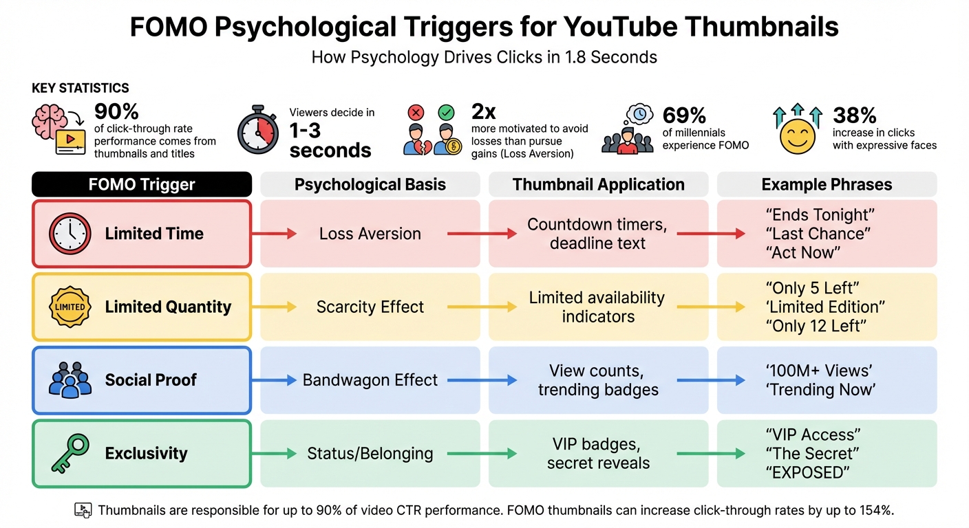
FOMO Psychological Triggers and Thumbnail Applications Guide
The power of FOMO (Fear of Missing Out) in thumbnails boils down to three psychological triggers: scarcity, exclusivity, and social proof. These triggers influence quick decisions in the blink of an eye.
Thumbnails and titles are responsible for up to 90% of a video's click-through rate performance. With viewers making decisions in just 1–3 seconds, your thumbnail has to spark an immediate reaction. FOMO does this perfectly by tapping into our deepest fears and desires.
Let’s break down how scarcity plays a key role in creating this urgency.
How Scarcity Creates Urgency
Scarcity triggers urgency by preying on a universal fear: losing something important. Psychologists Daniel Kahneman and Amos Tversky, who won the Nobel Prize, revealed that people are twice as motivated to avoid losses as they are to pursue gains. This concept, known as loss aversion, explains why phrases like "Last Chance" or "Ends Tonight" make you feel like you HAVE to act now - not because of what you might gain, but because of what you fear missing out on.
"Loss aversion: we're 2x more motivated to avoid losses than acquire gains." - Daniel Kahneman and Amos Tversky, Nobel Prize-winning psychologists
Scarcity operates on three levels:
- Time-based triggers: Deadlines, countdowns, or phrases like "Only available today" create a sense of urgency.
- Quantity-based triggers: Highlighting limited availability - like "Only 3 left" or "Limited spots" - adds pressure.
- Scarcity of information: This one’s sneakier. When creators blur objects, censor text, or use red circles and arrows to tease hidden details, they create an incomplete story. The brain, craving closure, pushes you to click, highlighting the fine line between clickbait and authentic thumbnails.
Visual cues amplify these effects. Blurred areas, dramatic arrows, or censored sections scream “there’s something you NEED to see,” making it nearly impossible to scroll past.
But scarcity isn’t the only psychological tool at play. Exclusivity and social proof are equally powerful.
Using Exclusivity and Social Proof
Exclusivity taps into FOMO by suggesting others are enjoying something you’re missing out on. Phrases like "The Secret", "Exposed", or "I Was Doing It All Wrong" create an insider vibe, making viewers feel like they’re gaining access to something special.
Social proof works differently but just as effectively. A thumbnail boasting "100M+ views" or featuring a well-known figure signals that the content is a must-watch event. This plays on herd mentality - if millions of people are watching, you don’t want to be left out. For younger audiences, this is especially potent: 69% of millennials experience FOMO. Thumbnails with expressive faces (like shock or surprise) can also boost click-through rates by 38%, as they hint at something major you’re about to miss.
| FOMO Trigger | Psychological Basis | Thumbnail Application |
|---|---|---|
| Limited Time | Loss Aversion | "Ends Tonight", countdown timers |
| Limited Quantity | Scarcity Effect | "Only 5 Left", "Limited Edition" |
| Social Proof | Bandwagon Effect | "100M+ Views", "Trending Now" |
| Exclusivity | Status/Belonging | "VIP Access", "The Secret" |
These psychological triggers work together to drive clicks before viewers even realize what’s happening.
Best Practices for Adding FOMO to Thumbnails
Now that the psychology behind FOMO is clear, it’s time to put that knowledge to work. Designing FOMO-driven thumbnails isn’t about cramming in every possible element - it’s about delivering a clear, focused message. With mobile users deciding in less than half a second whether to engage with your thumbnail, every detail must pull its weight. The One Idea Rule is crucial here: your thumbnail should communicate a single, clear point. If you can’t sum up its promise in seven words or less, it’s too complicated.
FOMO Text and Phrases That Get Clicks
Keep your thumbnail text short and punchy. The 3-Word Rule is a great guideline: aim for 3–5 bold, impactful words using clean sans-serif fonts. These words should create a curiosity gap, which is the mental space between what viewers know and what they’re eager to find out.
"The curiosity gap is the psychological space between what we know and what we want to know. A great thumbnail opens this gap and makes the viewer feel like they must click to close it."
- Zoey Angelina, Social Media Strategist
Certain phrases consistently perform well. Urgency phrases like "Last Chance", "Ends Tonight", or "Act Now" prompt immediate action. Scarcity phrases such as "Only 12 Left" or "Limited Edition" create a sense of rarity. For curiosity, single-word teasers like "EXPOSED", "FINISHED", or "SHOCKING" are highly effective. Exclusivity phrases like "The SECRET" or "Only a few know this" make viewers feel like insiders, while specific numbers like "$10K" or "$1 vs $100M" provide instant clarity and context. Importantly, your thumbnail text should complement, not duplicate, your video title. The text opens the curiosity gap, and the title delivers the payoff.
| FOMO Trigger | Effective Phrases | Why It Works |
|---|---|---|
| Urgency | "Last Chance", "Ends Tonight" | Creates time pressure through loss aversion |
| Scarcity | "Only 12 Left", "Limited Edition" | Triggers fear of missing out on rare opportunities |
| Curiosity | "The Secret", "EXPOSED" | Sparks a need to close the information gap |
| Exclusivity | "First Look", "VIP Access" | Makes viewers feel like part of an elite group |
| Transformation | "Before/After", "I Quit" | Highlights dramatic changes viewers want to see |
To ensure readability, apply the Squint Test: if you squint at your thumbnail and the text becomes unreadable at mobile size (about 100 pixels), adjust the contrast or font size. Both visuals and text should reinforce the One Idea Rule for maximum impact.
Visual Techniques to Increase FOMO
Text alone won’t do the heavy lifting - visual elements are just as critical for creating FOMO. Start with expressive faces. Thumbnails featuring shocked or surprised expressions boast an average click-through rate of 8.4%, and any face at all can boost clicks by 38% compared to faceless thumbnails. Among expressions, shocked or surprised looks perform the best, followed by excited, serious, and confused ones.
Leverage the Rule of Thirds by placing key FOMO elements - like a shocked face - at the intersection points of a 3×3 grid rather than dead center. Add visual cues such as bright red or yellow arrows and circles to guide viewers’ attention to the most compelling part of the thumbnail. To tease a reveal, blur or censor part of the image, creating a visual curiosity gap.
For urgency, include visual elements like countdown timers, progress bars (e.g., "80% claimed"), or "Sold Out" stamps directly in the design. Colors like red and yellow amplify urgency and visibility. High-contrast thumbnails can increase click-through rates by 20% to 40%.
The Contrast Sandwich technique can make your thumbnail stand out. This involves three layers: a simple or blurred background, a high-contrast subject with a subtle glow or stroke (4–8 pixels), and bold text in a contrasting color. This approach ensures the thumbnail "pops", even at the small size (160×90 pixels) most mobile users see.
"Make your thumbnail easy to understand so that when people look at it the first time, they're saying, 'I know what's going on in this video, so I'm going to click on it.'"
- Chucky Appleby, Creative Team, MrBeast
Don’t forget the safe zone: keep critical elements and text away from the bottom-right corner, which YouTube’s timestamp might cover. With over 70% of watch time happening on mobile, always preview your design on a phone to ensure it works at smaller sizes.
How to Create FOMO Thumbnails Using ThumbnailCreator
ThumbnailCreator leverages the psychology of scarcity and exclusivity to help you design thumbnails that spark FOMO (Fear of Missing Out). With 90% of the top-performing YouTube videos using custom thumbnails, this AI-powered tool simplifies the process, even for those with zero design experience. The result? Thumbnails that stand out and drive clicks.
Here’s how ThumbnailCreator’s features help you craft FOMO-packed designs.
Using AI for FOMO Designs
ThumbnailCreator’s AI generator transforms your video title into a thumbnail designed to grab attention. Simply input prompts like “vibrant limited-time offer with neon borders” or “exclusive event with dynamic lighting,” and the AI generates visuals based on proven FOMO strategies.
The tool also provides a performance score by analyzing your design against successful video thumbnails. It offers actionable tips - like adjusting contrast, saturation, or text placement - to fine-tune your thumbnail. Considering that custom thumbnails can boost engagement rates by up to 30%, these data-driven tweaks ensure your design hits the mark from the start.
For an extra edge, incorporating dynamic faces into your thumbnails can significantly enhance viewer engagement.
Customizing Thumbnails with Face and Object Swapping
Adding a face to your thumbnail can increase click-through rates (CTR) by 35% to 50%. ThumbnailCreator’s FaceSwap tool allows you to include expressive, high-intensity emotions like shock, curiosity, or excitement. Authentic expressions work best, as they’ve been shown to boost CTR by up to 15% more than overly exaggerated ones.
Use the "Remove Background" feature to cleanly isolate faces, then position them strategically using the Rule of Thirds for maximum visual impact. To amplify urgency, the object swapping tool lets you insert items like countdown clocks, “limited edition” badges, or “sold out” stamps with just a quick description. Thumbnails featuring high emotional intensity are twice as likely to be clicked.
Adding Text and Effects That Drive Clicks
The text editor in ThumbnailCreator offers bold fonts like Montserrat, Impact, and Bebas Neue, perfect for creating eye-catching designs. Stick to 3–5 words - shorter text has been shown to boost CTR by 30% compared to wordy thumbnails. The "Generate text effect" tool adds styles like high-contrast outlines (8–12 pixel strokes) to ensure readability, even on mobile.
Colors like red and yellow are excellent for conveying urgency, increasing CTR by up to 20%. You can also use arrows or highlight circles to direct attention to key elements. Keep in mind that over 70% of YouTube views come from mobile devices, so test your thumbnail at smaller sizes (around 160×90 pixels) to make sure every detail remains clear. Avoid placing critical elements in the bottom-right corner, as this is where YouTube’s timestamp appears.
FOMO Thumbnail Optimization and Testing
Fine-tuning and testing thumbnails are essential steps in maximizing video performance. Even small tweaks - like adjusting a facial expression or repositioning text - can make a big difference. With 90% of top-performing YouTube videos using custom thumbnails, applying proven FOMO strategies can push your content from unnoticed to viral.
FOMO Thumbnail Checklist
Before hitting publish, make sure your thumbnail checks all the right boxes. Start with the basics: it should be 1280×720 pixels, under 2MB, and include 3–5 bold words in high-contrast sans-serif fonts for easy readability on mobile.
Since 70% of YouTube watch time happens on mobile devices, preview your thumbnail at 100–120 pixels - the size it appears on smaller screens. The focal point, whether it's a face or a key object, should stand out immediately. Use dynamic composition techniques to naturally guide the viewer's eye.
Colors play a huge role in grabbing attention. Bright, saturated shades like red (urgency), yellow (attention), or orange (energy) work well against YouTube's white or dark backgrounds. Always preview your thumbnail in dark mode to ensure it maintains strong contrast.
Understanding the curiosity gap vs direct value is critical for engagement. This psychological pull—between what viewers know and what they want to know—encourages clicks. Use visual cues like arrows, circles, or blurred elements to hint at the video’s content without revealing too much.
"Make your thumbnail easy to understand so that when people look at it the first time, they're saying, 'I know what's going on in this video, so I'm going to click on it.'" - Chucky Appleby, Creative Team, MrBeast
Once your thumbnail meets these standards, it’s time to test its effectiveness.
A/B Testing for Better Performance
After ensuring your thumbnail meets the checklist, experiment with variations to find the design that performs best. YouTube’s "Test & Compare" tool, available in YouTube Studio, allows you to test up to three thumbnail designs at once. Unlike methods that focus only on click-through rate (CTR), YouTube evaluates performance based on watch time share, ensuring your thumbnail not only attracts clicks but also supports viewer engagement.
Start by changing one element at a time. For example, compare a thumbnail with "Only 24 Hours Left" to one saying "Limited Spots Available", keeping everything else the same. In 2024, a gaming channel tested neon colors against dark tones and saw a 45% boost in CTR with the neon version, showing how vibrant visuals can connect with audiences.
Run each test for 5–14 days or until you hit at least 1,000 impressions to get reliable data. Testing during the first 24–72 hours after upload - the period when traffic is highest - can provide faster insights. On average, creators who consistently A/B test their thumbnails achieve a 23% improvement in CTR.
YouTube classifies results into three categories: Winner (statistically significant), Performed Same (no clear difference), or Inconclusive (insufficient data).
"Deciding a 'winner' by watch time will best support creators' growth." - YouTube
Even a 1% boost in CTR can potentially double your video’s total views, making A/B testing one of the most impactful tools for growing your channel.
Conclusion: Using FOMO for YouTube Success
Your thumbnail has just seconds to grab attention. In that brief moment, elements like curiosity gaps, emotional expressions, urgency cues, and social proof can make or break whether someone clicks or scrolls past. With 90% of top-performing videos featuring custom thumbnails and thumbnails influencing up to 90% of a video's click-through rate, understanding how to tap into FOMO (Fear of Missing Out) is a game-changer.
Viewers click because they don’t want to miss out. A compelling question, a striking facial expression that grabs emotional attention, or text emphasizing urgency - like "limited time" - can prompt immediate action. The formula? High-contrast visuals, 3–4 bold words, and emotional appeal, all tailored for a mobile-first vs desktop-first audience.
"Your thumbnail's #1 job... is to put a burning question in the mind of your viewer. A question that must be answered." - Thomas Frank
To make this process easier, tools like ThumbnailCreator can save you hours of work. With AI-powered features, it analyzes proven design elements such as contrast, emotional triggers, and text placement, letting you focus on content creation rather than design struggles. What used to take hours can now be done in minutes.
Consistency is just as critical. A recognizable style - using the same fonts, colors, and layouts - helps your audience identify your videos instantly. Combine this with A/B testing vs gut feeling and the optimization checklist from earlier in this guide, and you’ll build a system for sustained growth.
FOMO isn’t just a tactic; it’s a pathway to long-term YouTube success.
FAQs
How do I design a FOMO thumbnail that grabs attention on mobile?
When designing a thumbnail that sparks Fear of Missing Out (FOMO), simplicity and visual punch are your best friends - especially on mobile screens. Here's how to make yours stand out:
- Go bold with colors: High-contrast, vibrant hues grab attention instantly. Pair them with large, readable text (stick to 3-5 words max) so your message is clear even on tiny displays.
- Show expressive faces: Human expressions can trigger curiosity and emotional engagement, which often leads to more clicks.
Avoid clutter at all costs. Mobile screens are small, and overly busy thumbnails just don’t work. Instead, guide the viewer’s eye with arrows or other contrasting elements that highlight the most important details. These small touches can amplify urgency and make your thumbnail feel exclusive.
By keeping it clean, bold, and emotionally engaging, you’ll create thumbnails that mobile users can't resist clicking.
What are the best psychological techniques to make thumbnails more clickable?
The best psychological tricks for crafting clickable thumbnails boil down to three key factors: emotional impact, curiosity, and visual contrast. Thumbnails that stir up strong emotions - whether it’s excitement, surprise, or intrigue - catch the eye almost instantly, making it hard for viewers to resist clicking. On top of that, teasing just enough information to spark curiosity (without giving away too much) nudges people to click and discover more.
Visual elements play a huge role, too. Bold colors, high contrast, and expressive human faces can make your thumbnail pop in a sea of content. Faces showing clear emotions like shock or joy are especially effective since humans are naturally drawn to expressions. Pair these visuals with clean, bold designs and minimal text, and you’ll have a thumbnail that not only stands out but also drives more clicks, helping your video get noticed by a larger audience.
What is A/B testing, and how can it improve my video thumbnails?
A/B testing is a way to compare two thumbnail designs to see which one gets a better response from your audience. By experimenting with different elements - like colors, text placement, facial expressions, or background styles - you can figure out what grabs attention and leads to higher click-through rates (CTR) and engagement.
This method relies on data, so you’re not just guessing what works. It helps you design thumbnails that connect with your viewers and boost visibility. Making A/B testing a regular part of your strategy can greatly improve your channel’s performance and help you grow your audience.