
How Thumbnails Impact Viewer Demographics
Thumbnails are a deciding factor in whether someone clicks on your YouTube video. Here’s why they matter:
- Speed matters: Your thumbnail has less than 150 milliseconds to grab attention.
- Custom thumbnails win: 90% of top-performing videos use custom thumbnails.
- Emotions drive clicks: Thumbnails with faces showing surprise or curiosity can boost click-through rates (CTR) by up to 47%.
Key takeaways:
- Younger audiences (18–34): Prefer bold colors, close-up faces, and minimal text (3–5 words).
- Older audiences (35–44): Value clarity, blue tones, and straightforward designs.
- Men: Respond to data-driven, technical visuals, and high contrast.
- Women: Engage more with emotional, relatable imagery.
Cultural context also influences design. For instance, U.S. viewers prefer bold, close-up visuals, while Chinese audiences favor balanced layouts with moderate detail.
To optimize thumbnails:
- Use large, expressive faces and bold colors.
- Keep text concise and readable on mobile.
- Test different designs to see what resonates with your audience.
Thumbnails are more than just visuals - they’re your first chance to connect with viewers and increase engagement.
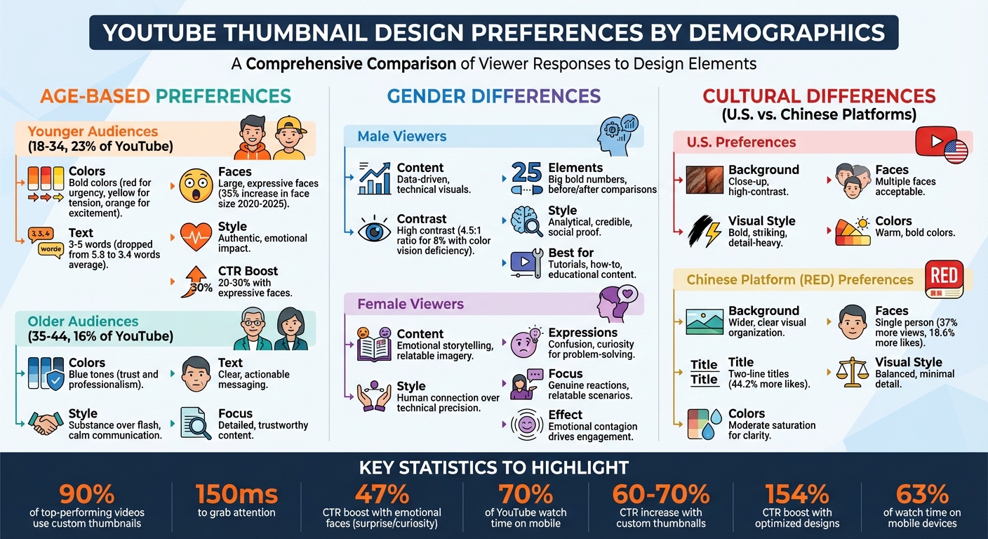
YouTube Thumbnail Design Preferences by Demographics: Age, Gender, and Culture
Age-Based Preferences in Thumbnail Design
Younger Audiences: Bold and Entertaining Designs
For viewers aged 18–34, thumbnails need to grab attention instantly. Between 2020 and 2025, the average word count on thumbnails dropped from 5.8 to 3.4, while face sizes increased by 35%. This trend reflects the growing emphasis on emotional impact, inspired by the success of creators like MrBeast, who use close-up facial expressions to forge instant connections.
Bold colors play a key role in stopping the scroll. Red conveys urgency, yellow hints at tension, and orange radiates excitement. Expressive faces - showing shock or excitement - can boost click-through rates by an impressive 20–30%. Among YouTube's largest demographic, the 25–34 age group (making up 23% of the platform's audience), authenticity often trumps polished visuals. Real reactions tend to resonate more than overly staged designs.
With 70% of YouTube watch time occurring on mobile devices, thumbnails must be mobile-friendly. Large faces, bold fonts, and clean backgrounds ensure the design remains effective even on smaller screens. A successful thumbnail should communicate one clear idea, using minimal text (3–5 words) and strong subject-background contrast. While this simplicity benefits all viewers, it’s especially crucial for younger audiences.
By contrast, older viewers prioritize clarity and actionable content.
Older Audiences: Clear and Simple Designs
Unlike their younger counterparts, older viewers (ages 35–44, accounting for 16% of YouTube's audience) value clarity and substance over flashy visuals. They gravitate toward thumbnails that promise detailed, actionable content, favoring trust and authority over dramatic or sensational designs.
For this demographic, blue tones work particularly well, as the color is often associated with trust and professionalism. Thumbnails targeting older audiences don’t need to shout for attention; instead, they should clearly and calmly communicate the video's purpose. High contrast remains essential for visibility, but the overall design leans toward straightforward communication rather than relying on emotional triggers.
sbb-itb-b59debf
The State of YouTube Thumbnails 2025: What's Working Now
Gender Differences in Thumbnail Engagement
When designing thumbnails, understanding gender-specific preferences can help fine-tune your approach by A/B testing thumbnails for better engagement.
Male Viewers: Driven by Data and Clarity
Thumbnails aimed at male audiences often succeed when they highlight analytical content and technical details. Elements like big, bold numbers or "Before vs. After" comparisons work well because they convey actionable insights and credibility. Including social proof, such as credentials or statistics, further reinforces trust, making these designs ideal for tutorials, how-to videos, and educational content.
It's also important to consider color vision deficiencies, which affect about 8% of males (compared to just 0.4% of females). To ensure accessibility, use a 4.5:1 contrast ratio and incorporate icons or other visual cues that don’t rely solely on color. High-contrast text and clear visual hierarchy are far more effective than designs heavily dependent on color.
For gaming-related content, which often appeals to male viewers, high-energy and exaggerated styles - like those popularized by creators such as MrBeast - tend to resonate. On the other hand, men drawn to documentary or educational videos prefer thumbnails that feel understated and authentic, favoring credibility over dramatic flair. Strategic use of facial placement can also guide attention - positioning a face to look toward a key element or message helps direct the viewer’s focus toward the central question or topic.
Female Viewers: Emotional and Relatable Designs
Female audiences are more likely to engage with thumbnails that focus on emotional storytelling and relatable imagery. Thumbnails featuring expressions like confusion or curiosity work particularly well for problem-solving content, as they reflect the viewer’s own uncertainties and encourage a sense of connection. This effect, often referred to as "emotional contagion", allows viewers to subconsciously mirror the emotions displayed on the thumbnail.
While expressive faces improve click-through rates (CTR) across genders, female viewers generally respond more strongly to visuals that emphasize human connection rather than technical precision. Relatable scenarios and genuine reactions often outperform thumbnails that are overly polished or focused solely on numbers and data. The goal is to craft a thumbnail that tells a story or poses a question viewers can personally connect with, rather than simply presenting information.
How Culture Affects Thumbnail Design
Thumbnail design isn't a one-size-fits-all approach - what grabs attention in one part of the world might fall flat elsewhere. Cultural nuances play a big role in how people perceive elements like color, layout, and visual focus, making it essential to consider these factors when aiming for global engagement.
Cultural context complements demographic data, refining how thumbnails connect with audiences across different regions.
U.S. vs. Chinese Thumbnail Design Trends
When comparing U.S. and Chinese thumbnail design, the differences are striking. Research analyzing 30 videos from the Chinese platform RED found that thumbnails featuring a single person outperformed group-focused thumbnails by 37% in average views and 18.6% in likes. Additionally, two-line titles on Chinese platforms generated 44.2% more likes than one-line titles.
The visual approach also differs significantly. Chinese platforms like RED lean toward thumbnails with wider backgrounds and neatly arranged visuals. In contrast, U.S. creators often use close-up shots and high-contrast designs to grab attention. These choices reflect broader cultural preferences - Chinese audiences often favor balanced, harmonious layouts, while U.S. viewers are drawn to bold, detail-heavy visuals.
| Aspect | U.S. Preferences | Chinese Platform (RED) Preferences |
|---|---|---|
| Background Distance | Close-up, high-contrast | Wider, with clear visual organization |
| Number of Faces | Multiple faces acceptable | Single person emphasized |
| Title Lines | Varies | Two-line titles perform better |
| Visual Complexity | Bold, striking designs | Balanced, with minimal detail |
| Color Saturation | Warm, bold colors preferred | Moderate saturation for clarity |
These differences highlight the importance of adapting to cultural expectations. While some design principles may work universally, the finer details - like layout, color, and text formatting - need to be adjusted for specific regions. Testing designs and tailoring them to fit local preferences can make all the difference when reaching international audiences.
Thumbnail Features and Viewer Engagement Metrics
The Impact of Faces, Colors, and Brightness
Diving deeper into design elements, it's clear that facial expressions, color choices, and brightness play a crucial role in driving viewer engagement. A striking statistic: 90% of top-performing YouTube videos use custom thumbnails. This alone highlights how intentional design choices can set videos apart.
Facial expressions are particularly influential. Thumbnails showcasing surprised or happy faces appear in about 27% of successful videos. Meanwhile, emotions like sadness or disgust are far less common, showing up in fewer than 2% of thumbnails. These trends also vary by genre. For instance, travel videos feature happy faces 53.69% of the time, while fitness and sports content leans toward calm expressions in 37.38% of thumbnails.
Strong emotional expressions can have a significant impact, boosting click-through rates (CTR) by as much as 30%. Take Mark Rober, for example - 57.14% of his thumbnails include a small, happy face, while SSSniperWolf favors a surprised look in 70% of her thumbnails.
Color choices also grab attention - sometimes in as little as 200 milliseconds. Different colors evoke different responses: red adds urgency and excitement (great for gaming or breaking news), blue builds trust (ideal for tech or business), and yellow conveys optimism (perfect for comedy or lifestyle content).
These insights make it clear that design elements like expressions and colors aren't just aesthetic choices - they're tools for boosting engagement.
Research Findings on Thumbnail Performance
Recent data reveals just how much thumbnail design influences viewer behavior. Custom thumbnails can increase click-through rates by 60–70%, and optimized designs can lead to an impressive 154% boost in CTR compared to generic or default thumbnails.
In September 2023, YouTube creator MrBeast shared surprising results from using A/B testing tools:
"I closed my mouth on all my thumbnails and the watch time went up on every video lol. We must not rest until mouths are closed in everyone's thumbnails."
His findings showed that he appears happy in 36.36% of his thumbnails and fearful in 18.18%. Meanwhile, the Sidemen demonstrated how aligning emotions with content themes can pay off. In a "Come Dine With Me" parody, they used a disgusted expression to match the video’s burnt pizza theme. This break from the usual positive expressions earned the video 6.1 million views in just two weeks.
With mobile devices accounting for 63% of YouTube watch time, ensuring thumbnails are mobile-friendly is critical. Large, legible text - at least 60pt font size - and high contrast are essential for readability. Moreover, concise text overlays (just 3–7 words) can boost CTR by 15%, making them a must for creators aiming to maximize visual impact.
These numbers highlight how thoughtful thumbnail design not only attracts clicks but also aligns viewer expectations with the video’s content, creating a seamless experience.
How to Optimize Thumbnails for Specific Demographics
Using AI Tools Like ThumbnailCreator
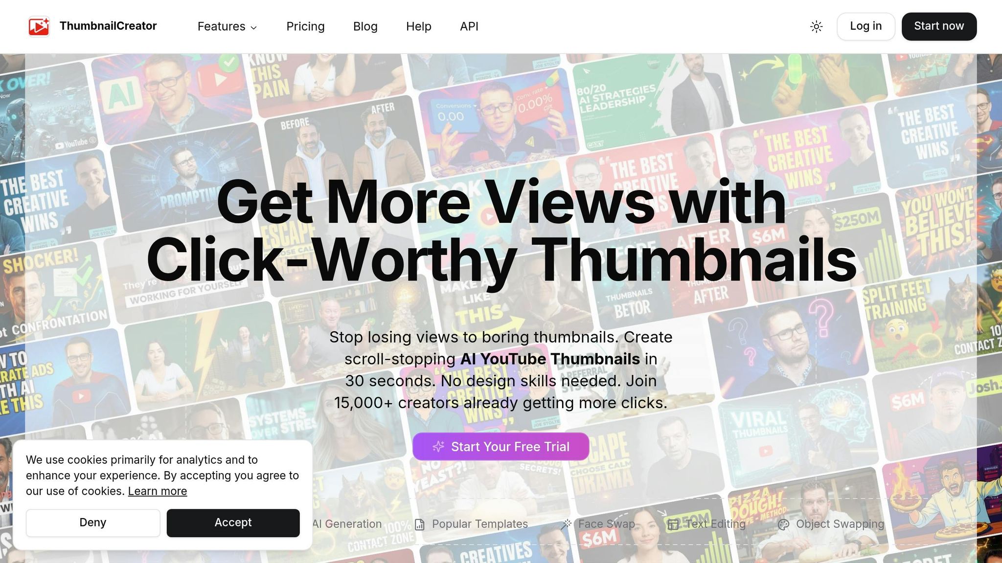
AI tools have made it easier than ever to create thumbnails tailored to specific audiences - no design expertise required. With the AI thumbnail market valued at $482.6 million in 2024 and expected to grow to $3.95 billion by 2033 (at a 23.7% annual growth rate), creators are increasingly turning to these tools for an edge.
One standout option is ThumbnailCreator (https://thumbnailcreator.com), which provides features aimed at optimizing thumbnails for different demographics. Its AI analyzes video content to recommend the most effective visuals, while features like face and object swapping allow creators to test and refine designs quickly.
A great example comes from December 2023, when podcast creator Facu Rubin revamped a Spanish audiobook narration thumbnail using Midjourney. He replaced a basic design with a dark, gothic aesthetic to attract fiction enthusiasts. The results? Over 90 days, the video saw a 33% boost in impressions and a 167% jump in clicks.
"The adoption of AI-powered solutions enables automated, high-quality thumbnail generation at scale, reducing manual effort and ensuring consistency."
– Raksha Sharma, Author, Growth Market Reports
While AI tools handle much of the heavy lifting, combining them with thoughtful design strategies can help you connect even more effectively with your target audience.
Practical Tips for Designing Demographic-Specific Thumbnails
Once you've used AI to create a baseline thumbnail, fine-tune it with these design tips to better align with your audience's preferences:
- For younger audiences: Use warm colors like red and orange, paired with close-up shots of faces showing dramatic expressions. This approach can increase click-through rates by 20–30%.
- For older viewers: Opt for minimalist layouts with blue tones, which convey trust and professionalism.
Apply the Rule of Thirds by placing key elements - like faces or text - at intersection points on a grid rather than centering them. This adds visual interest and naturally guides the viewer's attention. Keep text minimal and bold, limiting it to 3–5 words, so it remains clear on mobile devices, where 63% of watch time occurs. To make your thumbnail stand out, place bright subjects against dark or blurred backgrounds; this contrast ensures the main elements pop, even after compression.
"Your thumbnail and title should work as a team. The thumbnail creates curiosity, the title gives context."
– Lydia Sweatt, Blog Manager, vidIQ
Finally, use A/B testing tools to experiment with different designs. Test variations in facial expressions, color schemes, and text placement to identify what resonates most with your audience. With custom thumbnails used in 90% of top-performing videos, investing in demographic-specific tweaks can pay off in a big way.
Conclusion
Thumbnails are more than just images - they're powerful marketing tools that can significantly impact viewer engagement and clicks. Studies reveal that 90% of top-performing videos rely on custom thumbnails instead of auto-generated ones. Custom designs allow creators to connect emotionally with specific audiences, making them a crucial component for growing a channel.
It’s important to remember that audience preferences vary. For example, younger viewers often gravitate toward bold colors and dynamic visuals, while older audiences may prefer clean, minimalist designs with a professional feel. Additionally, factors like gender and cultural differences highlight the need for tailoring thumbnails to different demographics to improve click-through rates and watch time.
"Custom thumbnails leverage sophisticated understanding of viewer perception, using nuanced design elements that speak directly to audience expectations and emotional landscapes." - ViewsMachine
The good news? You don’t need to be a design expert to create effective thumbnails. Tools like ThumbnailCreator and A/B testing comparisons can help you refine your designs. The goal is to spark curiosity and create visual tension without resorting to misleading clickbait. This approach builds trust with your audience and improves your performance in YouTube’s algorithm over time.
FAQs
How do I know which thumbnail style my audience prefers?
To figure out which thumbnail style clicks with your audience, try A/B testing a few designs and track their performance over a span of 7–14 days. Pay close attention to metrics like click-through rates (CTR) and dig into demographic details - think age, gender, and location. For instance, bold colors and expressive faces might grab the attention of younger viewers, while older audiences could lean toward cleaner, simpler designs. Experimenting with these elements will help you discover what truly connects with your audience.
What should I A/B test first in my thumbnails?
Start by experimenting with one variable at a time - color, text, or images - to determine which design grabs the most attention. Think about what appeals to your audience: bold, vibrant colors might catch the eye of younger viewers, while high-contrast action images could resonate more with men. By testing these details, you can uncover what connects with your audience and boost your click-through rate in the process.
How can I tailor thumbnails for U.S. vs. Chinese viewers?
When creating thumbnails for U.S. and Chinese audiences, it's essential to consider their preferences and habits. For U.S. viewers, bold colors and imagery that resonates with local culture - like cars - tend to grab attention. On the other hand, Chinese viewers often lean toward minimalist designs or visuals that reflect their cultural context.
Demographics play a big role too. Younger audiences are drawn to bold and dynamic visuals, while older viewers typically appreciate cleaner and simpler designs. And since most people watch on their phones, make sure your thumbnails look great on small screens.
Finally, don’t skip A/B testing. This lets you experiment with different designs to see what works best for your audience. A little testing can go a long way in improving engagement.