

Study: AI Color Optimization Boosts CTR
Want more clicks on YouTube? It’s all about your thumbnail. Research shows that AI-optimized thumbnails can increase click-through rates (CTR) by up to 45%, especially when focusing on color contrast and clarity. High-contrast designs (7:1 ratio or higher) average a 9.2% CTR, compared to just 2.9% for low-contrast designs. Pairing bold colors like yellow and black or red and yellow can further elevate performance.
Key takeaways:
- Contrast is king: Accounts for 73% of CTR variance.
- Mobile matters: Over 70% of YouTube traffic comes from mobile, so thumbnails must pop at small sizes.
- AI + human edits win: AI alone averages a 3.2% CTR, but with manual tweaks, CTR jumps to 7.8–8.7%.
- Color psychology works: Red outperforms blue by 23%, and complementary color pairs boost CTR by 40% faster recognition.
Bottom line? Thumbnails that grab attention with bold colors, strong contrast, and simple layouts outperform "pretty" designs. AI tools like ThumbnailCreator speed up the process, but human oversight ensures the best results.
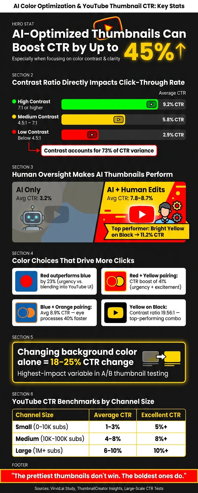
AI vs. Human Thumbnail Optimization: CTR Stats That Matter
I Tested AI Thumbnails vs Manual Design (CTR Results)
sbb-itb-b59debf
Research Overview: Why Thumbnail Design Affects CTR
Thumbnails are the unsung heroes of video performance, driving up to 90% of click-throughs. Think of a thumbnail as a billboard - its job is to instantly communicate value. If it doesn’t grab attention in a split second, viewers will scroll right past it. In fact, a well-designed thumbnail can matter even more than the video title or the channel's reputation. This research dives into the neuropsychological factors that shape viewer behavior, offering insights into why some designs succeed while others fail.
How Visual Appeal Shapes Click Behavior
Our brains are wired for quick decisions. Using peripheral vision, we instinctively notice things like contrast and movement. That's why thumbnails with high contrast, clear visuals, and emotional appeal dominate. These elements reduce the mental effort needed to understand what the video is about, making it easier for viewers to decide to click.
Take human faces, for example. Thumbnails featuring faces with strong emotions - like surprise, fear, or excitement - perform 83% better than neutral or faceless images. Why? Because emotional expressions are magnetic; they instantly tell a story and spark curiosity.
On the flip side, common thumbnail mistakes that lack clarity or emotional cues make viewers work harder to figure out the video's purpose. This extra cognitive load often results in them skipping over the content entirely.
YouTube CTR Benchmarks and Key Factors
Benchmark data highlights how thumbnail design directly impacts click-through rates (CTR). Here's a breakdown:
| Channel Size | Average CTR | Excellent CTR |
|---|---|---|
| Small (0–10K subs) | 1–3% | 5%+ |
| Medium (10K–100K subs) | 4–8% | 8%+ |
| Large (1M+ subs) | 6–10% | 10%+ |
While the overall platform average hovers around 3–4%, thumbnails that are thoughtfully designed can push CTRs into the 8–10% range or higher. This performance gap isn’t just about content quality - it’s a testament to the power of strategic design.
CTR matters because YouTube's algorithm views it as a trust signal. Videos with strong early click-through data are more likely to be promoted in Browse and Suggested feeds. On the flip side, if your CTR falls below 4%, or worse, under 3% in the first 48 hours, it’s a clear sign that your thumbnail needs a redesign.
Evidence: How Color and Contrast Affect CTR
Research shows that color and contrast adjustments can significantly impact click-through rates (CTR). Contrast, in particular, plays a major role, accounting for 73% of CTR variance in large-scale tests.
Why High-Contrast Thumbnails Perform Better
Thumbnails with high contrast (7:1 or higher) consistently outperform lower-contrast designs. Data indicates that high-contrast thumbnails average a 9.2% CTR, compared to just 2.9% for low-contrast designs (contrast below 4.5:1). This is especially crucial for mobile users, where thumbnails are often displayed at small sizes, making low-contrast details harder to see.
| Contrast Level | Contrast Ratio | Average CTR |
|---|---|---|
| High Contrast | 7:1 or higher | 9.2% |
| Medium Contrast | 4.5:1 to 7:1 | 5.8% |
| Low Contrast | Below 4.5:1 | 2.9% |
Source: Large-scale CTR tests
High-contrast designs stand out on fast-scrolling mobile screens by engaging peripheral vision, ensuring they grab attention quickly.
Color psychology in thumbnail design
Not all colors are created equal when it comes to driving clicks. For instance, red outperforms blue by 23%, as it creates a sense of urgency, while blue tends to blend into YouTube's interface. Pairing red with yellow boosts performance even further, increasing CTR by 41% by evoking urgency and excitement.
Complementary color combinations also perform well. For example, blue and orange thumbnails average an 8.9% CTR, as the human eye processes these contrasting pairs 40% faster than analogous color schemes. These findings highlight the importance of bold color choices in creating attention-grabbing thumbnails. While they may not always look "polished", such combinations are often more effective for platforms like YouTube.
"AI creates what looks professional. But 'professional' doesn't equal 'clickable' on YouTube." - Louis Vick, Virvid.ai
What A/B Testing Reveals About Thumbnail Performance
When testing thumbnail designs, background color emerges as the most impactful variable. Adjusting it alone can lead to a CTR change of 18–25%, making it the top priority for A/B testing.
"Changing the background color produces the largest average CTR change (18–25%) in A/B tests, making it the highest-impact variable to test." - ThumbnailCreator Insights
A study of 240 thumbnails across 60 faceless YouTube channels revealed stark differences between AI-generated designs and manually optimized ones. While AI-generated thumbnails averaged a 3.2% CTR, manually optimized designs hit 8.7% CTR. The top-performing thumbnail featured bright yellow (#FFFF00) text on a black (#000000) background, achieving an impressive 11.2% CTR.
Case Studies: AI Color and Contrast Optimization in Practice
These case studies highlight how AI can transform thumbnail design, showing its potential to boost click-through rates (CTR) through high-contrast, color-optimized visuals.
Examples of AI-Optimized Thumbnails
In December 2025, BananaThumbnail conducted a two-month test, replacing human-designed thumbnails with AI-enhanced versions for 20 videos. The AI focused on refining face positioning, lighting, and background blending. The outcome? A 38% higher CTR on average compared to the original designs, with the most noticeable improvements in the tech and gaming categories.
"AI tools can cut that design time down from hours to literally about 30 seconds... allowing you to A/B test without the burnout." - Curtis, Founder & Creative Director, BananaThumbnail
The key to success was blending AI's efficiency with human oversight, ensuring adjustments to contrast and composition were guided by human intuition. This hybrid approach aligns with earlier findings stressing the need for human input in AI-driven processes.
AI isn't just for new designs - it also breathes life into older thumbnails, helping to revive engagement and improve CTR.
How AI Revives Older Video Thumbnails
For older videos, AI-driven updates focusing on high-contrast vs. low-contrast adjustments can significantly enhance viewer engagement. On average, these updates boost CTR by 45%, making large-scale thumbnail refreshes a practical strategy.
The Virvid.ai study (January–March 2026), led by Louis Vick, tested AI optimization across 60 faceless YouTube channels in niches like psychology, true crime, and finance. By using AI-generated base images and enhancing them with high-contrast color pairings - such as bright yellow on black with contrast ratios as high as 19.56:1 - along with simplifying text to just three words, the average CTR rose from 3.2% to 7.8%. The best-performing thumbnails reached a 12.3% CTR. Notably, high-contrast designs outperformed pastel-based thumbnails by a staggering 127% in CTR.
"The 'prettiest' color combinations (pastels, subtle tones) perform worst. The 'garish' combinations (neon yellow on black) perform best." - Louis Vick, Virvid.ai
The consistent insight? AI works best as a tool to create a strong foundation. When paired with human creativity to amplify contrast, simplify layouts, and evoke emotional responses, it delivers real results in driving clicks.
How AI Optimizes Color and Contrast in Thumbnails
Case studies show that AI-optimized thumbnails can significantly boost click-through rates (CTR). But how does AI achieve this? Let’s dive into the core techniques that make these improvements possible.
AI Methods for Thumbnail Color and Contrast Adjustment
Advanced thumbnail optimization ensures images grab attention instantly. A key method here is saliency prediction, where AI identifies the most eye-catching focal points in an image. These are the areas that viewers notice first during rapid scrolling, ensuring the thumbnail conveys its message in a split second.
Another essential technique is feed-aware color analysis, which evaluates how colors appear against YouTube’s white desktop and dark mobile backgrounds. Colors that pop in one context might fade in another. For instance, AI might suggest swapping a muted blue for a vibrant yellow-orange to ensure the thumbnail stands out, regardless of the viewing environment.
Contrast plays a massive role in this process. In fact, contrast accounts for 73% of the variation in YouTube CTR. AI tools fine-tune contrast levels, often pushing them beyond what traditional designers might attempt. Techniques like S-curve adjustments and levels manipulation ensure that thumbnails maintain sharp blacks and bright highlights, even after compression. AI also compensates for 4:2:0 chroma subsampling, which can dull colors during compression. For example, it selects specific red shades that stay vivid, preventing red gradients from losing their impact.
How AI Maintains Text Readability and Visual Consistency
While high contrast is critical, it alone doesn’t guarantee readable text. AI ensures text legibility by adhering to WCAG (Web Content Accessibility Guidelines) contrast ratios, aiming for top-tier "AAA Excellent" ratings. For example, black text on a yellow background achieves a 16.0:1 contrast ratio, meeting these standards. It also prioritizes sans-serif fonts like Impact or Bebas Neue in sizes above 200pt, which are highly readable on mobile. Thumbnails with fonts sized at 200pt or larger average a 9.8% CTR, compared to just 2.8% for fonts below 70pt.
For creators focusing on long-term growth, AI promotes signature palettes, or consistent color schemes, across all thumbnails. A study of MrBeast’s thumbnails (500 from 2018 to 2024) revealed a dramatic increase in consistency - from 54% in 2018 to 96% in 2024. His team frequently used a "Signature Red" (#FF0000) in 89% of thumbnails and "Contrast Yellow" (#FFD700) in 72%. This consistency drove a 15–20% improvement in CTR by strengthening brand recognition.
"Consistency beats variety in thumbnails. When viewers see your color palette, they should immediately know it's your video before reading anything." - Asad, Lead Software Engineer, WeenyTools
Tools like ThumbnailCreator make these principles accessible to creators. They combine AI-driven design, text editing, and visual adjustments, allowing users to create high-contrast, visually cohesive thumbnails - no advanced design skills required.
Benefits and Limitations of AI Color Optimization
Key Benefits of AI-Based Thumbnail Optimization
One of the biggest perks of AI-powered thumbnail optimization is speed. When creators use a hybrid approach - letting AI generate a base image and then fine-tuning it manually - they can cut design time by more than 50% compared to fully manual methods, all without sacrificing performance.
The impact on click-through rates (CTR) is also quantifiable. For example, AI tools can identify brand colors vs. optimized color combinations, such as bright yellow on black, which can achieve an 11.2% CTR. Additionally, AI offers scalability that manual methods can't match. Creators with extensive video libraries can use AI to audit and update older thumbnails in bulk, breathing new life into underperforming content.
Still, while the benefits are clear, AI-driven optimization isn't without its challenges.
Limitations and Challenges to Keep in Mind
Despite its advantages, AI optimization has some notable drawbacks. The main issue? A disconnect between what AI typically generates and what actually grabs viewers' attention. AI tools often prioritize visual harmony - balanced layouts, realistic lighting, and pleasing color schemes. But on platforms like YouTube, especially in its mobile-first environment, success often depends on bold contrast, simplicity, and vibrant colors that stand out even at a tiny 120×90 pixel size.
The numbers back this up. Purely AI-generated thumbnails tend to underperform, averaging a 3.2% CTR. However, when creators add their own edits, CTR jumps to 7.8–8.7%, avoiding a documented 12% penalty for unedited AI visuals.
"AI can create the raw visual, but CTR optimization requires strategic human intervention." - Louis Vick, Author, Virvid.ai
Another issue is the "uncanny valley" effect. AI-generated faces often feel unnatural, and thumbnails featuring real human faces with exaggerated emotions perform 34% better. AI also struggles with text, frequently creating fonts that are either too small or overly decorative, making them unreadable in thumbnail form on mobile devices.
In short, AI serves as a powerful foundation but isn't a standalone solution. Tools like ThumbnailCreator help bridge the gap by combining AI's efficiency with manual editing capabilities - allowing creators to tweak text, swap faces, and make the bold adjustments needed for maximum clarity and contrast. These human touches are what ultimately make thumbnails pop.
Conclusion: What AI Color Optimization Means for YouTube Creators
Research highlights that color and contrast are game-changers for performance. In fact, contrast alone accounts for 73% of the variance in click-through rates (CTR). To put that into perspective, a low-contrast thumbnail might only achieve a 2.9% CTR, while a high-contrast one can soar to 9.2%. That’s a dramatic difference in potential viewership.
Here’s the key takeaway: AI works best when combined with human creativity. Thumbnails generated entirely by AI average a 3.2% CTR. However, when creators make strategic manual edits, CTR jumps to an impressive 7.8–8.7%. A/B testing further reveals that changing background colors can boost CTR by 18–25%. These numbers show how small, intentional adjustments can make a big impact.
If you're ready to take advantage of these insights, ThumbnailCreator is a tool designed with this hybrid approach in mind. It combines AI’s speed and precision with the flexibility of manual adjustments. The AI provides a solid starting point, while features like text editing, face swapping, and object swapping let you fine-tune your thumbnails for maximum impact. The result? A data-driven, repeatable process that doesn’t require design expertise but delivers results.
At the end of the day, aim for thumbnails that grab attention - not just ones that look pretty. Sometimes, the designs that feel a little bold or unconventional are exactly what makes someone pause and click.
FAQs
What contrast ratio should my thumbnails aim for?
When it comes to boosting click-through rates (CTR), a contrast ratio of 7:1 or higher is a game-changer. Thumbnails designed with this level of contrast consistently outperform those with lower ratios.
Here’s the breakdown: While the Web Content Accessibility Guidelines (WCAG) suggest a minimum contrast ratio of 4.5:1 for text readability, going beyond this can make a huge difference. Thumbnails with a 7:1 or higher ratio see an impressive average CTR of 9.2%, compared to just 2.9% for designs falling below the 4.5:1 threshold.
Need help ensuring your thumbnails meet these standards? ThumbnailCreator’s Color Enhancer is a handy tool to fine-tune your designs for maximum impact.
Which color combinations get the most clicks?
The most effective YouTube thumbnails make use of high contrast to grab attention. Studies reveal that pairing red and yellow can boost clicks by 41%, while blue and white combinations are 23% more engaging for professional content. For gaming and tech channels, black backgrounds with neon accents outperform others by 35%. Overall, thumbnails using complementary colors see 29% more clicks compared to monochromatic designs. Try these contrasting combinations to make your thumbnails stand out.
How can I A/B test thumbnail colors without affecting my video's performance?
To test thumbnail colors effectively, start by creating several versions where only the color scheme is adjusted - keeping everything else the same. This ensures the results focus solely on how color impacts performance. Aim for each variation to receive between 1,500 and 2,000 impressions for accurate data.
Monitor the results over the first 48 hours, paying close attention to click-through rates (CTR). This will help you pinpoint which color scheme resonates most with your audience.
For an easier workflow, consider using AI tools like ThumbnailCreator. These tools can simplify the process and help you fine-tune your thumbnails to boost CTR without negatively affecting overall engagement.