
How Colors in Thumbnails Show Personality
Colors in thumbnails do more than catch the eye - they shape how viewers feel about your content and influence click-through rates. Here's what you need to know:
- Colors evoke emotions instantly. For example, red signals urgency, blue builds trust, yellow conveys positivity, and purple suggests creativity.
- First impressions happen fast. Viewers decide to click within 0.1 seconds, and thumbnails with the right colors can boost clicks by up to 30%.
- Consistency builds recognition. Using a signature color palette helps your content stand out in crowded feeds, especially when following YouTube thumbnail trends.
- Match colors to your niche and personality. Gaming channels often use neon greens and blues, while financial content benefits from green tones.
- Cultural context matters. Colors like red or white hold different meanings across regions, so tailor your choices to your audience.
Tools like ThumbnailCreator simplify the design process with AI-powered suggestions and templates, helping you test and refine your thumbnail strategy for better engagement.
Master Color Theory for YouTube Thumbnails
sbb-itb-b59debf
Color Psychology Basics for Thumbnails
Color Psychology Guide for Thumbnails: Emotions and Brand Personality
How Colors Affect Viewer Emotions
Colors have a powerful way of influencing emotions and reactions almost instantly. For instance, red can make viewers feel a sense of urgency or excitement by increasing heart rate, while blue has a calming effect, often associated with trust and stability. What’s fascinating is that our brains perceive colors before we even process text or images - this happens in just fractions of a second.
"Color isn't decoration. It's a weapon." - YouTubeToolsHub
The meaning of colors can also vary depending on cultural context. For example, red is seen as a symbol of luck in China but often conveys danger or urgency in Western cultures. Similarly, white might represent purity in the United States but is linked to mourning in parts of Asia. If your audience spans multiple regions, it’s essential to consider these cultural nuances to avoid sending the wrong message by making common design errors.
This immediate emotional connection is why your choice of colors should align with your brand’s identity.
Why Colors Should Match Your Brand
The emotional impact of colors makes it crucial to use a consistent color palette that reflects your brand. A signature palette not only helps viewers recognize your content in crowded feeds but also builds trust over time. This balance between clickbait and authentic thumbnails is key to long-term viewer loyalty. When people see familiar colors tied to content they’ve enjoyed before, they’re more likely to click quickly because they already associate those colors with value.
Different niches often come with their own "visual language" that viewers expect. For example, gaming channels often feature bold neon greens and electric blues, while educational channels lean toward more subdued tones like navy or forest green. Matching your color choices to your personality and content type helps communicate your value at a glance - especially since viewers typically decide whether to click in just 1–3 seconds.
"The right colors are like a secret language, nudging viewers to click, watch, and subscribe." - 1of10.com
Picking Colors That Reflect Your Personality
Colors have a way of speaking for you before you even say a word. They set the tone, convey emotions, and give a glimpse into your personality. Think of color as your visual voice - it introduces your identity before anyone reads your title or clicks on your video. Here’s how different colors can reflect specific aspects of who you are.
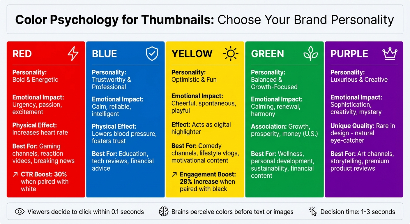
Red: Bold and Energetic
Red is all about making a statement. It’s the color of passion, urgency, and excitement, and it even has a physical effect - it can increase heart rate and create a sense of urgency. If you’re the type of person who thrives on energy and action, red is your go-to. It’s perfect for gaming channels, reaction videos, or breaking news - basically, any content that demands attention.
That said, red can be overpowering if overused. Pairing it with white, for instance, can create balance while boosting click-through rates by 30%. Use it strategically to amplify your high-energy vibe without overwhelming your audience.
Blue: Trustworthy and Professional
Blue exudes calmness, reliability, and intelligence. It’s a universal favorite for a reason: it lowers blood pressure and fosters trust. If your content focuses on education, tech reviews, or financial advice, blue helps establish you as a credible and professional voice.
"We chose that specific aubergine purple because it stood out dramatically in the enterprise software landscape, which was dominated by blues. We wanted something that felt different - professional but not corporate, distinctive but not frivolous" - Stewart Butterfield, former CEO of Slack.
Blue is a staple for creators looking to build authority, offering a sense of stability that viewers naturally gravitate toward.
Yellow: Optimistic and Fun
Yellow is like a ray of sunshine - it’s cheerful, spontaneous, and playful. It grabs attention without the intensity of red, acting as a digital highlighter. If your personality is approachable and upbeat, yellow instantly communicates that vibe. It’s a great choice for comedy channels, lifestyle vlogs, or motivational content that aims to spread positivity.
"We selected it because we wanted to signal that email marketing could be approachable and even fun at a time when most marketing software felt intimidatingly technical" - Ben Chestnut, former CEO of Mailchimp.
Pairing yellow with black creates a powerful contrast that drives engagement, with studies showing a 28% increase in interaction rates. Just be cautious about using yellow on light backgrounds - it works best when paired with darker elements for readability.
Green: Balanced and Growth-Focused
Green is the color of balance and renewal. It’s calming, easy on the eyes, and naturally associated with growth and harmony. If your content centers on wellness, personal development, sustainability, or financial growth, green reinforces those themes beautifully.
"The iconic Starbucks green was a deliberate choice to represent a different kind of coffee experience... We wanted to signal that Starbucks wasn't just another coffee shop - it was a third place between work and home" - Howard Schultz, former CEO of Starbucks.
In the U.S., green also ties strongly to money and prosperity, making it a solid choice for content about investing, budgeting, or wealth-building.
Purple: Luxurious and Creative
Purple blends the stability of blue with the energy of red, creating a sense of luxury, creativity, and mystery. If your personality leans toward the artistic, exclusive, or spiritual, purple helps you stand out. It’s particularly effective for art channels, storytelling, and premium product reviews - basically, any content where sophistication or originality is key.
Purple is relatively rare in design, which makes it a natural eye-catcher in crowded feeds. It signals that your content offers something special, helping you connect with viewers who value a fresh perspective.
Choosing between brand colors vs. CTR-optimized colors doesn’t just reflect your personality - it also shapes how your audience feels about your content. Use these hues thoughtfully to strengthen that connection and make a lasting impression.
Using ThumbnailCreator to Apply Color Psychology
ThumbnailCreator makes it easy to use color psychology in your thumbnails, helping you create designs that reflect your style and increase engagement.
AI-Powered Color Customization
With ThumbnailCreator's AI, you can bring your vision to life through simple text prompts. Describe the mood you're aiming for with words like "energetic", "professional", "luxurious", or "fun", and the AI will generate colors and imagery that fit your idea perfectly. For instance, if you're designing thumbnails for a high-energy gaming channel, you might input "bold, red, urgent" to evoke that adrenaline-packed vibe.
You can also upload your logo or photo, allowing the AI to analyze your brand's visual identity and suggest matching color schemes. The AI identifies key focal points with over 90% accuracy, fine-tuning contrast and colors to guide viewers' attention effectively. This data-driven approach has been shown to increase click-through rates by 25–30%.
If you're short on time, ThumbnailCreator also offers pre-designed templates to get started quickly.
Working with Pre-Designed Templates
ThumbnailCreator's templates are a great shortcut for creating thumbnails that connect with your audience. The AI offers tailored suggestions based on your niche - whether that's gaming, education, vlogging, or marketing - and ensures the color schemes align with your audience's preferences. From there, you can tweak the palette to match the emotion you want to convey: red for urgency, blue for trust, yellow for cheerfulness, green for growth, or purple for creativity .
High contrast vs low contrast is a key consideration for making your thumbnails stand out. For example, light text on dark backgrounds grabs attention during the critical 0.1-second decision window . ThumbnailCreator's built-in color correction automatically adjusts brightness and contrast, keeping your designs vibrant and eye-catching. You can create 1920×1080 thumbnails in just 5–15 seconds, quickly experimenting with different color combinations.
Testing Colors for Better Click-Through Rates
Choosing the right colors is not a one-and-done task - it requires ongoing testing and adjustment. ThumbnailCreator makes this easy by enabling you to generate multiple color variations for A/B testing. Focus on testing one element at a time, like the background or text color, to get clear insights into what works best . Aim for at least 1,000 impressions per variation before deciding on the winner.
Thumbnails with bold, high-contrast colors (like yellow or orange) and human faces can increase click-through rates by 30% and 38%, respectively . Don’t forget to preview your designs on mobile screens - since 70% of YouTube traffic comes from mobile devices, vibrant and high-contrast thumbnails are essential for readability on smaller displays .
"In the world of thumbnails, contrast is king. High-contrast images are more likely to grab attention in a sea of content." - IncRev
Your color palette should match the emotional tone of your video title. A mismatch between the two can drop CTR by as much as 40%. If your video has a strong watch time but a weak CTR, it’s a sign that your thumbnail colors might need immediate attention.
Conclusion
thumbnail color psychology does more than just grab attention - they reflect who you are and help build a lasting connection with your audience. By sticking to colors that align with your brand identity, you create instant recognition in crowded feeds. Over time, this consistency helps viewers identify your content at a glance, even before they read the title, strengthening brand recognition and trust.
"Consistency creates trust. When viewers recognize your thumbnail style before reading the title, you've built something valuable: brand equity." - Futuramo Blog
Colors also evoke emotions that align with your unique persona. Whether it’s red for boldness, blue for dependability, or purple for creativity, the right hues communicate your story before your video even starts. This emotional connection turns casual viewers into loyal fans who keep coming back.
With ThumbnailCreator, you can streamline this process using AI-driven color suggestions and performance-based insights. Test different color options, analyze what works best, and maintain visual harmony while adapting to new trends. This lets you focus on creating content while your thumbnails consistently showcase your style and personality.
FAQs
How do I choose a signature color palette for my channel?
To pick a signature color palette, focus on colors that showcase your brand’s personality and resonate with your audience. Begin with a primary color that embodies your channel’s essence, then add secondary colors that complement it and create balance. For instance, bold shades like red or yellow are great for capturing attention, while blue often symbolizes trust and dependability. Make sure your chosen palette aligns with your channel’s overall theme and stick to it consistently. This helps build recognition and creates a unified visual identity.
What color combos work best on mobile thumbnails?
Bright and high-contrast color combinations are ideal for mobile thumbnails. Pairings like red and yellow, orange and navy, or blue with white are especially effective. These combinations catch the eye and ensure your thumbnails pop on smaller screens, making them more noticeable.
How can I A/B test thumbnail colors in ThumbnailCreator?
To test how different thumbnail colors perform using ThumbnailCreator, you’ll need to create several variations with distinct color schemes. Once you’ve designed these thumbnails, use tools like YouTube’s built-in A/B testing features or other external platforms to measure their performance.
ThumbnailCreator is great for designing a variety of options, but the actual testing process happens elsewhere. This comparison helps you figure out which color scheme grabs more attention and boosts engagement.