
Color Choices That Boost Thumbnail CTR
Your thumbnail's colors can make or break your click-through rate (CTR). In less than 0.3 seconds, viewers decide whether to click or scroll past. Here's what works:
- High-contrast designs outperform low-contrast ones by 39%.
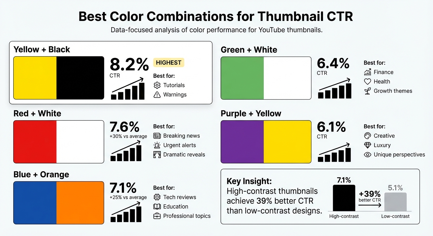
- Yellow + Black delivers the highest CTR at 8.2%, great for tutorials or warnings.
- Red + White boosts clicks by 30%, ideal for urgent or dramatic content.
- Blue + Orange increases CTR by 25%, perfect for tech and educational topics.
Key takeaways:
- Warm colors like red, orange, and yellow grab attention and evoke urgency.
- Cool tones like blue and green build trust and stability.
- Contrast is critical - bright subjects against dark backgrounds stand out.
- Tailor colors to your content type: gaming thrives on neon tones, while educational content benefits from blues and greens.
Use tools like ThumbnailCreator to test color combinations and optimize designs for mobile viewers, where over 70% of YouTube views occur. A small adjustment in color can significantly impact your CTR.
STOP Making Terrible THUMBNAILS - BETTER TRY THIS…
How Colors Affect Viewer Behavior
The human brain processes color faster than shapes or text. Warm tones like red and yellow grab attention more quickly than muted or cool shades. In those fleeting moments, color creates an emotional pull - a "curiosity gap" - that can make or break a viewer's decision to click.
This isn't just about aesthetics. Warm colors such as red, orange, and yellow trigger physical responses. Red, for instance, raises heart rates and conveys urgency. On the other hand, cool colors like blue and green promote calm and stability, which is why they're often used by finance and tech channels. Gaming channels, however, lean toward reds and oranges to spark excitement and energy.
"YouTube thumbnail best practices are not about design. In reality, thumbnails are about decisions. The viewer decides in less than a second whether to click or scroll past."
- Dewan Ysul Zulkarnain, Author, AWISEE
A study analyzing 1,247 videos showed that high-contrast thumbnails achieved a 7.1% average click-through rate (CTR), compared to 5.1% for low-contrast designs - a striking 39% gap. This is especially crucial on mobile, where over 70% of YouTube views occur, and thumbnails are displayed at much smaller sizes.
Warm Colors: Red, Orange, and Yellow
Warm colors act as emotional triggers, driving engagement and urgency.
Red is the most intense of these hues, symbolizing urgency, danger, and excitement. It’s no surprise that content creator David Kim found red thumbnails generate 30% more clicks, thanks to their ability to demand attention. This makes red a go-to choice for dramatic content, breaking news, or any video that needs an immediate reaction.
Orange strikes a balance between red’s intensity and yellow’s cheerful tone. It conveys energy and creativity without being overwhelming. This is why gaming channels, vlogs, and entertainment content frequently use orange. When paired with cool tones like blue, orange elements pop even more.
Yellow is the most visible color in the spectrum, evoking happiness, warmth, and alertness. It stimulates mental activity, making it perfect for tutorials, lifestyle videos, and positive news. Pairing yellow with black - akin to warning signs - can significantly boost engagement.
| Color | Primary Emotions | Best Content Types | Performance Impact |
|---|---|---|---|
| Red | Urgency, Excitement, Danger | Breaking News, Drama, Warnings | 30% higher clicks |
| Orange | Energy, Fun, Creativity | Gaming, Vlogs, Entertainment | 25% above average CTR (with blue) |
| Yellow | Happiness, Attention, Warmth | Tutorials, Lifestyle, Positivity | 28% higher engagement (with black) |
Cool Colors: Blue and Green
Cool tones, in contrast, focus on building trust and professionalism.
Blue is synonymous with stability, authority, and logic. Its calming nature makes it a favorite for tech reviews, educational content, and business channels. Adding a warm accent, like orange, can increase CTR by 25%.
Green symbolizes growth, health, and balance, making it ideal for finance and wellness topics. Videos featuring green elements see a 23% performance boost, reinforcing a sense of reliability and optimism.
| Color | Psychological Effect | Best Content Niches | Performance Impact |
|---|---|---|---|
| Blue | Trust, Stability, Professionalism | Tech Reviews, Education, Business | 25% higher CTR (with orange) |
| Green | Growth, Health, Balance, Safety | Finance, Wellness, Eco-topics | 23% better performance in Finance |
Contrast and Visibility
While color choice sets the tone, contrast ensures your thumbnail stands out. Thumbnails that blend into YouTube's interface are easily ignored. High contrast - like a bright subject against a dark background - creates instant visual separation.
"Contrast matters more than color choice. A bright subject on a dark background wins."
- AWISEE
Certain color pairings deliver consistently strong results. For instance, yellow with black achieves an average CTR of 8.2%, while red with white reaches 7.6%. Techniques like the "Contrast Sandwich" can further emphasize key elements: use a simple or blurred background, highlight the subject with an outline or glow, and add bold text in a contrasting color. To test your design, try the "squint test" - if the subject or text isn’t immediately clear, your contrast needs adjustment.
Color Combinations That Increase CTR
Top Color Combinations for YouTube Thumbnail CTR Performance
Building on the insights from color psychology, certain color pairings have been shown to significantly boost click-through rates (CTR). Here’s a closer look at the combinations that consistently deliver strong results, backed by recent data.
Yellow and Black take the top spot with an 8.2% average CTR, making it the most effective pairing tested. This combination grabs attention quickly, thanks to its high contrast, and is particularly effective for tutorials or warning content that needs to stand out.
Red and White comes in second with a 7.6% CTR, offering a noticeable 30% improvement over average thumbnails. This duo emphasizes clarity and urgency, making it a go-to choice for breaking news, urgent alerts, and dramatic reveals. Its visibility holds up well in both light and dark viewing modes.
Blue and Orange delivers a 7.1% CTR, outperforming average thumbnails by 25%. This pairing strikes a balance between trustworthiness and energy - blue conveys professionalism, while orange draws attention to focal points. It’s a favorite among tech reviewers and educational channels aiming to project authority without feeling too formal.
| Color Combination | Average CTR | Best Use Case |
|---|---|---|
| Yellow + Black | 8.2% | Tutorials, warnings |
| Red + White | 7.6% | Breaking news, urgent alerts, dramatic reveals |
| Blue + Orange | 7.1% | Tech reviews, education, professional topics |
| Green + White | 6.4% | Finance, health, growth themes |
| Purple + Yellow | 6.1% | Creative, luxury, and unique perspectives |
These pairings are more than just visually appealing - they’re backed by data to help your thumbnails perform better. Below, we dive into practical tips for using some of these combinations effectively.
Bright Orange with Black or White
Pairing orange with black or white creates a striking effect that’s hard to ignore. Orange conveys energy and excitement, while the contrasting background enhances visibility, especially on mobile screens.
This combination is perfect for gaming content, vlogs, and entertainment videos where a sense of fun and creativity is key. When paired with black, orange elements seem to glow, creating a dramatic effect. With white, orange pops forward, adding a sense of depth even to flat designs. To maximize impact, keep the orange bright and saturated - dull tones tend to lose their punch at smaller sizes.
Deep Blue with Yellow
Blue and yellow work well together because they’re opposites on the color wheel, creating a visually appealing contrast. Blue conveys reliability and professionalism, while yellow accents grab attention and highlight key details.
This pairing is ideal for educational and tech content, where you want to balance authority with approachability. A deep, rich blue paired with a vibrant yellow ensures that important elements stand out clearly. This combination helps creators convey trust while still drawing viewers in with a sense of urgency.
Red with White
Red and white are a classic combination for good reason - they’re bold, clean, and hard to miss. The white background provides a crisp contrast for red elements, making text and faces stand out.
This pairing drives a 30% higher CTR than average thumbnails, making it a top choice for content that demands immediate attention, like breaking news or urgent updates. It’s also highly versatile, performing equally well across devices and viewing modes, whether light or dark.
sbb-itb-b59debf
Best Colors for Different Content Types
Using color psychology effectively means going beyond general principles and aligning your palette with the specific type of content you're creating. The colors you choose should resonate with your target audience and the expectations of your niche. For instance, gaming fans look for something entirely different than viewers seeking educational or tech content. This isn't just about making things look good - it's about building trust and meeting your audience's expectations.
Gaming and Entertainment
Gaming content thrives on energy and intensity. Neon colors like electric blue, neon green, and hot pink consistently grab attention in this space. These saturated tones match the high-energy vibe gaming fans expect.
"Gaming audiences expect high-energy visuals that match the excitement of gameplay." - David Kim, Content Creator and YouTube Optimization Expert
Red and black are standout choices for gaming thumbnails, adding drama and excitement. In entertainment niches, purple and yellow have proven to boost click-through rates (CTR) by an average of 6.1%. Adding effects like RGB lighting or metallic textures can give your thumbnails a sleek, modern edge that aligns with gaming culture.
Orange is another effective choice for entertainment content. It conveys energy and fun but feels less aggressive than red . The key with these colors is saturation - bright, bold tones grab attention, while muted or washed-out hues tend to fall flat.
Educational and Tech Content
For educational and tech content, the focus shifts to colors that signal trust and clarity. Navy blue and forest green are excellent base colors, as they evoke professionalism and reliability - qualities viewers look for in these niches .
To make your thumbnails stand out, pair these foundational colors with high-contrast accents. For example, combining blue with orange or yellow creates a visually striking effect and can achieve a 7.1% CTR in tech and professional niches. Blue and green color schemes in educational thumbnails have also been linked to a 23% higher subscriber conversion rate.
Keep your palette simple - limit it to two or three colors. This ensures your design feels clean and organized rather than cluttered. To create balance, use soft whites or light grays instead of pure white, which can blend into YouTube's interface . For tech tutorials, incorporating a human face with an expressive reaction can increase CTR by 20–30% while maintaining a polished, professional look.
Strategic color choices tailored to your content type can significantly enhance contrast and improve CTR. Tools like ThumbnailCreator make it easy to apply these principles and fine-tune your design for maximum impact.
Applying Color Schemes with ThumbnailCreator
Understanding color theory is one thing; putting it into action is another. ThumbnailCreator helps bridge that gap by transforming data-driven color insights into thumbnails you can design in just seconds.
AI Color Recommendations
ThumbnailCreator’s AI takes the guesswork out of choosing colors by analyzing trending thumbnails and proven patterns to suggest combinations that drive clicks . For example, it might recommend yellow on black for warning-style content, which boasts an average click-through rate (CTR) of 8.2%, or orange on blue for tech reviews, which performs 25% above average .
To ensure readability, the AI also suggests specific colors for text overlays that work well against your chosen background. Plus, it automatically creates a "Contrast Sandwich", harmonizing the colors of your subject, background, and text to deliver a cohesive, high-contrast design.
Once you have these recommendations, you can dive into pre-designed templates that make applying them even easier.
Pre-Designed Color Templates
ThumbnailCreator offers a variety of templates designed around successful color combinations, so you don’t have to start from scratch. These templates are tailored to specific content types and optimized for performance. For instance, red and white templates are ideal for urgent content, delivering a 30% higher CTR, while orange and blue combinations work well for educational videos, performing 25% above average.
Templates also cater to niche styles: gaming thumbnails often feature electric blue, neon green, and hot pink with RGB lighting effects, while educational designs lean on navy blue and forest green with clean white accents. You’ll also find gradient backgrounds (like purple-to-pink or blue-to-teal) and neon accents that align with current 2026 design trends.
Testing Different Color Options
ThumbnailCreator makes refining your designs easier with built-in A/B testing tools. Its batch-making feature generates multiple color variations of the same thumbnail, letting you test different schemes without needing to manually redesign each one. For accurate results, keep everything else - text, layout, imagery - constant while changing only the colors .
When running tests, aim for at least 1,000 impressions and 100 clicks per variation to identify the most effective design. Allow tests to run for 2 to 4 weeks to account for daily fluctuations in viewer behavior . Since 63% of YouTube watch time happens on mobile devices, all thumbnails are optimized to ensure your color choices remain clear even on small screens.
ThumbnailCreator also offers flexible pricing plans to fit any budget. Choose from the Free Starter plan ($0.00) with 3 credits, the Starter Pack ($6.99) with 10 credits (around $0.69 per thumbnail), or the Pro Bundle ($25.99) with 50 credits (around $0.51 per thumbnail), which includes bulk processing for A/B testing multiple designs.
Conclusion
Color has a subtle yet powerful way of influencing viewers by sparking emotional reactions that guide their behavior. For instance, red can increase clicks by 30%, blue fosters professional trust, and yellow grabs attention. But here’s the real secret: contrast. High-contrast color pairings - like yellow with black or red with white - are the most impactful. This makes contrast a key factor in tailoring colors to suit your audience.
Your content’s niche plays a big role too. Gaming thumbnails tend to pop with neon greens and electric blues, while educational or financial content benefits from colors like navy blue, forest green, or green accents. Matching your color palette to your niche ensures your thumbnails connect with the right audience. Keep it simple - sticking to 2-3 dominant colors avoids clutter and keeps the focus sharp.
"Your thumbnail is not 'just an image.' It's the single most important piece of marketing you will ever create for your video. Get it wrong, and YouTube never even shows your masterpiece to anyone." - YouTube Tools Hub
Relying on guesswork won’t cut it. A/B testing is a must since your personal preferences might not match what your audience responds to. Data-backed decisions are key - every element of your design should pass the squint test for clarity and impact. Tools like ThumbnailCreator make it easy to test multiple color combinations with their batch-making feature. And with 70% of views happening on mobile devices, testing for mobile visibility is the final step in perfecting your strategy.
Start experimenting today with ThumbnailCreator's AI tools and templates to refine your color schemes. A small adjustment in colors could be the difference between a 3% and a 7% click-through rate.
FAQs
How do color choices affect YouTube thumbnail click-through rates (CTR)?
Color has a powerful influence on YouTube thumbnail click-through rates (CTR). Bold, high-contrast combinations - like red and white - tend to grab attention instantly and can boost CTR by as much as 30-45%. Beyond catching the eye, colors also evoke emotions. For example, red stirs feelings of urgency and excitement, making it perfect for fast-paced or time-sensitive content. On the other hand, blue conveys trust and professionalism, which works well for educational or business-focused videos.
The type of video content also plays a big role in choosing the right color strategy. For entertainment or gaming thumbnails, bright and vibrant colors are more effective at standing out. Meanwhile, softer tones like blue or green are better for informative or professional content, as they help build trust and match audience expectations. Choosing colors that align with your video's theme and message can make your thumbnails more engaging and increase your video's visibility.
What color combinations work best for increasing YouTube thumbnail click-through rates?
When it comes to YouTube thumbnails, high-contrast color combinations are key to grabbing attention and driving clicks. These combinations not only help your thumbnail stand out but also evoke emotions that make viewers curious enough to click.
Take red and white, for instance. Red brings energy and urgency, while white offers a clean and easy-to-read contrast. This pairing often leads to better click-through rates because it’s visually striking and emotionally engaging.
Other effective combinations include:
- Blue and white: This duo gives off a professional and trustworthy vibe, making it perfect for educational or business-related content.
- Yellow and orange: These warm, vibrant colors are hard to miss and create a sense of excitement and positivity.
To make your thumbnails even more effective, combine these bold color choices with clear text and expressive visuals. This approach ensures your thumbnails pop against YouTube's interface and catch the eye of potential viewers.
Why is contrast more important than color in YouTube thumbnails?
Contrast is a game-changer when it comes to making your YouTube thumbnail pop and grabbing attention right away. While colors help set the tone or create an emotional vibe, contrast ensures your design elements are clear and easy to spot. It highlights text, images, or key focal points, making them stand out even in a quick glance.
On a crowded platform like YouTube, thumbnails with strong contrast are much more likely to catch someone’s eye. This can have a big impact on click-through rates, as it directs viewers’ attention to the most important parts of your thumbnail.