
Why Contrast Matters in Thumbnail Design
High-contrast thumbnails grab attention and boost engagement. On platforms like YouTube, where users decide to click in under a second, contrast helps your content stand out. Comparing high contrast vs low contrast thumbnails shows that low-contrast designs often blend into the background, reducing visibility and click-through rates (CTR). In contrast, bold color pairings like Yellow + Black or Red + White can increase CTR by up to 39%. This is especially important on mobile devices, where over 70% of YouTube watch time occurs and thumbnails shrink to as small as 168×94 pixels.
Key takeaways:
- High contrast improves readability: Bold text and clear colors ensure visibility, even on small screens.
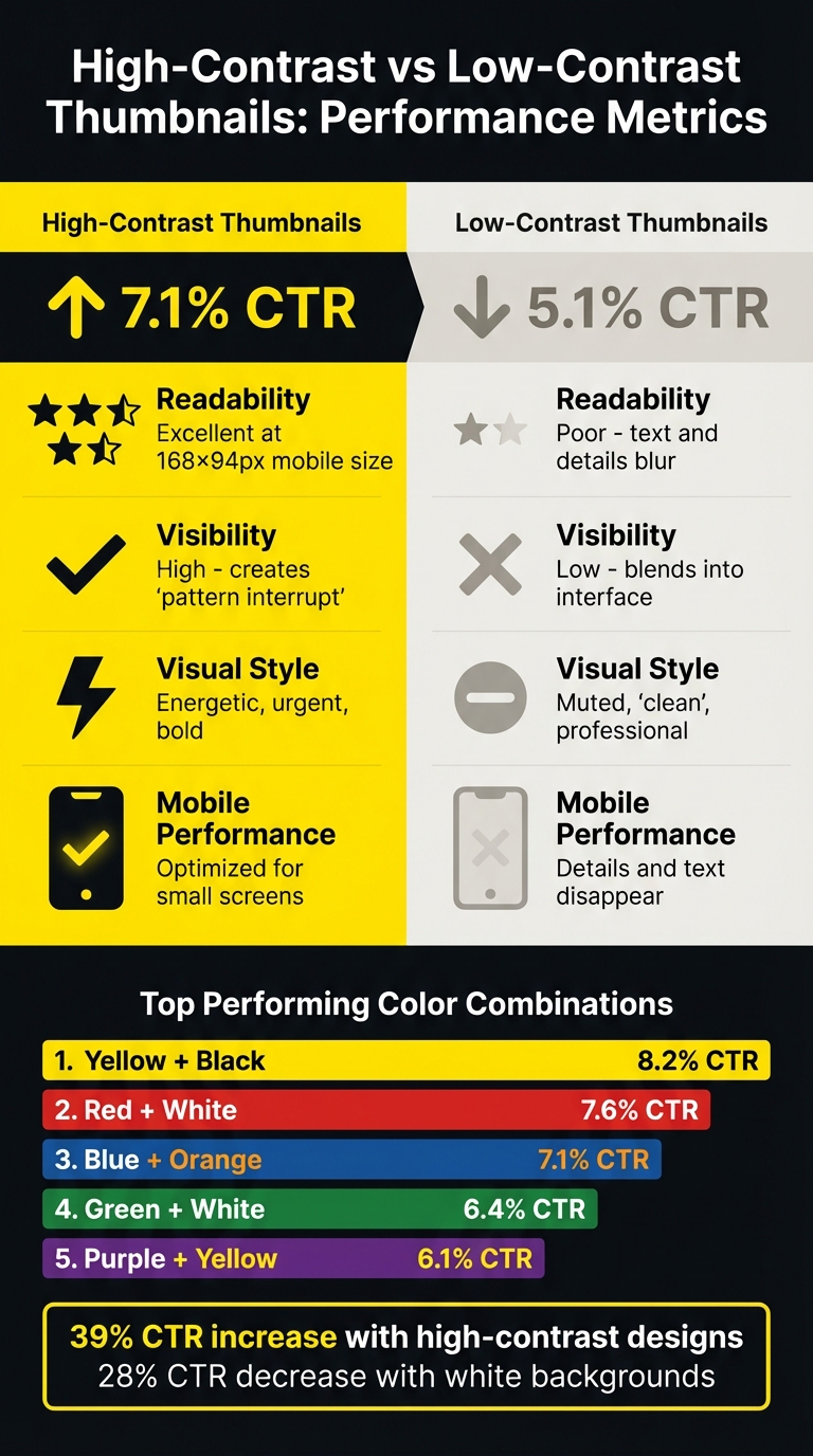
- CTR impact: High-contrast thumbnails average a 7.1% CTR, compared to 5.1% for low-contrast designs.
- Psychological effect: Bright, opposing colors evoke urgency and energy, guiding viewers' attention.
If you're aiming for better performance, focus on strong contrast in your thumbnails.
How To Make a Thumbnail 'POP'? - Color Theory In Thumbnails
sbb-itb-b59debf
1. Low-Contrast Thumbnails
Low-contrast thumbnails rely on similar tones, brightness levels, or colors for text and background elements. Think light gray text on a white background or dark blue lettering over a black image. While this sleek, minimalist style might seem appealing, it often backfires when it comes to viewer engagement. Let’s break down why contrast is so crucial for effective thumbnail design.
Readability
When the text and background share similar brightness levels, it forces viewers to strain to read and understand the content. Katie Sherwin, a Senior User Experience Specialist at Nielsen Norman Group, explains it perfectly: "Low-contrast text may be trendy, but it is also illegible, undiscoverable, and inaccessible". Thin fonts with low contrast can even disappear due to anti-aliasing effects. To counter this, text should meet a contrast ratio of at least 4.5:1 for standard text or 3:1 for larger text (18pt or larger). Research also shows that hard-to-read text leads to lower trust in the content.
Poor readability doesn’t just frustrate viewers - it directly impacts click-through rates.
Click-Through Rate (CTR)
Low-contrast designs can make content almost invisible, causing viewers to scroll past without noticing. This phenomenon, often called "content blindness", puts your thumbnail at a disadvantage. On the other hand, high-contrast thumbnails - featuring bold colors like yellow or orange - can increase click-through rates by 20–30%. A simple squint test can help: if your text or main imagery blurs into the background when you squint, the contrast is too low for effective performance. Companies that focus on high-quality design, including proper contrast, often see up to 32% higher revenue growth.
Visibility on Mobile
Low-contrast issues become even more pronounced on mobile devices. Screens vary widely, from glare-heavy outdoor settings to dimly lit environments, making low-contrast designs even harder to see. For the 1 in 12 men and 1 in 200 women with some form of color blindness, these designs are almost impossible to interpret. Many users resort to pinch-and-zoom to decipher low-contrast elements, which leads to visual fatigue and higher abandonment rates.
Psychological Impact
Low contrast doesn’t just affect visibility - it also influences how viewers perceive your content. Dim or grayed-out text often signals inactivity, making users think the content is unavailable or unimportant. This can create unnecessary cognitive load, leaving viewers feeling frustrated or even blaming themselves for missing information. Ultimately, this erodes trust and engagement.
Altogether, these factors make it clear why low-contrast thumbnails struggle to capture attention in today’s competitive visual space.
2. High-Contrast Thumbnails
High-contrast thumbnails are a game-changer for YouTube creators aiming to grab attention and boost viewer engagement. By pairing bold, opposing colors - like yellow text on a black background or red elements against white - these designs not only stand out visually but also improve key metrics like click-through rates (CTR). This approach ensures thumbnails remain eye-catching and inviting, even in a crowded feed.
Readability
One of the biggest strengths of high-contrast thumbnails is their readability. Text becomes instantly legible, even at smaller sizes. A simple 3–5px contrasting stroke around text can make a huge difference, separating it from busy or photographic backgrounds. This small adjustment can increase CTR by as much as 23%. Pairing bold, uppercase fonts with a clear visual hierarchy - using brighter colors and strong contrasts - guides the viewer’s eye to the most important elements. The result? More clicks and better engagement.
Click-Through Rate (CTR)
The numbers speak for themselves. High-contrast thumbnails achieve an average CTR of 7.1%, compared to just 5.1% for low-contrast designs - a 39% increase. Certain color pairings perform even better: Yellow + Black leads the pack with an 8.2% average CTR, while Red + White follows closely at 7.6%. A study conducted in January 2026 by the NoteLM Team analyzed 1,247 YouTube videos across 20 channels. They found that switching to a high-contrast Yellow + Black scheme boosted CTR by 41% for 10 tested videos. These results highlight the power of contrast in helping thumbnails break through the visual clutter.
Visibility on Mobile
With over 70% of YouTube watch time happening on mobile devices, designing for small screens is non-negotiable. Mobile thumbnails can shrink to just 168×94 pixels, making fine details hard to see and colors prone to blending. High-contrast designs ensure that both text and focal points remain sharp and distinct, even at reduced sizes. However, the contrast needs to work not just within the thumbnail but also against YouTube’s interface. For instance, white backgrounds can reduce CTR by 28% because they blend into YouTube's light mode.
Psychological Impact
Thumbnail color psychology explains how colors evoke emotions and set the tone before a viewer even reads the text. Red, for example, conveys urgency and excitement, while yellow suggests energy, optimism, or caution. High-contrast thumbnails isolate key elements, guiding the viewer’s gaze and reducing mental effort. This clarity can help build trust and make the content feel more approachable. These psychological cues underscore why high-contrast designs are so effective at grabbing attention.
To make the most of high-contrast thumbnails, consider the table below, which highlights effective color combinations and their impact on CTR:
| Color Combination | Contrast Rating | Average CTR | Best Use Case |
|---|---|---|---|
| Yellow + Black | Excellent | 8.2% | High energy, warnings, tutorials |
| Red + White | Excellent | 7.6% | Urgency, importance, news |
| Blue + Orange | Very Good | 7.1% | Tech, professional, reviews |
| Purple + Yellow | Very Good | 6.1% | Creative, unique, entertainment |
| Green + White | Good | 6.4% | Growth, money, finance |
Pros and Cons of Each Approach
High-Contrast vs Low-Contrast Thumbnail Performance Comparison
Contrast plays a crucial role in grabbing attention and driving engagement. Here's how low-contrast and high-contrast thumbnails stack up.
Low-contrast thumbnails might give off a polished and sleek vibe, but they tend to fall short in performance. Subtle gradients and white backgrounds can make thumbnails less noticeable, leading to a drop in click-through rates (CTR) by as much as 28%. When comparing mobile-first vs desktop-first thumbnails, text and intricate details on smaller screens often blur, making the content easy to overlook.
On the other hand, high-contrast thumbnails tend to deliver better results. Bold color combinations make these thumbnails stand out immediately, even at smaller mobile sizes. Text remains sharp and readable, while color pairings like Yellow + Black or Red + White create a sense of urgency and energy that draws viewers in.
The table below provides a side-by-side comparison of these approaches based on recent data:
| Metric | High-Contrast Thumbnails | Low-Contrast Thumbnails |
|---|---|---|
| Average CTR | 7.1% | 5.1% |
| Readability | Excellent at 168×94px (mobile) | Poor; text and details blur |
| Visibility | High; creates a "pattern interrupt" | Low; blends into the interface |
| Visual Style | Energetic, urgent, bold | Muted, "clean", or professional |
| Mobile Performance | Optimized for small screens | Details and text often disappear |
High-contrast thumbnails clearly provide an edge when it comes to visibility and engagement, especially on mobile platforms where competition for attention is fierce.
Creating High-Contrast Thumbnails with ThumbnailCreator
Designing high-contrast thumbnails that grab attention can often feel like a tedious task, but ThumbnailCreator makes it much easier. Traditionally, creating these thumbnails involves manually checking contrast against YouTube's light and dark modes to ensure all elements stand out. On top of that, Thumbnail A/B testing for click-through rate (CTR) data can take 48–72 hours per variation, slowing down the process significantly.
ThumbnailCreator eliminates these hurdles with its AI-driven tools. Instead of manually tweaking color values and testing backgrounds, the AI automatically selects high-contrast color combinations tailored to your content. Tools like face swapping and object swapping ensure clear separation between elements, making your thumbnail stand out on any screen. What used to take hours of adjustments now happens almost instantly.
The platform also offers pre-designed templates built with proven contrast techniques, along with text editing features that keep your message readable in all viewing conditions. This means you can quickly create and preview multiple high-contrast variations in just minutes, rather than days.
For creators managing multiple channels, these time-saving features are invaluable. You’ll spend less time perfecting thumbnails and more time producing content, all while ensuring your thumbnails remain bold and attention-grabbing to drive higher CTRs.
Conclusion
Contrast is the key to creating thumbnails that get noticed. It’s what sets apart thumbnails that grab attention from those that fade into the background. High-contrast designs consistently outperform low-contrast ones, with studies showing a CTR boost of up to 39% when bold color pairings like Yellow + Black or Red + White are used. Given that thumbnails appear as small as 168×94 pixels on mobile screens, strong contrast ensures your content stays visible and easy to read.
The numbers speak for themselves: high-contrast thumbnails average a CTR of 7.1%, while low-contrast designs lag behind at 5.1%. That’s a gap no content creator can afford to overlook. As Jamie Chen explains:
"Most ignored thumbnails aren't 'bad.' They're just invisible... Low contrast makes your image wash out".
ThumbnailCreator simplifies this process with AI-powered tools that apply high-contrast principles effortlessly. Its color selection features and pre-built templates make it easy to craft eye-catching thumbnails in minutes - no need for A/B testing vs gut feeling decisions. Plus, tools for face and object swapping ensure clear separation of elements, helping your design pop on both YouTube’s light and dark modes.
If you want to boost your click-through rates, high-contrast thumbnail design is a must. With ThumbnailCreator, achieving standout designs is quick, simple, and accessible - even for beginners.
FAQs
What’s the easiest way to check thumbnail contrast fast?
To quickly assess thumbnail contrast, make sure the colors are bold and distinct, creating a clear separation between elements. High-contrast designs can greatly improve click-through rates. Always test your thumbnail on various devices to ensure it looks sharp and clear across screens. Tools like ThumbnailCreator provide templates and features designed to enhance color contrast, particularly for mobile viewers, who make up the majority of content consumers.
How do I keep text readable on mobile thumbnails?
To keep text readable on mobile thumbnails, opt for bold, sans-serif fonts like Impact or Montserrat Extra Bold. These fonts maintain clarity even at smaller sizes. Stick to short phrases (3-5 words) to avoid overcrowding. For better visibility against busy backgrounds, consider adding outlines or shadows (4-8px) to enhance contrast and make the text pop on mobile screens.
Which high-contrast color pairs work best for YouTube?
High-contrast color combinations such as yellow and black, red and white, and blue and orange work wonders for YouTube thumbnails. These pairings naturally draw the eye, making your thumbnails pop. By enhancing visual clarity and appeal, they can help capture attention and increase click-through rates.