
How Colors Create Urgency in Thumbnails
Want more clicks on your thumbnails? Start with color.
Colors influence decisions in 0.13 seconds - faster than text. Red, orange, and yellow, for example, can boost click-through rates (CTR) by 20% to 50%. Red alone can increase clicks by up to 30% because it signals urgency. Pairing high-contrast colors, like yellow and black, can amplify this effect, with some combinations driving CTRs as high as 8.2%.
The key takeaway? Thumbnails with bold, strategic color use stand out and drive engagement. Use warm tones for energy, cool tones for trust, and test variations to find what works best for your audience.
Let’s break down how to use color psychology to grab attention and increase clicks on your content.
Master Color Theory for YouTube Thumbnails
Color Psychology and Urgency Explained
Color Psychology Impact on Thumbnail Click-Through Rates
How Colors Trigger Emotions
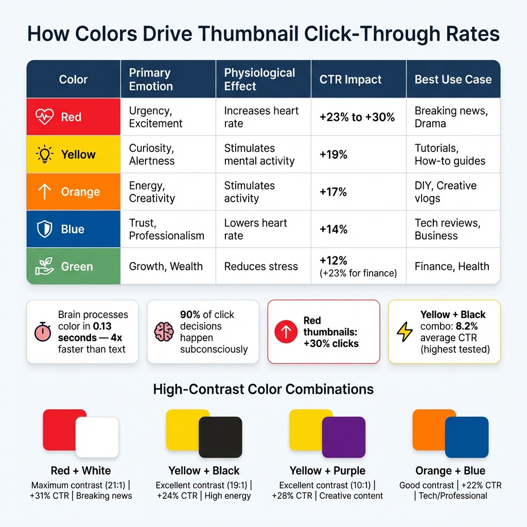
Did you know that your brain processes color in just 0.13 seconds - about four times faster than text? It’s no exaggeration to say that color is the first thing your brain reacts to, even before you consciously think about it. This split-second reaction makes color a powerful emotional trigger, especially when it comes to decisions like clicking on a thumbnail.
Take warm colors like red and orange, for example. Red doesn’t just catch your eye - it physically affects your body, increasing heart rate and blood pressure, which creates a sense of urgency. Orange, on the other hand, combines red’s energy with yellow’s inviting warmth, delivering an engaging yet less aggressive vibe. Meanwhile, cool colors like blue work differently. Blue slows the heart rate, creating feelings of trust and professionalism, making it particularly effective for more serious or business-focused content.
"Color isn't decoration. It's a weapon. Different colors trigger different psychological responses. And top creators don't pick colors randomly - they engineer them." – YouTube Tools Hub
Here’s something to think about: 90% of a viewer’s click decision happens subconsciously, driven by visual cues like color. That’s why understanding the psychology behind colors can make or break your content’s performance.
How Color Affects Click-Through Rates
The emotional pull of colors isn’t just theoretical - it directly impacts click-through rates (CTR). For instance, thumbnails featuring red can see a 23% to 30% increase in clicks, thanks to red’s ability to spark urgency and excitement. Yellow, known for stimulating curiosity and mental activity, boosts CTR by about 19%. Even orange, with its energetic and action-oriented vibe, can generate a 17% increase in clicks.
Here’s a quick breakdown of how different colors influence emotions, physiological responses, and CTR:
| Color | Primary Emotion | Physiological Effect | CTR Impact | Best Use Case |
|---|---|---|---|---|
| Red | Urgency, Excitement | Increases heart rate | +23% to +30% | Breaking news, Drama |
| Yellow | Curiosity, Alertness | Stimulates mental activity | +19% | Tutorials, How-to guides |
| Orange | Energy, Creativity | Stimulates activity | +17% | DIY, Creative vlogs |
| Blue | Trust, Professionalism | Lowers heart rate | +14% | Tech reviews, Business |
| Green | Growth, Wealth | Reduces stress | +12% (+23% for finance) | Finance, Health |
If you want to take it a step further, consider using high-contrast color combinations. These combinations can amplify the emotional impact of individual colors, boosting CTR by as much as 39%. For example, pairing yellow and black has been shown to achieve an 8.2% average CTR, the highest of all tested combinations. The reason? These contrasts don’t just catch the eye - they create a psychological tension that draws viewers in and makes your content hard to ignore.
Colors That Create Urgency
Red and Orange: Energy and Action
Red dominates 32% of top-performing thumbnails, making it a go-to choice for grabbing attention quickly. Its association with breaking news, warnings, and critical updates makes it perfect for content that demands immediate action.
Take MrBeast as an example - he uses red backgrounds paired with sharp contrasts, like "$1 vs $100M", to amplify engagement and hook viewers.
Orange, on the other hand, offers a more balanced approach. Found in 15% of successful thumbnails, it combines the urgency of red with the warmth of yellow, making it a great fit for entertainment and creative content. Linus Tech Tips uses orange as a signature color to project energy and excitement. Orange works well when you want to encourage action without overwhelming your audience.
While red and orange focus on urgency and energy, yellow stands out by sparking curiosity and guiding attention.
Yellow: Curiosity and Alertness
Yellow complements the urgency of red and orange by adding an element of curiosity. As the most visible color to the human eye, it naturally draws attention. Unlike red, which demands immediate focus, yellow evokes optimism, making it ideal for tutorials, how-to guides, and educational content. It appears in 24% of high-performing thumbnails.
When paired with black, yellow reaches an impressive 8.2% average click-through rate, the highest of any color combination tested. In research conducted by the NoteLM Team, which analyzed 1,247 videos across 20 YouTube channels between July 2025 and January 2026, yellow and black combinations boosted CTR by an average of 39% compared to thumbnails lacking high-contrast colors.
To maximize impact, use yellow sparingly as a neon accent - perhaps as a glowing outline around your main subject or a bold word like "SHOCKING." This approach ensures visual impact without overwhelming the design. If your content revolves around finance or wealth, pairing yellow with green can further enhance performance by 23%.
sbb-itb-b59debf
Design Techniques for Maximum Urgency
Using Contrast to Grab Attention
If you want your thumbnails to scream urgency, it's not just about picking bold colors - it’s about using design principles that make those colors pop. Colors grab attention faster than images or text, so they’re your first chance to hook someone scrolling by.
One powerful trick is to use complementary colors - those directly opposite on the color wheel - and pair them with value contrast. For instance, make sure your subject is at least 30% brighter or darker than the background. This creates a sharp visual separation that naturally draws the eye.
Another method is the "Contrast Sandwich" technique, which involves layering three elements for maximum effect:
- Layer 1: Start with a simple or slightly blurred background to avoid visual clutter.
- Layer 2: Add your high-contrast subject, outlined with a 4–8 pixel border or glow to make it pop.
- Layer 3: Place bold text in a color that contrasts with both the background and the subject.
To ensure your design works, try the grayscale method: convert your thumbnail to black and white. If your subject or text gets lost, your contrast isn’t strong enough. Also, shrink your design down to about 160×90 pixels - the size it appears on mobile feeds. If the key elements aren’t clear at that size, it’s time to tweak the design.
"A creator spends forty hours on an edit and five minutes on the thumbnail - and that's like building a Ferrari engine and putting it inside a rusted-out sedan."
- Jamie Chen, Author, Banana Thumbnail
When done right, contrast not only isolates your subject but also keeps the focus on your call-to-action, making it impossible to miss.
Applying the 60-30-10 Color Rule
Once you’ve nailed contrast, the 60-30-10 rule helps you organize colors in a way that naturally guides the viewer's eye. Here’s how it works:
- 60% goes to your dominant color, usually the background.
- 30% is your secondary color, used for the main subject or overlay.
- 10% is your accent color, reserved for the most critical element - like urgent text or a call-to-action.
This rule taps into the Von Restorff effect, where a standout color gets all the attention. By saving that vibrant accent color for just 10% of your design, you make sure your key message or action can't be ignored.
"Accent means action."
- sixtythirtyten Blog
Spotify nails this approach. Their design uses 60% black (#191414) as the base, 30% dark gray (#282828) for navigation, and a bold 10% green (#1DB954) for play buttons and primary actions. That 10% green feels urgent and actionable because it’s used sparingly.
To keep your accent color effective, don’t use it on anything unimportant. It should be reserved for the hook or the primary action. And, as with contrast, test your design by shrinking it to 168×94 pixels (mobile feed size). If your subject and text don’t stand out, adjust the color proportions.
| Color Combination | Contrast Rating | CTR Impact | Best Use Case |
|---|---|---|---|
| Red + White | Maximum (21:1) | +31% | Breaking news, urgent warnings |
| Yellow + Black | Excellent (19:1) | +24% | High energy, tutorials |
| Yellow + Purple | Excellent (10:1) | +28% | Creative, unique content |
| Orange + Blue | Good | +22% | Tech reviews, professional topics |
Testing and Improving Your Color Strategy
Tracking Success with Engagement Metrics
Once you’ve laid out your design principles, the next step is using performance data to fine-tune your strategy.
Start by tracking Click-Through Rate (CTR) and Average View Duration (AVD) to see how well your thumbnails are performing. CTR measures how effectively your colors grab attention. You can find this in YouTube Studio under Analytics → Reach. A typical CTR falls between 4–5%, while 6–10% is excellent, and anything over 10% suggests your content has viral potential.
But CTR isn’t the whole picture. To ensure your colors aren’t misleading, check Average View Duration (AVD) under Analytics → Engagement. This metric helps you see if viewers are sticking around. A good AVD benchmark is at least 50% of your video’s total length.
YouTube Studio’s "Test & Compare" feature is another invaluable tool. It lets you upload up to three thumbnail variants and measures which one generates the most watch time from impressions. If your impressions are high but CTR is low, it might mean your color palette isn’t standing out enough in the feed.
Here’s a breakdown of key metrics and their role in your color strategy:
| Metric | Where to Find (YouTube Studio) | Purpose for Color Strategy |
|---|---|---|
| Click-Through Rate (CTR) | Analytics → Reach | Measures if your colors draw attention effectively |
| Average View Duration (AVD) | Analytics → Engagement | Ensures colors align with content and avoid clickbait |
| Impressions | Analytics → Reach | Tracks how visible your color palette is |
| Watch Time from Impressions | Test & Compare Tool | Identifies the best-performing thumbnail |
These metrics form the foundation for making informed adjustments to your strategy.
Adjusting Based on Performance Data
Once you’ve gathered the data, it’s time to refine your design using what you’ve learned.
Focus your testing on color schemes while keeping other elements - like layout, text, and images - consistent. This ensures you’re isolating color as the variable. Run tests for at least two weeks or until you’ve reached thousands of impressions. For smaller channels (under 10,000 weekly impressions), extending tests to a month can help ensure reliable results.
If you notice a high CTR but low retention, your colors might be too intense, creating unrealistic expectations. In that case, try toning them down or switching to cooler colors. On the other hand, if CTR is low but retention is strong, your content resonates with viewers, but your colors may need more contrast or a warmer, more energetic vibe to attract clicks.
Once you’ve identified a winning thumbnail, use it as your new baseline and continue testing variations. This iterative process allows you to build on small improvements over time. Keep a detailed log with screenshots, dates, and performance data. Over time, patterns will emerge, like whether your audience prefers warm tones (reds, oranges) or cool tones (blues, greens).
"A thumbnail with slightly lower CTR but higher retention may still 'win' because it sets better expectations." - ThumbnailCreator
Conclusion
Color grabs attention fast and can drive clicks effectively. Using shades like red, orange, or yellow taps into subconscious cues, creating urgency that encourages engagement.
The data speaks for itself: thumbnails featuring red can see 30% more clicks, while bold contrasts like yellow and black can boost click-through rates to 8.2%. But relying on color alone won’t cut it. Combine it with smart design techniques like the 60-30-10 rule, test your designs in grayscale to ensure readability on mobile, and avoid blending into YouTube’s interface.
Keep in mind that more than 70% of YouTube views happen on mobile devices, where thumbnails are displayed at just 168×94 pixels. This means high saturation, bold contrasts, and a clear visual hierarchy are essential to make your thumbnails pop on smaller screens.
These tips form the groundwork, but testing is what separates good from great. The best creators don’t rely on guesswork - they track performance. Use YouTube Studio analytics to monitor your CTR and average view duration, then tweak your color strategy based on the results. Even small adjustments, like shifting from muted tones to bold contrasts, can increase your CTR by 20% to 50%.
With less than half a second to grab attention, make your colors work harder for you. Experiment with these strategies using tools like ThumbnailCreator’s AI-powered features, and watch your engagement soar.
FAQs
Which color should I use for my niche?
Warm colors - like red, orange, and yellow - are attention-grabbers that evoke urgency and energy. They're perfect for niches that thrive on action or excitement. On the flip side, cooler tones such as blue and green are associated with trust and calmness, making them ideal for educational or informational content. The key is to pick colors that reflect the emotions and goals of your niche, ensuring they resonate with your audience and boost engagement.
How do I test thumbnail colors the right way?
To figure out the most effective thumbnail colors, try running A/B tests with different color schemes. Experiment with high-contrast combinations or individual colors like red, yellow, or blue - these can influence click-through rates (CTR). Use YouTube's "Test & Compare" tool, but make sure to adjust only one major element at a time during each test. Let the test run for at least two weeks or until the results are statistically significant. Pay close attention to metrics like CTR and watch time to identify the colors that perform best.
How can I make colors pop on mobile?
To make your thumbnails stand out on mobile screens, focus on high-contrast color combinations and bold, vibrant hues. Small screens demand visuals that grab attention instantly, so pair colors like yellow and black, red and white, or blue and orange for maximum impact.
Keep your designs clean and uncluttered. Overly busy thumbnails can look chaotic and lose their appeal on mobile. By using bold, saturated colors and ensuring clear contrast, your thumbnail can catch the eye and encourage more clicks.