

AI Thumbnail Study: CTR Impact
Most AI thumbnail losses came from three simple problems: clutter, weak contrast, and weak title match. In this study, low-performing thumbnails often had text that broke on mobile, no single subject, or visuals that looked polished but did not make the point fast.
Here’s the short version:
- CTR was the main score, with AVD, retention, and watch time per impression used to filter out bad clicks.
- The study looked at U.S. YouTube channels across education, gaming, lifestyle, and tech.
- Thumbnails were reviewed by traffic source: Browse/Home, Suggested, and Search.
- The main image factors were:
- face use
- facial intensity
- text length
- background detail
- contrast
- focal order
- title-thumbnail match
- channel style match
- Common thumbnail mistakes that led to low-CTR patterns included:
- dense layouts
- hard-to-read mobile text
- low contrast
- too many competing elements
- vague or generic AI imagery
- thumbnail text that repeats the title
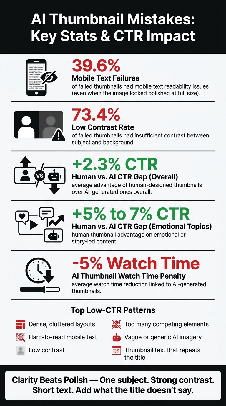
- A few numbers stood out:
- 39.6% of failed thumbnails had mobile text issues
- 73.4% had low contrast
- human-made thumbnails averaged 2.3% higher CTR
- the gap reached 5%–7% on emotional or story-led topics
- AI thumbnail use was tied to 5% lower average watch time in follow-up findings
- The best pattern was simple: one clear subject, short text, strong contrast, and a thumbnail that adds something the title does not say.
If I had to sum it up in one line, it would be this: clarity beats polish. If you want more clicks without hurting watch time, make the idea obvious in one to two seconds, especially on a phone screen.
Study Method and Thumbnail Variables
Sample, Timeframe, and Traffic Sources
The sample covered U.S.-based channels in education, gaming, lifestyle, and tech. It included small, mid-sized, and large channels. Only channels with at least 90 days of steady posting made the cut. YouTube Shorts were left out because people find them in a different way than standard long-form videos.
To keep CTR comparisons fair, thumbnails or thumbnail variants were only counted after they hit minimum impression levels:
- 10,000 impressions for Browse and Suggested traffic
- 5,000 impressions for Search
That filter helps remove low-visibility uploads, where random click swings can look bigger than they are. The data window stayed within a 90- to 180-day span, and outlier traffic periods were either excluded or averaged out to reduce seasonal noise.
CTR was reviewed separately for Browse/Home, Suggested, and Search because user intent changes depending on where the thumbnail appears.
The Visual Factors Compared
These variables were chosen to isolate the thumbnail design choices that AI-generated or AI-assisted visuals often overdo or flatten. To keep comparisons consistent, each thumbnail was coded against eight visual variables:
| Variable | How It Was Measured |
|---|---|
| Face presence | Yes/no, plus whether the face was primary or secondary |
| Expression intensity | Rated 1–5, from neutral to highly expressive (surprise, shock, excitement) |
| Text length | Short (1–3 words), medium (4–7 words), or long (8+ words) |
| Background complexity | Simple (solid or blurred) to complex (busy scenes, multiple objects) |
| Contrast | High vs. low contrast between the main subject and background, and between text and background |
| Focal hierarchy | Clear single dominant element vs. multiple competing elements |
| Title–thumbnail alignment | Strong, moderate, or weak, based on how directly the visual supports the video title |
| Brand consistency | Recurring colors, fonts, logo placement, and framing style across a channel |
How Impact Was Measured
After the visual coding was done, the study looked at whether changing ONLY the thumbnail moved CTR. It used thumbnail A/B testing while keeping the title, description, and video content the same. Each swap included a pre-change window of 7–14 days and a post-change window of similar length, with similar impression volume in both periods.
A CTR shift was treated as meaningful only if it showed a relative change of at least 10% to 20% and cleared the impression threshold in both windows.
The study also checked post-click quality metrics, including AVD, audience retention, percentage viewed, and watch time per impression. That step kept high-CTR thumbnails from being treated as wins if viewers clicked and then left fast.
A thumbnail counted as successful only when CTR went up without a meaningful drop in post-click quality.
sbb-itb-b59debf
The Thumbnail Experiment: Using Science to Boost CTR
The AI Thumbnail Mistakes Most Linked to Lower CTR
AI Thumbnail Mistakes: Key Stats & CTR Impact
The study found a few repeat mistakes in low-CTR thumbnails. These problems are easy to miss in feed view, where a thumbnail has to get the point across FAST on a small screen. And they line up with the same factors the study measured: layout, contrast, focal hierarchy, and title alignment.
Cluttered Layouts, Dense Text, and Poor Mobile Readability
Busy thumbnails lose attention fast. When you cram in too many people, graphics, or text blocks, the message gets muddy in the feed. About 39.6% fail because the text is unreadable on mobile, even when the image looks polished at full size.
That’s the trap. A thumbnail can look fine on a desktop monitor and still fall apart on a phone.
Short, clear wording tends to work better because people can read it at a glance. Before publishing, creators should shrink the thumbnail down to phone size and check one simple thing: Can someone understand this in a second or two?
Low Contrast, No Clear Focal Point, and Over-Polished AI Visuals
Low contrast between the subject and the background was one of the most common reasons thumbnails underperformed. Roughly 73.4% of failed thumbnails had insufficient contrast, which made the main idea harder to spot in a crowded feed. If the subject doesn’t stand out right away, people keep scrolling.
A thumbnail also needs one clear focal point. When every part of the image is fighting for attention, the eye doesn’t know where to go first.
This is where AI visuals often slip. They can look slick, sharp, and nicely balanced, but still miss the visual hierarchy that pulls attention to one main subject. In one comparison over time, human-designed thumbnails averaged a 2.3% higher CTR than AI-generated ones overall, with a larger 5% to 7% gap for emotional or narrative content.
So the issue isn’t just image quality. It’s whether the thumbnail tells your eyes what matters first.
Vague Messaging and Mismatch With the Video
Another common mistake is copying the video title word-for-word into the thumbnail. That uses up space without adding a new reason to click. The title and thumbnail should work together, not echo each other.
Misleading thumbnails may spike clicks at first, but they also hurt trust and perceived credibility over time. And that cost shows up after the click. Follow-up research found that videos with AI-generated thumbnails had 5% lower average watch time, likely because the visuals oversold the content.
The better pattern is pretty simple:
- One clear subject
- Strong contrast
- Short text
- A thumbnail that adds something new to the title
The next section shows the opposite pattern: the traits that consistently lift CTR.
What Higher-CTR Thumbnails Have in Common
Traits That Repeatedly Outperform
The best thumbnails fix the problems that drag clicks down: one clear subject, one clear hook, and no wasted space.
Subject placement matters. Keep the main subject out of the lower-right corner because YouTube’s timestamp can block it. Placing the subject in the left third or near the center usually keeps it visible. Gaze direction matters too. When the subject looks toward the text or the main object, the eye follows. When they look away, attention drifts away from the hook.
Match the visual language of the top 20 videos in your niche. There’s no one-size-fits-all CTR formula. What works in one niche can flop in another. Study the top 20 videos in your space and mirror their visual language.
And don’t judge a thumbnail by CTR alone. Track CTR alongside AVD, or compare A/B testing vs gut feeling to see which data-driven approach works best. If a thumbnail gets clicks but hurts retention, that’s not a win.
Use the table below for a quick side-by-side look.
| Design Factor | Low-CTR Mistake | High-CTR Trait | Practical Fix |
|---|---|---|---|
| Face Position | Lower-right corner (hidden by timestamp) | Center or left placement | Move the subject to the left third of the frame |
| Subject Gaze | Eyes looking off-frame or away from the hook | Eyes pointed at text or key object | Redirect gaze toward the hook |
| Design Style | Copying "viral" styles from unrelated niches | Niche-specific colors and text density | Match the visual language of the top 20 videos in your category |
| Testing Focus | Judging success by CTR alone | Balancing CTR with Average View Duration | Reject high-click thumbnails that cause immediate viewer drop-off |
Tools That Can Speed Up Thumbnail Testing
Once you can see the pattern, the next step is speed. ThumbnailCreator can generate and edit multiple thumbnail versions from a video URL or transcript, which makes testing much faster. The next section walks through a simple testing workflow and the main takeaways creators should keep in mind.
Testing Results and Final Takeaways
A Simple Testing Workflow
Once you have a few thumbnail variants, test them in a clean way. Change one element at a time and let the data do the talking. If you swap the background color, the text, and the facial expression all at once, you can't tell which edit made the difference.
Don't judge results too early. Wait until the video has enough impressions: 1,000–3,000 for smaller channels, 5,000–10,000 for mid-size channels, and 20,000+ for larger ones. Browse and Suggested traffic usually settle within 48–72 hours, while Search may take 7–14 days, especially for evergreen topics.
It also helps to compare performance by traffic source. Browse, Suggested, and Search don't behave the same way, so lumping them together can blur what's happening. YouTube's native Test & Compare feature can split traffic across up to 3 thumbnail variants for you automatically.
And don't stop at CTR. Put it next to post-click metrics like watch time, average view duration, and retention. On high-impression videos, even a 0.5-point CTR lift above your recent channel average is meaningful. That's how testing becomes a repeatable decision process instead of a guessing game.
Key Findings Creators Should Remember
The main pattern is simple: clarity beats polish.
The study showed the same thing again and again. AI thumbnails tend to lose CTR when they add polish without making the image clearer. Clutter, weak contrast, and vague imagery make thumbnails harder to read on mobile. Simpler thumbnails, with one focal point, strong contrast, and minimal text, did better on Browse and Suggested.
FAQs
Why do AI thumbnails lower CTR?
AI-made thumbnails can hurt CTR when they look polished at full size but fall apart on a small mobile screen. That usually shows up in a few ways: low contrast, busy layouts, and text that’s too small or too stylized to read at a glance.
They can also come off as generic or out of sync with the video itself. And when there’s no clear emotional hook, people hesitate. That split-second confusion can lead to fewer clicks.
How can I tell if my thumbnail is too cluttered?
Use a simple readability check.
Shrink the thumbnail to about 120 × 68 pixels or 10% of its original size. If the text and focal point aren’t clear right away, the design is probably too busy.
You can also use the squint test to see if the main message still stands out, or the three-element test to check whether the design feels overwhelming.
What should I test first in a thumbnail?
Start with background color. It often leads to the biggest CTR shifts, usually around 18% to 25%.
A clear, strong facial emotion is another smart first test, with possible gains of 15% to 34%.
Stick to one bold change at a time. Skip minor layout or text tweaks at the start.