
Top 10 Thumbnail Trends from Leading YouTubers
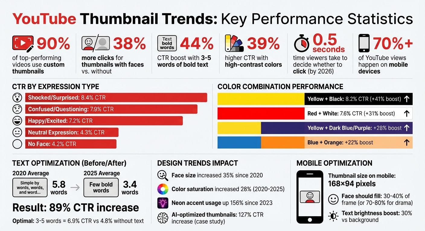
Want your YouTube videos to stand out? It all starts with your thumbnail. By 2026, viewers decide in less than 0.5 seconds whether to click on a video. Here's what you need to know:
- Custom thumbnails dominate: 90% of top-performing videos use them.
- Human faces matter: Thumbnails with expressive faces get 38% more clicks.
- Bold text drives clicks: 3–5 words can boost CTR by up to 44%.
- Bright colors pop: High-contrast designs improve CTR by 39%.
- Trends evolve: From exaggerated expressions to before-and-after transformations, creators like MrBeast and Ali Abdaal treat thumbnails as science - testing dozens of variations to find the best one.
This guide breaks down the 10 biggest thumbnail trends shaping YouTube success today, with actionable tips to help you improve your CTR and grow your channel.
YouTube Thumbnail Statistics: CTR Performance by Design Element
how to make a killer thumbnail (for the 2025 algorithm)
1. Bold Text Overlays
Bold text overlays can grab attention instantly. Thumbnails featuring 3–5 words of bold text average a 6.9% click-through rate (CTR), compared to 4.8% for those without - an increase of 44%. However, cramming in more than six words can backfire, causing a 31% drop in CTR.
Visual Impact (Grabbing Attention)
At just 168×94 pixels on mobile - where over 70% of views happen - text plays a crucial role in catching the eye. Adding a contrasting outline or drop shadow can boost CTR by 23%. Think of your thumbnail text like a billboard, not a paragraph. Ideally, it should cover 20–30% of the frame.
"Bold, bright colors help your thumbnail stand out in a sea of videos."
– Paul O'Malley, YouTube Creator
This visual technique not only stops the scroll but also sets the stage for emotional engagement.
Emotional Engagement (Sparking Curiosity or Excitement)
Text can create a "curiosity gap", enticing viewers by teasing something they can only discover by clicking. For example, Vsauce uses thought-provoking questions like "Can You Actually SEE the Future?" to intrigue viewers. MrBeast takes a different route, combining bold numbers like "$100,000" with dramatic expressions to trigger emotional urgency. Short, punchy phrases like "Only 3% survive this" or "I QUIT" can also spark curiosity and drive clicks .
CTR Potential
Reducing text length by 40% - from 5.8 to 3.4 words - has been shown to increase CTR by 89%. High-contrast color combinations, such as yellow on black or red on white, enhance visibility and create a sense of urgency, making it easier for viewers to process the message at a glance.
"Make your thumbnail easy to understand so that when people look at it the first time, they're saying, 'I know what's going on in this video, so I'm going to click on it.'"
– Chucky Appleby, MrBeast Creative Team
Simplifying Design for Creators
With clear visual and emotional cues in mind, modern tools make thumbnail optimization easier than ever. The "squint test" is a simple yet effective method: shrink your thumbnail to mobile size, and if the text isn’t instantly readable, adjust the font size or contrast. Stick to bold sans-serif fonts (700+ weight) and maintain a consistent font and color palette to build brand recognition. These strategies help creators design thumbnails that drive engagement effortlessly.
2. Exaggerated Facial Expressions
Visual Impact (Grabbing Attention)
Did you know the brain processes faces 60,000 times faster than text? That’s why facial expressions are such a powerful tool to grab attention. Since 2020, faces in thumbnails have become 35% larger on average. Top creators now dedicate 25% to 40% of the frame to a single expressive face. This isn’t just a trend - it’s science. The fusiform face area, a part of the brain specialized for recognizing faces, processes them before anything else. To make the most of this, boost the face's brightness by 30% compared to the background and position it in the left two-thirds of the frame.
But grabbing attention is only the first step. Facial expressions also play a big role in how viewers emotionally connect with your content.
Emotional Engagement (Evoking Curiosity or Excitement)
Expressive faces do more than catch the eye - they spark curiosity. Viewers see an exaggerated reaction and want to know the story behind it. For example, surprised expressions appear in 26.95% of top-performing thumbnails, with happy expressions close behind at 26.65%. Even small tweaks can make a difference. In September 2023, YouTuber MrBeast (Jimmy Donaldson) ran A/B tests and found that closing his mouth in thumbnails boosted watch time across all tested videos. As he humorously noted:
"I closed my mouth on all my thumbnails and the watch time went up on every video lol. We must not rest until mouths are closed in everyone's thumbnails."
– MrBeast, YouTuber
Other creators, like SSSniperWolf (Alia Shelesh), lean heavily into surprise. She uses this expression in 70% of her thumbnails, keeping her audience hooked.
CTR Potential
Here’s the payoff: thumbnails with faces get 38% more clicks than those without, and expressive reactions double the click-through rate (CTR) compared to neutral faces. Shocked or surprised expressions are especially effective, driving an average of 104,000 views per video. A 2025 case study by TechReviewer Pro showed how AI-enhanced thumbnails with "perfect expressions" and cinematic lighting led to a 127% increase in CTR and an 89% boost in average view duration. The type of expression matters too - surprise works best for gaming and entertainment, while focused expressions perform better for educational content. Channels adopting AI-optimized expression techniques typically see an 89% jump in CTR compared to older thumbnail styles.
Ease of Adaptation for Creators
Want to refine your thumbnails? Start by using the Rule of Thirds - position your face at one of the four intersection points of a 3×3 grid instead of dead center. This prevents a static look. Make eye contact with the viewer to create a personal connection, or if you’re adding text, have your gaze point toward it. People naturally follow where others are looking.
Try the squint test: if your expression isn’t clear when you squint, adjust its size or contrast. AI tools like ThumbnailCreator can help by enhancing lighting, sharpening eyes, and even swapping expressions to find the most engaging look. For best results, experiment with different emotions every 24–48 hours to see what resonates most with your audience. These strategies make it easier than ever to optimize your thumbnails and set the stage for even better performance.
3. Question-Based Hooks
Visual Impact (Grabbing Attention)
A sharp, concise question on your thumbnail can act like a speed bump in a crowded feed, grabbing attention instantly. Keep it short - just 3–4 words. Anything longer might lose its impact, especially on mobile screens where users scroll quickly. To ensure readability, use bold, high-contrast fonts, like bright text against a dark background. In fact, many top creators are now using just one striking word with a question mark to make their thumbnails pop. This minimalist approach not only grabs attention but also sets the stage for the content inside.
Emotional Engagement (Evoking Curiosity or Excitement)
Questions naturally create a "curiosity gap", making viewers want to click and find the answer. The best ones tap into relatable concerns or spark debate. For example, a finance creator might ask, "Should you quit your job?" while a tech reviewer could go with, "Is THIS the BEST Camera for Beginners?". The goal is to ignite curiosity without repeating your video title. Instead, the question should add an extra layer of intrigue.
"A few words that pique curiosity and give viewers a reason to click" – Paul O'Malley, YouTube Creator
By pairing the question with the title, you create a dynamic duo that pulls viewers in.
CTR Potential
When done right, question-based hooks are a powerful tool to boost click-through rates (CTR). Thumbnails and titles together account for up to 90% of a video's CTR. While most YouTube videos average a CTR between 2% and 10%, top creators often exceed this by mastering their thumbnail strategy. Questions work across all types of content, from "Can you really build this?" for DIY videos to "Should you invest now?" for financial advice. Plus, 90% of high-performing videos rely on custom thumbnails rather than auto-generated images. Investing time in crafting the perfect question hook can make a huge difference.
Ease of Adaptation for Creators
Question-based hooks are not only effective but also simple to implement. Start with a single, clear question that ties directly to your video's main topic. Avoid technical terms - stick to language that anyone can grasp at a glance. Enhance the question with a visual cue, like a prop or an icon, to reinforce its meaning. Remember, the thumbnail text should work with your video title, not just repeat it.
"Make your thumbnail easy to understand so that when people look at it the first time, they're saying, 'I know what's going on in this video, so I'm going to click on it'" – Chucky Appleby, MrBeast Creative Team
To fine-tune your approach, try A/B testing 2–3 different question variations to see which one resonates most with your audience. This simple yet effective strategy can elevate your channel’s visual appeal and drive higher engagement.
4. Before-and-After Transformations
Visual Impact (Grabbing Attention)
A split-screen thumbnail with a striking contrast is an instant attention-grabber. Humans are naturally drawn to differences, making these layouts powerful tools to stop viewers mid-scroll. They tell a story in one glance by juxtaposing a problem with its solution. The "before" side often showcases a messy or incomplete state, while the "after" side highlights a polished or improved result. This kind of visual storytelling works across countless niches - whether it's fitness transformations, home makeovers, cooking tutorials, or even desk organization.
Emotional Engagement (Evoking Curiosity or Excitement)
These thumbnails tap into emotions tied to "Achievement & Success", sparking feelings of curiosity, inspiration, or even amazement. By showcasing a dramatic "after" state, they entice viewers to click and uncover the journey behind the transformation.
"A before and after thumbnail is a mini story in one frame. It promises a result. If you've got a problem (the 'before'), this video shows you the solution (the 'after'). That's irresistible." - 1of10
This approach not only grabs attention but also builds trust. The stark contrast between "before" and "after" serves as proof that the content delivers on its promise, reinforcing credibility.
CTR Potential
The impact of this visual and emotional strategy is measurable. Thumbnails that use storytelling and transformation themes can boost click-through rates (CTR) by up to 98% compared to standard reaction-based designs. In 2025, creators who leaned into transformation-focused thumbnails saw an average 89% increase in CTR over older styles. By 2026, thumbnails with bold, high-contrast visuals achieved a 39% higher CTR than those without. Since 90% of top-performing videos rely on custom thumbnails rather than auto-generated ones, investing in well-crafted designs can significantly enhance your channel's performance.
Ease of Adaptation for Creators
Creating effective before-and-after thumbnails is simpler than it might seem. Always position the "before" image on the left and the "after" on the right - reversing this can confuse viewers. Enhance the transformation with elements like arrows, "VS" symbols, or bold dividing lines to emphasize the change. For authenticity, keep the camera angle and lighting consistent between shots. Use muted colors for the "before" side and vibrant tones for the "after" to heighten the visual contrast. Adding text labels like "BEFORE" and "AFTER" or short, context-specific details such as "30 Days" can provide clarity without overwhelming the design.
Also, remember to optimize for mobile screens, where most viewers watch YouTube. The transformation should remain clear even at smaller sizes. Tools like ThumbnailCreator make it easier to implement these tips, helping you produce professional, eye-catching thumbnails that drive clicks.
5. Bright Contrasting Colors
Visual Impact (Grabbing Attention)
Bright, contrasting colors are a game-changer for thumbnails. Why? The brain processes color in just 0.13 seconds, faster than images (0.25 seconds) or text (0.45 seconds). That split-second edge makes bold colors an effective way to grab attention and make your video stand out in crowded feeds.
A popular tactic among top creators is the "Contrast Sandwich" technique. This involves layering a simple, dominant color background, a high-contrast subject with a border or glow, and bold text that contrasts with both. This method ensures readability, even on small screens like mobile devices. Research on 740 top-performing YouTube videos revealed that 88% featured vibrant, colorful thumbnails, proving the strong link between color choices and success.
"Bold, bright colors help your thumbnail stand out in crowded feeds." - Paul O'Malley, YouTube Creator
Emotional Engagement (Evoking Curiosity or Excitement)
Colors aren't just visually appealing - they also stir emotions. For example, red conveys urgency and excitement, yellow grabs attention with its high visibility, and green evokes growth or wealth. Alicja Suska of Outdraw Design saw a tenfold increase in views after switching from dark, muted thumbnails to ones with vibrant colors and engaging backgrounds.
Between 2020 and 2025, thumbnail color saturation increased by 28% as creators leaned into bolder designs to stop the scroll. Neon accents, in particular, have skyrocketed in use - up 156% since 2023. When paired with dark backgrounds, neon elements deliver a 38% CTR advantage over lighter designs.
CTR Potential
High-contrast colors can significantly boost click-through rates, with increases of up to 39%. Specific color combinations can further raise CTR by 20–50%. For instance, TechReviewer Pro revamped their thumbnails with hyper-saturated colors and "impossible scenarios", resulting in a 127% jump in CTR and a 201% rise in subscriber rate.
Neon text effects are particularly effective, drawing 27% more attention in eye-tracking studies than standard text. Among neon shades, green leads the pack (34%), followed by blue (28%) and pink (22%). Channels adopting these bold design trends have seen an average 89% boost in CTR.
| Color Combination | Use Case | CTR Boost |
|---|---|---|
| White Text + Red Background | Breaking news, gaming, drama | +31% |
| Yellow + Black | High energy, warnings, alerts | +41% |
| Yellow Text + Dark Blue/Purple | Tutorials, educational content | +28% |
| Blue + Orange | Tech reviews, modern content | +22% |
These stats highlight how thoughtful color choices can drive engagement.
Ease of Adaptation for Creators
Creators can easily incorporate these strategies into their designs. Start with the 60-30-10 rule: dedicate 60% of your thumbnail to a dominant background color, 30% to a secondary color for the subject, and 10% to an accent color for text or highlights. This keeps designs visually balanced and avoids clutter. To test your thumbnail's effectiveness, try the squint test - if it’s not clear when you squint, it likely needs stronger contrast.
Use neon accents sparingly to avoid overwhelming viewers. Match your color palette to your content niche: yellow works well for tutorials, red suits dramatic or urgent topics, blue builds trust for tech content, and green signals finance-related themes, boosting performance by 23% over other colors. Always preview thumbnails at 120×67 pixels to ensure they hold up on mobile screens, where most YouTube viewing happens.
For a streamlined process, tools like ThumbnailCreator can help you craft professional, attention-grabbing thumbnails with the perfect color contrast to boost clicks.
6. Facts and Stats Teasers
Visual Impact (Grabbing Attention)
Numbers have a way of stopping people in their tracks - almost like visual speed bumps. They stand out and promise structure, giving the viewer a sense of clarity and confidence about what they’re about to see. To amplify this effect, use large, bold numbers that are easy to spot, even on mobile screens.
Here’s a trend worth noting: the average word count on thumbnails has dropped significantly - from 5.8 words in 2020 to just 3.4 in 2025. This means a single, well-placed statistic can carry your entire message. Pair that with data visualization - charts, infographics, or simple graphics - and you’ve got a recipe for making complex ideas instantly understandable. This is especially powerful for topics like education or finance.
Emotional Engagement (Evoking Curiosity or Excitement)
Specific numbers don’t just grab attention - they spark curiosity. Think about it: "$12,847" is far more intriguing than a generic phrase like "Make Money." That level of precision builds trust and makes people wonder about the story behind the number.
When paired with expressive visuals, numbers like these pack an even bigger punch. Large stats (like "100+ Ideas") create a sense of scale, while time-focused figures (e.g., "In 5 Minutes") add urgency and set clear expectations. Odd numbers, interestingly enough, tend to stick in people’s minds better than even ones - so "7 Tips" might resonate more than "6 Tips".
CTR Potential
Thumbnails with bold text and specific stats consistently outperform those without. On average, they achieve a 6.9% click-through rate (CTR), compared to 4.8% for stat-free thumbnails - a 44% boost. Want even better results? Use yellow and black for your stats, which can push CTR to 8.2%, or red and white, which hover around 7.6%. For finance-related content, adding green can increase performance by 23%.
Ease of Adaptation for Creators
Incorporating stats into your thumbnails is as simple as using bold text or vibrant colors. To make your numbers pop, try high-contrast combinations like yellow on dark backgrounds or white text on red. Don’t just repeat your video title - highlight the most compelling stat. For instance, if your video is titled "How I Made $10,000", let "$10K" take center stage on your thumbnail.
Tools like ThumbnailCreator make it easy to design stat-driven thumbnails with optimized font sizes and color contrasts. When combined with other proven strategies - like bold text and vivid colors - these stat teasers can significantly boost your CTR.
sbb-itb-b59debf
7. Humor and Meme Styles
Visual Impact (Grabbing Attention)
Humorous thumbnails act like visual speed bumps, disrupting the endless scroll by standing out from overly polished or serious content. One technique gaining traction is brutalist typography - bold, aggressive, and intentionally "ugly" text that breaks traditional design norms. This 2025 trend is especially popular in commentary and humor niches. By combining bold overlays with offbeat visuals, humor provides a refreshing way to spark curiosity.
The secret lies in embracing "raw" aesthetics. Think unpolished, grainy screenshots or "caught in the moment" images - they feel more genuine and relatable than overly polished studio shots. For example, in September 2024, the YouTube group Sidemen used a thumbnail featuring Harry "W2S" Lewis reacting to a burnt pizza with a disgusted expression. This simple yet effective visual helped their video rack up 6.1 million views in just two weeks. It’s a perfect example of how humor can grab attention and create an emotional connection.
Emotional Engagement (Evoking Curiosity or Excitement)
Humor doesn’t just catch the eye - it builds a deeper connection with viewers. Videos that convey joy and humor average 1.5 million views, far outperforming content driven by anger or fear, which averages 818,000 views. The Stokes Twins are a great example of blending humor with other emotions. Nearly half (47.37%) of their thumbnails feature fear, but they undercut it with exaggerated humor, promising a shocking yet funny payoff. This mix of emotions strengthens their brand identity and builds trust with their audience.
CTR Potential
Humor-styled thumbnails can significantly boost your click-through rate (CTR). While the average YouTube CTR sits between 2% and 10%, exaggerated expressions - like shocked or surprised faces - average an impressive 8.4% CTR. Thumbnails showing confused or questioning expressions, such as a raised eyebrow, achieve a 7.9% average CTR. The key is to let the image do most of the talking, using minimal text to ensure the message is clear.
Ease of Adaptation for Creators
You don’t need to be a design expert to jump on this trend. Use freeze frames from your video to capture authentic, genuine reactions. Limit text to 3-4 words so it stays readable on mobile devices, where over 70% of views take place. Tools like ThumbnailCreator make it easy to add bold text and tweak colors for maximum mobile impact.
8. High-Quality Facial Close-Ups
Visual Impact (Grabbing Attention)
Did you know the fusiform face area, a specialized part of the brain, processes faces 60,000 times faster than text? That’s why facial close-ups are such a powerful way to grab attention on YouTube. Direct eye contact in a thumbnail creates an instant connection, making viewers pause as they scroll through their feed. This is especially effective on mobile devices, where over 70% of YouTube views take place. Since smaller screens can blur fine details, large facial close-ups ensure emotions remain clear and impactful. This technique pairs well with other strategies to boost both visibility and emotional resonance.
Emotional Engagement (Evoking Curiosity or Excitement)
A face in a thumbnail can set the tone for your video in seconds - whether it’s fear, surprise, or triumph. Take SSSniperWolf, for example. She uses a surprised expression in 70% of her thumbnails, making her one of YouTube’s most consistent creators for emotional hooks. On the other hand, Mark Rober often uses a happy expression in 57.14% of his thumbnails, letting his experiments share the spotlight. Adding a human face to thumbnails isn’t just about emotion - it’s about results. Videos with faces in thumbnails average 921,000 more views than those without. Even subtle tweaks, like MrBeast’s decision to close his mouth in thumbnails, have been shown to increase watch time across his videos.
CTR Potential
The numbers don’t lie - thumbnails with faces drive clicks. On average, they get 38% more clicks than those without. A 2026 study analyzing 1,247 videos found that expressive faces in thumbnails averaged a 7.8% CTR, compared to just 4.2% for thumbnails without faces - a 47% increase. Different expressions also yield different results: shocked or surprised faces hit 8.4% CTR, confused or questioning expressions reach 7.9%, and happy or excited faces average 7.2% CTR. Meanwhile, thumbnails with neutral expressions lag far behind at just 4.3% CTR.
Ease of Adaptation for Creators
You don’t need a professional photoshoot to make this work. Aim to fill 30–40% of your thumbnail with your face, or go bold with 70–80% for added drama. For a dynamic look, position your face or eyes at the intersection points of a 3×3 grid (the rule of thirds) instead of placing them dead center. High-contrast lighting helps your face pop against the background, and always check your thumbnail at 168×94 pixels to ensure it looks sharp on mobile screens. Tools like ThumbnailCreator make testing easy - try 3–5 variations of expressions (e.g., shocked, smiling, or a subtle smirk) to see what resonates most with your audience.
9. Urgency and Surprise Elements
Visual Impact (Grabbing Attention)
Your brain makes a decision to click or keep scrolling in just 1–2 seconds. This makes urgency and surprise crucial for grabbing attention instantly. For example, thumbnails with bold one-word overlays like "EXPOSED" immediately spark curiosity. Expressions such as wide eyes, open mouths, or exaggerated reactions hint at something unexpected, drawing viewers in. Adding arrows or circles can guide the viewer’s eye to the key element of surprise, while high-contrast color combinations - like Red + White - amplify the effect. Thumbnails using these tactics average a 7.6% click-through rate (CTR). This visual "shock" primes the audience for an emotional reaction, making them more likely to engage.
Emotional Engagement (Evoking Curiosity or Excitement)
Urgency taps into FOMO (fear of missing out) and mystery, making it hard to resist clicking when faced with thumbnails featuring shocked faces or phrases like "The SECRET...". A study conducted by the NoteLM Team in January 2026 analyzed 1,247 YouTube videos across 20 channels. Their findings? Thumbnails with surprised or shocked expressions achieved an 8.4% average CTR, the highest among emotional categories, and a 47% improvement over thumbnails lacking expressive faces.
"Thumbnails can trigger emotional responses that entice viewers to click. Using wide eyes, open mouths, or question marks can pique curiosity." – David Ch, Chief Editor at ThumbnailTest
CTR Potential
Thumbnails that feature shocked, surprised, or confused expressions consistently perform better, averaging between 7.9% and 8.4% CTR. In comparison, thumbnails without clear expressions lag behind at just 4.3% CTR. A notable example: In 2025, TechReviewer Pro swapped standard product photos for AI-enhanced "impossible scenarios", like phones floating in dramatic lighting. This change led to a 127% rise in CTR, an 89% increase in view duration, and a 201% boost in subscriber conversion rates. For creators aiming to signal urgency or a life hack, Yellow + Black color schemes work particularly well, achieving an 8.2% CTR.
Ease of Adaptation for Creators
To harness these tactics, capture a standout reaction from your video that aligns with the surprise being promised. Keep text overlays concise - 3–5 words - so they remain readable on mobile devices, which account for over 70% of views. Use specific numbers like "$12,847" instead of vague claims to build credibility and urgency. Tools like ThumbnailCreator let you experiment with different levels of shock. Test variations featuring happy, surprised, or subtly smirking expressions to discover what resonates most with your audience. Ultimately, these urgency and surprise elements are all about delivering a clear, visually striking message that hooks viewers right away.
10. Process and Tutorial Showcases
Visual Impact (Grabbing Attention)
Tutorial and process thumbnails are all about clarity and transformation. They don’t just show results - they map out the journey, making the process feel accessible. For instance, before-and-after split screens are a classic choice, but tutorial thumbnails step it up by breaking down the method itself. To grab attention, the "after" side should dominate visually - larger, brighter, or more vibrant. This instantly highlights the payoff viewers can expect. Adding focal elements like oversized tools, charts, or products ensures mobile users can quickly understand the topic at a glance.
Custom diagrams are another game-changer. They simplify complex steps, boosting clicks by 31% compared to generic stock images. Adding arrows or motion lines can guide the viewer’s eye to the most critical details, making the process even easier to follow. Since 90% of top-performing videos feature custom thumbnails, investing effort here can help your content stand out from auto-generated options.
Emotional Engagement (Evoking Curiosity or Excitement)
Process thumbnails also thrive on sparking curiosity. They often use curiosity gaps - teasing the result while withholding the method. Phrases like "This is why…" or a thumbnail that only shows the final transformation can create a strong psychological pull for viewers to click and fill in the blanks. Educational thumbnails using this approach see 47% more clicks than those with straightforward topic descriptions.
Including the instructor’s face is another smart move. Faces foster trust, leading to a 26% boost in repeat viewers by building a personal connection. Even color choices matter: blue and green tones suggest trust and growth, increasing subscriber conversions by 23% for tutorial content.
CTR Potential
Educational thumbnails average a click-through rate of 5.8%, but with the right design tactics, this can climb even higher. Minimal text - fewer than four words - can increase CTR by 30% compared to cluttered designs. Visual cues like arrows and circles add focus and can boost CTR by up to 25%. And don’t underestimate the power of facial expressions - emotions like surprise or excitement can drive a 20–30% increase in clicks.
"If Ali Abdaal can't think of a sufficiently intriguing thumbnail for his video ideas, he won't even make the video."
– Kirsti Lang, Senior Content Writer, Buffer
Even creators like MrBeast take thumbnails seriously, reportedly spending $10,000 per thumbnail and testing up to 20 versions to find the most effective one.
Ease of Adaptation for Creators
Creating effective thumbnails doesn’t have to be complicated. Stick to bold, high-contrast text with 1–4 words (e.g., "FIX THIS" or "3 STEPS") for maximum clarity, especially on mobile devices, which dominate watch time at over 70%. For before-and-after comparisons, use a vertical or diagonal divider to clearly showcase the transformation.
Frame-enhanced thumbnails - real video frames with added color grading or outlines - combine authenticity with visual appeal. And tools like ThumbnailCreator make it easy to experiment with custom diagrams, face swaps, and text overlays, so you can test different designs and find what clicks with your audience.
How These Trends Work and How to Use Them
These thumbnail trends work because they align with how our brains naturally process visuals. The human brain can process images 60,000 times faster than text. Plus, we have a specific neural pathway - the fusiform face area - that instinctively focuses on faces, especially those showing intense emotions like shock or joy. By combining bold colors, expressive faces, and minimal text, these designs tap into how we’re wired to respond to visuals.
Data backs this up: text-heavy designs are falling out of favor as visual storytelling takes the lead. For instance, in 2025, TechReviewer Pro swapped traditional product photos for AI-generated "impossible scenarios", like phones suspended in perfect lighting against surreal, AI-crafted backgrounds. The results were stunning: a 127% increase in click-through rate (CTR), an 89% rise in view duration, and a 201% jump in subscriber conversions.
If you're ready to try these trends, here’s how to get started:
- Use the "Contrast Sandwich" technique: pair a simple or blurred background with a high-contrast subject that has a glow or outline. Add bold, contrasting text for extra impact.
- Keep text short - 3–4 words max. Back in 2020, successful thumbnails averaged 5.8 words, but by 2025, that number dropped to just 3.4 words.
- Test your design at a tiny size (120×67 pixels) and apply the 3-second rule: if the message and emotion aren’t instantly clear, simplify it further.
Tools like ThumbnailCreator make it easier to apply these strategies. With features like AI generation, you can create perfect lighting and hyper-realistic backgrounds - no photography skills required. The face swapping tool lets you experiment with different emotional expressions, while the text editor ensures your bold text stands out on mobile. You can even upload 5–10 of your top-performing thumbnails to train the AI, so it learns your preferred colors and layouts for consistent results.
"Make your thumbnail easy to understand so that when people look at it the first time, they're saying, 'I know what's going on in this video, so I'm going to click on it.'"
– Chucky Appleby, Creative Team, MrBeast
Custom thumbnails are key to success - 90% of top-performing videos rely on them instead of auto-generated stills. Updating a single thumbnail can boost CTR by 20–60%, and AI-optimized designs often deliver an average 35% CTR increase, with some creators reporting gains of 45% or more. Since most viewers are on mobile, every design choice - from colors to facial expressions - needs to work effectively at smaller sizes.
Conclusion
Your thumbnail isn’t just a picture - it’s a quick, powerful message that sparks curiosity and drives action in less than half a second. That’s why 90% of top-performing videos rely on custom thumbnails to grab attention. When paired with a high click-through rate (CTR) and solid watch time, your thumbnails can nudge YouTube’s algorithm to promote your videos on the homepage and suggested feeds.
The trends we’ve discussed - like bold text overlays or AI-enhanced visuals - aren’t universal fixes. What works brilliantly for one niche might fall flat in another. That’s why experimenting with different styles is key. Testing various designs will help you uncover what resonates with your specific audience and aligns with their preferences.
To refine your strategy, let data lead the way. A/B testing can eliminate guesswork by showing which visual elements - like eye contact, color choices, or emotional expressions - drive engagement. For example, channels that embrace newer design trends have seen an average 89% boost in CTR compared to older styles. In some cases, effective testing has even tripled click-through rates.
Start small. Try incorporating one or two trends into your current thumbnails and see how they perform. Tools like ThumbnailCreator can simplify the process by helping you create multiple variations. Track metrics like CTR and watch time over a 7–14 day period, and use that data to guide your next steps.
While thumbnail trends will continue to shift, the basics stay the same: keep it simple, use emotion to connect, and rely on data instead of guesswork. Whether it’s bold text or close-up faces, success comes from thoughtful application, consistent testing, and adapting to what your audience responds to.
FAQs
What thumbnail style fits my niche best?
When it comes to creating thumbnails, the best style really hinges on your content type and who you're trying to reach. For educational videos, bold fonts paired with bright, eye-catching colors tend to grab attention effectively. If you're producing personal or reaction-based content, thumbnails featuring expressive facial emotions can work wonders in drawing viewers in. On the other hand, clean and professional designs - featuring sharp, high-contrast photography - are a great fit for more polished or niche content.
A few tips to make your thumbnails pop: use vibrant colors, keep text to a minimum, and include large, clear faces when possible. These elements not only help your video stand out but also ensure your thumbnails reflect your channel's unique personality.
How do I A/B test thumbnails on YouTube?
To test thumbnails on YouTube, take advantage of YouTube Studio's Test & Compare feature. This allows you to upload up to three different thumbnail designs and track their performance using metrics like watch time. If you prefer, third-party tools can also help you generate thumbnail variations and analyze data such as click-through rate (CTR) and impressions. For accurate results, run each test for 7–14 days to determine which thumbnail generates the highest engagement - without resorting to misleading tactics.
What makes a thumbnail readable on mobile?
A thumbnail is easy to read on mobile devices when it’s designed with clarity and simplicity in mind. To make it stand out on smaller screens, focus on these key elements: use a large, expressive face, bold high-contrast colors, keep text minimal (around 3-5 words), and ensure there’s a single, clear focal point. These details help maintain visibility and catch the viewer’s eye, even at smaller sizes.