

Checklist for Thumbnail Workflow Optimization
Most thumbnail problems come from process gaps, not design skill. I can cut missed files, off-brand visuals, and last-minute fixes by using one clear workflow from brief to review.
Here’s the full idea in plain terms:
- I define the video’s main promise before I start designing.
- I prep templates, source files, and naming rules before making anything.
- I build around one clear subject and keep text to 3–4 words.
- I check export specs like 1,280 x 720**, 16:9, sRGB, and **under 2 MB before upload.
- I confirm the right file is live on YouTube, then wait 24–48 hours to review CTR, watch time, and retention using a thumbnail A/B testing guide.
- I avoid changing the thumbnail, title, and description all at once, so I can tell what caused the result.
In short: this article lays out a six-step thumbnail workflow - brief, assets, design, quality check, publishing, and review - so I can do the job in the same order every time and cut avoidable rework.
A few points stand out. The thumbnail should communicate one idea at a glance. The design should still work at 10% scale on mobile. And the file I upload should be the approved export, not the working file. Those small checks can save a lot of wasted time.
If I want a thumbnail process that is easier to run and easier to review, this checklist gives me the structure.
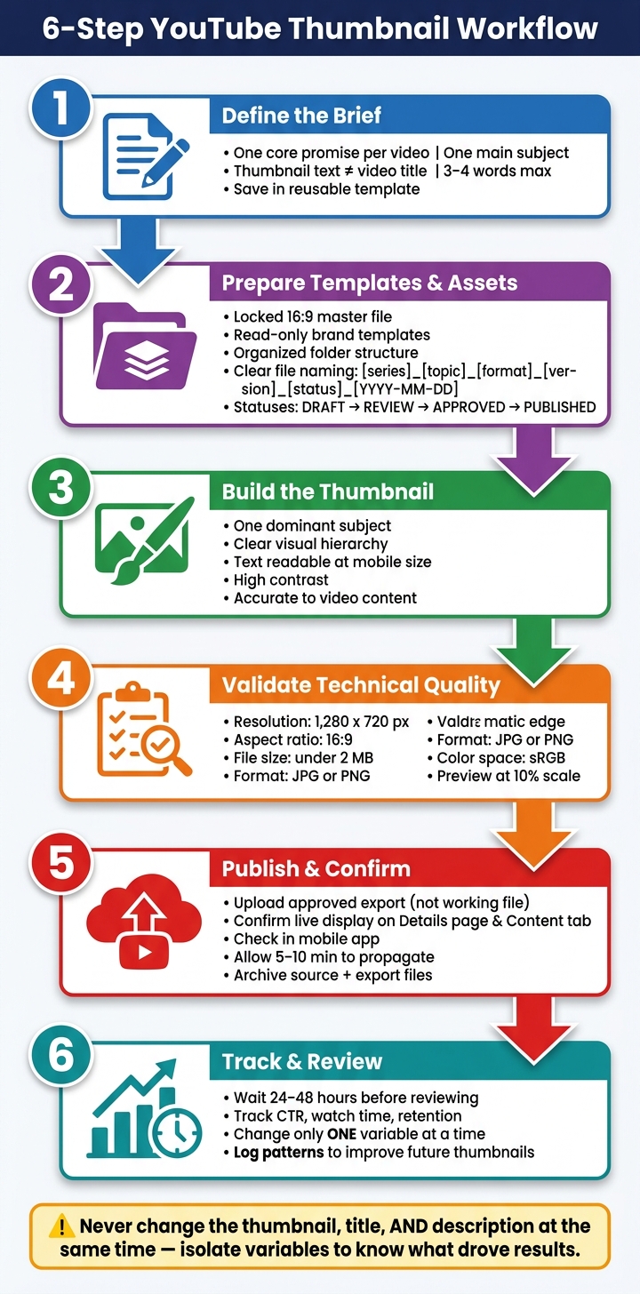
6-Step YouTube Thumbnail Workflow: From Brief to Review
Thumbnail Tutorials 4: The BEST Workflow Setup!
sbb-itb-b59debf
1. Define the Thumbnail Brief Before Design Starts
Write the brief before you open a design file.
Confirm the Video's Core Promise and Main Subject
Each thumbnail should get across one idea at a glance. That idea is the video's core promise: the specific result, shift, or curiosity gap vs direct value the video delivers. Put it into one sentence before you touch any design tool.
Then pin down the single main subject - one face, one object, or one action. Sticking to one subject makes the image easier to read on small screens. Check the design at 10% scale or use the squint test. If the subject and text aren't clear, strip it back.
Write Thumbnail Text That Supports the Title
The thumbnail and title should work together, not say the same thing twice. If your title is "How to Grow on YouTube," thumbnail text like "It's This Simple" adds new information. It builds curiosity and points to a result. Don't repeat the title word for word.
Keep text to 3–4 words max. Use bold sans-serif text with high contrast.
Save the Brief in a Reusable Template
Use one template per video with the publish date, assigned creator, and thumbnail layout.
| Brief field | What to include |
|---|---|
| Publish date | MM/DD/YYYY (e.g., 10/15/2026) |
| Assigned creator | Name or initials of the designer |
| Thumbnail layout | Layout choice for the thumbnail |
Store the brief with the project files, then move on to templates, source files, and naming rules. You can also browse YouTube thumbnail templates to speed up this stage.
2. Prepare Templates, Assets, and File Rules
Once the brief is done, the next move is setting up the systems that make every thumbnail easier to build. This is the stuff that cuts rework, keeps files tidy, and makes sure every design still feels like it belongs to the same channel.
Build Master Templates for Channel Consistency
Start with a locked 16:9 master file at the largest practical size, and keep exports inside platform upload limits. Inside that master, lock in your approved colors, fonts, visual hierarchy, logo placement, effects, and safe spacing.
Keep those master templates in a read-only folder and name them in a way nobody can miss, like TUTORIAL_MASTER_DO_NOT_EDIT. Then have designers work from duplicates saved in a separate project folder. That one rule alone saves a lot of headaches.
It also helps to build template variants for tutorials, gaming, and reviews. They can follow the same brand rules while using different layout logic. That way, each type of thumbnail feels a little different without drifting off-brand.
ThumbnailCreator is useful for fast concept drafts and variations. Before you export anything, apply your documented font, color, spacing, and logo rules.
Organize Source Files and Naming Rules
Use a folder structure that separates each stage of production:
YouTube-Thumbnails/
  Brand-Library/
    Fonts/
    Logos/
    Colors-and-Styles/
  Templates/
    Tutorials/
    Gaming/
    Product-Reviews/
  Projects/
    2026/
      2026-09-23-video-topic/
        Raw-Images/
        Cutouts/
        Working-Files/
        Exports/
        Approved/
  Archive/
File naming matters more than people think. A clear naming system makes it easy to find the right file, spot the latest version, and avoid uploading the wrong thumbnail.
Use this format:
[series]_[topic]_[format]_[version]_[status]_[YYYY-MM-DD].ext
For example:
techlab_iphone-camera-review_thumb_v03_draft_2026-09-23.psdtechlab_iphone-camera-review_thumb_v04_approved_2026-09-23.png
Use zero-padded version numbers like v01, v02, and v03 so files sort in the right order. And skip vague names like new, updated, or final-final.
Use Clear File Statuses to Prevent Rework
A short, plain status system keeps everyone on the same page. Use the same labels in both filenames and folders: DRAFT, REVIEW, CHANGES-REQUESTED, APPROVED, and PUBLISHED.
Only mark a file APPROVED after checking the subject, on-image text, branding, usage rights, and the matching video. If your design app allows it, lock brand layers so no one changes them by accident.
After the thumbnail is cleared for upload, move the exported file into the Approved folder. Keep the editable source file somewhere else so the final export doesn't get mixed up with working files.
| Asset type | Where it lives | Access rule |
|---|---|---|
| Brand master templates | Templates/ folder |
Read-only; duplicate before editing |
| Logos, fonts, color swatches | Brand-Library/ folder |
Locked; no direct editing |
| Active project files | Projects/YYYY/[date-topic]/Working-Files/ |
Editable by assigned creator |
| Final approved thumbnail | Projects/YYYY/[date-topic]/Approved/ |
No overwriting; new version = new file |
With the brief, templates, and file rules locked in, the design team can get to work without wasting time searching for assets, renaming files, or rebuilding the same pieces over and over.
3. Build the Thumbnail and Run Required Design Checks
With the brief locked in and your files in order, it's time to build the thumbnail. The job here is straightforward: make a thumbnail that tells the video's main idea at a glance, then run the checks that matter before export.
That split matters. Required checks come first. Optional polish comes later. Otherwise, small taste-based tweaks can slow down a file that's already ready to publish. Use the brief as your baseline, then compare the draft against it before you export.
Use One Clear Subject and Strong Visual Hierarchy
Start with one main subject. Then build a clear visual hierarchy so the thumbnail reads in an instant. The viewer's eye should move in a simple order: subject first, supporting image second, background third.
You can separate the subject with contrast, foreground brightness, background blur, or a restrained shadow. The key word is restrained. Piling on every effect at once - thick outlines, harsh sharpening, heavy glow - usually makes the image feel fake, not clearer.
A simple test works well here: can someone describe the video in 2–3 seconds without zooming in? If not, strip things back before you add any decorative detail.
Also, keep faces, text, and other key details away from the outer edges. That matters even more in the lower-right corner, where YouTube's duration label often sits.
Once the image reads fast, move on to text and accuracy.
Keep Text Short, Legible, and On Brand
Thumbnail text should add something the image doesn't already say. It shouldn't just copy the video title word for word.
Keep the text readable on mobile. If it falls apart at a small size, it's too much. YouTube specifically recommends readable fonts and descriptive text overlays in its own thumbnail guidance.
Contrast does a lot of the heavy lifting. If the text disappears in a small mobile preview, shorten it, make the font larger, or add an outline or shadow only if it helps. Tiny text and extra detail tend to break down first on smaller screens.
Once the text reads cleanly, check that the thumbnail lines up with the video itself.
Check Accuracy, Consistency, and Alternate Versions
Before moving forward, confirm that every major image, expression, and claim appears in the video. YouTube's thumbnail policy explicitly prohibits imagery that misleads viewers about a video's content, so accuracy isn't just a brand issue - it's a publishing requirement.
If you used an AI-generated or edited image, inspect it closely. Pay extra attention to hands, logos, labels, and faces. Small visual mistakes can make people hesitate, and that hurts trust fast.
Next, compare the draft with recent thumbnails in the same content category. Check for steady use of brand colors, type treatment, subject scale, and framing. Consistency doesn't mean every thumbnail has to look the same. It means people should still recognize the channel at a glance. If this draft moves away from the channel's usual style, make that call on purpose and note it so you can judge the result later.
Create alternate versions only when the idea is meaningfully different - for example, a different crop, a different emotional tone, or a different visual promise. YouTube's A/B testing feature vs gut feeling supports up to three thumbnail variants for eligible public long-form videos or podcast episodes.
The table below separates required checks from optional polish so the review stays focused:
| Check | Required or Optional |
|---|---|
| One dominant subject with clear separation | Required |
| Readable text at mobile size | Required |
| High text/background contrast | Required |
| Accurate representation of video content | Required |
| Safe spacing away from outer edges | Required |
| Consistent with recent channel thumbnails | Required |
| Subtle color grading or texture effects | Optional |
| Near-identical alternate versions | Optional |
4. Validate Technical Quality Before Upload
Once the design is approved, check the exported file before you upload it, following a YouTube thumbnail beginners guide if you're new to the process.
Check Resolution, Format, and File Size
Make sure the export matches the specs below. Miss just one, and you could end up with a failed upload or a stretched, blurry thumbnail.
| Technical Requirement | Acceptance Standard | Action if Fail |
|---|---|---|
| Aspect Ratio | Exactly 16:9 | Adjust canvas size or crop to 16:9 ratio |
| Minimum Width | 640 pixels | Resize image to at least 640px width |
| Resolution | 1,280 x 720 pixels | Scale assets to fit a 1,280 x 720 canvas |
| File Format | .JPG, .PNG, .GIF (static), or .BMP | Re-export or convert to a supported file type |
| File Size | Under 2 MB | Compress the image or reduce JPG export quality |
| Color Space | sRGB | Convert color profile in design software before export |
A simple rule of thumb:
- Use .PNG for thumbnails with lots of text or flat graphics.
- Use .JPG for photo-heavy thumbnails.
If a JPG is getting close to 2 MB, lower the export quality to about 80%–90%. Also export in sRGB so colors don't look washed out or overly saturated on different devices.
Preview the Thumbnail at Mobile Size
Then check how it looks on a phone-sized screen. Preview it at 10% scale. If the text or main subject feels hard to read, make it larger or increase the contrast.
Faces should still be easy to recognize at a small size. Also, don't place key elements in the bottom-right corner. That's where YouTube shows the video duration timestamp.
Confirm the Final Export Is the Correct Version
Before uploading, open the exported file itself, not the project file. This step catches small mistakes that are easy to miss during editing.
Check the exported file for:
- alignment
- crop
- text
- stray layers
Then make sure the file you're about to upload is the approved version.
5. Publish, Track Performance, and Update the Workflow
Upload, Confirm Display, and Archive Files
After export, upload the thumbnail and check the live version. Make sure the live thumbnail shows up the right way on the Details page and in the Content tab. Then open the video in a private browser window and check it in the YouTube mobile app to make sure the text and main visual still read well at mobile size. Give YouTube 5–10 minutes to update the thumbnail across the platform.
Once the live version matches the export, archive the approved export and source file. Then start the performance log.
Review Metrics Without Changing Too Many Variables
Wait 24–48 hours before reviewing results, or wait until impressions are high enough to judge CTR with some confidence. Log the thumbnail concept and CTR in one tracking sheet.
Here’s the big thing: don’t change the thumbnail, title, and description at the same time. If you adjust too many variables at once, you won’t know what actually changed the result. Each log entry should help you spot patterns so you can decide which thumbnail style to repeat on the next upload.
Conclusion: Turn One-Off Designs Into a Repeatable Process
The goal is consistency, not perfection. Use the same checklist for every thumbnail, then refine the process based on performance data. Over time, that makes the workflow faster and more dependable, with better speed, consistency, and decision-making from one upload to the next.
FAQs
How often should I update my thumbnail workflow?
Update it on a set schedule.
- Every week: check for clarity, readability, and consistency on mobile and desktop
- Every month: look for patterns and review visual identity
- Every quarter: review export settings, font pairings, and template assets
- Twice a year: check cross-platform performance
For individual videos, review the thumbnail again about 14 days after upload.
Move faster if performance slips. If CTR drops 10% below your baseline or falls under 4.0%, make an update sooner.
What should I do if my thumbnail CTR is low?
First, figure out whether the issue is the thumbnail itself or a disconnect between the thumbnail and the video. Compare CTR against your channel baseline. If it’s 10% below baseline or under 4.0%, send the thumbnail to a revision queue.
Then use ThumbnailCreator to make a few variations and test them with YouTube’s Test & Compare tool. Change one major element at a time so you can tell what’s moving the needle. Keep text short, use high-contrast visuals, show expressive faces, and make sure the thumbnail matches what the video actually delivers.
When should I create multiple thumbnail versions?
Create multiple thumbnail versions when you want to scale production, keep branding consistent, and cut manual design time. They’re especially handy when you’re testing different hooks, angles, or design choices to improve click-through rates.
It also makes sense to create new versions when a thumbnail falls short on readability or composition at small sizes, like 160 x 90 pixels. With ThumbnailCreator, you can generate 3 to 10 variations from a single brief, then pick the strongest ones for YouTube’s Test and Compare tool.