
Best Practices for Cross-Platform Thumbnails
One thumbnail can work across YouTube, Instagram, Shorts, Reels, and X - but only if I plan for crop, size, text, and UI overlap from the start.
If I want one image to hold up in more than one place, I need to check four things first: layout, readability, branding, and platform rules. The big numbers are simple: keep text short at 3–5 words, test readability around 168 × 94 px or even 120 × 90 px, keep text and faces about 8% from the sides and 10% from the top and bottom, and make sure text contrast hits at least 4.5:1.
Here’s the short version:
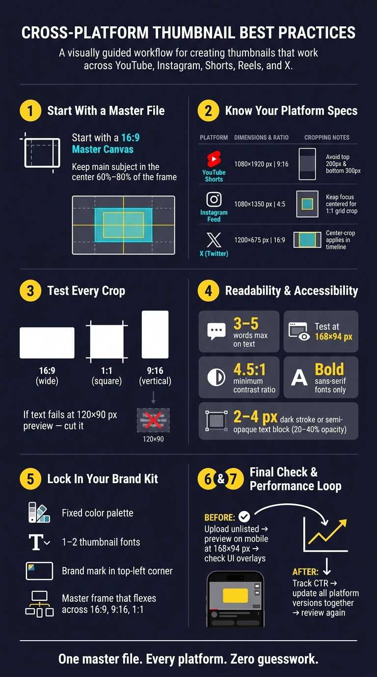
- I start with a 16:9 master thumbnail
- I test it in 1:1, 4:5, and 9:16 crops
- I keep the main subject near the center 60%–80% of the frame
- I leave room for timestamps and app UI
- I check if the thumbnail still makes sense in one second
- I keep branding the same across every version
- I review CTR and update all versions together after publish
A thumbnail that looks fine at full size can fail fast on mobile. So if I’m making one image for many platforms, I treat crop tests and small-screen checks as part of the design, not something I do at the end.
Cross-Platform Thumbnail Checklist: From Master File to Publish
1. Check Dimensions, Aspect Ratios, and Safe Zones
Start with a base canvas you can reuse
Use one 16:9 master file first. Then test that same layout in square and vertical crops before you export anything. That master file should be the starting point for every crop test in this section.
Keep your subject near the middle. A good rule is to place the main subject inside the center 60% to 80% of the frame so it still shows up after crop changes. That matters because thumbnail placements often crop or shrink the image.
Here’s a quick reference for dimensions and safe zones across the main platforms:
| Platform | Recommended Size | Aspect Ratio | Safe Zone Notes |
|---|---|---|---|
| YouTube Shorts | 1080 × 1920 px | 9:16 | Avoid the top 200 px and bottom 300 px due to UI overlays |
| Instagram Feed | 1080 × 1350 px | 4:5 | Instagram grid previews crop to 1:1; keep the focus centered |
| X (Twitter) | 1200 × 675 px | 16:9 | Center-crop behavior often applies in timeline views |
Test center crops, vertical crops, and small previews
Once the base layout is in place, check how it holds up after each platform crop. A thumbnail can look fine at full size and then fall apart the moment it gets squeezed down.
Start with a square crop. Crop the 16:9 canvas to 1:1 and make sure your face, text, or main object still shows in full. If part of it gets cut off, move it closer to the center.
Then check the vertical crop. For Reels and YouTube Shorts thumbnails, keep the main subject in the center third of a 9:16 canvas. Anything outside that area can end up hidden behind UI buttons or title overlays.
Last, test the image at small preview size. If the text is hard to read at about 120 × 90 pixels, it’s too small. If a design fails at thumbnail size, cut it and move on. To speed up your workflow, you can also use AI thumbnail generation to create multiple variations for testing.
sbb-itb-b59debf
2. Check Visual Hierarchy, Readability, and Accessibility
Make the focal point clear within one second
After you check the crop, ask one simple question: can someone understand the thumbnail in one second on YouTube, Instagram, or X? Once the crop is set, visual hierarchy decides whether people can read the image at a glance.
Guide the eye in a clear path: from the main subject to a short text hook, then to one supporting detail. Put the hook close to the face. Keep text to 3–5 words. Anything longer gets tough to read on mobile. That matters because the same image also needs to work in feed previews, short-form covers, and timeline views.
A quick way to test this is to shrink the design to about 10–15% of its original size - roughly 168 × 94 pixels. If the focal point and text hook still stand out, the hierarchy works. If the whole thing turns into visual clutter, you need to move, trim, or remove something.
Run contrast and accessibility checks before export
Contrast is one of the fastest ways to direct attention. Use at least a 4.5:1 contrast ratio between text and background.
If the background is busy, font weight alone usually won’t save you. Add a 2–4 px dark stroke, a soft drop shadow, or a semi-opaque color block behind the text at around 20%–40% opacity. That keeps the words readable without hiding too much of the image. Bold sans-serif fonts also tend to hold up better after compression and on small screens.
| Feature | High-Contrast Design | Busy/Low-Contrast Design |
|---|---|---|
| Readability | Legible at 168 × 94 px | Harder to decode at small sizes |
| Accessibility | Passes 4.5:1 ratio check | Fails against dark/light UI themes |
| Focal Point | Single, dominant subject | Multiple competing elements |
Before you export, test the thumbnail in both light and dark interfaces. Also keep key text away from platform UI zones. Once the hierarchy is set, apply your chosen thumbnail styles consistently across every platform.
How to design GREAT thumbnails (even if you’re not a designer)
3. Check Brand Consistency Across YouTube, Instagram, and X
After readability, consistency is what makes people recognize your content on sight across platforms. Once your layout is clear, the next step is to lock in a brand system that still works through different crops and placements on YouTube, Instagram, X, and other surfaces.
If you skip that step, the same thumbnail can lose its identity from one platform to the next.
Build a simple thumbnail brand kit
Keep your brand kit simple. Use a fixed color palette, one or two thumbnail fonts, and a master frame that can flex across 16:9, 9:16, and 1:1 exports.
Place the most important brand mark in the top-left corner. Then build the rest of your system around the smallest safe area shared across major crops. That way, your thumbnail still feels like your thumbnail even when parts of it get trimmed.
Use this setup as the starting point for every export, not as a last-minute fix.
Use ThumbnailCreator to keep layouts and branding consistent
Brand consistency usually falls apart when you rebuild each thumbnail from scratch. That’s where ThumbnailCreator can help.
It lets you save reusable templates with your colors and fonts already in place, so every new thumbnail starts from the same base. You can also make on-brand variations fast, even if design isn’t your thing. The result is simple: every export stays aligned without forcing you to rebuild the layout each time.
4. Check Workflow, Policy Compliance, and Performance
A thumbnail can still flop even after the design looks done. Maybe the crop is off. Maybe it gets flagged. Maybe nobody checks it again after the video goes live. That’s why this last step matters: do one final check before publishing, then do another review after publish.
Preview on desktop, mobile, and in-platform placements
Preview the thumbnail on desktop, mobile, and in-feed placements before publishing. Make sure faces and text still show up once platform overlays are added.
Upload an unlisted version and check it in the mobile app before publishing. Test it at mobile-feed size. If it only works on desktop, that’s not enough. YouTube’s mobile feed shows thumbnails at roughly 168×94 pixels.
Once the thumbnail looks right in every placement, start tracking performance and revise the weakest version.
Track CTR and update every platform version together
After publishing, watch CTR and watch-time signals, then revise the thumbnail across every platform version. On YouTube, weak CTR often points to text-heavy vs minimal text composition, size, or contrast problems.
Update all platform versions at the same time to keep the look consistent. Make the same change everywhere, then review performance again.
FAQs
Do I need separate thumbnails for each platform?
Usually, no.
Most thumbnails get reused across 4+ platforms, and about 67% of the places they appear will crop or resize them in some way. So instead of making a different version for every channel, it makes more sense to optimize once for easy reading anywhere.
A simple rule works well here: keep the stuff that matters most - especially faces and text - inside the center 80% safe zone. That gives you some breathing room when platforms trim the edges.
You’ll also want strong contrast, with at least a 4.5:1 ratio, and text that still holds up at small sizes like 120x90 pixels. Before you publish, shrink the image and check it at a few different sizes. If it falls apart when it gets small, it’s not ready yet.
What should I prioritize if my thumbnail looks crowded?
Use simple, bold visuals with one clear idea. Keep on-image text to 2–6 words, use a single main text area, and make the subject large enough to spot even at small sizes.
Add strong contrast between the subject and background. Place key details inside the center 60%–80% of the frame so app UI or mobile crops don’t cover them.
How often should I update thumbnails after publishing?
Use a recurring maintenance cycle instead of waiting for performance to slip.
- Weekly: check clarity, readability, and consistency on mobile and desktop
- Monthly: review recent uploads for patterns that worked and for visual identity
- Quarterly: refresh export settings, font pairings, and template assets
- Twice a year: review cross-platform performance