
Ultimate Guide to Brand Storytelling with Thumbnails
Thumbnails are the gateway to your brand’s story on YouTube. They’re not just images - they’re tools to grab attention, build trust, and drive clicks. Here’s what you need to know:
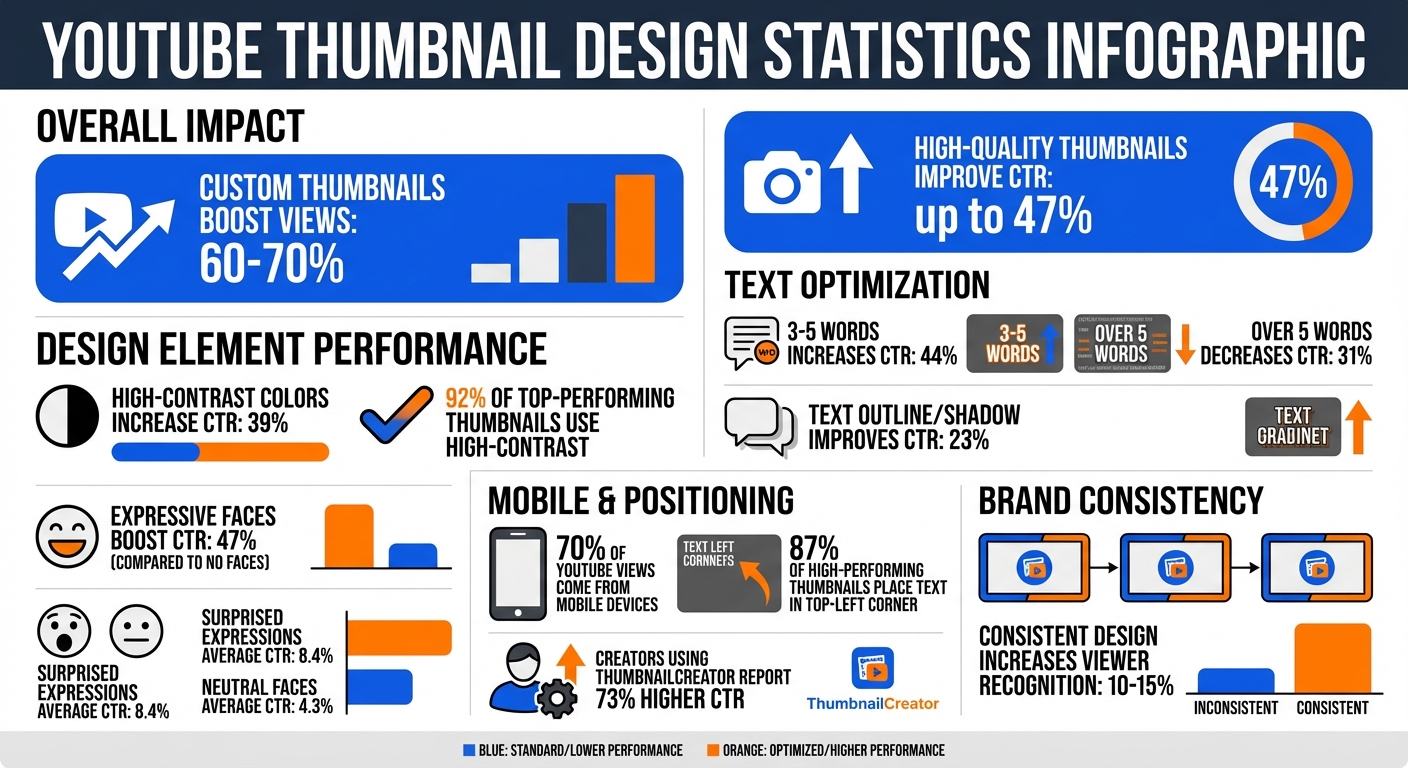
- Why Thumbnails Matter: Custom thumbnails can boost views by 60-70%. High-quality thumbnails with expressive faces, bold colors, and clear text improve click-through rates (CTR) by up to 47%.
- Key Design Tips: Use high-contrast colors, expressive emotions, and concise text (3-5 words). These elements make your thumbnails stand out and communicate your message instantly.
- Consistency Builds Trust: Reuse colors, fonts, and layouts across thumbnails to create a recognizable style. This builds trust and makes your content easier to spot.
- Mobile Optimization: Design for small screens - 70% of YouTube views come from mobile devices. Keep text readable and avoid placing key elements where the interface overlaps.
Want to make this process easier? Tools like ThumbnailCreator use AI to design thumbnails that tell your story, maintain branding, and boost engagement. Start with simple changes - bold visuals, clear text, and consistent style - and watch your CTR rise.
YouTube Thumbnail Design Statistics: CTR Impact by Design Elements
How to design GREAT thumbnails (even if you’re not a designer)
sbb-itb-b59debf
Design Principles for Storytelling Thumbnails
Creating thumbnails that grab attention and drive clicks boils down to three key principles: contrast, emotion, and clarity. These elements work together to ensure your thumbnail stands out and communicates your message effectively.
Using High-Contrast Colors
Your thumbnail has to pop against YouTube's white or dark gray interface. Using high-contrast color combinations can boost your click-through rate (CTR) by 39% - and 92% of top-performing thumbnails rely on this technique. The trick is to pick colors that make your subject stand out while also matching the mood of your story.
For example:
- Yellow/black radiates energy.
- Red/white creates urgency.
- Blue/orange builds trust.
- Purple/yellow suggests creativity.
To balance these colors, try the 60-30-10 rule: use 60% dominant color, 30% secondary color, and 10% as an accent.
"Thumbnail design is 80% marketing psychology, and only 20% design skill." – Thomas Frank
Be cautious with pure red (#FF0000) or pure white (#FFFFFF), as YouTube’s compression can dull these tones. Slightly adjusted shades work better and maintain vibrancy.
While contrast grabs attention, emotion helps forge a connection with your audience.
Adding Expressive Faces and Emotions
Humans are naturally drawn to faces - it’s hardwired into our brains. Thumbnails featuring expressive faces can boost CTR by 47% compared to those without. But it’s not just about including a face; the emotion it conveys is just as important.
- Surprised expressions perform the best, with an average CTR of 8.4%.
- Neutral faces fall flat, averaging only 4.3%.
To maximize impact, use exaggerated features like wide eyes or raised eyebrows. Position the face following the Rule of Thirds vs. centered layouts so it takes up 30–50% of the thumbnail - this ensures it’s visible even on smaller screens. Direct eye contact with the viewer adds a human touch and strengthens your brand’s connection. Match the expression to the video’s theme: use "shocked" for big reveals, "happy" for tutorials, "serious" for warnings, or "confused" for problem-solving.
Pair these visuals with concise text to complete the story.
Keeping Text Short and Clear
The text on your thumbnail should spark curiosity without giving too much away. Stick to 3–5 words - this sweet spot can increase CTR by 44%, while going over five words can drop it by 31%.
"I reduced my thumbnail text from 12 words to 3. My CTR jumped from 3.2% to 7.8% overnight." – Ali Abdaal
For fonts, bold sans-serif options like Montserrat Black, Impact, or Bebas Neue work best. Use font sizes between 100–200 pixels, and add an 8–15 pixel outline or drop shadow to make the text stand out against busy backgrounds - this simple tweak can improve CTR by 23%. Keep the text intriguing but avoid repeating the video title. And always test your thumbnail at smaller sizes to ensure it’s readable on mobile devices.
Building Brand Consistency Across Thumbnails
Having a consistent look across your thumbnails gives your content an identity that viewers instantly recognize. Think of it as a visual signature - when someone scrolls through their feed, this consistency acts like a mental shortcut, helping them spot and trust your content before even reading the title. Over time, this recognition builds trust and familiarity, which can lead to better engagement and even improved algorithmic performance.
"Your visual consistency acts like a mental bookmark, making it easier for people to find and trust your content." – Sacha Dumay, Founder of DataFuel
Thumbnails that share a unified design - through colors, fonts, and layouts - make your content easier to process visually. This not only strengthens brand recall but also reinforces your storytelling. Below, we’ll dive into practical ways to make this happen.
Creating Template Systems
Templates are your secret weapon for keeping your thumbnail designs consistent and efficient. By standardizing your design process, templates save time and eliminate unnecessary decisions. Start with 2–3 template variations: one for regular content, another for collaborations or special series, and a third for seasonal or trending topics. This keeps your visuals fresh while maintaining your brand's identity.
Here are a few design tips to keep in mind:
- Logo placement: Keep your logo in a fixed spot, taking up 5–10% of the thumbnail area - enough to be noticeable but not overpowering.
- Color choices: Stick to 2–3 colors - a primary brand color, a high-contrast accent, and a neutral tone.
- Fonts: Use 1–2 fonts (preferably bold or black weights) to ensure readability.
"Templates aren't constraints - they're freedom machines." – Sacha Dumay, Founder of DataFuel
Set up placeholders in your design tool for fonts, logos, and background areas. This way, you can easily swap in new images or text without starting from scratch. Always preview your thumbnails at 160x90 pixels to make sure text is legible on mobile devices, and aim for a contrast ratio of at least 4.5:1 to ensure accessibility.
Using the Rule of Thirds for Composition
The Rule of Thirds is a simple yet powerful tool for creating balanced and visually appealing thumbnails. Picture your 1280x720 canvas divided into a 3x3 grid. The key is to place important elements - like a person’s face, a product, or bold text - at the intersection points of these lines. This naturally draws the viewer’s eye to the focal points.
For example, you could position a face in the left third and text in the right third, or highlight a product in the upper-right intersection while using your brand color to fill the opposite corner. This layout creates a sense of movement and keeps the design dynamic. To further emphasize the focal point, use a shallow depth of field by blurring the background. This technique ensures the viewer’s attention stays on the most important part of your thumbnail.
Working with Complementary Colors
Complementary colors are a game-changer for making your thumbnails stand out. These color pairs - like blue/orange, red/green, and yellow/violet - sit opposite each other on the color wheel, creating a natural contrast that instantly grabs attention. This is especially effective on YouTube, where thumbnails need to pop against white, gray, and dark mode backgrounds.
Here’s how to choose the right colors for your content:
- Blue/orange: Ideal for tech or educational videos; it conveys trust and energy.
- Red/green: Great for product reviews or comparisons; it creates a sense of urgency.
- Yellow/violet: Perfect for creative or entertainment-focused channels.
Once you’ve picked your palette, increase the saturation and contrast by 15–25% to ensure the colors stay vibrant, even when thumbnails are scaled down to 160x90 pixels. Always test your designs at this smaller size to confirm they remain visually impactful.
Technical Guidelines for Thumbnail Optimization
Once your design is polished, fine-tune the technical settings using free thumbnail tools to guarantee your thumbnails perform well on all devices. Getting these details right ensures your visuals stay crisp, whether viewed on a large desktop monitor or a smartphone.
Recommended Dimensions and File Formats
Stick to 1280 x 720 pixels (16:9) for a balance of clarity and manageability across platforms. If you prefer higher resolution, you can use 1920 x 1080, but keep the file size under 2 MB. For most creators, 1280 x 720 hits the sweet spot between quality and file size.
When it comes to file formats, choose JPG for photographic imagery and PNG for designs that incorporate text or graphics. PNG files preserve sharp text edges. If your PNG exceeds 2 MB, convert it to a high-quality JPG (80–90%) to reduce the size without compromising the visual quality. Always save your thumbnails in the sRGB color profile to ensure consistent colors across web browsers.
Now, let’s talk about how to make your thumbnails effective on smaller screens.
Safe Area and Mobile Readability
With over 70% of YouTube views happening on mobile devices, thumbnails must remain clear and readable even at reduced sizes - sometimes as small as 156 x 88 pixels in search results. To ensure key elements stay visible, use the central 900 x 430 pixel area as your safe zone. This is where you should place critical elements like faces, text, and logos to avoid them being cut off by YouTube’s interface.
"Most creators are designing for a billboard when they should be designing for a postage stamp." – Alex Rivera, YouTube Design Expert
Avoid putting important visuals in the bottom-right corner, where the video duration timestamp typically appears. Similarly, text should be positioned at least 150–200 pixels above the bottom edge to steer clear of the progress bar. For text readability on mobile, use a minimum font size of 60–80 pixels on a 1280 x 720 canvas. For primary text, go even larger - 100–140 pixels is ideal.
Positioning Storytelling Elements
How you position faces, text, and branding can make or break your thumbnail’s performance. For example, in early 2026, creator MrBeast boosted his click-through rate by 34% (from 8.2% to 11.0%) - adding 15 million views in just 30 days - by adapting his thumbnails for mobile viewing. His approach? Keeping crucial storytelling elements within highly visible areas.
| Element Type | Optimal Positioning | Reason for Placement |
|---|---|---|
| Primary Text/Hook | Top-left or center | Avoids interface overlap and stays prominent. |
| Faces & Emotions | Center or left (with ~15% padding) | Boosts emotional appeal while avoiding cropping. |
| Logos/Branding | Within the 900 x 430 safe zone | Ensures branding remains visible and unobstructed. |
| Decorative Elements | Bottom-right or edges | Best for non-essential visuals due to potential UI overlap. |
Data from 2025 reveals that 87% of high-performing thumbnails placed text in the top-left corner. This area is often the first spot viewers scan on mobile and stays unobstructed by YouTube’s interface. To maintain visibility across devices, center your key elements with 15–20% padding from the edges.
How ThumbnailCreator Helps with Brand Storytelling
ThumbnailCreator simplifies the process of creating eye-catching thumbnails by leveraging AI tools designed specifically for YouTube creators. You don’t need to be a design expert to use it - over 15,000 creators already trust the platform, which has generated more than 10 million thumbnails so far.
AI-Powered Thumbnail Generation
ThumbnailCreator’s AI can generate customized thumbnails in just 30 seconds. By analyzing your text descriptions or YouTube links, it taps into a database of over 3 million top-performing thumbnails. The system automatically applies proven design principles to ensure your thumbnails are visually appealing and align with your brand. All you need to do is paste an unlisted YouTube URL, and the AI will analyze your video content to create a thumbnail that reflects your story.
The platform’s Style Cloning feature allows you to replicate the look of any reference thumbnail instantly, helping you maintain a consistent aesthetic across your videos. If you’ve already found a style that resonates with your audience, you can scale your production without compromising on quality. Plus, with natural language editing, you can make quick adjustments like “change the background” or “add text” with a single click.
Features for Customizing Storytelling Thumbnails
ThumbnailCreator offers tools that take your storytelling to the next level:
- Face Swap lets you upload personal photos to integrate into your designs seamlessly. This ensures your thumbnails reflect authentic emotions, whether it’s subtle surprise for a documentary or excitement for a fitness transformation.
- Advanced Face Training (available with Creator and Teams plans) saves specific faces, making it easy to use the same “protagonist” across multiple thumbnails.
- Object Swapping allows you to replace elements to create visual metaphors. For example, a tech reviewer might swap in a cracked screen with the text “BROKEN?” to spark curiosity, while a fitness creator could replace a dumbbell with a transformation prop to inspire viewers.
- Text Overlay Tools let you add short, punchy phrases like “TRUTH REVEALED” in bold, high-contrast fonts. Combined with the Background Remover and Layer Editing features, you can precisely position every element to tell your story effectively.
To ensure brand consistency, the Brand Kit locks in your colors, fonts, and layouts across thumbnails. You can create a system of 3–5 core templates that viewers will easily recognize. Plus, direct YouTube integration allows for one-click uploads with automatic resizing to 1280 x 720 pixels and mobile-friendly checks.
Comparing Plans: Free vs. Pro vs. Agency
ThumbnailCreator offers three subscription tiers tailored to different needs:
- Starter Plan: Perfect for testing concepts, this plan includes a 7-day free trial with 10 credits. At $24/month (or two free months with annual billing), you get 600 credits per year and access to basic AI generation and templates.
- Creator Plan: For $41/month, this plan unlocks unlimited AI generations, face and object swapping, expression morphing, and access to over 50 templates. With 1,200 credits per year, it’s ideal for creators producing 3–5 videos weekly.
- Teams Plan: Designed for agencies, this $83/month plan includes all Creator features plus team collaboration, multiple face training profiles, and a Channel Makeover feature for bulk rebranding. With 3,000 credits per year and 24/7 priority support, it’s perfect for managing multiple channels.
Creators using ThumbnailCreator report a 73% higher click-through rate on thumbnails compared to DIY designs.
| Plan | Price (USD/Month) | Key Features for Storytelling | Best For |
|---|---|---|---|
| Starter | $24 | Basic AI generation, 5 templates, 600 credits/year | Testing concepts, 1–2 videos/week |
| Creator | $41 | Unlimited AI, face/object swapping, expression morphing, 50+ templates, 1,200 credits/year | Consistent branding, 3–5 videos/week |
| Teams | $83 | All Creator features plus team collaboration, custom brand kits, channel makeover, 3,000 credits/year | Agencies, multi-channel networks |
Conclusion
Key Takeaways
Your thumbnail is essentially a promise to the viewer. As discussed in this guide, the most effective thumbnails combine smart design with consistency. The majority of high-performing thumbnails share four key traits: an expressive face, high contrast, minimal text (just 3–5 words), and a clear focal point.
Design choices matter. Expressive faces and bold, contrasting colors make thumbnails stand out and boost engagement. Consistency also plays a big role - using the same color schemes, fonts, and recurring visuals can increase viewer recognition by 10–15%. Techniques like creating curiosity gaps vs. direct value (e.g., before/after images or slightly blurred elements) can dramatically improve click rates, sometimes doubling or tripling them.
With over 70% of YouTube views happening on mobile devices, thumbnails need to stay clear and readable even at smaller sizes. A well-designed thumbnail doesn’t just look good - it drives clicks.
Next Steps for Creators
Take a close look at how your thumbnails appear on mobile. If they’re hard to read, simplify the design and boost the contrast. Tools like ThumbnailCreator can make this process easier by using AI to apply proven design principles automatically.
Try out ThumbnailCreator’s free plan to see how AI can refine your thumbnails. Use the Brand Kit feature to lock in your visual identity, and set up reusable templates for consistent branding across your videos.
FAQs
How do I A/B test thumbnails to improve CTR?
To improve your click-through rate (CTR) on YouTube, testing different thumbnails is a smart move. Start by creating multiple variations of your thumbnail. You can use YouTube’s "Test & Compare" feature, which allows you to upload up to three different options.
Run the test for at least two weeks to ensure you collect enough data for accurate results. For each variation, make sure to tweak just one major element - like the color scheme, text, or the main image. This approach helps you pinpoint exactly what grabs attention and drives engagement. Once the test is complete, stick with the thumbnail that performs the best for future use.
What makes a thumbnail “on-brand” without looking repetitive?
An on-brand thumbnail strikes a balance between consistency and creativity. It should stick to your brand's visual identity - like using your specific colors and fonts - so viewers instantly recognize your content. But to keep things engaging, mix it up with unique touches. For example, vary facial expressions, layouts, or overlays to reflect the specific vibe of each video. The goal is to stay true to your brand’s tone and style while adding enough variety to avoid looking repetitive or dull.
How can I keep thumbnails readable on mobile without clutter?
When creating thumbnails for mobile, simplicity is key. Stick to bold, large fonts and limit text to 3-5 words. Use high-contrast colors to ensure visibility, even at small sizes like 120×90 pixels. Avoid cramming in too many details - keep the design clean and emphasize a single, clear focal point. Always preview your thumbnail at reduced sizes to make sure it’s easy to read on any device.