

Thumbnails and Viewer Trust: Why Design Matters
A thumbnail can win the click and still lose the viewer. If your click-through rate is high but people drop off in the first 10–30 seconds, your thumbnail likely set the wrong expectation.
Here’s the short version: clear thumbnails, honest visuals, readable text, and a steady channel style help viewers feel sure about clicking. Common thumbnail mistakes, overhyped reactions, and images that don’t match the video often do the opposite. And that shows up in your numbers: lower retention, weaker return visits, and slower subscriber growth.
If I had to boil the article down, it would be this:
- CTR alone is not enough
- Early retention drop-off is a warning sign
- Clarity is one of the biggest drivers of visual trust
- Mobile readability matters
- The first 20–60 seconds must match the thumbnail
- Comments and subscriber change help confirm what analytics suggest
- A simple workflow works best: audit, redesign, test, monitor
A few stats stand out:
- Studies on visual communication cited clarity most often for perceived trust, with 80%+ of participants pointing to it
- A mismatch between thumbnail and video often leads to an early retention loss of about 15%–20%
- Text overlays work best when kept to 3–5 words
In plain English: if you want people to click and stay, your thumbnail needs to make a promise the video keeps. That means one focal point, clean text, calm color use, and visuals that match what viewers see right after the click.
The article explains how to spot trust problems, fix them, and track whether your new thumbnails are helping.
What damages trust in thumbnail design
Misleading visuals and exaggerated promises
Once you understand visual trust, the next step is seeing what chips away at it.
Misleading thumbnails may get a short burst of clicks, but they wear down trust over time. And this goes past obvious clickbait. It also includes sensational images, overhyped results, fake reactions, or dropping in a celebrity or brand logo that has no real tie to the video. When viewers see familiar faces, logos, or credentials without a legit connection, skepticism kicks in fast - especially when the content doesn’t back it up.
YouTube now penalizes blatant clickbait, including thumbnails that promise something the video never delivers.
Visual clutter, weak typography, and tone mismatch
Even honest topics can fall flat if the thumbnail looks messy or low-effort.
Crowded layouts, too much text, and fonts that are hard to read all hint at low quality before anyone clicks. A simple rule helps: use no more than two fonts, keep text to 3–5 words, and check whether it still reads well at thumbnail size. Most YouTube views happen on mobile, so if the text is hard to read on a small screen, the design has already missed the mark.
Color and tone mismatch can do just as much damage. If the visual style clashes with the topic, the thumbnail can feel spammy or off, even when the video itself is accurate.
How trust loss slows community growth
Poor thumbnail design doesn’t just hurt clicks. It teaches viewers not to come back.
When the thumbnail keeps setting one expectation and the video delivers another, viewers start skipping future uploads. Over time, that pattern shows up in the numbers: lower returning viewer rates, weaker engagement, and slower subscriber growth. Trust isn’t some vague feeling. You can track it, and you can improve it - and the next section gets into how.
sbb-itb-b59debf
Design choices that build credibility
Clear focal points and honest subject selection
Once the trust problem is clear, the fix is pretty simple: make the thumbnail's promise obvious and believable.
Give the thumbnail one clear focal point so people can grasp the promise right away. Use a subject that plainly matches the video. That lowers skepticism before the click and helps the thumbnail avoid clickbait vs authentic thumbnails friction.
Honest subject selection works the same way. If your video is about saving $500 in 30 days, the image should feel grounded: a progress chart, a wallet, or a calendar. Not luxury visuals that hint at a totally different result.
Readable text, restrained color, and consistent style
Once the focal point is locked in, the next step is removing friction.
Text should tell viewers the video's value at a glance. Keep the color palette restrained so the design feels clean and trustworthy. Match color intensity to the topic's tone, and keep serious topics visually restrained. It also helps to use a few reusable templates so the channel stays visually consistent.
Comparison table: trust-building vs. trust-damaging design choices
Use this as a quick check against your current thumbnails.
| Design Choice | Trust Impact | Behavioral Outcome |
|---|---|---|
| Natural expression vs. exaggerated shocked face | Natural feels honest; exaggeration can feel manipulative | Viewers feel less baited |
| 3–5 word bold overlay vs. crowded text block | Short text signals clarity and professionalism | Clearer value on mobile |
| Content-aligned color palette vs. tone-mismatched colors | Matching colors reinforce honesty; mismatch feels off-brand | Clearer emotional expectations |
| Single focal subject vs. multiple competing elements | One subject cuts confusion and looks intentional | Faster comprehension |
| Consistent channel style vs. random per-video design | Consistency builds recognition and reliability | Stronger brand recall and confidence returning |
Top 5 Mistakes When Designing YouTube Thumbnails
A step-by-step workflow for fixing thumbnail trust issues
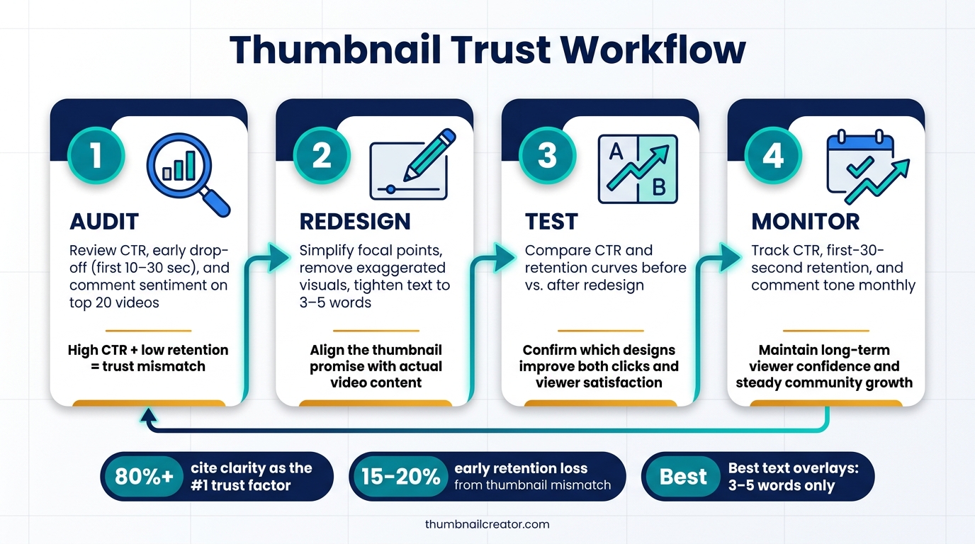
Thumbnail Trust Workflow: Audit, Redesign, Test & Monitor
Audit current thumbnails using retention data and viewer feedback
Once you know which thumbnail choices hurt trust, the next move is simple: go into your data and find them.
In YouTube Analytics, open Reach and flag videos with high CTR but low average view duration, or a sharp drop in the first 10–30 seconds. That combo usually means the thumbnail sold one thing, but the video gave people something else. In plain English, that's where trust starts to crack.
Next, check the audience retention graph for each flagged video. Then pair that with a fast scan of the comments. Look for phrases like misleading, clickbait, or not what I expected. Those comments often tell you the same story the graph does.
It also helps to check each thumbnail on a phone, one scroll at a time. If faces, key objects, or words blur together on a small screen, viewers may feel confused before the video even begins.
Build honest, repeatable thumbnail templates
After the audit, lock in the parts that keep your thumbnails consistent.
Set one subject position, one text zone, one palette, and one typeface. Then use them again and again. That kind of template makes your channel easier to spot for returning viewers.
ThumbnailCreator fits this process well. You can use AI generation to try different compositions while keeping the message tied to the actual video. Face swapping and object swapping can help sharpen the main focal point, so the thumbnail matches what people will see after they click. You can also edit short text overlays directly to keep the copy specific and honest.
One rule matters here: only use face and object swaps for elements that appear in the video.
Process table: audit, redesign, test, and monitor
Use this sequence for each thumbnail refresh.
| Step | Action | Trust Outcome |
|---|---|---|
| Audit | Review CTR, early drop-off, and comment sentiment on your top 20 videos | Finds misleading thumbnails fast |
| Redesign | Simplify focal points, remove exaggerated visuals, and tighten text to match actual content | Aligns promise with delivery |
| Test | Compare CTR and retention curves after redesigns | Confirms which designs improve both clicks and viewer satisfaction |
| Monitor | Track CTR, first-30-second retention, and comment tone monthly | Maintains long-term viewer confidence and supports steady community growth |
How to measure thumbnail trust over time
Metrics that show whether viewers trust your thumbnails
After a redesign, check the numbers to see if trust actually improved. CTR tells you who clicked. It does not tell you whether the thumbnail kept its promise. That’s why it helps to read CTR alongside retention and viewer feedback.
The simplest way to spot change is to compare performance before and after a thumbnail update over the same time window. If you see a steep drop in the first 15–30 seconds, that usually points to a mismatch between the thumbnail and the video. If retention stays steadier, the thumbnail and the content are more in sync. The key is to watch whether that early-drop pattern gets better after the redesign. Retention helps show whether the video delivered on what the thumbnail suggested.
Comments add the human side that dashboards can’t fully show. If viewers say the video wasn’t what they expected, or that the thumbnail felt misleading, take that seriously. That often means the thumbnail is driving curiosity clicks instead of trust clicks. Subscriber growth is a slower signal, but it still matters. If a video gets strong views with little or no net subscriber growth, that can hint that people clicked out of curiosity rather than confidence in the channel.
No single metric proves trust by itself. You need to look at the full picture.
| Metric | What it reveals | Its limitation |
|---|---|---|
| CTR | Whether the thumbnail attracted clicks | Cannot show if viewers felt satisfied after clicking |
| Average percentage viewed | Whether the video held attention after the click | Does not isolate the thumbnail as the cause |
| Early drop-off (first 15–30 seconds) | Whether the opening matched the thumbnail's promise | Could reflect the intro, not just the thumbnail |
| Comment sentiment | Whether viewers felt aligned or misled | Does not identify the exact cause of trust change |
| Net subscriber change | Whether viewers trusted the channel enough to commit long term | Influenced by many factors beyond thumbnails |
Conclusion: honest design supports clicks, retention, and community
When the monitor step leads to better retention and better feedback, the thumbnail is doing what it should. Misleading designs may drive clicks for a short stretch, but high CTR with weak retention usually means the thumbnail set the wrong expectation.
Channels that build steady communities usually do something pretty simple: they make thumbnails that match the video. Clear focal points, honest subject choice, readable text, and a consistent visual style all send the same message - this channel respects the viewer’s time. Across many uploads, that kind of consistency can support stronger retention and steadier subscriber growth.
A simple workflow - audit, redesign, test, monitor - cuts down on guesswork and helps keep that signal clear. Tools like ThumbnailCreator can help you move faster inside those honest limits, with AI generation and templates for professional thumbnails that still stay true to the video. Honest thumbnails bring in viewers who stay, come back, and subscribe. That’s how thumbnail trust turns clicks into a community.
FAQs
How do I know if my thumbnail is hurting trust?
Look for red flags in both performance and design. If you see a high click-through rate and then a steep drop in engagement in the first 30 seconds, that’s often a sign the thumbnail promised more than the video delivered.
Design issues can hurt trust too. A thumbnail can turn people off if it looks unpolished, cluttered, hard to read, off-brand, or built around misleading imagery.
ThumbnailCreator can help keep your thumbnails clear, consistent, and mobile-friendly.
What should I change first in a low-trust thumbnail?
First, simplify the design so people get it right away. Thumbnails that look cluttered, use low-contrast colors, or are tough to read can come across as unprofessional or easy to ignore.
Use high-contrast colors, trim the text down to a clear hook, and make it easier to read with an outline or drop shadow. Then check it at a small, mobile-friendly size in ThumbnailCreator to make sure the main focal point stands out at a glance.
Can a higher CTR still mean my thumbnail is failing?
Yes. A high click-through rate (CTR) can still be a bad sign if the thumbnail doesn't line up with the video itself.
Here's the issue: people click, but then leave in the first 30 seconds. That usually means the thumbnail promised one thing and the video delivered another. In plain English, the click happened, but the viewer felt misled.
YouTube picks up on that fast. Low audience retention tells the platform that the packaging and the content don't match. And that mismatch can hurt the video's performance and limit future recommendations.