
How Viral Elements Improve Thumbnail CTR
Your thumbnail is the first thing viewers notice, and it determines whether they click or scroll past in under a second. This article explains how specific design choices - like bold colors, expressive faces, and curiosity-driven visuals - can boost your video’s click-through rate (CTR) by up to 40%. Here’s the key takeaway: effective thumbnails grab attention, spark curiosity, and align with your video’s content to build trust and keep viewers engaged.
Key Points:
- Viral Elements: Use expressive faces, bold contrasts, and curiosity gaps to disrupt scrolling patterns.
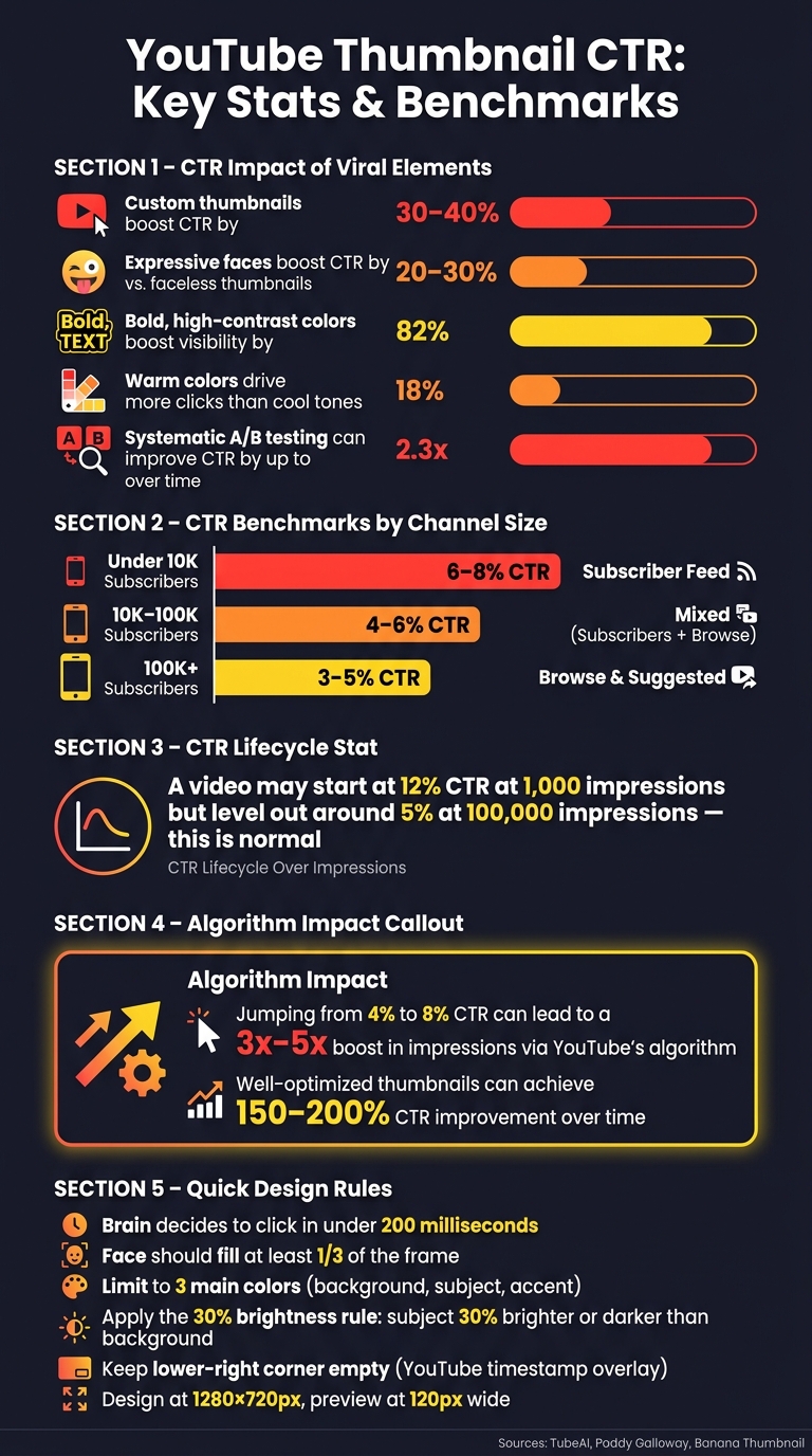
- CTR Impact: Custom thumbnails boost CTR by 30–40%, with higher CTRs leading to more impressions and algorithmic promotion.
- Design Tips: Focus on clarity with one main subject, minimal text, and high contrast for mobile screens.
- Avoid Misleading Tactics: Thumbnails should reflect the video’s content to maintain viewer trust and retention.
- Data-Driven Testing: Use A/B testing to refine thumbnails and track CTR, view duration, and engagement metrics.
By mastering these strategies, you can significantly improve your video’s reach and performance. Let’s break it down further.
We Tested the Viral Thumbnail Strategy
sbb-itb-b59debf
How Viral Elements Shape Viewer Behavior
Thumbnails are like visual bait - viewers respond to them almost instantly. In fact, the brain decides whether to click or scroll past in under 200 milliseconds. That’s quicker than a blink, leaving no time for logic. It’s all about instinct. The difference between a thumbnail that gets ignored and one that drives clicks lies in understanding what triggers those gut reactions. Let’s break down the key design elements that influence these snap decisions.
Curiosity Gaps and Emotional Triggers
A curiosity gap teases just enough to intrigue but holds back enough to leave questions unanswered. This creates a psychological itch that the brain feels compelled to scratch. Clicking becomes almost automatic when a thumbnail poses a visual question.
"The brain wants resolution. A well-engineered thumbnail withholds just enough to make clicking feel necessary." - TubeAI
The most effective thumbnails also tap into core emotions like surprise, curiosity, desire, or fear. These emotions create urgency or tension that nudges viewers toward clicking. The secret is to balance that emotional pull with honesty - if the thumbnail doesn’t match the video’s content, you risk losing trust. And trust is hard to win back.
Composition, Focal Points, and Contrast
Beyond emotion, clarity in design is essential. A cluttered thumbnail overwhelms the viewer, making it harder to process. Instead, focus on one clear element - whether it’s a face, an object, or a striking result. This focal point grabs attention immediately.
From there, visual hierarchy guides the eye: the primary focus comes first, followed by any text, and then the background. High contrast between the foreground and background ensures this hierarchy is easy to spot, even on tiny screens where thumbnails appear at just 128×72 pixels.
"Contrast is communication, and on a platform where your thumbnail competes with hundreds of others in a single feed view, communication speed is everything." - TubeAI
How to Increase CTR Without Misleading Viewers
Nothing damages a channel faster than a misleading thumbnail. Sure, it might get clicks, but if the video doesn’t deliver on the promise, viewers leave quickly. Worse, YouTube’s algorithm notices the short watch time and assumes the content isn’t engaging, which hurts how often your video gets recommended.
Instead of overpromising, think of your thumbnail as a visual setup - it should prepare viewers for what they’re about to see. Misleading thumbnails don’t just cause viewers to leave; they can make them disengage entirely, lowering your channel’s overall performance. A well-designed thumbnail doesn’t just attract clicks - it builds trust and keeps viewers coming back for more.
How to Identify Viral Trends in Your Niche
Understanding what resonates with your audience is crucial. Before creating anything, you need to familiarize yourself with the visual style and trends that are already successful in your niche. This means analyzing what’s working and why it’s working.
Analyzing Top-Performing Thumbnails in Your Niche
Start by searching for your target keyword on YouTube and taking screenshots of the top 10 thumbnails. These thumbnails have already proven their effectiveness, so look for common design elements that make them stand out. Pay attention to details like color schemes, facial expressions, and how text is incorporated. Then, check out the most-viewed videos on the top 10 channels in your niche. You'll likely notice a recurring formula in their layouts, color choices, and overall composition. These insights will help you build a foundation for identifying and replicating trends in your own designs.
Tracking Visual Trends with a Swipe File
A swipe file is essentially a visual moodboard where you save thumbnails that catch your eye. Anytime a thumbnail grabs your attention - whether it’s because of its colors, layout, or text placement - screenshot it and add it to your collection. Over time, patterns will emerge. For example, you might notice trends like the use of "before and after" split screens or the dominance of warm colors like red, orange, and yellow. Interestingly, warm colors tend to perform better, with an average of 18% more clicks compared to cooler tones. This swipe file becomes your go-to resource for designing thumbnails that align with viral cues in your niche.
How to Stand Out When Trends Get Overused
Trends lose their edge when they become overused. If every thumbnail in a feed looks the same, none of them stand out. This is where you can use pattern interruption to your advantage. For instance, if all the top thumbnails in your niche use blue and white, experiment with bold colors like red and yellow. If most thumbnails show the finished result, try showcasing the "before" stage instead.
To test your design, use the Scroll Test: place a mockup of your thumbnail into a YouTube feed screenshot and see if it grabs attention. If it blends in, adjust elements like contrast or focal points to make it pop. You can also use YouTube’s "Test & Compare" feature to run A/B tests on two thumbnail variations. Let them run for 48–72 hours, tweaking one element at a time, and use the data to refine your approach.
The key isn’t to avoid trends altogether - it’s about understanding them deeply enough to know when breaking the mold will work in your favor. Up next, we’ll dive into the viral elements you can incorporate to elevate your thumbnails and boost your click-through rate.
Key Viral Elements to Use in Your Thumbnails
Here’s how to design thumbnails in various styles that get more clicks.
Expressive Faces and Direct Eye Contact
People naturally focus on faces first when looking at a screen. It’s almost instinctive - our brains are wired this way. Thumbnails featuring strong, clear emotions like surprise, joy, or shock tend to grab attention and drive clicks. In fact, these designs can boost click-through rates (CTR) by 20% to 30% compared to faceless thumbnails.
For the best results, choose an expressive face over a neutral one. The emotion should be so clear that it’s instantly recognizable, even at a small size. Since over 70% of YouTube views happen on mobile devices, make sure the face fills at least one-third of the frame to stay visible. Tools like ThumbnailCreator can help refine or adjust facial expressions to match the mood of your video without needing a reshoot.
Direct eye contact takes things up a notch. When the subject looks straight into the camera, it feels personal - like the video was made just for the viewer.
Using Curiosity Gaps Through Visual Storytelling
Curiosity gaps are all about teasing the viewer’s interest. The goal? Show just enough to spark their curiosity but not enough to fully answer their questions. This creates a sense of mystery that makes them want to click.
Partial reveals work especially well here. Pair your thumbnail with a title that complements it - the thumbnail should pose the question, while the title sharpens it. Together, they create an irresistible urge to find out more.
Bold Colors and High Contrast
In a sea of thumbnails, low-contrast designs tend to fade into the background. Bold, high-contrast colors, on the other hand, grab attention immediately. They can boost visibility by 82%. Warm colors like red, orange, and yellow are particularly effective, leading to an average of 18% more clicks.
"In the tiny space of a mobile screen, contrast is king." - Jamie Chen, Author, Banana Thumbnail
Follow the 30% rule: make your main subject either 30% brighter or darker than the background to create clear separation. For color schemes, limit yourself to three main colors: one for the background, one for the subject, and one accent color for text or highlights. Always test your thumbnail at a small size, around 120x67 pixels, to ensure it remains clear and readable on mobile screens.
Next, we’ll dive into a step-by-step process for creating thumbnails inspired by these principles.
Step-by-Step Workflow for Designing Viral-Inspired Thumbnails
Knowing what makes a thumbnail go viral is only part of the puzzle. The next step? Applying those principles through a solid, repeatable design process.
Start with the Video's Core Message
Before diving into design, pinpoint the video's main hook. What's the standout moment, promise, or surprise that will make someone think, I have to watch this?
Spend 30 seconds sketching 2–3 thumbnail ideas to experiment with layouts. Then, apply the "One Subject, One Message, One Second" rule: if someone can’t instantly identify the video’s topic within a second, simplify the design.
"Your thumbnail and title should create a combined curiosity gap that neither element resolves alone."
- learn.tubeai.app
Avoid simply repeating the title in your thumbnail text. Instead, use those few words (3–5 max) to add extra context or evoke emotion that the title doesn’t already cover. This step ensures your thumbnail grabs attention while complementing the video’s title.
Set Up a Clear Visual Hierarchy
Every great thumbnail has one dominant feature - a face, object, or result - that hooks viewers in under 300 milliseconds. Everything else in the design should enhance that focal point, not compete with it.
Here’s a simple order to follow:
- Focal point: The main feature that grabs attention.
- Text overlay: Short, bold text that adds meaning.
- Background: Clean and minimal, so it doesn’t distract.
Keep the lower-right corner empty - YouTube’s video duration timestamp will cover it. Design thumbnails at 1280×720 pixels but preview them at 120 pixels wide to ensure they remain clear on mobile devices, where over 70% of views happen. Simplicity is key here: fewer elements mean better focus.
Once your structure is in place, it’s time to test and refine.
Test and Refine Your Thumbnail Designs
After completing your design, publish the video and track its performance. Tools like ThumbnailCreator can help you create multiple variations easily - whether it’s swapping a face, tweaking colors, or adjusting text - without starting from scratch.
Monitor your click-through rate (CTR) during the first 48 hours. If it’s below your channel’s average, try a new variation. Change only one element at a time (e.g., replace a face with an object or update the text hook) to pinpoint what’s making the difference. This methodical testing can improve CTR by up to 30%. Even a jump from a 4% to an 8% CTR can lead to a three- to fivefold boost in impressions, thanks to YouTube’s algorithm.
How to Measure and Improve Thumbnail Performance
YouTube Thumbnail CTR: Key Stats & Benchmarks
Tracking CTR and Viewer Engagement Metrics
CTR (Click-Through Rate) is a straightforward way to gauge if your thumbnail grabs attention. YouTube calculates CTR as the percentage of viewers who click on your thumbnail after seeing it. But while CTR is important, it doesn’t tell the whole story.
YouTube’s algorithm considers CTR alongside metrics like average view duration (AVD) and total watch time. A high CTR paired with poor viewer retention can signal a problem. As Paddy Galloway explains:
"Your thumbnail promises engagement; if the video fails to deliver, viewers leave and performance suffers."
It’s also worth noting that CTR tends to drop naturally as your video reaches a larger audience. For instance, a video might start with a 12% CTR at 1,000 impressions but level out around 5% after hitting 100,000 impressions. This decline is expected and doesn’t mean your video is underperforming.
Additionally, your channel size affects what qualifies as a "good" CTR. Here’s a quick guide:
| Channel Size | Typical CTR Benchmark | Primary Traffic Source |
|---|---|---|
| Under 10K Subscribers | 6–8% | Subscriber Feed |
| 10K–100K Subscribers | 4–6% | Mixed (Subscribers + Browse) |
| 100K+ Subscribers | 3–5% | Browse & Suggested |
These benchmarks provide a baseline for evaluating your thumbnails. With this data, you can start refining your designs to improve performance.
Using Data to Refine Your Thumbnail Strategy
Once you’ve gathered performance data, it’s time to optimize your thumbnails. YouTube Studio’s "Test and Compare" feature allows you to upload up to three thumbnail variations for a single video. Let these tests run for at least 14 days to ensure the results are statistically reliable. The tool doesn’t just measure clicks - it evaluates watch-time share, meaning the best thumbnail is the one that keeps viewers engaged.
When experimenting, tweak one element at a time. For example, you might adjust the facial expression while keeping the text and background consistent, or change the color scheme while leaving other features untouched. Creators who use systematic A/B testing have reported up to 2.3x growth in views over time.
A quick tip: avoid changing a thumbnail while a video is benefiting from an algorithm boost. Doing so can reset YouTube’s performance data for that video.
Keeping a Thumbnail Performance Log
Maintaining a log of your thumbnails’ performance can help you identify trends and refine your approach. Over time, you’ll uncover which elements consistently drive clicks and which fall short.
Here’s an example of how to structure your log:
| Video Title | Viral Elements Used | CTR (%) | Avg. View Duration | Performance Note |
|---|---|---|---|---|
| How to Bake Bread | Bold Text, Result Image | 5.2% | 4:15 | Above average; text helped |
| My Morning Routine | Expressive Face, High Contrast | 3.1% | 2:10 | Low; face might be too small |
| 10 Tech Hacks | Curiosity Gap, Bright Colors | 7.8% | 5:45 | Exceptional; high retention |
After tracking 10–15 videos, patterns will start to emerge. You might notice that thumbnails with bold colors and a “shocked” expression consistently outperform others, or that certain text styles boost CTR above 6%. These insights form a repeatable formula tailored to your audience. Tools like ThumbnailCreator can help you quickly test variations by swapping out faces, colors, or text without starting from scratch.
Conclusion: Growing Your Channel with Better Thumbnails
Here's the bottom line: better thumbnails lead to better performance. By combining smart design elements - like expressive faces, bold contrasts, and minimal text - with data-driven testing, you can achieve a 3% to 8% jump in click-through rates (CTR). In fact, well-optimized thumbnails have been shown to boost CTR by 30–40%, which not only increases watch time but also strengthens your video's reach through the algorithm.
Think of your thumbnail as a promise. As TubeAI explains:
"The thumbnail is a promise. Your content is the delivery. Both must align for the system to work in your favor."
This harmony between what your thumbnail suggests and what your video actually delivers is what sets sustainable growth apart from fleeting success.
The most successful creators rely on a repeatable system. They analyze trends, use proven visual strategies, test different variations, and document their findings. Over time, this process has helped some channels achieve CTR improvements of 150–200%. Revisiting older content every few months and refreshing underperforming thumbnails can even re-engage YouTube's recommendation system without requiring new videos. It's a smart way to maximize your existing library.
Tools like ThumbnailCreator make this process easier by allowing you to quickly experiment with faces, colors, and text. The faster you test, the quicker you'll uncover what truly resonates with your audience.
FAQs
What’s a good CTR for my channel size?
A solid click-through rate (CTR) usually falls between 2% and 10% across most channels. If you're hitting around 6% CTR, you're doing well - this is often seen as a strong target. However, keep in mind that performance can differ depending on your specific niche and audience. Want to boost your CTR? Start by refining your thumbnails to grab attention and encourage more clicks.
How do I create curiosity without clickbait?
To pique interest without resorting to clickbait, craft thumbnails that tap into real emotions and naturally prompt curiosity. Use expressive faces that convey genuine feelings, such as surprise or excitement, to connect with viewers. Keep the design straightforward by emphasizing one main element, using high-contrast visuals, and limiting text to 3–5 bold words. Most importantly, ensure the thumbnail accurately reflects your video's content. This approach builds trust and encourages clicks without relying on exaggerated or misleading tactics.
When should I A/B test a new thumbnail?
When working to improve your click-through rate (CTR), testing a new thumbnail is a smart move. YouTube’s built-in A/B testing tool makes this easy, letting you test up to three different thumbnails simultaneously. For accurate results, aim to run your test for at least 14 days and ensure you gather a minimum of 10,000 impressions. This approach helps pinpoint the thumbnail that performs best, which can boost your CTR and even lead to a significant increase in video views.