

A/B Testing Thumbnails: Improve Branding
The short answer: I use thumbnail A/B tests to find a look that gets clicks and keeps people watching. If I only chase CTR, I can pick a thumbnail that wins the click but loses viewers in the first 30 seconds.
Here’s the core idea in plain English:
- I test thumbnail only, not title and thumbnail together
- I change one visual element at a time
- I judge results by CTR, watch time, and retention
- I keep a simple log so winning patterns turn into brand rules
- I use repeat winners to shape a thumbnail system for future videos
A thumbnail test is not just about one upload. It tells me whether my usual colors, text, face crop, layout, or logo use help people spot my videos in a crowded feed. And with YouTube Studio’s Test & Compare for long-form videos, I can rotate up to 3 thumbnail versions and check what leads to better viewing behavior.
If I want branding data I can trust, I keep the test clean, avoid mid-test edits, and look for the version that balances higher clicks with steady watch time and retention.
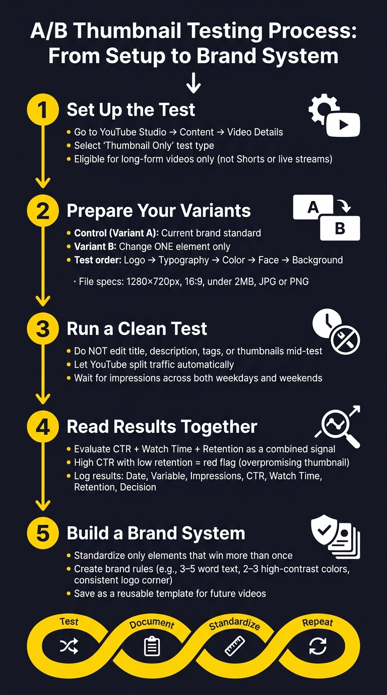
A/B Thumbnail Testing Process: From Setup to Brand System
A/B Test YOUR YouTube Thumbnails For FREE! [A/B Testing Tutorial]
sbb-itb-b59debf
How to Set Up a Thumbnail Test in YouTube Studio
Turn that branding idea into a controlled test inside YouTube Studio. On desktop, go to Content, open an eligible long-form video in Video details, and look for the thumbnail test option near the thumbnail area or inside Editor or Analytics, depending on your Studio layout.
This only works for long-form videos. Shorts and live streams aren't eligible. Premiere videos can be tested after the Premiere ends and the video switches to a standard long-form upload.
Choose the Right Test Type for Branding Decisions
YouTube Studio gives you three test types: Thumbnail only, Title only, and Title and thumbnail.
If you're trying to sharpen your visual brand, pick Thumbnail only. That's the cleanest setup. If you change the title too, you muddy the result because you won't know whether people reacted to the image or the wording. A thumbnail-only test lets you isolate the visual choice and see how viewers respond to the branding itself.
Use Title only or Title and thumbnail when you're changing the video's angle or keyword focus, not when you're trying to judge a visual branding move.
Prepare Thumbnail Files That Are Consistent and Test-Ready
Before you upload anything, make sure each file fits YouTube's thumbnail specs:
- 1280 × 720 px
- 16:9
- Under 2 MB
- JPG or PNG for still images
Specs matter, but consistency matters just as much. That's what makes the test mean something. Keep the subject framing the same in every version: same face crop, same position on the canvas, same overall layout. Then change just one branding element, such as the background color, font weight, or logo placement.
It helps to preview each version at actual thumbnail size. If the text is hard to read, the face gets lost, or the logo disappears, strip it back. Small changes are easier to judge when everything else stays fixed.
With the test structure locked in, the next move is to build variants that change only one branding element at a time.
How to Create Thumbnail Variants Focused on Branding
Once your files are standardized, make two thumbnails: a control and a one-change version.
Your control thumbnail, Variant A, should follow your current brand standard based on your most consistent recent videos. That means keeping the same palette, logo placement, font, face framing or expression, and background. Then write those choices down in a short style guide so you know the exact settings you’re using.
Test One Branding Element at a Time
For Variant B, change just one branding element.
Good options to test include:
- Color palette
- Logo placement
- Face prominence
- Typography
- Background treatment
Each of these shifts how viewers read the brand at a glance. For every version, add a short hypothesis that links the change to audience behavior and a measurable outcome. For example, you might expect a larger face to draw more attention and lift click-through rate.
Prioritize What to Test First
Start with the safest, smallest brand changes before moving into bigger visual shifts. A simple order looks like this:
- Logo placement: Small move, low risk.
- Typography: Changes readability and tone without changing the whole look.
- Color palette: More noticeable, but still fairly controlled.
- Face prominence: Can shift the emotional feel of the thumbnail fast.
- Background treatment: Often changes the overall look the most.
Speed Up Version Creation with ThumbnailCreator
ThumbnailCreator can make this process a lot faster. Start with a thumbnail template that already has your usual logo, text, and face placement. Then duplicate it and change ONLY the single element you want to test.
The text editing tool makes it easy to adjust font weight or shorten copy without rebuilding the layout. Face swapping lets you compare a more expressive look with your usual expression in seconds. That matters because the only difference between versions should be the test variable, which keeps the test clean.
Once both variants are ready, you can run the test with just one variable changing.
How to Run a Clean Test and Read the Results Correctly
Follow Clean Testing Rules So the Data Is Reliable
Once both thumbnail variants are live, your job is simple: don’t touch the test.
That means no edits to the title, description, tags, or thumbnails while the test is running. If you change anything mid-test, YouTube restarts the test from scratch. And once that happens, the earlier data is no longer useful for branding calls.
Let YouTube handle the traffic split automatically, and leave the setup as-is. Then wait until each variant has picked up enough impressions across both weekdays and weekends. That helps you see performance under normal traffic swings, instead of letting one random spike tilt the outcome.
The idea is pretty straightforward. If the test stays clean, the signal stays clean too, providing a clear A/B testing vs gut feeling comparison.
Review CTR, Watch Time, and Retention Before Picking a Winner
A higher click-through rate doesn’t always mean you’ve found the right thumbnail for your brand.
Sometimes a thumbnail gets more clicks because it overpromises. Maybe it uses exaggerated facial expressions. Maybe the text hints at something the video doesn’t fully deliver. That can boost CTR, but it can also hurt watch time and audience retention. YouTube’s Test & Compare tool puts strong weight on overall watch time, not just CTR.
So when the test has enough data, read the numbers together, not one by one.
If one version has the higher CTR but shows a sharper early drop in retention, that’s a red flag. It likely brought in viewers who weren’t a good match for the video. For branding, the better pick is usually the thumbnail that keeps retention high without giving up CTR.
It also helps to track every test in a spreadsheet. Include:
- Date range
- Variable tested
- Impressions
- CTR
- Watch time
- Retention
- Final decision
Over time, that log turns into your proof. You start to see which thumbnail choices fit your brand, which ones pull the wrong audience, and which patterns keep showing up.
How to Turn Winning Tests Into a Repeatable Brand System
Build Simple Thumbnail Rules From Test Results
Once a test gives you a clear winner, turn that result into a rule instead of treating it like a one-time design choice. The key is to standardize ONLY the ideas that win more than once. And not just on CTR alone. The best versions should perform well across CTR, watch time, and retention together.
Here’s what those rules can look like:
| Element | Example Brand Rule |
|---|---|
| Text Length | 3–5 words maximum |
| Color Scheme | 2–3 high-contrast colors (for example, yellow/white on dark) |
| Typography | Max 2 font styles; always use stroke or shadow |
| Composition | Keep the main subject in the same frame position |
| Logo Placement | Same corner, consistent size, never overlapping the focal point |
Use rules like these as your starting template for each new upload. Then leave them alone until a new test beats your current baseline. Even then, don’t rush to change the system. Make the update only after the same change wins more than once.
Apply the Winning Look Across Future Videos
Consistency matters, but that doesn’t mean every thumbnail should look like a copy-paste job. You want them to feel related, not identical.
A simple way to do that is to keep the main layout fixed, like:
- font
- colors
- face placement
Then swap only the parts tied to that specific video, such as the background, the facial expression, or the hook text.
ThumbnailCreator lets you save a layout that already works and reuse it as a template. From there, you can switch in new images, text, or objects without rebuilding the whole thing from scratch. Its AI generation and object swapping features make it easier to tailor each thumbnail while keeping the system intact.
Conclusion: Test, Document, Standardize, and Repeat
The process is simple: define a branding goal → test one variable → validate with CTR, watch time, and retention → document the winner → turn it into a reusable standard. Then run the next test from that new baseline.
Your testing log, the rules pulled from past winners, and the templates you’ve saved all support the same cycle.
Test, document, standardize, repeat.
FAQs
How long should I run a thumbnail test?
For most channels, run a thumbnail test for 7 to 14 days. That gives you enough time to see normal weekly traffic patterns and helps you avoid calling a winner too soon.
If a video gets fewer than 10,000 impressions per week, let the test run longer, up to a month. As a rule of thumb, try to get at least 1,000 to 5,000 impressions per variation before you make a call.
What if one thumbnail gets more clicks but lower retention?
If a thumbnail gets more clicks but leads to lower retention, that usually points to a simple problem: the thumbnail promises one thing, but the video delivers another. People click, don’t find what they expected, and leave. Over time, that gap can hurt performance and limit reach.
When you review results, put watch time share and average view duration ahead of CTR. A high click-through rate can look good at first glance, but it doesn’t mean much if viewers bail early. If retention drops by more than 5%, adjust the thumbnail so it lines up more closely with what the video actually shows.
When should I update my brand rules after a test?
Update your brand rules based on performance data, not on a fixed schedule.
Each month, review your top 20 videos and look at click-through rate and viewer retention. That gives you a clear read on when certain design elements stop lining up with your content or what your audience expects.
It also helps to review your thumbnail testing log every month. The goal is simple: confirm which design patterns keep performing well over time.
Tools like ThumbnailCreator can make this easier. You can store updated brand assets there and spin up new thumbnail variations fast.