
Checklist for AI Thumbnail Customization
Most thumbnails fail for simple reasons: too much text, weak contrast, or AI edits that don't match the video.
I’d sum this checklist up like this: start with the right YouTube size (1,280 × 720 px, 16:9, under 2 MB), lock your thumbnail layout first, keep text to 3–5 words, make it readable at 120 px, and check that every AI edit still fits the video. If I want more clicks without hurting viewer trust, that’s the core process.
Before I upload, I’d check these points:
- Specs: JPG or PNG, 1,280 × 720 px, 16:9, under 2 MB
- Layout: background, subject, text, and brand items on separate layers
- Readability: high contrast, short text, clear at small size
- Branding: same colors, same logo spot, no more than 2 fonts
- Focus: one main subject, not a busy frame
- AI edits: clean face/object swaps, matching light, no odd hands or eyes
- Accuracy: thumbnail promise matches the video
- Testing: preview at 120–180 px and compare one variant at a time
Here’s the short version: good AI thumbnail customization is less about adding more and more about keeping one clear idea. The full checklist then walks through setup, design checks, AI edits, and final testing.
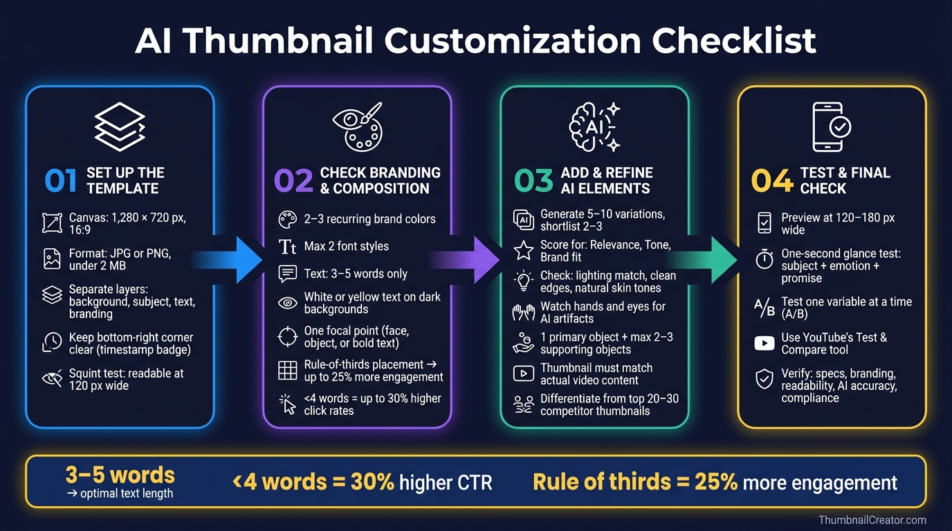
AI Thumbnail Customization Checklist: 4-Step Process
How to Create YouTube Thumbnails with AI using ThumbnailCreator.com AI YouTube Thumbnail Generator
sbb-itb-b59debf
1. Set Up the Template Before Adding AI Elements
Set up the template first so AI edits don't wreck the layout.
Confirm YouTube Specs and Export Requirements
Start with YouTube's required canvas size and export settings (see our YouTube thumbnail beginners guide for more basics).
| Requirement | Specification |
|---|---|
| Resolution | 1,280 × 720 px |
| Aspect Ratio | 16:9 |
| Minimum Width | 640 px |
| File Format | JPG or PNG |
| Max File Size | 2 MB |
JPG is a good fit for image-based thumbnails because it compresses well. PNG is better for bold text and logos when you want crisp edges and fewer compression artifacts.
Build a Clean Layer Structure
Use separate layers for the background, subject, text, branding, and effects. That way, face swaps, object swaps, and text edits stay in their own lane. Change one part, and the rest of the layout stays intact.
One placement rule trips up a lot of creators: keep the bottom-right corner clear. YouTube puts the video duration badge there, so text or a subject in that spot can get covered. Faces and key objects usually work best in the left or center third of the frame. Also, name layers clearly so AI tools hit the right element instead of the wrong one.
That setup makes branding and composition much easier to check next.
Use a Ready-Made Starting Point in ThumbnailCreator
Use ThumbnailCreator's pre-sized templates and Remix feature to start from a clean base, then swap in AI elements without rebuilding the layout. Each template comes with suggested zones for the subject, text, and branding. That helps keep the design clear and mobile-friendly before you make a single edit.
Run a quick squint test: shrink the thumbnail preview to about 120 px wide and see if the subject still stands out and the text is still readable. If not, tweak the spacing before you add AI elements.
Once the base passes the small-size preview, move to branding and composition.
2. Check Branding, Readability, and Composition
Once the template is locked, review branding, readability, and focal balance before you add any AI elements. That step helps you avoid AI edits that throw off the thumbnail’s visual hierarchy.
Keep Branding Consistent Across Videos
People scroll fast. So stick with 2–3 recurring brand colors and keep logo placement in the same spot across videos. That familiar look makes your thumbnails easier to spot. It also helps to keep subject framing consistent, so viewers can recognize your style right away.
Font choice matters too. Keep it simple: use no more than two font styles. One should handle the main headline, and the other can cover any small supporting label.
Limit Text and Maximize Contrast
Keep text to 3–5 words. In fact, using fewer than 4 words can lead to 30% higher click rates than text-heavy designs. Trim filler. And only repeat words from the title when they add something useful.
For contrast, white or yellow text on dark backgrounds is a solid default. Thin strokes and low-contrast color pairings tend to vanish at small sizes. If the text can’t hold up at thumbnail size, it’s not doing its job. Following a thumbnail size guide ensures your dimensions and resolution are optimized for every device.
Place the Subject Where the Eye Goes First
Use one focal point and one message. Thumbnails with a single dominant focal point, like a face, an object, or a bold text statement, are easier to process at a glance.
Place that focal point on a rule-of-thirds intersection, not right in the center. Thumbnails that use this layout can see up to a 25% increase in engagement compared with center-aligned designs.
Keep the whole design to 2 or 3 key visual elements. If a face is the focal point, make it big enough for the expression to read clearly. Also, leave the bottom-right corner open for the timestamp badge.
| Element | Best Practice | Avoid |
|---|---|---|
| Text Count | 3–5 strong words | Repeating the video title exactly |
| Font Styles | Max 2 consistent fonts | Thin, decorative, or script fonts |
| Contrast | White/Yellow on dark backgrounds | Low-contrast colors or thin strokes |
| Subject Size | Face fills 40%+ of frame | Multiple competing subjects |
| Mobile View | Clear at 120–160 px wide | Cluttered designs with tiny details |
Once the layout is clear, add AI elements that support that focal point.
3. Add AI-Generated Elements Without Losing Accuracy
Generate Several Options and Pick the Best Fit
Once the template is set, use AI to sharpen the main idea, not take it over. Following a structured AI thumbnail generation guide ensures you maintain this balance. That distinction matters. AI should support the focal point, not replace it.
Also, don't settle for the first output. Generate 5–10 variations of the AI element, then cut that list down to 2–3 candidates before you edit in detail.
As you narrow things down, score each option for:
- Relevance
- Tone
- Brand fit
If an option feels off for the channel, skip it. The right choice is the one that supports the video's message and still feels like it belongs on that channel.
Refine Face Swaps, Object Swaps, and Text Edits
After you have a shortlist, check each option for technical issues before you fine-tune anything. Look for bad lighting, rough cutout edges, warped proportions, or unnatural skin tones. Hands and eyes usually give problems away first, so pay extra attention there.
The lighting also needs to match the rest of the scene. Direction, intensity, and color should all line up. ThumbnailCreator handles these edits with built-in face swapping, object swapping, and text editing tools.
For facial expressions, focus on emotional clarity. Viewers should be able to read the expression at a glance. The eyes need to stay visible, and the mood should match what the video actually delivers.
For object swaps, keep it simple. Use one primary object to show the video's main idea, plus no more than 2–3 supporting objects. Push the background back by blurring it or muting it so the subject stays front and center. And make sure any text is easy to read right away.
Make Sure the Thumbnail Matches the Video
Before export, check that the thumbnail tells the same story as the video. This is where trust and retention are on the line. Understanding the difference between clickbait vs authentic thumbnails is vital; a misleading thumbnail might boost CTR for a moment, but that short-term bump can hurt retention and damage the channel's reputation.
Do a quick accuracy check before export. Ask:
- Does the scene show a real moment from the video?
- If the thumbnail hints at a dramatic reveal, product, or location, does that moment appear in the content?
- If you show a stat or dollar amount in the text, does it appear in the video?
One more step helps here. Search the video's topic on YouTube and review the top 20–30 results. If your thumbnail looks too close to another top result - same layout, same color scheme, same pose - change at least one major element. That could be the background color, the subject's direction, or the main object.
| Accuracy Check | What to Verify |
|---|---|
| Visual promise | The main scene, result, or location shown must appear in the video |
| Text claims | Any stat, amount, or outcome in text must be supported in the content |
| Person depicted | Anyone shown should either appear in the video or clearly read as a generic figure |
| Originality | At least one major element should differ from top thumbnails in the niche |
4. Test Performance, Mobile Visibility, and Final Compliance
Check Mobile Visibility and Clear at a Glance
After you clean up AI-made faces, objects, and text, make sure the thumbnail still works at a small size. Preview it at 120–180 px wide. At a one-second glance, people should instantly get the main subject, the emotion, and the promise. Contrast should still hold up at thumbnail size.
Review CTR Signals and Create One Variant
Once the thumbnail is easy to read on mobile, check whether the click prompt is strong enough to stand out. Before you lock it in, make sure the hook and focal point support each other, and that the title adds new information instead of repeating what the thumbnail already says.
Use your channel’s own baseline instead of generic CTR benchmarks. Then duplicate the thumbnail and change one variable at a time. Use YouTube's Test & Compare tool to confirm which version wins.
Conclusion: Final Pre-Upload Checklist
Use this last pass to catch anything that could hurt clicks, trust, or compliance.
- Technical specs: 1280×720 px, 16:9 ratio, under 2 MB, JPEG or PNG
- Branding: Consistent logo placement, brand colors, and font across the channel
- Readability: 3–5 words max, high contrast, text clear at 120 px wide
- AI accuracy: Generated elements match the actual video content; no distortions or artifacts
- Mobile visibility: Passes the one-second glance test on both light and dark backgrounds
- Compliance: No misleading claims, policy violations, or unauthorized likenesses
ThumbnailCreator's templates, face swapping, text editing, and object swapping tools can help you move through this last check faster and make a second variant before export. Publish only when the thumbnail is accurate, easy to read, and on-brand.
FAQs
How do I know if an AI edit feels misleading?
Use a simple perception test: show the finished thumbnail to someone who hasn’t seen the video title. If they guess the topic wrong, the edit is probably sending the wrong message.
Misleading visuals might get clicks at first. But they can hurt watch time and trust if viewers feel tricked. Keep AI edits aligned with the video’s core value.
What should I change first if my thumbnail looks cluttered?
First, simplify the composition and center it around one clear subject - like a face, product, or main object. Keep the thumbnail to no more than three visual elements so it doesn’t feel cluttered.
Use the Rule of Thirds to balance the layout. Then tone down or desaturate background elements so the focal point stands out. ThumbnailCreator’s Auto-Optimize tool can also help fine-tune composition, contrast, and placement.
How often should I test new thumbnail variants?
Run A/B tests for 7 to 14 days so you get a fair read on both weekday and weekend traffic. And before you judge the outcome, make sure each variant has at least 1,000 impressions.
Keep your changes tight. If you swap too many things at once, it gets hard to tell what actually improved click-through rate. ThumbnailCreator can help you make multiple variations fast, which makes live testing a lot easier.