

Checklist for Using AI Thumbnails in Different Niches
One thumbnail process does not fit every YouTube niche. If I want more clicks, I need to match the thumbnail to the audience, keep it easy to read on mobile, and test what changes CTR over time.
Here’s the short version:
- Start with one click goal for the video
- Prep the right inputs before using AI: title, viewer, key frames, subject, colors, fonts, and tone
- Match the thumbnail style to the niche
- gaming/vlogs: faces, tension, bold contrast
- education/tech: clean layout, product or outcome first
- beauty/lifestyle: polished close-ups, steady color use
- faceless commentary: symbols, bold text, topic-first visuals
- Pass the basic upload checks
- 1280×720 px
- 16:9
- JPG or PNG
- under 2 MB
- Check mobile readability first, because about 84% of U.S. YouTube views come from mobile
- Keep text short: 3–5 words max
- Avoid the bottom-right corner, since the time badge can cover key details
- Test one change at a time and track CTR, impressions, watch time, and average view duration
A few numbers stand out. In the article’s data, short text beat longer text by 75% in relative CTR, and specific hook text beat vague copy by 53%. Face presence and strong expressions also helped more than flat, neutral looks.
So if I had to sum it up in one line, it would be this: pick one clear promise, show it fast, and shape the thumbnail around how that niche gets clicks.
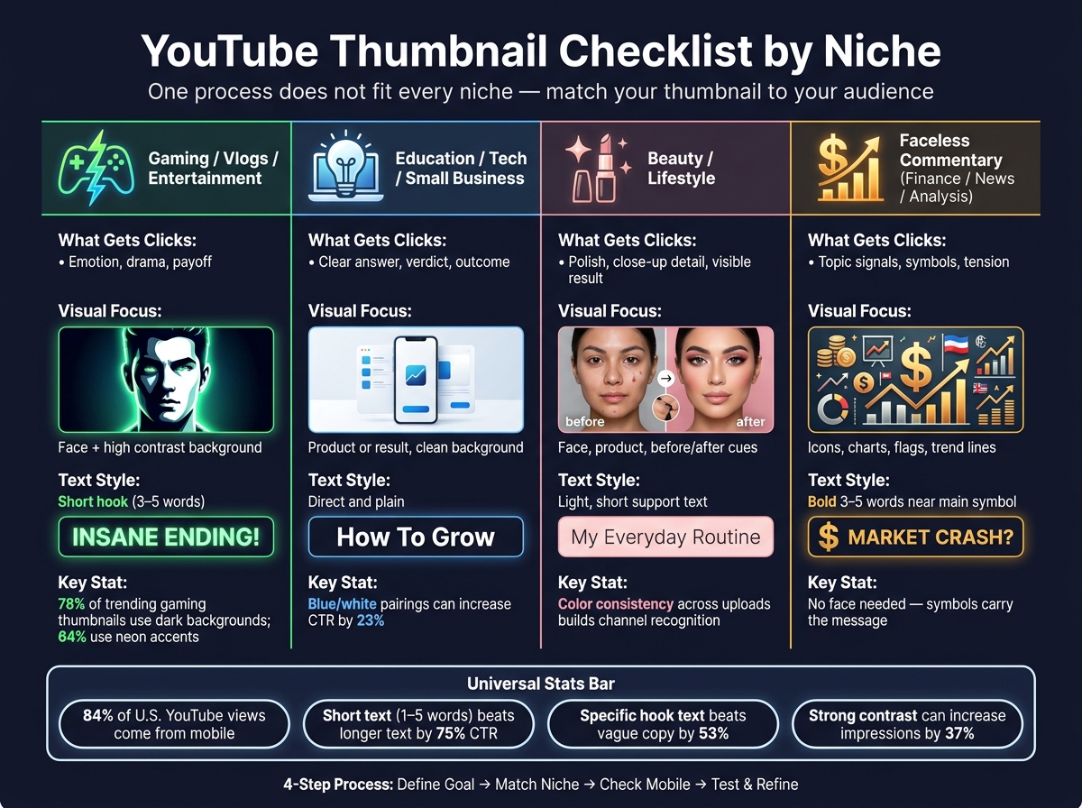
YouTube Thumbnail Strategy by Niche: Quick Reference Guide
My Secret to 10% CTR: How I Design AI Thumbnails That Get 1,000+ Views Fast
sbb-itb-b59debf
Quick Comparison
| Niche | What tends to get clicks | Main visual focus | Text style |
|---|---|---|---|
| Gaming / Vlogs / Entertainment | Emotion, drama, payoff | Face, expression, high contrast | Short hook |
| Education / Tech / Small Business | Clear answer, verdict, outcome | Product, result, clean background | Direct and plain |
| Beauty / Lifestyle | Polish, close-up detail, visible result | Face, product, before/after cues | Light, short support text |
| Faceless Commentary | Topic signals, symbols, tension | Icons, charts, flags, money, trend lines | Bold 3–5 words |
I’d use this as a pre-publish check: goal, niche fit, mobile readability, then test data after launch.
Step 1: Define the Goal, Brand, and Inputs Before Using AI
A little prep up front makes AI thumbnail work cleaner and easier to tweak. It turns general thumbnail advice into a workflow you can use again and again. Start with the click goal, then build everything around that.
Identify the Click Goal for the Video
Every thumbnail should do one thing: give people one clear reason to click.
Before you open a design tool, write down the single main promise of the video. Is it a result, a verdict, an outcome, or a story beat?
If you cram in too many promises, the click gets weaker. In a dataset of 1,000 thumbnails, short text of 1–5 words beat longer text with a 75% relative CTR difference. Specific hook text also beat vague copy by 53%. That’s the point: one clear promise helps the image, text, and emotional tone all pull in the same direction.
Once you know the promise, gather the assets that help prove it.
Gather the Inputs the AI Needs
After the click goal is set, pull together the inputs before you generate anything. This is the brief ThumbnailCreator needs to produce better first drafts: your final or near-final video title, a description of your target viewer, 1–3 key frames from the video, brand colors vs. optimized colors, your fonts, and your emotional tone.
Start with the main subject: the face, product, or result at the center of the thumbnail. Crop it so it fills about 40–60% of the frame. On mobile, where thumbnails may appear at only 120–160 px wide, a subject pushed into a corner can be easy to miss. Put the primary subject into ThumbnailCreator first so the AI builds around the main click target.
| Input | What to Prepare |
|---|---|
| Video title | Final or near-final title that defines the concept |
| Target viewer | One-line description (e.g., "beginner home cooks") |
| Key frame | 1–3 screenshots that match the click goal |
| Primary subject | Face, product, or result - cropped to fill ~40–60% of frame |
| Brand colors | 2–3 colors: one dominant, one high-contrast accent |
| Fonts | 1–2 fonts max: one bold headline font, one secondary |
| Emotional tone | One word that matches the video's mood |
With those pieces ready, the next move is to lock in the channel rules that make each upload look like it belongs to you.
Set Reusable Brand Rules
Brand rules help people recognize your channel at a glance. Pick 1–2 fonts, a 2–3 color palette, a fixed logo position, and one text placement zone. That way, each thumbnail feels familiar even when the subject or scene changes.
The structure stays fixed. The subject, scene, and hook can change.
Inside ThumbnailCreator, these rules guide prompts, templates, text, and color edits. That makes it easier to use ThumbnailCreator across different niches without losing brand consistency.
Step 2: Match ThumbnailCreator Features to Your Content Niche
Different niches play by different thumbnail rules. Entertainment leans on emotion. Education leans on clarity. Beauty leans on polish. Faceless commentary leans on symbols.
Your job here is simple: take the brand rules from Step 1 and line them up with what your audience expects. Then use the niche signals below to choose which subject, background, and text style should drive the click.
Gaming, Vlogs, and Entertainment Channels
These niches run on emotion and energy. The thumbnail needs to signal drama, reward, or tension right away.
Use ThumbnailCreator for this niche with a strong facial expression, like surprise, shock, or excitement, sharpened with Face Swap. Pair that with a high-contrast background. Around 78% of trending gaming thumbnails use dark backgrounds, and 64% use neon accents. Keep text short - just 3–5 words centered on the main hook, whether that's a challenge, a reward, or a dramatic moment.
Pick the visual cue that backs up the click promise. If the video is about risk, show risk. If it's about a big win, show the payoff. You can also use Object Swap to replace plain props with bolder items that show the video's stakes at a glance.
Education, Tech Reviews, and Small Business Content
People in these niches usually want a clear answer, a product verdict, or a direct outcome. So the thumbnail should stay tight and easy to read.
Use:
- a clean background, like a solid color or subtle gradient
- direct verdict text such as Worth It in 2026? or Save 20 Hours
- Background Remover to cut distracting surroundings from product shots
- Image Upscaler to keep close-ups sharp
Blue and white pairings signal trust and can increase CTR by 23%. For tech content, go with close product shots that highlight the easiest-to-recognize features, like camera modules, ports, or screen bezels.
Beauty, Lifestyle, and Faceless Commentary Channels
Beauty depends on visual polish. Faceless commentary depends on visual symbols. Same goal - get the click - but the path looks different.
Beauty and lifestyle: Here, the thumbnail works like a brand asset. Use clean close-ups with accurate skin tones. Keep products easy to spot near the focal point. Then use Color Enhancer to keep your niche palette steady across uploads so the channel feels connected at a glance.
Faceless commentary (finance, news, analysis): Since there's no face doing the heavy lifting, symbols need to carry the message. Use dollar signs, stock charts, country flags, or trend lines. With AI generation and Object Swap, you can build thumbnails around those symbols, then add 3–5 words of bold text near the main symbol.
Use face-led designs when the channel is built around personality. Use icon-led designs when the topic matters more than the person on screen.
- Face-driven thumbnails - best for gaming, vlogs, reaction videos, and personality-led entertainment; strong emotional impact and fast drama signaling
- Icon-based thumbnails - best for education, finance, news commentary, and faceless storytelling; clear topic signaling that works across many videos
Step 3: Review Technical Quality, Readability, and Mobile Performance
After niche matching, use this last gate to catch tech, readability, and layout issues before upload. Run three final pass/fail checks before you publish.
Pass the Technical Export Check
Start with the file itself. Only export if it matches YouTube's upload specs.
| Check | Target Requirement | Status |
|---|---|---|
| Resolution | 1280×720 px | Pass / Fail |
| Aspect Ratio | 16:9 | Pass / Fail |
| File Size | ≤2 MB | Pass / Fail |
| File Format | JPG or PNG | Pass / Fail |
| Orientation | Landscape | Pass / Fail |
On Windows, right-click the file and go to Properties → Details to confirm the dimensions and file size. On macOS, use Get Info. If the file is over 2 MB, export it again as JPG.
Once it passes the upload specs, check how it looks on a phone.
Pass the Small-Screen Readability Check
Most viewers see your thumbnail at about 160–320 px wide in the YouTube mobile feed. So this part matters a lot.
Open the thumbnail on your phone and look for:
- one clear subject
- short, bold text
- no extra elements fighting for attention
If you can’t tell what the video is about within one second, cut something.
Gaming thumbnails can be a bit busier, sure. But they still need to read fast on mobile. If your niche leans on faces, make sure the face is still clear at that size.
Also, treat the bottom-right corner like off-limits for key details. YouTube places the video duration badge there, and it will cover any text or visual element in that spot.
If the thumbnail reads well but still feels a little flat, move on to layout and contrast.
Pass the Composition and Contrast Check
At a glance, the focal point should be obvious. The subject that earns the click needs to stand out first.
Stick with one main color and one high-contrast accent. Pairings like white text on dark blue or yellow text on black are a safe default. Outlined text improves readability by 40%, and thumbnails with strong contrast can increase impressions by 37%.
If your text blends into the background even a little, add a stroke or put a semi-transparent panel behind it. If the layout feels crowded, remove one element.
Step 4: Test Results, Track CTR, and Refine Your Niche Template
Once the thumbnail is live, the job isn't over. Now you need to see if it actually earns clicks, then use that data to make the next version better.
Run Simple Thumbnail Variations
Start with the first version, then test the variables that tend to move the needle most. Change one thing at a time: expression, text, color, or object emphasis.
You can use YouTube Studio's Test & Compare to upload up to three variants and let YouTube pick a winner.
Pay close attention to two time windows:
- The first 48 hours, when YouTube is most likely to push the video through browse features, subscriptions, and notifications
- The first 7 days, when the video starts reaching new viewer groups and search traffic settles
Track impressions, CTR, average view duration, and watch time. When high CTR comes with strong watch time, that's a good sign the thumbnail is attracting the right viewers. If CTR goes up but watch time falls, the thumbnail may be promising more than the video delivers. In that case, simplify it.
Log What Works by Niche
Track every test in a spreadsheet. Include the niche, video type, date, impressions, CTR, average view duration, watch time, and the ThumbnailCreator features used: template style, face swap, object swap, text edits, and color treatment.
After a while, patterns start to show up. Gaming videos may respond better to face swaps and brighter colors. Tech reviews may do better with device-focused object swaps and cleaner layouts. Beauty and lifestyle channels might get better results from creator faces or product close-ups, depending on the video.
Review your log once a month and keep the elements that continue to win.
Conclusion: One Checklist, Customized by Niche
Each step in this checklist builds on the one before it. A clear video goal shapes your inputs. Those inputs guide the AI. Your niche points to the visual style. The technical checks make sure the thumbnail works on actual devices. Then the test loop turns every upload into a useful data point, so the next thumbnail is easier to build and more likely to perform.
Use this checklist before every upload.
| Stage | What to Verify |
|---|---|
| Goal & Inputs | Video goal defined; niche identified; face, objects, and text assets ready |
| Niche Tailoring | Template matches niche tone; visual focus fits audience expectations; ThumbnailCreator features applied |
| Technical & Mobile | Correct resolution and aspect ratio; text readable on mobile; 3–5 words max; strong contrast; focal point clear |
| Testing & Optimization | One variable changed per test; 48-hour and 7-day CTR, impressions, and watch time logged; template updated by niche |
Copy this into Notion, Google Docs, or wherever you manage your workflow. Use it every time you publish. The checklist stays the same. What changes is how you fill it in for your niche.
FAQs
How do I pick the best thumbnail style for my niche?
Start by looking at your top-performing thumbnails and spotting patterns in layout, color, and subject focus. That gives you a clear sense of what your audience already responds to.
Each niche has visual signals viewers recognize almost instantly.
For example, gaming thumbnails often lean on bold colors and dramatic reaction faces. Educational content usually does better with clean, authoritative layouts, often in blue or green.
ThumbnailCreator can generate niche-based options and help you pick a template built around performance data.
What should I test first if my thumbnail CTR is low?
Start with background color. That’s often where you’ll see the biggest CTR shifts first.
If you need another round of testing, move to facial expressions next. After that, test your text hook.
ThumbnailCreator makes it easy to swap these parts fast. One rule matters here: test one variable at a time. And give each test 7 to 14 days so you can read the results with confidence.
How can I tell if my thumbnail looks good on mobile?
Shrink your thumbnail to about 120–180 pixels wide and give it a quick glance test. The goal is simple: within two seconds, you should be able to spot the main subject, read the facial expression, and catch the text hook. If any of that feels fuzzy or hard to read, simplify it.
Then check it on your phone with an unlisted upload. That extra step matters more than people think. A thumbnail can look fine on a desktop and fall apart on mobile.
A few rules help keep things clear:
- Keep text to 3–5 words
- Use high-contrast colors
- Avoid putting key visuals in the bottom-right corner
That last point is easy to miss, but it can cost you. On many mobile screens, UI elements sit in that area and can cover part of the image.