

Checklist for Cross-Platform Thumbnails
A thumbnail can look fine in your editor and still fail once a platform shrinks or crops it. My pre-publish check is simple: start with a 1,280 × 720 px master, keep key parts inside the center area, use 3–5 words of text, and test the image at small sizes on both phone and desktop.
Here’s the short version:
- I start with a 16:9, 1,280 × 720 px file
- I export in JPG or PNG and keep YouTube files under 2 MB
- I keep faces, logos, and text away from the outer edges
- I make sure the main subject fills about 30% to 50% of the frame
- I keep text short and easy to read at about 120 px wide
- I use strong contrast, with text contrast at 4.5:1 or more
- I test the thumbnail in feed, search, suggested, and channel views
- I check that the thumbnail matches the video so clicks don’t turn into fast drop-offs
- I save strong versions as templates for later use
A few numbers stand out. About 67% of thumbnail display contexts involve cropping or resizing, 42% can become hard to read at smaller placements, and about 69% to 70% of YouTube views happen on mobile. That means small-screen clarity has to come first.
If I had to boil the whole article down to one point, it would be this: one thumbnail idea is not enough. I need one master image, then I need to check how that idea holds up across different placements before I publish.
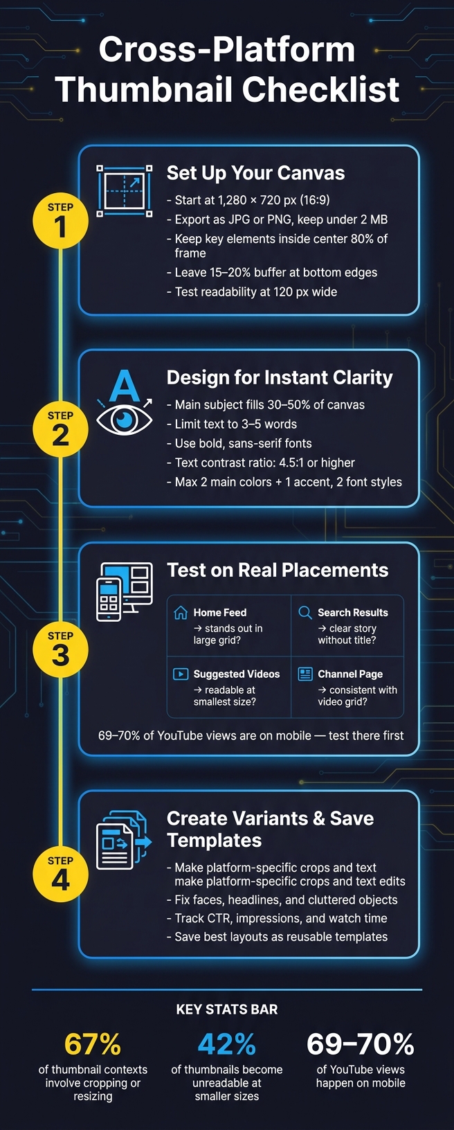
Cross-Platform Thumbnail Checklist: 4-Step Pre-Publish Process
1. Check Format, Size, and Safe Areas First
Get the technical setup right before anything else. A good-looking thumbnail can still fall flat if the size is off or the file turns blurry after compression. So before you pick colors, fonts, or faces, start here.
Use the Right Canvas for Each Platform
Start every thumbnail on a 1,280 × 720 px canvas at 16:9 aspect ratio. That’s YouTube’s standard recommendation, and it’s a smart base for planning versions across platforms.
Use that 1,280 × 720 file as your master every time. Don’t start at the minimum. YouTube allows thumbnails as small as 640 px wide, but files that small can look rough or pixelated on laptops and TV screens.
Keep a High-Resolution Master File
Save your working file as a layered, editable source file. That way, every platform version comes from the same base instead of being rebuilt from scratch.
When it’s time to export, use JPG or PNG and keep YouTube files under 2 MB. As a rule of thumb:
- JPG is usually the better pick for photo-heavy thumbnails
- PNG is better when you need crisp text edges or transparency
Use a steady file-naming system too, like 07-09-2026_video-title_youtube_1280x720.jpg.
Keep Key Elements Away From the Edges
This part matters more than people think. About 67% of platforms where thumbnails appear will crop or resize the original image. If your main subject sits too close to the edge, it can get cut off fast.
Keep faces, logos, and main text inside the center 80% of the frame. Leave extra room in the bottom-right corner and across the bottom 15% to 20% of the image.
A simple check helps: shrink the thumbnail to 120 px wide. If the face vanishes or the headline turns hard to read, pull those elements inward.
Once the file size and layout are set, the next step is making sure the subject, text, and contrast still read in a split second.
2. Check Visual Hierarchy, Text, and Contrast
Once sizing and safe zones are set, the next job is simple: make sure the thumbnail makes sense in less than a second. Viewers fixate in about 50 ms, so the design has to land fast.
Keep One Main Subject
A thumbnail should answer one basic question at a glance: what is this about? If someone needs more than a moment to figure it out, the focal point isn’t strong enough.
Your main subject should take up about 30–50% of the canvas. In many cases, one face works better than a crowded layout because people read emotion fast.
If two elements are fighting for attention, push one into the background.
Use Short Text That Stays Readable
Keep on-image text to 3–5 words. The text on the thumbnail should support the title, not say the same thing again.
For example, if your title is How I Paid Off $50,000 in Debt, your thumbnail text could say Debt-Free at 30. Same topic, but with a sharper hook. Use bold, sans-serif fonts, and make the text large enough to stay clear on mobile. If you’re using light text, add a dark outline or shadow so it doesn’t wash out.
Increase Contrast and Cut Visual Clutter
Keep text contrast at 4.5:1 or higher. High-contrast combinations like white on black, yellow on dark blue, or bright text over a blurred background usually hold up best across different layouts.
Clutter kills clarity. Stick to 2 main colors plus one accent, and use no more than two font styles in the whole design. If the background feels busy, add a blur or gradient overlay to push it back.
If a stranger can't tell what the thumbnail is about almost instantly, remove elements until they can.
After the thumbnail reads well on its own, test it on actual devices and platform layouts.
sbb-itb-b59debf
3. Review the Thumbnail on Real Devices and Platforms
Once your hierarchy and contrast are in place, the next step is simple: see how the thumbnail holds up in the places people will actually see it. A thumbnail can look great in your editor and still flop in the wild. So test it in real placements like the home feed, search results, suggested videos, and your channel page.
Preview on Mobile and Desktop
About 69–70% of YouTube views happen on mobile devices globally. That means mobile is where your thumbnail has to do the heavy lifting.
Check the thumbnail at the size each platform shows. Make sure faces, text, and main objects are still easy to recognize at a glance. If your main subject starts to melt into the background, that's a sign the design is doing too much. Strip it down.
A practical way to test this:
- Open the unlisted video on your phone
- Compare it against desktop browser views
- Look for text that disappears or details that get muddy
Check Feed, Channel, and Suggested Video Views
Each placement asks your thumbnail to do a slightly different job.
| Placement | Key Check |
|---|---|
| Home Feed | Does the subject stand out in a large grid against competing thumbnails? |
| Search Results | Does the image tell a clear story even before reading the title? |
| Suggested Videos | Is the subject still recognizable at the smallest display size? |
| Channel Page | Does the thumbnail stay consistent with the rest of your video grid? |
One simple test works well here: take a screenshot of the feed with your thumbnail in view, then zoom out until all the thumbnails look tiny. The one that still stands out and stays easy to identify usually has the strongest visual pull. If yours still reads well at that size, the next thing to check is whether it lines up with the video's promise.
Make Sure the Thumbnail Matches the Video
Don't judge the thumbnail by itself. Test it with the title.
A misleading thumbnail might get more clicks for a moment, but it can hurt retention fast. After publishing, watch the first 30–60 seconds. If you see a steep drop, the thumbnail or title likely set the wrong expectation.
Save the best-performing version as your master so you can make platform-specific variants faster later.
4. Use AI to Create Variants and Build a Repeatable Workflow
Use your test results to turn one master thumbnail into versions for each platform. After the real-device test, go back to the same master file and make platform-specific variants.
That matters because a platform-specific version is more than a resize. You’re adjusting the image for how each platform shows content in the wild. On one platform, that may mean a tighter crop for mobile-first feeds. On another, it may mean keeping more detail for desktop browsing. In some cases, it’s as simple as cutting text so it still reads in a smaller preview.
Since 67% of thumbnail display contexts involve cropping or resizing, one version usually won’t hold up everywhere. A better approach is simple: keep the main idea the same, then change only the parts that fall apart at smaller sizes.
Create Platform-Specific Versions Faster With ThumbnailCreator
ThumbnailCreator helps you take one strong thumbnail idea and turn it into multiple ready-to-publish versions with AI generation and reusable templates.
The goal isn’t to start from scratch every time. It’s to keep the brand and the main concept in place, then update only what needs work, like the crop, the text, or the focal point. That makes the workflow easier to repeat from video to video.
Edit Faces, Text, and Objects Without Rebuilding the Design
Once your variants are ready, start testing the weakest parts first. That’s where AI edits can save a lot of time.
ThumbnailCreator’s face swapping, text editing, and object swapping tools line up with the problems found earlier in the process. If a face looks flat or pulls attention the wrong way, swap the expression. If a headline breaks or gets messy at smaller sizes, shorten it. If a background object adds clutter, replace it.
Those small edits can make a big difference. 42% of thumbnails become unreadable on smaller placements due to size reduction, so focused fixes like these are a practical way to clean things up without rebuilding the whole design.
Conclusion: Save the Checklist and Track What Performs
After publishing, track:
- Click-through rate
- Impressions
- Watch time after the click
- Differences between platforms or placements
Then save your best-performing layouts as templates. Write down what text length worked, which crops survived platform previews, and which facial expressions drove clicks. Over time, that gives you a template library that every new video can use.
FAQs
How much cropping should I expect across platforms?
Expect heavy cropping: 67% of display placements will resize or crop your image. Start with a 16:9 master file, then test 1:1, 4:5, and 9:16 versions.
Keep your main subject and other key elements inside the center 60% to 80% of the frame. Also leave at least 8% padding on the left and right, plus 10% on the top and bottom.
What should I fix first if my thumbnail looks bad on mobile?
Start by shrinking it to 120–160 pixels or doing a squint test. If the main subject or text still doesn’t come through, strip the design back to one clear subject and 3–5 words.
It also helps to keep key elements away from the bottom-right corner. Use bold, sans-serif text with strong contrast so the thumbnail reads fast on small screens. ThumbnailCreator’s Auto-Optimize tool can improve contrast, readability, and mobile composition in one click.
When should I make a new variant instead of resizing?
Create a new variant when resizing fails the readability or composition test at small sizes. If your thumbnail at 160 × 90 pixels has text that's hard to read or a main subject that no longer stands out, the original layout isn't doing the job.
ThumbnailCreator can help you make brand-consistent variations fast with saved templates and AI tools, so you don't have to rebuild the layout from scratch.