
Mobile vs Desktop: Thumbnail Scaling Tips
If your thumbnail fails at 120–160 px wide, it fails where most people first see it.
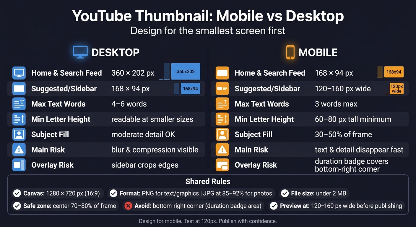
I’d boil the whole topic down like this: make one 1280 × 720 thumbnail, but design it for the smallest screen first. On desktop, viewers may see it around 360 × 202 px. On mobile, that same image can shrink to 168 × 94 px or even 120–160 px wide. When that happens, small text, busy backgrounds, and edge placement stop working fast.
Here’s the short version:
- I’d keep text to 3 words or less
- I’d make letters about 60–80 px tall on a 720p canvas
- I’d keep the main subject inside the center 70%–80%
- I’d avoid the bottom-right corner because YouTube can place the duration badge there
- I’d preview the thumbnail at 120–160 px wide before publishing
- I’d use PNG for text-heavy designs and JPG at 85%–92% quality for photo-heavy ones
- I’d stay under YouTube’s 2 MB file limit
The main idea is simple: desktop gives you more room, but mobile gets less space and less time. So I’d cut detail, keep one clear focal point, and check whether the image still makes sense in a one- or two-second glance.
How Big Should YouTube Thumbnails Be? (Sizing Tips + Photoshop Tricks)
sbb-itb-b59debf
Quick Comparison
YouTube Thumbnail Sizes: Mobile vs Desktop Cheat Sheet
| Factor | Desktop | Mobile |
|---|---|---|
| Common display size | 360 × 202 px | 168 × 94 px |
| Smaller placement | 168 × 94 px | 120–160 px wide |
| What usually works | More detail, slightly more text | Big subject, short text, strong contrast |
| Main problem | Blur and compression are easier to spot | Text and detail disappear fast |
| Placement risk | Small sidebar views still cut detail | Bottom-right overlays can cover key elements |
In other words: I wouldn’t judge a YouTube thumbnail at full size. I’d judge it at phone size first.
How thumbnails display on desktop and mobile
Desktop and mobile show the same thumbnail at very different sizes. And that changes everything.
What matters here isn't the upload size. It's the rendered size. That's what decides how much detail people can still make out.
Desktop: more detail, more visible flaws
On desktop, thumbnails in the Home feed and Search results render at about 360 × 202 pixels. At that size, people can spot a lot more. Text is easier to read. Facial expressions come through better. But flaws also stand out.
A thumbnail that's a little soft, low-contrast, or uploaded at the minimum 640 px width instead of 1280 × 720 will usually look worse on desktop. Blur and compression show up more clearly when the tile is larger.
The Suggested sidebar on desktop is smaller, at about 168 × 94 pixels. So even on desktop, viewers don't always see the larger version. In plain terms: desktop can show more detail, but it can also make mistakes easier to spot.
Mobile: smaller display, tighter safe zone, faster decisions
On mobile, thumbnails in Search results render at around 168 × 94 pixels, and suggested placements can shrink to about 120–160 pixels wide. That's a big drop in visible space.
At that size, small details fall apart fast. Tiny text turns into a blur. Light texture in the background starts to look messy. A face that reads well at 360 pixels can lose most of its expression at 120 pixels.
There's also a layout problem. The duration badge and progress bar can cover part of the bottom-right corner, so text and main subjects should stay out of that area. If you place something important there, a viewer may never see it.
Deciding whether to design for mobile-first vs desktop-first thumbnails means prioritizing the smallest common view, not the best-looking one.
Here's the size gap in practical terms:
| Placement | Desktop Display Size | Mobile Display Size |
|---|---|---|
| Home Feed | 360 × 202 px | 168 × 94 px |
| Search Results | 360 × 202 px | 168 × 94 px |
| Suggested Sidebar | 168 × 94 px | 120–160 px wide |
Those size gaps decide what still reads at a glance. Understanding these constraints is the first step in advanced thumbnail optimization for higher click-through rates. And they shape the design rules that come next.
Mobile vs desktop: scaling differences that change design choices
Once a thumbnail gets smaller, design choices turn into scaling choices.
A thumbnail made on a 1,280-pixel canvas can shrink to just 120–160 pixels wide on mobile. That’s about a 10x drop in linear size and 100x less area. At that point, the thumbnail simply can’t say as much. Something that looks clean and sharp on desktop can fall apart on a phone. This is why many top YouTube creators prioritize mobile-first compositions.
Text size, word count, and subject placement
Because mobile shrinks the frame so aggressively, text and subject placement need to stay simple.
There isn’t much space for text on mobile. Letters should be about 60–80 pixels tall on a 720p canvas to stay legible. Font size matters, but word count matters just as much. Three words is the practical ceiling for mobile. Four to six words can still work on desktop, but on a phone they often turn into visual clutter.
Use fewer words.
Keep the main subject and text inside the central 70%–80% of the frame. In plain terms, make the composition center-heavy, with a slight shift left if needed.
Those same limits also shape how compression artifacts show up.
Compression and scaling artifacts on small and large screens
Mobile hides some problems and makes others worse. When a thumbnail shrinks to around 120 pixels wide, soft edges become harder to notice. But fine background details can turn into noise. Intricate textures, small logos, and layered elements may look deliberate at full size, yet messy at thumbnail scale.
Desktop changes the picture. At 360 pixels wide or more, viewers can spot blur, noise, weak edges, and pixelation much more easily. For photographic thumbnails, exporting at 85%–90% JPEG quality helps keep the file under YouTube’s 2 MB hard limit while still holding onto enough sharpness for larger screens.
Design for mobile first. Then check the same thumbnail on desktop for blur, noise, and pixelation. That’s the standard to use before moving into design rules.
Design rules that work on both devices
Once you understand how thumbnails shrink, the next step is simple: design for the smallest view first, then make sure it still looks good on desktop. This approach is especially critical when creating YouTube Shorts thumbnails for vertical mobile feeds.
Start with the right size and format
Use 1,280 × 720 in a 16:9 ratio. You can export from a larger source, but only if it helps keep edges sharper after compression.
Format also makes a difference. PNG usually works best for thumbnails with text and graphic elements that have hard edges. JPG is a good fit for photo-heavy designs, especially at 85–92% quality. Keep the file under 2 MB.
Use tighter composition and fewer elements
Mobile screens are brutal on clutter.
One clear subject. Strong contrast. Very little text.
A face or object that fills about 30–50% of the frame tends to stay readable when the thumbnail shrinks on mobile. Thin lines, busy backgrounds, and tiny details often vanish, leading to common thumbnail mistakes. Thick, bold, sans-serif fonts like Impact or Bebas Neue keep their shape much better than light or decorative typefaces.
Watch the bottom-right corner too. That’s where YouTube places the duration badge, at about 180 × 72 px on a 1,280 × 720 canvas. Put key text or a main visual there, and part of it may get covered before anyone notices it.
Preview at small sizes before publishing
Before you publish, shrink the thumbnail to about 120–160 pixels wide. If the text becomes hard to read or the facial expression gets lost, trim the design down.
If it still looks crowded, that’s usually a sign to make another pass and tighten it up.
Using ThumbnailCreator to build thumbnails that scale well
Once the main scaling rules are in place, ThumbnailCreator makes them much easier to use. It helps with size, layout, and preview checks, and it can generate multiple thumbnail options in under 60 seconds so you can compare ideas fast.
Templates and AI generation built for YouTube specs
Every YouTube thumbnail template is locked to YouTube’s 16:9 canvas, which helps you avoid stretched layouts. AI layouts also keep the main parts centered and away from YouTube’s overlay area.
Once the canvas is set, the next step is simple: test which layout still works on the smallest screen.
Fast iteration for text, faces, and object placement
Face swapping and object swapping make it easy to test expressions and composition without rebuilding the thumbnail. That matters when a design looks good on desktop but gets muddy after it shrinks for mobile.
The YouTube Preview Tool shows how the thumbnail looks in Home, Search, Suggested, and Mobile before you publish. Use that preview to pick the version that stays readable on mobile first, then on desktop.
Conclusion: get the dimensions right, check at small sizes, and optimize for both screens
After sizing and preview checks, the main point is simple: most people won’t see your thumbnail at the large size you made it in. They’ll see a much smaller version. On mobile, thumbnails can show up at just 120 to 160 pixels wide. That means tiny details vanish fast, small text gets tough to read, and busy layouts start to look like a blur.
Start with a 1,280 × 720 canvas. Keep the main subject near the center, use very short text, and avoid stuffing the edges with extra elements.
Before you publish, shrink the thumbnail down to mobile size and look at it for a second or two. If the message doesn’t land right away, simplify it. If it fails on mobile, it fails.
The good news is that a thumbnail that works on mobile will usually work on desktop too. Cut the clutter, test it small, and only publish when the image is instantly clear.
FAQs
Why do thumbnails that look good on desktop fail on mobile?
Desktop thumbnails often fall apart on mobile because they get squeezed down fast. Text that looked fine on a big screen can become hard to read. Busy backgrounds start to look messy. And subtle gradients can lose their shape.
Mobile brings another issue too: UI overlays. The timestamp in the bottom-right corner can sit on top of key parts of your thumbnail and hide them.
That’s why mobile-first thumbnail design matters. Use bold, high-contrast visuals, keep text to a minimum, and make sure there’s one clear focal point the viewer can spot right away.
How can I test if my thumbnail still works at small sizes?
Don’t judge a thumbnail by the full-size image alone. On mobile, thumbnails can show up at roughly 120 to 168 pixels wide, which means tiny text and fine details often vanish.
A simple way to check this is the squint test. Zoom out to 10% to 15% or add a 3 to 5 pixel Gaussian blur. You can also scale your export down to 150 × 83 pixels and see if the subject and text still pop.
If they don’t, the thumbnail probably needs fewer details and a clearer focal point.
Should I use PNG or JPG for YouTube thumbnails?
It depends on the kind of image you’re uploading.
Use PNG for graphics, flat illustrations, or thumbnails with a lot of text. It keeps edges sharp and helps you avoid those fuzzy compression artifacts that can make words and lines look off.
Use JPG for photos or detailed, color-heavy images. The big win here is smaller file size, while still keeping the image looking good.
For JPG, save the file at 85% to 90% quality. PNG is often the more practical pick now because YouTube allows up to 50 MB for desktop uploads. On mobile, though, uploads still need to stay under 2 MB.