
Common Thumbnail Text Placement Mistakes
Your YouTube thumbnail text can make or break your video's success. Here are five common mistakes to avoid:
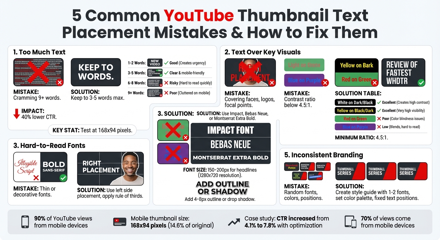
- Too Much Text: Keep it short - 3-5 words max. Overcrowding makes it unreadable, especially on mobile.
- Text Over Key Visuals: Avoid covering faces or focal points. Place text on the left or follow the rule of thirds.
- Hard-to-Read Fonts: Use bold, sans-serif fonts like Impact or Montserrat. Avoid thin or decorative fonts.
- Poor Color Contrast: Ensure text stands out by using high-contrast combinations, like white on black.
- Inconsistent Branding: Stick to the same fonts, colors, and text positions across thumbnails to boost recognition.
Quick Tip: Test your thumbnail at 168x94 pixels to ensure readability on small screens. Tools like ThumbnailCreator can simplify the process with AI-driven designs and mobile previews.
YouTube Thumbnail Text Placement Best Practices Guide
5 Common Text Placement Mistakes in Thumbnails
Mistake 1: Cramming Too Much Text
Too much text can ruin your thumbnail's effectiveness. Trying to squeeze entire sentences or multiple ideas into a small thumbnail creates clutter and overwhelms viewers.
Remember, YouTube thumbnails can appear as small as 168x94 pixels on mobile search results. At that size, anything beyond 3-5 words becomes unreadable. Research shows that thumbnails with 9+ words perform poorly because they lack clarity, while the ideal range of 3-5 words ensures better results.
Thumbnails with minimal text can improve click-through rates by up to 40%. For example, instead of "The Complete Beginner's Guide to...", simplify it to "BEGINNER GUIDE." Or replace "How I Made $10,000 in One Month" with "I MADE $10K." This makes your message easy to grasp at a glance.
| Word Count | Effectiveness | Impact on Viewer |
|---|---|---|
| 1-2 words | Good | Creates urgency, very direct |
| 3-5 words | Best | Clear and mobile-friendly |
| 6-8 words | Risky | Often hard to read quickly |
| 9+ words | Poor | Cluttered and illegible on mobile |
Before publishing, do a shrink test: resize your thumbnail to 168x94 pixels. If the text isn't legible at that size, it's time to cut down. Considering that 90% of YouTube views come from mobile devices, ensuring readability is critical.
Next, think about how text placement interacts with the visuals in your thumbnail.
Mistake 2: Placing Text Over Important Visuals
Covering key visuals like faces, logos, or focal points with text reduces your thumbnail's impact. Faces and other strong visuals grab attention first. If text blocks these elements, it creates unnecessary competition rather than complementing the overall design.
The left side of your thumbnail is a safer zone for text. YouTube's interface often overlays elements like timestamps on the right side, which can obscure your message. Placing text on the right risks it being cropped or hidden altogether.
Use the rule of thirds to create balance. Overlay a 3x3 grid on your thumbnail and position text at the intersection points. This way, your text enhances the visual story instead of overpowering it.
The next step is ensuring your text is easy to read, no matter the device.
Mistake 3: Using Hard-to-Read Fonts
Thin or overly decorative fonts might look stylish on desktop but fail on mobile. When thumbnails shrink to mobile size, intricate serif fonts or scripts can lose their shape and become illegible.
For a standard 1280x720 thumbnail, keep your headline font size between 150-200px to ensure readability when scaled down. Stick to bold, sans-serif fonts like Impact, Bebas Neue, or Montserrat Extra Bold. These fonts retain their clarity, even on the smallest screens.
To further improve visibility, add a 4-8px outline or drop shadow around your text. This ensures your words stand out, regardless of the background image.
Mistake 4: Poor Color Contrast
Low contrast between text and background makes your message disappear. Combinations like light gray on white or blue on purple blend together, making your text hard to notice.
Your text should have a contrast ratio of at least 4.5:1 against the background. High-contrast pairings like white on black, yellow on dark, or black on white make the text pop. Avoid combinations like red on green, which not only lack contrast but also pose challenges for color-blind viewers.
| Text Color | Background | Contrast Level | Use Case |
|---|---|---|---|
| White | Dark/Black | Excellent | Great for universal readability |
| Yellow | Black/Dark | Excellent | Grabs attention effectively |
| Red | Green | Poor | Avoid (color blindness issues) |
| Blue | Purple | Low | Avoid (blends too much) |
Test your contrast on multiple devices. If the text doesn't stand out immediately, adjust the colors until it does.
Mistake 5: Inconsistent Text Placement Across Thumbnails
Inconsistency in text placement confuses viewers and weakens your branding. When viewers can't quickly identify your thumbnails in a crowded feed, you lose the opportunity to build recognition and gain repeat views.
Consistency doesn't mean making every thumbnail identical - it means sticking to specific text positions, fonts, and color schemes. For instance, if your first few thumbnails use yellow Impact font in the top-left corner, suddenly switching to blue script font in the bottom-right disrupts the visual connection viewers have with your content.
Create a style guide to maintain consistency. Limit yourself to 1-2 fonts, define a color palette, and stick to set text positions. This makes your thumbnails instantly recognizable, even when users are scrolling quickly through their feeds.
sbb-itb-b59debf
How to Fix These Text Placement Mistakes
Keep Text Minimal and Focused
When it comes to text, less is more. Stick to the 3–5 word rule or keep it under 20 characters to ensure readability across all devices. Instead of cramming in too much information, focus on a single, attention-grabbing hook. For instance, change something like "5 Things I Wish I Knew Before" to "5 MISTAKES", or swap "Everything You Need to Know About" with "FULL GUIDE." Short, punchy keywords are easier to read and more impactful.
Also, prioritize mobile users by testing your thumbnail at 168×94 pixels. If the text isn’t clear at that size, trim it down until it is. And remember, your text should enhance your visuals, not compete with them.
Position Text Strategically
Where you place your text matters just as much as what it says. Align the text on the opposite side of your main subject to avoid cluttering the thumbnail. For example, if a face is on the right side, position your text on the left for balance.
Using a 3×3 grid can help you align your text at key intersection points, creating a composition that feels natural. Maintain a 40–60 pixel margin to prevent cropping, and avoid the bottom-right corner where YouTube displays the video duration.
Choose Readable Fonts for All Devices
Readable fonts are key for thumbnails that work across devices. Stick to bold, sans-serif fonts like Impact, Bebas Neue, or Montserrat Extra Bold, which remain clear even at smaller sizes. At a resolution of 1280×720, use font sizes between 150–200 pixels for headlines. For secondary text, keep it between 80 and 120 pixels. Adding a 4–8 pixel outline or drop shadow can make your text pop, especially against busy backgrounds.
Use High-Contrast Color Combinations
Contrast is everything when it comes to visibility. Aim for a contrast ratio of 4.5:1 or higher between your text and background. Combinations like white on black, yellow on black, or black on white are tried-and-true options. Test your thumbnail on both desktop and mobile to ensure the text stands out clearly. Adjust colors if needed until the text truly "pops."
Establish Consistent Branding
Consistency builds recognition. Create a style guide that outlines your fonts, colors, and text placement rules. Stick to 1–2 fonts and a cohesive color palette across all your thumbnails. This not only makes your designs look polished but also helps viewers instantly recognize your content.
YouTube Thumbnail Image Placement Tips with Canva
How ThumbnailCreator Can Help
ThumbnailCreator takes the hassle out of fixing text placement mistakes, saving you from hours of manual adjustments. This AI-driven tool is built specifically for YouTube creators, offering a fast and efficient way to craft professional thumbnails. By addressing common thumbnail mistakes highlighted earlier, it simplifies the entire process with smart automation and ready-to-use templates. Here's how it tackles each issue.
AI-Generated Designs for Better Visibility
ThumbnailCreator uses AI to automatically design thumbnails with text strategically placed for maximum readability. It ensures your text doesn’t overlap critical visuals like faces or key objects by positioning it thoughtfully. The tool also applies high-contrast color combinations, making sure your text is easy to read on any device, whether it’s a large desktop screen or a small mobile display. With this feature, you can focus on creating engaging content while the tool takes care of the design details.
Pre-Designed Templates for Effortless Consistency
The platform includes a variety of pre-designed templates that follow best practices for text placement, font styles, and color contrasts. These templates help maintain a consistent look across your thumbnails, reinforcing your branding. By keeping text minimal and well-positioned, they ensure your thumbnails remain clear and visually appealing without the need to start from scratch every time. Plus, the layouts and font sizes are optimized to stay sharp and readable, even at smaller resolutions.
Real-Time Previews for Perfect Mobile Optimization
One of ThumbnailCreator’s standout features is its real-time preview tool. This allows you to see exactly how your thumbnail will appear on different screen sizes, including mobile resolutions as small as 168×94 pixels. If your text looks cramped or unclear in the mobile view, you can make adjustments instantly using the built-in text editing tools. This ensures your thumbnails are polished and effective, whether viewers are scrolling on their phones or watching on a larger screen.
Conclusion
Where you place text on your thumbnail can make or break its effectiveness. Common pitfalls - like overcrowding with text, obscuring important visuals, choosing hard-to-read fonts, poor color contrast, and inconsistent branding - can hurt your click-through rate (CTR). But the good news? These mistakes are easy to fix. A small tweak can make a big difference. For example, a personal finance creator increased their CTR from 4.1% to 7.8% simply by optimizing their thumbnail text. As Ventress aptly states, "If your title is the logical pitch, your thumbnail text is the emotional hook".
To fix these issues, focus on simplicity: use fewer than four words, avoid placing text over faces or the bottom-right corner (where visuals are often obscured), pick high-contrast colors, and stick to consistent branding across your channel. These small changes not only make your thumbnails more appealing but also help YouTube's algorithm recognize your branding, which can lead to more impressions over time.
With 70% of views coming from mobile devices, every detail matters - especially since thumbnails shrink to just 14.6% of their original size on smaller screens. Tools like ThumbnailCreator simplify this process by handling technical aspects like AI-driven text placement and real-time mobile previews, leaving you free to focus on your content.
Top creators rely on tried-and-true systems for text placement, visual design, and testing using proven thumbnail guides. Whether you're making adjustments manually or using tools like ThumbnailCreator to streamline your workflow, refining your text placement is one of the most powerful ways to grow your channel. By mastering these strategies, your thumbnails will not only grab attention but also drive consistent growth.
FAQs
How do I choose the best 3–5 words for my thumbnail?
When creating text for small screens, keep it short and easy to read. Use bold, sans-serif fonts like Montserrat or Bebas Neue for sharp clarity, and choose high-contrast color combinations (like yellow on black) to make it pop. Focus on delivering a concise message that grabs attention and sparks curiosity. Before finalizing, test your design at 168x94 pixels to ensure it looks clear on all devices.
Where is the safest place to put text so YouTube doesn’t cover it?
To make sure text on a YouTube thumbnail stays visible and isn’t hidden by UI elements, keep it within the safe zone. This area is generally the middle 60–70% of the image, leaving about 180–200 pixels of space from each edge. Positioning text here ensures it remains clear and readable on all devices and layouts.
How can I quickly test if my thumbnail text is readable on mobile?
To make sure your thumbnail text is easy to read on mobile devices, preview it at 168x94 pixels - the standard resolution for YouTube mobile views. This helps confirm that your text remains sharp and legible. For best results, stick to high-contrast colors, use bold sans-serif fonts, and keep the text short - ideally 3-5 words.