
Ultimate Guide to Thumbnail Text Placement Strategies
Want more clicks on your YouTube videos? It starts with your thumbnail. The way you place text on a thumbnail can make or break your video’s performance. Here’s what you need to know:
- Text placement impacts click-through rate (CTR): YouTube’s algorithm favors videos with higher CTR, and 90% of top-performing videos use custom thumbnails.
- Mobile matters: 70% of YouTube views come from mobile devices, where thumbnails shrink to just 168x94 pixels. Text must stay readable at this size.
- Avoid dead zones: YouTube overlays (like timestamps in the bottom-right corner) can obscure text, so critical elements need to stay clear of these areas.
The key is balancing text with visuals, ensuring clarity across devices, and using proven strategies like the centered vs rule of thirds layouts, safe zones, and alignment techniques. Below, we’ll dive into actionable tips to help your thumbnails stand out, grab attention, and drive more views.
YouTube Thumbnail Image Placement Tips with Canva
sbb-itb-b59debf
Basic Principles of Text Placement
Getting text placement right is all about ensuring clarity and visual appeal across different devices. These guidelines help your message stand out, no matter the platform. Let’s lay the groundwork for beginners before diving into advanced alignment techniques.
The Rule of Thirds
Imagine dividing a 1,280×720 pixel thumbnail into a 3×3 grid. The intersections of this grid are natural focal points where the viewer’s eyes are drawn. Placing text and key subjects at these intersections, rather than centering them, creates a more dynamic and visually engaging composition .
This approach also solves a common issue: where to position text when there’s a face or object in the frame. For example, if your subject is on the right intersection, placing text on the opposite third creates balance. This diagonal arrangement ensures the text doesn’t compete with the main visual element .
"Thumbnails are like stamps and flags; they are normally viewed at quite a small size. Make sure everything in your thumbnail is clear and easily recognizable." - Thomas Frank, Creator
Using a grid overlay in your design tool can help you align elements more precisely. For example, placing the subject’s eyes in the upper third naturally draws attention while leaving enough room for text.
Now, let’s consider how to avoid interface elements obscuring your design.
Avoiding UI Overlaps
YouTube’s interface elements - like the duration timestamp in the bottom-right corner, the progress bar along the bottom edge, and various badges - can interfere with your text placement. To avoid these "dead zones", keep critical elements like text, faces, and logos within the central 60–70% of the thumbnail, which is about 900×430 pixels. This means leaving 180–200 pixels of padding around the edges.
"Anything that must be readable - text, faces, logos - should stay inside the safe zone." - Thumix
Test your thumbnail at smaller sizes to make sure the text remains legible. If it’s hard to read, tweak the design until it’s clear .
Balancing Text with Visual Elements
A good thumbnail guides the viewer’s eye in a natural order: first to the subject, then to the main text, and finally to supporting details. Ideally, text should cover around 20–30% of the frame, complementing the visuals without overpowering them.
The 60-30-10 color rule is a helpful guide for maintaining balance: use 60% for the dominant background color, 30% for the subject, and 10% for text or accent highlights. This approach ensures the text enhances the overall design rather than clashing with it.
Contrast is key for readability. Bold sans-serif fonts (like Impact, Bebas Neue, or Montserrat Extra Bold) with 4–8 pixel outlines or shadows work well at small sizes . For headlines at 1,280×720 resolution, aim for font sizes between 150–200 pixels, and for secondary text, stick to 80–120 pixels.
These principles form the backbone of effective text placement, ensuring your design is both eye-catching and functional.
Text Placement Strategies
YouTube Thumbnail Text Alignment Guide: Best Practices by Placement Zone
When designing thumbnails, where you place text can make or break its effectiveness. Strategic text placement not only enhances clarity but also boosts viewer engagement, especially on smaller screens like mobile devices (where a whopping 70% of YouTube views happen). Let’s dive into three tried-and-true placement strategies that work across various designs.
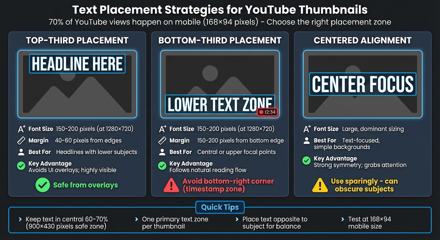
Top-Third Placement
The top third of a thumbnail is a reliable spot for text. It’s highly visible, avoids interference from YouTube’s interface overlays, and creates a balanced look when the main subject is positioned lower in the frame. This placement ensures your text grabs attention right away.
For best results, use this area for your headline text, ideally sized between 150–200 pixels at a 1,280×720 resolution. To avoid cropping, leave a margin of 40–60 pixels around the edges. This approach works particularly well when your subject or focal point is in the lower portion of the thumbnail, as it naturally balances the composition.
Bottom-Third Placement
The lower third is another effective zone, aligning with natural reading patterns. This placement works best when your main subject is centered or positioned toward the top of the thumbnail. It separates the visual focus from the text, making both elements stand out.
However, steer clear of the bottom-right corner - it’s always covered by the video’s duration timestamp. Instead, stick to the bottom-left or bottom-center areas. Before finalizing, perform thumbnail testing at scale to see how the text looks at smaller sizes to ensure it remains readable on mobile screens.
Centered Alignment
Centering text works wonders for thumbnails with simple backgrounds where the message takes center stage. This layout creates symmetry and draws immediate attention, making it ideal for text-heavy designs or announcements.
That said, use centered text sparingly. If your thumbnail features a face or a key visual element, centered text can clash or get obscured by overlays like the play button. To make centered text pop, go bold, use high-contrast colors, and size it large enough to dominate the frame.
Quick Reference Table
| Placement Zone | Best Use Case | Key Advantage |
|---|---|---|
| Top-Third | Headlines with lower subjects | Avoids UI overlays; highly visible |
| Bottom-Third | Central or upper focal points | Follows natural reading flow |
| Centered | Text-focused, simple backgrounds | Strong symmetry; grabs attention |
For a polished, professional thumbnail, keep these guidelines in mind:
- If the subject’s face is on one side, place the text on the opposite side. This keeps the design clean and ensures both elements stand out.
- Stick to one primary text zone per thumbnail. Spreading text across multiple areas can clutter the design and confuse viewers.
Text Alignment Techniques
Text alignment plays a crucial role in grabbing attention, especially on small mobile displays like 168×94 thumbnails. Building on earlier text placement strategies, proper alignment sharpens your thumbnail's clarity and ensures it stands out across devices.
Horizontal and Vertical Alignments
Horizontal alignment is all about directing focus. Placing text opposite your main subject creates a balanced composition. For example, if a face is on the right, positioning the text on the left feels dynamic and modern. Centered alignment, on the other hand, provides a symmetrical and safe option that draws attention directly to your message. However, it should be used sparingly, as it risks obscuring key visuals in the center of the frame.
Vertical alignment helps guide the viewer's eye. Headlines positioned in the upper third of the frame are highly visible, while text in the lower third should sit 150–200 pixels above the bottom edge to avoid overlapping with UI elements like timestamps or buttons.
"The goal is zero cognitive load; the viewer should absorb the text's meaning in a fraction of a second." - ClickyApps Team
To ensure your text remains legible, follow safe zone and text placement guidelines for padding near the edges. These foundational principles are essential for implementing effective alignment techniques.
Alignment Best Practices
Each alignment style has its strengths and limitations, depending on the type of content and the intended audience. The table below outlines when to use each style, with a focus on mobile readability - where over 70% of YouTube views occur.
| Alignment Style | Advantages | Limitations | Best Use Case |
|---|---|---|---|
| Left-Aligned | Matches natural reading patterns; gives a modern, dynamic vibe | May feel unbalanced without a right-side subject | Tutorials, listicles, "vs" videos |
| Right-Aligned | Balances left-side subjects; conveys intentionality | Risk of overlapping timestamps if placed too low | Lifestyle or vlog content with left-side focus |
| Centered | Balanced and directs attention to the message | Can obscure the main subject; feels static | Minimalist designs or text-only thumbnails |
| Upper Third | Highly visible; avoids UI interference | Can feel top-heavy if the bottom is empty | Urgent news or "breaking" announcements |
| Lower Third | Keeps focus on the subject's face; traditional look | Requires precise placement above overlays | Supporting text (stay 150px+ from edge) |
Always test your thumbnail design at 168 x 94 resolution to ensure it remains readable on mobile. If the alignment doesn't work at this scale, it won't perform well where most viewers see it. For more advanced workflows, you can also use AI thumbnail generation tools to automate layout testing. Adjust letter spacing and line spacing carefully to avoid cramped text in tight zones. Adding 4–8 pixel outlines or drop shadows can also help maintain contrast, no matter where the text is aligned.
Using ThumbnailCreator for Text Placement
ThumbnailCreator takes the guesswork out of text placement by using AI to simplify your design workflow. It tackles common issues like overlapping UI elements and hard-to-read text, automating placement techniques that professionals use.
With ThumbnailCreator, you don’t have to manually drag text into position. Its advanced algorithms identify the best spots to place text, ensuring your thumbnails look polished and grab attention fast. The AI Thumbnail Generator creates complete layouts in seconds, automatically placing text in areas proven to drive clicks. Love the layout of a top-performing video in your niche? The Style Cloning feature lets you replicate that exact text placement and design instantly, making it easy to use strategies that already work.
Templates for Quick Alignment
ThumbnailCreator’s templates go beyond static designs. When you pick a template, it automatically positions text in ideal zones - like the left third or bottom band - so your message stays clear and doesn’t interfere with key visuals. Plus, the AI Editing tools let you tweak placements with simple commands, saving you time compared to manual adjustments.
Currently, more than 15,000 YouTube creators rely on ThumbnailCreator, with 90% of the platform’s best-performing videos featuring custom thumbnails. These templates are built on proven design principles, ensuring consistent results. Whether you’re working on a tutorial thumbnail with left-aligned text or a vlog thumbnail with bold, centered headlines, the system does the heavy lifting, freeing you to focus on your content.
Once your design is ready, you can test its effectiveness using AI-powered tools.
Testing Placement with AI Previews
The A/B Testing Variations tool makes it easy to compare multiple thumbnail versions with different text placements, helping you choose the layout that will make the biggest impact. With viewers deciding in just 0.3 seconds whether to click or scroll past your video, the AI preview mode shows how your thumbnail will look at mobile scale - where over 70% of video views happen.
The Thumbnail Analyzer offers expert feedback on your design, flagging common thumbnail mistakes like text placed in "dead zones" (e.g., the bottom-right corner, where YouTube’s timestamp could obscure it). Optimized thumbnails have been shown to boost click-through rates by 30% to 154%, and the AI preview system helps you pinpoint the best text positioning to achieve those results. You can even try all these features with a 7-day free trial to see how AI-driven placement can transform your channel.
Conclusion
Effective text placement isn't just about aesthetics - it directly impacts clicks. A high click-through rate (CTR) signals to YouTube's algorithm that your video is engaging, prompting the platform to recommend it to more viewers, which can lead to significant growth. Using techniques like the rule of thirds and keeping your text concise (just 3–5 words) ensures your message is clear and immediately understood.
Here’s what the data says: thumbnails with fewer than four words see a 30% higher CTR, and bold text with proper contrast can boost CTR by 44% (from 4.8% to 6.9%). With more than 70% of views happening on mobile devices, it’s crucial that text remains readable, even at the small size of 168×94 pixels.
ThumbnailCreator simplifies this process by automating proven text placement techniques. Its AI-powered tools provide professionally designed templates for optimal alignment and offer preview features to test how thumbnails look on mobile, ensuring your message is both clear and visually appealing.
Whether you're placing text in the top third for tutorials, the bottom third for vlogs, or opting for a centered alignment for bold statements, consistency and clarity are essential. By combining smart design principles with performance insights, you can bridge the gap between aesthetics and results. Try ThumbnailCreator’s free plan today and see how thoughtful text placement can elevate your channel’s success.
FAQs
How do I keep thumbnail text readable on mobile?
To make sure thumbnail text is easy to read on mobile, stick to bold, sans-serif fonts like Impact or Montserrat Extra Bold. These fonts remain clear even at smaller sizes. Keep the text short - ideally 3 to 5 words - and use a font size between 150-200px for a resolution of 1280x720. Adding outlines or shadows (around 4-8px) can help improve contrast. Finally, always test your thumbnails at smaller sizes to ensure they’re readable on mobile screens.
Where should I avoid placing text on a YouTube thumbnail?
Avoid placing text in the bottom-right corner of your thumbnail, as YouTube’s duration timestamp or other UI elements can cover it. To make your text readable across all devices and layouts, stick to the central 60–70% of the thumbnail - this "safe zone" ensures nothing important gets cut off or hidden.
How can I quickly A/B test different text placements?
If you're looking to experiment with text placements on your YouTube thumbnails, YouTube Studio's 'Test & Compare' feature is a great place to start. This tool lets you upload up to three different thumbnail variations. YouTube then displays these variations to different viewers and provides detailed insights on which one performs best.
For even more options, consider third-party tools like ThumbnailTest or Skywork.ai. These platforms are designed to help you create and test multiple thumbnail variations efficiently. By analyzing the results, you can pinpoint the text placement that drives the highest click-through rates, boosting your video's overall performance.