
Logo Placement Tips for Better Thumbnails
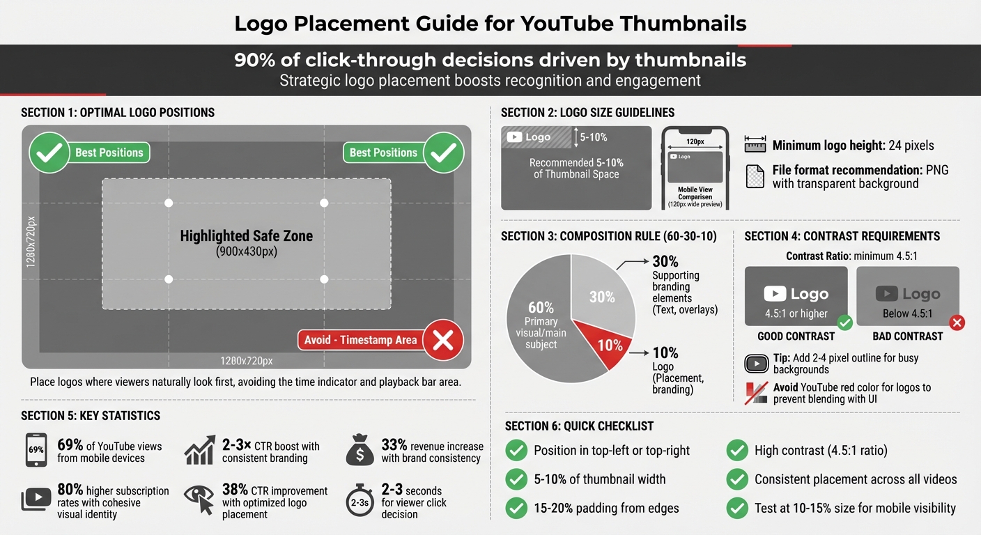
Your logo’s placement on YouTube thumbnails can directly impact clicks, views, and long-term channel growth. Thumbnails drive 90% of all click-through decisions, and placing your logo strategically boosts recognition and engagement. Key takeaways:
- Best spots for logos: Top-left or top-right corners (avoid bottom-right due to timestamps). This is one of many common thumbnail mistakes to avoid when designing for mobile.
- Size matters: Logos should occupy 5–10% of the thumbnail space for visibility on mobile and desktop.
- Contrast is crucial: Use high contrast and avoid busy backgrounds to make your logo stand out.
- Consistency is key: Always position your logo in the same spot to build brand recognition.
Tools like ThumbnailCreator simplify this process, automating placement and A/B testing designs to optimize click-through rates. A well-placed logo isn’t just branding - it’s a powerful tool to make your videos stand out.
YouTube Thumbnail Logo Placement Best Practices Guide
Best Practices for Logo Placement in Thumbnails
Where to Position Your Logo for Maximum Visibility
For the best visibility, place your logo in the top-left or top-right corners of your thumbnail. These spots ensure your branding is noticeable while avoiding interference with YouTube’s interface. Steer clear of the bottom-right corner, as this area is reserved for the video duration timestamp.
To keep your logo and other key elements safe from YouTube’s overlays, position them within the central 60–70% of the frame (approximately 900 x 430 pixels).
"Anything that must be readable - text, faces, logos - should stay inside the safe zone." - Thumix
Using the rule of thirds can also guide your logo placement. Divide your thumbnail into a 3x3 grid and position your logo at one of the intersections. This method works especially well if the main subject, like a face, occupies one side of the frame. Placing your logo on the opposite side creates a visually balanced design.
Leave 15–20% padding from the edges to prevent cropping in different display formats. If your thumbnail features a face, position the logo in a corner that complements the subject. This way, the logo enhances the design rather than competing for attention.
Once you’ve found the right position, focus on balancing the logo with other elements in the thumbnail.
Balancing Your Logo with Other Thumbnail Elements
After placing your logo, ensure it harmonizes with the rest of the thumbnail for a clear and appealing design. Ideally, your logo should take up about 5% to 10% of the total thumbnail space - large enough to be recognizable on a smartphone but small enough to avoid overshadowing the main visual.
Follow the 60-30-10 composition rule:
- 60% for the primary visual or main subject.
- 30% for supporting branding elements like colors or fonts.
- 10% for the logo itself.
Use whitespace effectively to avoid a cluttered look. Negative space helps your logo stand out, and a clean design encourages more clicks. For better visibility, ensure a high contrast between your logo and the background - aim for a contrast ratio of at least 4.5:1. If the background is too busy, add a solid color block or an outline behind your logo.
Keep text to a minimum - just a few impactful words. To test your design, scale it down to 10–15% of its size to mimic how it appears on mobile devices. If the logo becomes unreadable or the design feels cramped, adjust accordingly.
Since viewers often decide whether to click in just a few seconds, proper logo placement not only strengthens your branding but also makes your content instantly recognizable across your channel.
sbb-itb-b59debf
Scaling and Sizing Your Logo for Thumbnails
Choosing the Right Logo Size for YouTube Thumbnails
When designing for YouTube thumbnails, your logo needs to work well within the platform's standard resolution of 1280 x 720 pixels. Ideally, your logo should take up about 5–10% of the thumbnail's width to remain clear and recognizable. This proportion helps reinforce your channel's visual identity, making it easier for viewers to associate your content with your brand.
Since around 69% of YouTube views come from mobile devices, it's important to test how your thumbnail looks at smaller sizes - approximately 120 pixels wide. If your logo becomes unreadable at this scale, you may need to adjust its size or simplify its design. Also, ensure your thumbnail is at least 640 pixels wide to avoid pixelation, and keep your logo's height no smaller than 24 pixels for proper visibility on web displays.
For file formats, save your logo as a PNG instead of a JPG. PNG files preserve sharp edges and allow for transparent backgrounds. Keep a vector file as your master source, as vectors can be resized infinitely without losing quality.
Using Contrast and Clear Backgrounds for Logo Visibility
Beyond size, contrast plays a key role in making your logo stand out. Aim for a contrast ratio of at least 4.5:1 to ensure readability across different devices. If your thumbnail has a busy background, consider adding a 2–4 pixel contrasting outline around your logo - white for dark logos works particularly well. You might also place your logo on a semi-transparent shape or solid color block to further enhance its visibility.
Avoid using YouTube red in your logo or icons, as it can blend into the platform’s interface and confuse viewers. Instead, choose complementary brand or optimized colors that naturally create contrast. For thumbnails with complex backgrounds, applying a subtle blur effect to the background while keeping your logo sharp can guide the viewer's focus effectively.
To ensure your logo works at smaller scales, reduce the thumbnail to 10–15% of its original size during testing. If it loses clarity, either increase its size or adjust the contrast. Keep in mind that viewers often decide whether to click on a video within 2–3 seconds, so your logo needs to grab attention immediately.
Maintaining Brand Consistency with Logos
Matching Your Logo with Channel Colors and Fonts
Your logo should seamlessly integrate into your overall visual system. To achieve this, define your brand's Visual DNA with a primary color, an accent color, and a neutral color (black or white), each with precise HEX codes. Even slight variations in these colors can appear sloppy and weaken your brand identity.
Follow the 60-30-10 rule to create balance in your visuals - 60% for primary elements, 30% for secondary accents, and 10% for highlights like your logo. For typography, stick to just two fonts. Use a bold, attention-grabbing font for headlines (e.g., Montserrat or Bebas Neue) and a clean, easy-to-read font for supporting text. Sans-serif fonts are ideal since they remain legible even on small mobile screens.
Given YouTube's neutral interface colors (white, light gray, and dark gray), opt for vibrant brand colors like electric blue, bright red, or orange that stand out against these backgrounds. Consistent branding can significantly impact performance, boosting click-through rates by 2–3× and increasing revenue by up to 33%. Maintain a Brand Kit that includes your HEX codes and font files to ensure every thumbnail aligns perfectly with your brand's identity.
Consistency in design across all thumbnails is key to building a recognizable and professional brand presence.
Using Repeated Design Elements for Brand Recognition
Beyond your logo, consistent design elements help establish a visual fingerprint that viewers can instantly recognize. This could include uniform borders, specific photo filters, or shadow styles in your brand colors across all thumbnails. Another effective strategy is using color-coded tabs to organize your content - blue for tutorials, red for reviews, for example.
Since the human brain processes visuals 60,000 times faster than text, these elements give you an edge, making your content stand out as users scroll through their feeds. Place your logo consistently in one spot - preferably the top-left corner - to create a reliable anchor point. Also, test your thumbnail at 160×90 pixels to ensure it remains clear and effective on mobile screens. Channels with a cohesive and professional visual identity see 80% higher subscription rates.
How To Create Great Branded YouTube Thumbnail Designs to get more subscribers
How ThumbnailCreator Simplifies Logo Placement
ThumbnailCreator takes the hassle out of logo placement by automating the process, ensuring your brand's identity shines through in every thumbnail. The AI consistently applies your brand's style, creating what’s often referred to as your visual DNA. This means your logo will always appear in the same spot, with the same size, acting as a dependable visual marker for your audience.
Using AI Features for Precise Logo Placement
ThumbnailCreator’s templates are designed with YouTube best practices in mind. They ensure logos are placed away from interface elements, like the timestamp, and keep the logo size under 5% of the thumbnail area. With over 70% of YouTube views happening on mobile devices, the AI makes sure your logo remains sharp and visible - around 160×90 pixels on a smartphone screen.
The platform also suggests tweaks to make your logo pop. For example, it can add a 5–10 pixel outline to improve contrast against busy backgrounds. Features like background removal, subject isolation, and scaling are automated, so you can focus on crafting your video’s message. As Alex Rivera, a seasoned industry expert, explains:
"AI also locks in consistent brand elements across teams - type styles, color tokens, and framing that stays on-message".
Beyond automation, ThumbnailCreator allows you to fine-tune your strategy by testing and analyzing different approaches in real time.
Testing Different Logo Placements to Improve Click-Through Rates
ThumbnailCreator doesn’t stop at automation - it also helps you refine your logo placement with A/B testing vs gut feeling data. You can try different positions, such as top-left versus top-right, and see which drives better click-through rates. The platform tracks how each design performs based on viewer engagement and recommends running tests for at least 72 hours to ensure reliable results.
A mobile visibility simulation lets you preview how your thumbnail will look in search results at smaller sizes, so you can confirm your logo remains clear across all devices. This data-driven approach eliminates guesswork, replacing it with actionable insights. Optimized thumbnail branding, achieved through consistent logo placement, can boost click-through rates by up to 38%. With ThumbnailCreator, your logo evolves from a simple branding element into a key driver of performance.
Conclusion
A thoughtfully placed logo does more than just showcase your brand - it boosts your video's performance. By ensuring strategic placement, your logo becomes instantly recognizable, cutting through the clutter and creating a lasting impression. High-contrast, consistent positioning acts like a visual signature that viewers identify in mere moments. Plus, strong branding directly influences viewer engagement and helps your channel grow.
Striking the right balance is essential. Stick to placement guidelines while maintaining your brand's visual identity across all your videos. This consistency not only enhances professionalism but also fosters trust and improves algorithmic performance.
For seamless execution, tools like ThumbnailCreator simplify the process. By using AI-powered templates designed with YouTube's best practices in mind, it takes the guesswork out of logo placement. Its A/B testing features provide real data to help you pinpoint what resonates with your audience. With ThumbnailCreator’s automation and insights, your logo placement becomes a vital part of your channel’s success story.
FAQs
Should my logo ever be bigger than 10%?
When designing thumbnails, aim to keep your logo size to less than 10% of the total thumbnail area. Oversized logos can overwhelm the design, pulling attention away from the main visuals and reducing the thumbnail's effectiveness. A smaller, more subtle logo helps maintain balance and keeps the focus on the key elements.
How do I keep my logo readable on mobile?
To keep your logo readable on mobile, stick to a clear, simple design with high contrast and minimal distractions. Use bold colors, and steer clear of busy or overly detailed backgrounds. Always test how your thumbnail looks at smaller sizes (like 120×90 pixels) to ensure it remains visible. Place your logo in a prominent, uncluttered spot so it stands out effectively.
How can I A/B test logo placement in ThumbnailCreator?
To test logo placement effectively in ThumbnailCreator, design 2-3 thumbnail variations, each featuring the logo in a different position. Then, use the platform's A/B testing tools to measure how each version performs. ThumbnailCreator offers analytics and performance predictions, making it easier to determine which placement generates the highest click-through rate (CTR). This approach ensures your thumbnails are optimized for both visibility and brand recognition, using clear, data-backed insights.