
Ultimate Guide to Thumbnail Typography
Your thumbnail text is often the first thing viewers notice - it must grab attention instantly. With 90% of top YouTube videos using custom thumbnails and over 70% of watch time happening on mobile, typography plays a key role in driving clicks. For those just starting out, following a YouTube thumbnail beginners guide can help master these fundamentals. Here’s the bottom line:
- Bold, sans-serif fonts like Montserrat or Bebas Neue work best for small screens.
- Keep text short and readable (3-5 words max) and test designs at 168x94 pixels.
- Use outlines, shadows, and high-contrast colors (e.g., yellow on black) to ensure visibility.
- Consistent fonts and styles build a recognizable brand, boosting click-through rates by up to 38%.
Pro tip: Tools like ThumbnailCreator simplify font presets and templates, helping you maintain a polished, professional look across all thumbnails. The right typography isn’t just about aesthetics - it’s about making your content stand out in crowded feeds.
Typography Basics for Thumbnails
Making Text Readable at Small Sizes
Thumbnails often appear at just 168x94 pixels on mobile search results. At this tiny scale, your text needs to be instantly readable. If viewers can't quickly make out your message, they'll scroll right past it.
Stick to bold, sans-serif fonts like Impact, Bebas Neue, or Montserrat Extra Bold for clear, sharp text. While decorative or script fonts might look great in larger formats, they tend to blur and become unreadable on mobile screens. Keep your text short and sweet - aim for 3-5 words max to ensure clarity.
"Readability beats creativity every single time. You can have the most artistic font in the world, but if people can't read it on their phone while they're on the bus, you've already lost." - Clement, Founder, ThumbnailMaker.co
When designing, start with a canvas size of 1280x720 pixels and use a primary headline size of 150-200px. Then, test your design at 168x94 pixels to ensure it holds up. To make the text stand out against busy backgrounds, add 4-8px outlines or drop shadows. Also, keep your text at least 40-60px away from the edges to avoid interference from UI elements like the video duration timestamp.
Once your text is legible, focus on arranging it in a way that naturally guides the viewer's attention.
Creating Visual Hierarchy with Text
Good typography isn't just about being readable - it's about leading the viewer's eye to your main message. Your primary headline should dominate the thumbnail, while any secondary text serves as subtle context. To establish hierarchy, use dramatically different sizes. For example, if your main text is 180px, keep supporting text at 90px or smaller.
Font weight also plays a big role. Extra bold or "black" weights grab attention immediately. You can emphasize key words by using a contrasting color to make them pop. Position your text in high-visibility areas, like the lower third or sides of the frame, to avoid overlapping with important visuals. This approach not only boosts clicks but also reinforces a consistent look for your brand.
For a quick check, try the Squint Test. Step back and squint at your design - if the main text doesn’t stand out, tweak the hierarchy. Keep in mind that viewers decide whether to click in just 1.5 seconds. Your typography should deliver the message instantly, with the most important info hitting first and hardest.
sbb-itb-b59debf
How to Choose Fonts for Thumbnails
Best Fonts for YouTube Thumbnails
Picking the right font for your thumbnails can significantly impact how well they perform. Bold, sans-serif fonts are a go-to choice because they stay sharp and readable, even when scaled down to smaller sizes.
For gaming or entertainment channels, high-energy fonts like Impact, Bangers, or Anton work wonders. If your channel leans toward education or tech, clean and polished fonts like Montserrat, Roboto, or Poppins are ideal - they project professionalism and clarity. Lifestyle or beauty creators might prefer fonts such as Raleway or Playfair Display, which bring a touch of sophistication and style.
The best news? Many of these fonts are completely free through Google Fonts or might already be installed on your device. That means you can create thumbnails that look polished and professional without spending a cent. These fonts don’t just improve readability - they also help define your channel’s personality, boosting engagement and clicks.
While knowing the best fonts is crucial, it’s just as important to avoid common thumbnail mistakes that can hurt your thumbnail’s impact.
Fonts to Avoid in Thumbnails
Steer clear of thin, lightweight, decorative, or overly intricate fonts - they tend to lose legibility when viewed at smaller sizes, which could cost you clicks. Serif fonts can work for content that aims to establish authority, but they require thorough testing, especially on mobile devices. When in doubt, stick with sans-serif fonts - they’re dependable, clear, and maintain a consistent look across all screen sizes and platforms.
How to design GREAT thumbnails (even if you’re not a designer)
Using Effects and Contrast to Improve Text Visibility
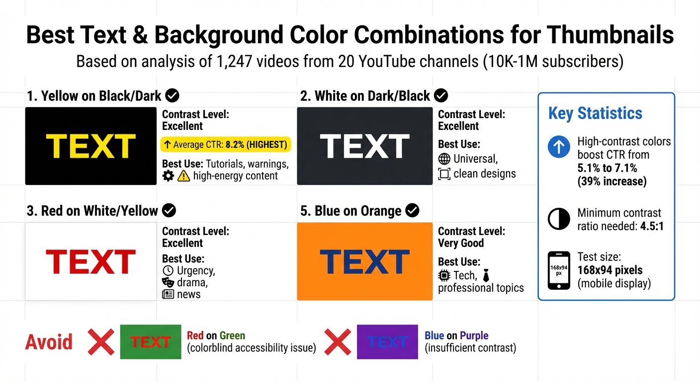
High-Contrast Color Combinations for YouTube Thumbnail Text: CTR Performance Guide
Adding Effects to Make Text Stand Out
Sometimes, a little extra flair can make your text pop. Adding a 4–8px outline (or even 8–12px for busier backgrounds) can help separate text from complex visuals. The key here is contrast: use black outlines for lighter text (like white or yellow) and white outlines for darker text.
Drop shadows are another great tool to give your text depth. For a polished, professional vibe, set the shadow to 40–60% opacity with an 8–12px blur. Want something bold and eye-catching? Go for 80–100% opacity with little to no blur (0–4px) - this creates a retro, punchy effect. These subtle enhancements can elevate your typography without overpowering your design.
Gradients, when used sparingly, can add a modern touch. However, overdoing it can hurt readability. For gaming or tech content, glows bring in that neon energy viewers often expect, while 3D extrusion adds weight and drama, making it ideal for action-heavy visuals. But keep it simple - stacking multiple effects like gradients, glows, and patterns can clutter your design and make text harder to read.
One thing to skip? Bevel and emboss effects. They tend to look outdated and unpolished.
Choosing High-Contrast Color Combinations
Contrast is what makes your text stand out, and it's non-negotiable. A contrast ratio of at least 4.5:1 ensures your text is readable across all devices.
For example, yellow text on a black background is a standout choice. A study by the NoteLM Team (July 2025–January 2026) analyzed 1,247 videos from 20 YouTube channels (10K to 1M subscribers) and found that this pairing achieved an average CTR of 8.2%, which is significantly higher than typical thumbnail CTR benchmarks for most niches. High-contrast color schemes overall boosted CTR from 5.1% to 7.1% - a 39% jump.
Other strong combinations include white text on dark backgrounds, which is clean and versatile, and black text on white, offering a minimalist, professional look. Red on white or yellow is great for conveying urgency, making it perfect for news or dramatic content. On the flip side, avoid red on green (difficult for colorblind viewers) and blue on purple, which lacks sufficient contrast.
Before finalizing your design, test your thumbnail at 168x94 pixels - the smallest size for mobile displays. If the text isn’t clear at this scale, your contrast needs adjustment. Also, remember that YouTube's interface alternates between light (white) and dark (gray) modes, so your thumbnail should stand out against both.
| Text Color | Background Color | Contrast Level | Best Use Case |
|---|---|---|---|
| Yellow | Black / Dark | Excellent | Tutorials, warnings, high-energy content |
| White | Dark / Black | Excellent | Universal, clean designs |
| Red | White / Yellow | Excellent | Urgency, drama, news |
| Black | White / Light | Excellent | Minimalist, professional |
| Blue | Orange | Very Good | Tech, professional topics |
These combinations not only improve readability but also help reinforce your channel's branding. Tools like ThumbnailCreator make it easier to apply these effects consistently, ensuring your style remains cohesive across all your designs.
Maintaining Brand Consistency with ThumbnailCreator
Typography alone won't carry your brand if your overall design lacks consistency. When your fonts, colors, and effects remain uniform across thumbnails, your content becomes instantly recognizable. And that recognition? It’s what draws viewers in and encourages clicks.
Saving Font Presets for Consistent Branding
Did you know YouTube viewers decide whether to click on a video in just 1.5 seconds? That makes brand recognition crucial. ThumbnailCreator simplifies this with its preset feature, letting you lock in your established style so every thumbnail reinforces your visual identity.
With ThumbnailCreator’s font presets, you can save your entire typographic style - everything from font family and weight to spacing and color. This means you won’t need to rebuild your text settings every time you create a thumbnail, even when time is tight. For example, save one preset for your main headline, like Montserrat Extra Bold at 180px with a 6px black outline, and another for secondary text, such as Open Sans Semi-Bold at 100px. These presets ensure your text is not only consistent but also legible on any device.
"By consistently using the same font across all your thumbnails, you can maximize your channel's recognition and memorability, which in turn can lead to an increase in click-through rate (CTR)." - Approachable Design
The results speak for themselves: consistent branding in thumbnails can boost CTR by up to 38%, and maintaining visual uniformity across your brand can lead to a 33% revenue increase. By using presets, you’re not just saving time - you’re building trust and familiarity with your audience.
Once your typography is locked in, the next step is streamlining your overall design with templates.
Using Templates for Quick Design
Templates ensure your thumbnails maintain the same layout and composition across your content, saving time while keeping your designs professional. They follow best practices, like the rule of thirds, for optimal text and image placement.
ThumbnailCreator provides pre-designed templates tailored to various content types, from tutorials to reaction videos and comedy sketches. These templates include placeholder text and image areas, making it easy to drop in your content while keeping your brand’s colors and font presets intact. They also adhere to the 60-30-10 rule: 60% content visuals, 30% brand elements (like fonts and colors), and 10% logo.
"Consistency is key in YouTube... it’s also about making your thumbnails easy to recognize and fit your overall brand. Consistent colors, fonts, and elements go a long way to getting that click from people who have seen your videos before!" - Roberto Blake, Founder of Awesome Creator Academy
With 90% of YouTube’s top-performing videos using custom thumbnails, templates ensure you’re always delivering polished, on-brand designs - even under pressure. Consider creating multiple template variations - standard for everyday use, special for collaborations, and seasonal for trending topics - to cover all scenarios while staying true to your brand.
Together, font presets and templates make ThumbnailCreator a powerful tool for building a consistent, recognizable brand across your thumbnails.
Conclusion
Typography goes beyond looking good - it plays a crucial role in grabbing attention and driving clicks. The difference between a thumbnail that gets noticed and one that gets ignored often boils down to whether the text is easy to read on a mobile screen. With most viewers scrolling on devices, mobile-first design is essential. If your text isn’t crystal clear at smaller sizes like 168x94 pixels, you’re likely missing out on potential clicks.
Here’s what works: stick to bold sans-serif fonts like Montserrat or Bebas Neue, and use 4–8px outlines to ensure strong contrast. A quick "squint test" can help you confirm readability at a glance. Avoid overly decorative fonts that sacrifice clarity for style. In fact, a study from October 2025 found that switching to more legible fonts increased click-through rates by 23%.
Consistency is where the magic happens. When your thumbnails use the same fonts, colors, and effects, your content becomes instantly recognizable in crowded feeds. This kind of branding not only boosts click-through rates but can also lead to higher revenue. It’s not just good design - it’s smart business.
Thankfully, tools like ThumbnailCreator make applying these principles easier. With features like font presets and templates, you can lock in your typography style and maintain a polished look across all your videos. This ensures your thumbnails stay professional, even when you’re short on time. Considering that 90% of YouTube’s top-performing videos rely on custom thumbnails, having a tool to streamline your process gives you a competitive edge. These tools don’t just save time - they help you stay creative while keeping quality intact.
FAQs
How do I pick a font that matches my channel’s vibe?
The font you pick says a lot about your channel’s personality. For example, bold fonts like Impact are perfect for energetic, attention-grabbing content. On the other hand, sleek, modern fonts like Montserrat work great for tech-focused or professional themes.
Whatever you choose, make sure it’s easy to read - even on small screens. Consistency is key, too. Using the same font across all your thumbnails helps strengthen your branding. The right font doesn’t just look good; it supports your message, aligns with your channel’s vibe, and connects with your audience.
How can I keep thumbnail text readable on any phone?
To make sure your thumbnail text is easy to read on phones, stick to bold, sans-serif fonts like Impact or Montserrat Extra Bold. These fonts remain sharp and clear, even when scaled down. Keep the text short - aim for 3-5 words max - and use a font size of around 150-200px for a 1280×720 resolution. Adding outlines or shadows can help the text stand out by improving contrast.
Always test your thumbnail by shrinking it to smaller sizes, such as 168×94 pixels, to ensure it stays readable across all devices.
How can I quickly make my thumbnails look consistent?
To make your thumbnails stand out and maintain a consistent look, start by creating a style guide for your channel. This should include details like the fonts, colors, and layouts you’ll use across all thumbnails. Choose readable fonts such as Impact or Montserrat, and stick to a cohesive color palette with consistent text placement.
For a smoother workflow, tools like ThumbnailCreator can be a game-changer. They allow you to create templates that match your style guide, making it easy to design polished, uniform thumbnails in just seconds.