
Checklist for Desktop Thumbnail Optimization
Your YouTube thumbnail is the first thing viewers notice, and for desktop users, it’s even more critical. Desktop thumbnails have more space but face unique challenges like interface overlays and the need for higher resolution. Here’s how to ensure your thumbnails stand out and drive clicks:
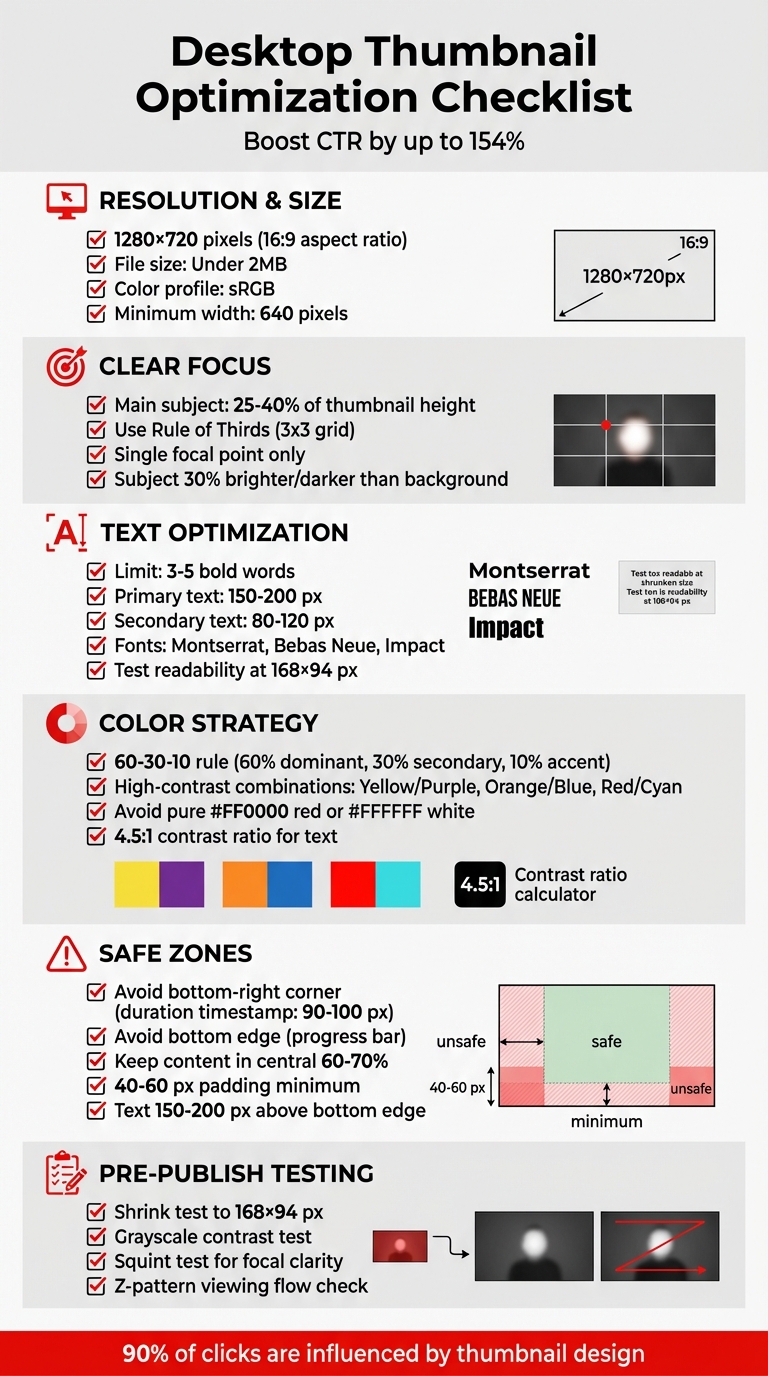
- Resolution & Size: Use 1280×720 pixels (16:9 aspect ratio) with a file size under 2MB for sharp visuals. Stick to sRGB color for accurate display.
- Clear Focus: Make the main subject fill 25–40% of the thumbnail and position it using the Rule of Thirds or centered layouts.
- Text: Limit text to 3–5 bold words, using large, sans-serif fonts like Montserrat or Bebas Neue. Ensure readability even at 168×94 px.
- Colors: Use high-contrast colors with the 60-30-10 rule. Avoid pure red or white to minimize dulling from compression.
- Safe Zones: Keep critical elements away from the bottom-right corner (duration timestamp) and bottom edge (progress bar).
- Testing: Shrink your thumbnail to check clarity and legibility. A quick grayscale test can ensure proper contrast.
Pro Tip: Tools like ThumbnailCreator can automate technical adjustments, saving time while maintaining quality.
Optimized thumbnails can boost your click-through rate (CTR) by up to 154%, directly impacting your video’s performance and audience reach. A clean, engaging design is the key to grabbing attention and keeping viewers coming back.
Desktop YouTube Thumbnail Optimization Checklist
Everything you need to know to make YouTube thumbnails
sbb-itb-b59debf
Visual Design Elements for Desktop Thumbnails
Take advantage of the extra screen space on desktops, but don’t clutter it. The trick is to establish a clear visual hierarchy that naturally draws the viewer’s attention to the most important part of the thumbnail. Your main subject - whether it’s a face, product, or another key element - should occupy about 25–40% of the thumbnail’s height. Position this subject at a key point on a 3x3 grid (commonly known as the Rule of Thirds) for maximum impact.
Color Contrast and Visual Hierarchy
Start with bold, eye-catching colors and a structured layout. High-contrast colors are excellent for grabbing attention. Stick to the 60-30-10 rule for color balance: 60% dominant color, 30% secondary color, and 10% accent color. For complementary color combinations, try Yellow/Purple, Orange/Blue, or Red/Cyan. However, stay away from pure colors like #FF0000 red or #FFFFFF white, as YouTube’s compression can dull them. Instead, opt for slightly muted shades, like darker reds or off-whites, for better results.
To make your main subject pop, ensure it’s 30% brighter or darker than the background. You can also blur the background slightly (using a 4–8 pixel Gaussian blur) to emphasize the foreground. Adding a subtle outline or outer glow (5–10 pixels) around the main subject can help it stand out even more. Finally, apply a dark vignette (20–30%) around the edges to draw attention toward the center.
"I reduced my thumbnail text from 12 words to 3. My CTR jumped from 3.2% to 7.8% overnight." - Ali Abdaal, Creator
Focal Point and Composition
With colors and hierarchy in place, shift your focus to layout and composition. Desktop viewers tend to follow a Z-shaped viewing pattern: top-left, top-right, bottom-left, and bottom-right. Place the most critical elements along this path. For example, a face or main subject works well in the top-left, text fits naturally in the top-right, and supporting graphics can go in the bottom sections.
Keep the design clean by maintaining a single focal point. Avoid common thumbnail mistakes like cramming in too many competing elements, as this creates visual clutter and can confuse viewers, ultimately lowering your click-through rate (CTR). Instead, layer your design elements with clear priorities: the largest element should be the main subject, followed by medium-sized text, and finally, smaller supporting graphics.
Thumbnails play a massive role in viewer decisions - about 90% of clicks are influenced by the thumbnail design. Applying these principles can potentially increase your CTR by 40–60%.
Text Optimization for Desktop Thumbnails
Text plays a key role in making desktop thumbnails effective. Stick to 3–5 words to keep things clear and readable, no matter the size. Thumbnails need to be legible from dimensions as large as 360×202 px down to as small as 168×94 px. This means choosing fonts and sizes that prioritize clarity is essential.
Font Selection and Text Size
Go for bold, sans-serif fonts that hold up when scaled down. Fonts like Impact, Bebas Neue, and Montserrat Extra Bold are excellent choices for desktop thumbnails. These fonts remain crisp and easy to read across all standard sizes.
For a standard 1280×720 px thumbnail, aim for primary text to be between 150–200 px and secondary text around 80–120 px. Avoid using font sizes smaller than 60–80 px. Before publishing, always perform a shrink test: resize your thumbnail to 168×94 px. If the text is hard to read at this size, either increase the font size or reduce the amount of text.
"If text isn't readable when you shrink your thumbnail to 168×94 pixels, it's too small or there's too much of it." - NoteLM Team
To make text stand out from busy backgrounds, use 4–8 px outlines (strokes) or drop shadows. For short, punchy phrases (1–3 words), use ALL CAPS for extra impact. High-contrast color combinations, like yellow text on black or white text on dark, perform well and ensure visibility on YouTube's interface in both light and dark modes.
Text Placement and Safe Zones
Once you've set your font and text size, where you place the text matters just as much. Some areas of a thumbnail are problematic. For instance, avoid the bottom-right corner, as YouTube’s duration timestamp covers about 90–100 px horizontally and 20–25 px vertically in this space. Similarly, steer clear of the bottom edge because YouTube overlays a progress bar here when users hover over thumbnails.
To ensure your text is always visible, keep it within the central 60–70% of the thumbnail, leaving 40–60 px of padding. This safe zone, roughly 900×430 px at full resolution, protects your text from being obscured by YouTube’s interface. Place primary headlines in the upper or middle sections, staying at least 150–200 px above the bottom edge.
For a balanced design, position text opposite your main subject. For example, if a face is on the right side of the thumbnail, place the text on the left. This approach keeps the layout clean and easy for viewers to process instantly.
Technical Requirements for Desktop Thumbnails
Once you've polished the visual and text elements of your thumbnail, it's time to focus on the technical details to ensure it displays perfectly on desktop screens.
YouTube sets specific guidelines to guarantee thumbnails look sharp and load quickly, as detailed in our YouTube thumbnail beginners guide. The platform requires a 1280×720 pixel resolution with a 16:9 aspect ratio. This matches the dimensions of the video player and prevents black bars (pillarboxing) from appearing on the sides. At this resolution, thumbnails use 921,600 pixels, striking a balance between clarity and compatibility across various desktop displays.
The minimum width for thumbnails is 640 pixels, which helps avoid severe pixelation when viewed on high-resolution monitors. While some creators opt for 1920×1080 pixels for enhanced sharpness on 4K screens, most stick to 1280×720 since YouTube's compression often negates the benefits of higher resolutions on standard displays.
Resolution and Aspect Ratio
To ensure your thumbnail fits seamlessly into YouTube's player, stick with a 16:9 aspect ratio. This prevents unwanted black bars and maintains a professional appearance. Some creators suggest designing at 1280×760 pixels to account for potential interface overlays, though this isn't a widely adopted practice.
Always export your thumbnails using the sRGB color profile. This helps maintain accurate and vibrant colors across different desktop browsers and monitors, avoiding dull or distorted hues.
File Format and Size
Choosing the right file format and size is just as important as resolution. YouTube supports JPG, PNG, and GIF formats, but the best choice depends on the content of your thumbnail:
- JPG is ideal for photos or images with complex gradients. It produces smaller file sizes (100KB–500KB) while maintaining good visual quality.
- PNG works best for text-heavy designs or logos, as it preserves sharp edges and ensures text looks crisp. However, PNG files often approach the 2MB limit.
Keep the file size under 2MB for standard uploads. Some creators working with 4K thumbnails may encounter file sizes up to 50MB, but this is less common. If you're using a GIF, remember only the first frame will display as a static image - YouTube does not support animated thumbnails.
| Specification | Requirement | Purpose |
|---|---|---|
| Resolution | 1280 x 720 pixels | Ensures sharp visuals on high-resolution displays |
| Aspect Ratio | 16:9 | Matches YouTube's player dimensions |
| Max File Size | 2MB (up to 50MB for some) | Balances quality with fast loading speeds |
| Color Space | sRGB | Provides consistent color rendering |
| Recommended Formats | JPG for photos; PNG for text/graphics | Optimizes quality and file size |
Desktop-Specific Layout Considerations
When designing thumbnails for desktop viewers, you have the advantage of larger screen space. However, this doesn’t mean you should cram in as much content as possible. Using professional thumbnail tools can help you maintain this balance. A clean, well-organized layout is key to ensuring your thumbnail is readable and avoids interference from YouTube’s interface elements.
Avoiding Overlays and Clutter
YouTube adds several interface elements over thumbnails that can obscure important content. For example, the duration timestamp is always located in the bottom-right corner, and a progress bar appears along the bottom edge when users hover over the thumbnail. These overlays are unavoidable, so your design must work around them.
Avoid placing critical text, faces, or logos in the bottom-right corner - this area is a "dead zone" reserved for YouTube’s duration badge. Stick to the safe zone guidelines to ensure that key elements aren’t hidden by these permanent overlays.
Using Screen Space Effectively
Once you’ve accounted for overlays, focus on making the most of the available space. While desktop screens offer more room than mobile devices, the most effective thumbnails still highlight a single, clear focal point. Remember, users decide whether to click in just 0.3 seconds, so a cluttered design with multiple focal points can confuse and deter them.
Use the extra canvas size to create plenty of negative space around your main subject, which helps the design feel less crowded and easier to process. The background should extend to the edges of the 1280 × 720 canvas for a polished look, but your focal element - whether it’s a face, product, or icon - should stay centered within the safe zone.
With more screen space, you can also use larger, bolder text with high contrast to grab attention. To test visibility, zoom out to 10–15% of the original size. If your text or focal point becomes unreadable at that scale, it’s likely to be overlooked in the desktop feed.
Pre-Publication Desktop Verification Checklist
Once your design and technical settings are in place, it's time to finalize your thumbnail with a thorough pre-publication check. This step ensures your thumbnail meets technical requirements and captures your audience's attention effectively.
Visual and Technical Checks
Start by confirming your thumbnail adheres to YouTube's standard dimensions: 1280×720 pixels with a 16:9 aspect ratio. Using lower resolutions can lead to pixelation when the image is upscaled for desktop or TV displays.
Double-check the file format and size. YouTube supports JPG, PNG, or GIF formats, with a maximum size of 2MB. However, for 4K-resolution thumbnails, the limit has been raised to 50MB as of October 2025.
Perform a quick squint test to ensure the main subject immediately stands out. If the subject blends into the background, your design might be too cluttered for desktop viewing. Testing your thumbnail in grayscale can also help you assess its visual hierarchy and contrast. Additionally, text elements should maintain a 4.5:1 contrast ratio against the background to ensure readability.
For larger screens, make sure the primary subject fills 30–60% of the frame to maintain a clear focal point. Before exporting, consider applying a slight sharpening filter (between +10 and +30) to enhance clarity on high-resolution displays.
Emotional and Branding Checks
Technical precision is just one piece of the puzzle - your thumbnail also needs to connect emotionally with viewers and align with your channel's branding.
Ask yourself: Does this thumbnail create a curiosity gap vs direct value that encourages clicks? Thumbnails that perform well often tap into emotions like surprise, intrigue, or excitement to drive engagement.
"It's critical to align your thumbnail with your video, and the first few seconds of your video must confirm to the viewer that what is promised in the title and thumbnail, will be delivered." - Chris Munch, CEO, AmpiFire
Consistency is key for branding. Stick to your channel's 2–3 core colors, 1–2 bold fonts, and place your logo consistently to build recognition. If your thumbnail includes a face, ensure the subject's gaze directs attention toward the key message or text. Your logo should take up around 5–10% of the thumbnail width and be positioned in a corner, ensuring it doesn’t overpower the main focal point.
Finally, verify that your thumbnail accurately represents the video's content. A misleading thumbnail might generate clicks, but if it leads to low watch time, it could hurt your video's performance. The emotional tone should also align with the video itself - over-the-top expressions can exhaust viewers and harm your credibility over time.
How ThumbnailCreator Simplifies Desktop Optimization
Creating thumbnails tailored for desktop viewing can be a time-consuming process, often requiring 30–60 minutes to manually adjust dimensions, safe zones, and contrast ratios. ThumbnailCreator takes the hassle out of this process by using AI to handle these technical details. Its tools are designed specifically to meet YouTube's desktop requirements, ensuring consistent, high-quality thumbnails every time.
Features for Desktop Thumbnails
ThumbnailCreator offers an array of tools that make desktop thumbnail creation effortless:
- AI-Generated Thumbnails: Automatically produce high-contrast images with a clear focal point. These thumbnails are formatted in a 16:9 aspect ratio and use the sRGB color profile, ensuring accurate color display across devices.
- Face Swapping: Add expressive close-ups with direct eye contact, a proven technique supported by VidIQ analysis to increase click-through rates by up to 30%.
- Object Swapping: Position high-contrast focal points that fill 30–60% of the frame, maximizing desktop resolution benefits while addressing mobile cropping issues.
- Text Editing: Overlay 2–5 bold words in safe zones - typically at the top to avoid YouTube’s UI overlays. Fonts are set at a minimum of 30 pixels for easy readability.
- Pre-Designed Templates: Templates are optimized for larger desktop screens, featuring layered details and gradients that enhance visual appeal on monitors and TVs.
These features ensure your thumbnails are not only visually striking but also technically optimized for desktop viewers.
Time and Cost Savings
ThumbnailCreator doesn’t just simplify the design process - it also saves time and money. Manually creating a thumbnail in software like Photoshop can take up to an hour and requires a subscription costing $20 or more per month. In contrast, ThumbnailCreator generates multiple thumbnail variants in minutes, significantly reducing time-to-publish.
Additionally, its built-in compression tools maintain image clarity on large desktop previews. By automating technical requirements like resolution and file size, ThumbnailCreator allows you to quickly test different designs, emotional hooks, or layouts to improve your video’s click-through rate. This efficiency means more time to focus on content creation, without sacrificing quality.
Conclusion
Optimizing desktop thumbnails plays a huge role in grabbing attention on YouTube. Thumbnails drive 90% of all click decisions, and even a small 1% boost in CTR can lead to 30-50% more views for your video. Desktop screens provide the perfect canvas for detailed designs that might get lost on smaller mobile screens.
By following the checklist we discussed - like sticking to a 1280×720 resolution, using high-contrast colors, keeping text between 3-5 bold words, and respecting safe zones - you can ensure your thumbnails are sharp, readable, and effective across all devices. For example, cutting down text from 12 words to just 3 has been shown to more than double CTR in some cases.
Tools like ThumbnailCreator make this process even easier. It handles the technical details for you, generating multiple optimized thumbnail options in no time. This frees you up to focus on the creative side, ensuring your thumbnails not only attract clicks but also deliver on their promise, keeping viewers engaged.
Optimizing for desktop isn’t just about aesthetics - it’s about making every viewer impression count. A standout thumbnail doesn’t just grab clicks; it builds recognition for your channel and fosters trust with your audience.
FAQs
How do I optimize one thumbnail for both desktop and mobile?
To make a thumbnail work well on both desktop and mobile, stick to a 16:9 aspect ratio with dimensions of 1280×720 pixels. For smaller sizes, like 120×90 pixels, ensure it stays clear by using bold colors, minimal text, and expressive faces. Keep the design clean with a clear focal point, avoid unnecessary clutter, and always preview it at different sizes to confirm it looks sharp and grabs attention on any device.
What should I A/B test first to improve CTR on desktop?
To improve desktop CTR, begin by A/B testing a single visual element - this could be bold colors, expressive faces, or clear, readable text. Thumbnails with high-contrast colors and eye-catching visuals are more likely to grab attention and drive clicks. After pinpointing what works best for your audience, fine-tune further by experimenting with text placement or layout to boost engagement even more.
How can I keep my thumbnail under 2MB without losing sharpness?
To keep your thumbnail under 2MB and still looking crisp, try compressing the image with smart techniques. Stick to dimensions of 1280×720 pixels and save it in formats like JPEG or WebP, which offer strong compression with minimal loss in quality. Always preview the thumbnail at smaller sizes to make sure it remains clear, and tweak the quality settings to strike the right balance between file size and visual appeal.