

AI Tools for Horror Game Thumbnails
If your horror thumbnail is dark but unclear, it will likely lose clicks. My main takeaway is simple: the best tool is the one that helps you keep one face or threat in focus, text short, and contrast strong at 1,280 × 720 px and on a phone screen.
Here’s the short version:
- ThumbnailCreator is the best fit if I want a horror-first thumbnail flow with face swap, object edits, and fast version testing.
- Canva works well if I care most about repeatable layouts and hands-on text control.
- Adobe Express is a good pick if I want a more cinematic look with AI edit tools.
- Picsart fits dark, edited thumbnails with glitch, grain, and cutout work.
- Fotor is the simple option for prompt-based ideas and basic cleanup.
A few rules matter across all five tools:
- Keep text to 2–5 words
- Use one clear focal point
- Check the thumbnail at about 120–160 px wide
- Stick to strong contrast, like dark navy or black + deep red (#991B1B) or white text
- Make sure YouTube UI elements don’t cover the face or title
Quick Comparison
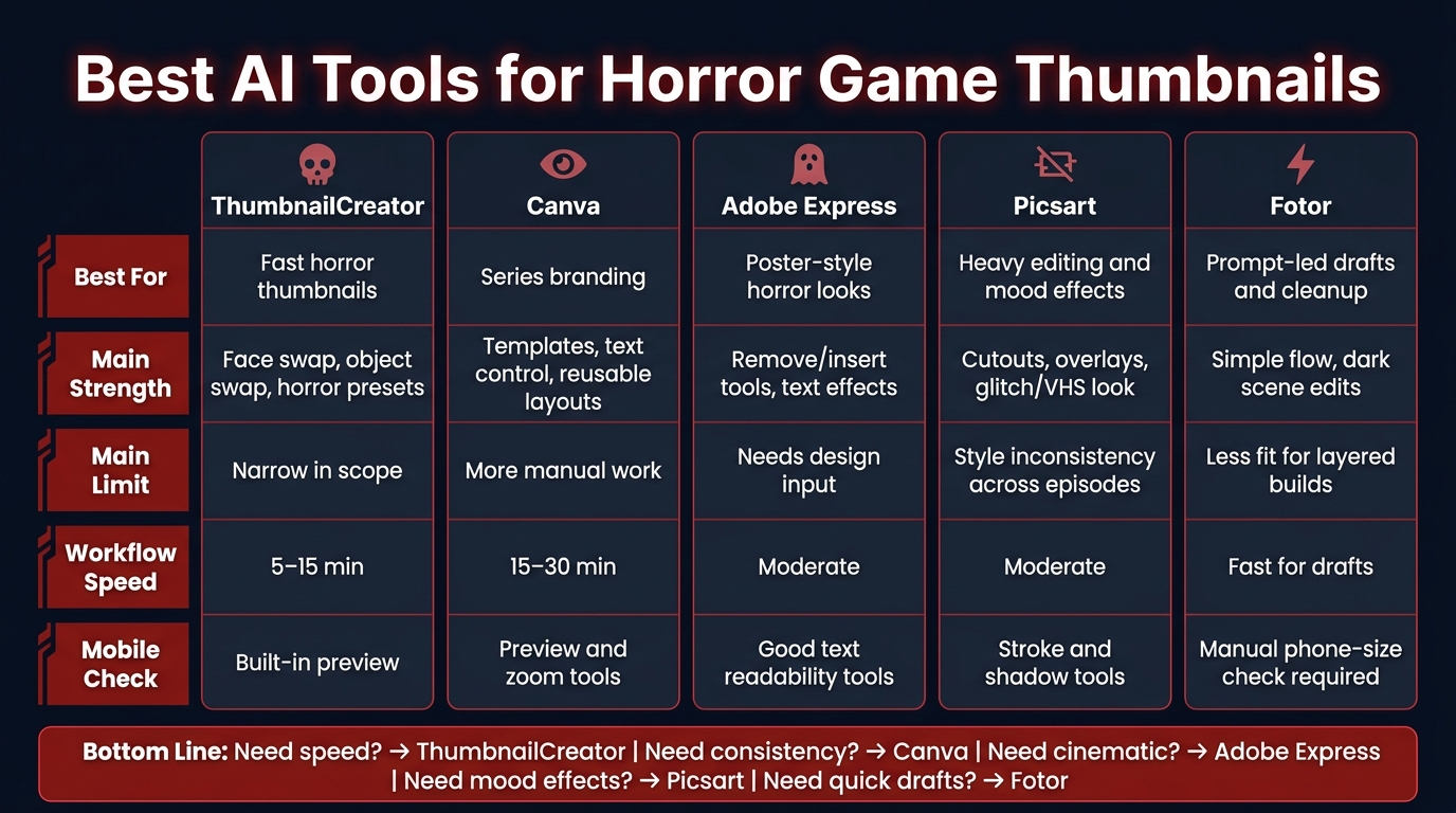
Best AI Tools for Horror Game Thumbnails: Side-by-Side Comparison
| Tool | Best for | Main strength | Main limit | Mobile check |
|---|---|---|---|---|
| ThumbnailCreator | Fast horror thumbnails | Face swap, object swap, horror presets | More narrow in scope | Built-in preview |
| Canva | Series branding | Templates, text control, reusable layouts | More manual work | Preview and zoom tools |
| Adobe Express | Poster-style horror looks | Remove/insert tools, text effects | Needs more design input | Good text readability tools |
| Picsart | Heavy editing and mood effects | Cutouts, overlays, glitch/VHS look | Can drift in style from video to video | Strong stroke/shadow tools |
| Fotor | Prompt-led drafts and cleanup | Simple flow, dark scene edits | Less fit for layered builds | Must check phone-size view |
My bottom line: if I need output fast, I’d start with ThumbnailCreator. If I want tighter control over series-wide layouts, I’d lean toward Canva or Adobe Express. If I’m editing dark gameplay shots by hand, Picsart and Fotor can still do the job well.
Below, I’d break down which tool fits which type of horror channel and where each one helps most.
1. ThumbnailCreator
ThumbnailCreator is an AI-powered thumbnail tool made just for YouTube creators. For horror channels, it helps you build one clear, high-contrast focal point fast. The workflow is built to take you from idea to finished thumbnail in under 60 seconds.
Horror Visuals
ThumbnailCreator comes with style presets aimed at horror looks, including Dramatic & Intense, Grunge, and Neon & Glow. That means you can set the mood fast instead of building the whole look from scratch.
Its horror color guidance leans on #991B1B paired with dark shades like #0F172A. The result is a high-contrast palette that keeps the main subject easy to read against a dark background.
Once the mood is in place, the next move is simple: make the face or threat impossible to ignore.
Face/Object Editing
The Face Swap feature lets you drop your own reaction face, or a stronger expression, right into a game scene. Its custom AI model can be trained on as few as 5 reference photos, which helps keep lighting and expressions natural. That's handy when you want to turn a flat gameplay screenshot into a wide-eyed reaction or a jump-scare moment.
For the threat itself, object swapping gives you a way to add shadowy figures, creepy props, or ominous environments. Targeted inpainting lets you edit specific parts of the image, like replacing a generic enemy with the game's actual antagonist.
Text tools support short, bold phrases that stay readable at small sizes. So you can pair a strong image with a simple horror hook without making the thumbnail feel cluttered.
After that, you can clean things up and export in a YouTube-ready format.
Thumbnail Workflow
You start with a text prompt, such as dark moody background, terrified face lit only by the game screen, then generate variations and tweak them in the built-in editor. This can cut thumbnail creation down to about 5–15 minutes, which is a big deal if you're posting multiple videos each week.
Mobile Readability
ThumbnailCreator includes a preview mode that shows how your thumbnail will look on smaller screens before you export it. That gives you a quick gut check: does the face stand out, and does the headline read right away? If not, the thumbnail probably won't earn the click.
For text, the tool pushes a 3–5 word maximum and high-contrast pairings like white or yellow on dark backgrounds, with a stroke or shadow for legibility. It also keeps key elements inside the visible area, which lowers the chance that YouTube UI overlays like timestamps and channel badges will cover something important.
2. Canva
Canva gives you a big library of ready-made YouTube thumbnail templates, including gaming layouts you can shift into a horror look. It works best when you want fast, template-driven thumbnails but still want to tweak things by hand. Its main pull is simple: speed, control, and layouts you can reuse again and again.
Horror Visuals
Canva comes with dark backgrounds, grunge textures, glitch effects, fog overlays, broken glass, and horror-style fonts that you can stack together for a horror look. It’s also easy to build high-contrast color schemes, like neon green or red on black, with filters and brightness/contrast controls.
Once the mood is in place, the next job is pulling out the face or threat so it stands front and center.
Face/Object Editing
Canva’s background remover, color grading, transparency controls, and filters let you isolate a face or object and drop it into a horror scene. Common edits include desaturating skin tones, adding slight blur or motion to hint at panic, and layering scratches or cracks to make a subject look possessed or damaged. The catch is that getting everything to blend well usually takes manual tweaking, especially if you want a face or object to feel natural inside a dark scene.
That hands-on control can slow things down, but it also makes it easier to keep your channel look consistent.
Thumbnail Workflow
A typical Canva horror thumbnail can take 15–30 minutes to finish because most of the process is manual. The upside is control. You can build 3–5 reusable horror templates for jump-scare compilations, story-based playthroughs, or challenge runs, then swap in a new screenshot and title for each upload.
That same hands-on setup makes Canva slower, but also simpler to standardize across a channel.
Mobile Readability
Canva’s zoom and preview tools help you check how the design looks at small sizes before export. That matters a lot when you’re using layered overlays. Too many effects can flatten the image and weaken contrast on a phone screen, so it helps to keep the composition tight and make sure the text stands apart from the background.
That’s the Canva tradeoff: flexible, but more hands-on than automated tools.
3. Adobe Express
Adobe Express mixes ready-made templates with AI editing tools, so you can put together polished horror thumbnails without spending forever on each one. For horror channels, that usually means dark scenes, hard contrast, and a setup you can reuse from episode to episode.
Horror Visuals
Use #991B1B with black or neon green for a dark palette that still reads well at a glance. That color mix helps the thumbnail stay clear even after YouTube compresses the image.
Face/Object Editing
Tools like Remove Background, Remove Object, and Insert Object make thumbnail work much easier. You can isolate a face, clear out messy parts of the frame in one move, and drop in horror props without rebuilding the whole scene.
Thumbnail Workflow
A smart way to use Express is to build one base layout, then swap in a new screenshot and title for each episode. If your channel posts the same kind of horror series again and again, this saves time and keeps your thumbnails visually consistent.
Mobile Readability
Adobe Express also works well for mobile-friendly thumbnail design. It includes text effects like strokes, shadows, and color fills, along with AI-suggested font and color pairings that help titles stay readable without losing that creepy feel. Keep titles to 4–5 words, use high contrast, and always preview the thumbnail at phone size.
4. Picsart
Picsart mixes strong image editing with a 1280×720 YouTube thumbnail maker, which makes it a good fit for fast horror thumbnails built around dark, cinematic scenes. In plain English, it works well when your thumbnail needs more compositing and a heavier edited look.
Horror Visuals
Use contrast, shadow, desaturation, and low-opacity grunge overlays to build tension without making the image look muddy. Picsart's AI Image Generator can also make cinematic horror art fast. Once you lock in the mood, shift your focus to the part that matters most: making the face or threat stand out right away.
Face/Object Editing
Use cutouts and masking to isolate your reaction face, remove distracting UI, and add one horror prop that fits the game. That could be a knife, a flashlight, a ghostly hand, or anything else that matches the scene. After you land on a look that works, reuse the same edit pattern for future uploads.
Thumbnail Workflow
Picsart Flow lets you save a repeatable edit sequence, so each new thumbnail only needs fresh assets. Import your screenshot and reaction face, cut out your subject, apply a color grade, add one overlay, drop in bold text, and export.
Mobile Readability
Before you export, zoom out and make sure the scene still reads at phone size. For mobile-first design, stick to three focal points:
- your face
- the threat
- one short text phrase
Picsart's stroke and drop-shadow tools help characters and text stay visible against dark backgrounds. Check the thumbnail at a small size often, and keep text to 2–4 words in a bold, high-contrast font.
sbb-itb-b59debf
5. Fotor
Fotor can generate horror thumbnail ideas from a text prompt or an uploaded image, then lets you edit those ideas in the same flow. That makes it a good pick when you want to test a few directions fast before locking in the final design.
Horror Visuals
Fotor tends to work best when the thumbnail is dark, high-contrast, and built around one clear focal point. Red accents such as #991B1B against black or gray usually fit the horror look well.
Face/Object Editing
Fotor’s cutout, background removal, and object removal tools make it easy to isolate a reaction face, clean up UI clutter, and switch in a darker background or a simple prop. That speed is helpful for basic thumbnail cleanup. But if you want a full monster reveal or a strange scare effect, expect more hands-on editing. Once the main subject looks clean, you can move into testing different versions fast.
Thumbnail Workflow
The workflow is pretty simple:
- Enter a text prompt or upload an image
- Refine the style and colors
- Generate a few options
- Edit and download the one you want
Fotor also says its AI thumbnail maker can be used free and exported without a watermark for commercial use. After that, the main check is simple: does the thumbnail still make sense on a phone screen?
Mobile Readability
Before you export, preview the thumbnail at roughly 120–160 px wide. At that size, fog, grain, and dark textures often fade out or get muddy. So keep the layout tight: one main face or threat, a few words of bold text, and strong contrast between the subject and the background. If the threat doesn’t read in a second, the background probably needs to be simpler.
How These Tools Compare for Horror Thumbnails
Each tool in this article brings something useful to the table. But they don't all do the same job equally well.
For horror thumbnails, a few things matter more than usual: dark mood, clear subject focus, bold text, and the ability to make an image feel tense at a glance. The table below shows how each tool stacks up on those points, so you can pick based on your workflow, editing style, and how much hands-on control you want.
| Criterion | ThumbnailCreator | Canva | Adobe Express | Picsart | Fotor |
|---|---|---|---|---|---|
| Horror Visuals | AI horror presets for high-contrast layouts. | Template-heavy; needs manual darkening and overlays. | Effect-heavy; manual composition required. | Glitch, VHS, and distortion effects. | Prompt-led; not horror-specific. |
| Face/Object Editing | Face swap, object swap, and targeted regeneration. | Background removal and layering; no true swap-first workflow. | Flexible layering; general-purpose. | Background removal and face retouching. | Background removal; better for cleanup than composites. |
| Thumbnail Workflow | Analyzes video, generates variations fast. | Brand kits and templates; variations still manual. | Manual layout; suits Adobe ecosystem users. | Strong image editing; less specialized for thumbnails. | Simple prompt-to-edit-to-download flow. |
| Mobile Readability | Bold type and text-checking tools built in. | Grid tools and mobile previews available. | Dimensions preset; contrast still manual. | Stroke, shadow, and glow controls for dark backgrounds. | Prompt-led; phone-size check still required. |
The biggest divide here is speed vs. control.
ThumbnailCreator is the fastest pick if you want a horror-first workflow out of the box. Canva, Adobe Express, Picsart, and Fotor can all get you to a strong result too, but they usually take more manual shaping to get there.
Next, the pros and cons break down where each tool helps horror creators most.
Pros and Cons of Each Tool for Horror Gaming Channels
Pick the tool that fits what you care about most: speed, control, consistency, or mobile readability. For horror thumbnails, that choice matters fast. You usually have a split second to make the image work.
The main thing to watch is simple: can the tool make the face, the threat, and the text readable at a glance?
| Tool | Strength for Horror Thumbnails | Limit for Horror Thumbnails |
|---|---|---|
| ThumbnailCreator | Face swap generation and horror-specific presets for high-contrast reaction shots; generates multiple thumbnail versions fast | Focused on YouTube thumbnails; fewer general graphic design assets |
| Canva | Strong typography controls and brand kits for series consistency | No face swap; reaction-based thumbnails require manual cropping and masking |
| Adobe Express | Cinematic filters suited to film-poster horror aesthetics; integrates with the Adobe ecosystem | Requires basic design skill; reaction-based thumbnails take more manual work |
| Picsart | Glitch, VHS, and grain effects add visual tension fast | Inconsistent branding when heavy effects vary across episodes |
| Fotor | Quick contrast adjustments for dark game footage; basic templates pre-sized to 1,280 × 720 pixels | Limited horror-specific assets; less capable for complex composites |
If you want to move fast, ThumbnailCreator has a clear edge. It’s built for thumbnails, and that shows in the way it handles reaction shots and quick versioning.
If your channel runs on repeatable series branding, Canva is often the safer pick. The text tools are strong, and brand kits make it easier to keep episode thumbnails in the same visual lane.
Adobe Express leans more cinematic. That can work well if your horror channel aims for a movie-poster look instead of a loud reaction style. The tradeoff is more hands-on design work.
Picsart is handy when you want instant mood. Glitch, VHS, and grain can make a frame feel tense in seconds. The catch is that too much variation from one upload to the next can make your channel page feel all over the place.
Fotor is the simple option for dark gameplay stills. It’s useful for fast contrast fixes and comes with templates already sized to 1,280 × 720 pixels. But once you need layered edits or more advanced image builds, it can feel a bit limited.
Conclusion
This comes down to a simple question: which workflow helps you publish faster without losing clarity? For horror thumbnails, that usually means three things: clear faces, dark contrast, and text or visuals that still work on mobile.
That decision matters most when you're publishing again and again, not making a one-time design. Use ThumbnailCreator for fast ideas, face swaps, and object edits. Then stick with one thumbnail formula you can repeat. If consistency is the top priority, lock in one layout, one font, and one contrast rule, and use them across every upload.
Do that every time, and your thumbnails can get sharper without eating up extra time. The goal is simple: a thumbnail that signals fear and payoff at a glance, with faster drafts, clearer focal points, and better click-through potential.
FAQs
How do I make dark thumbnails clear on mobile?
Use high-contrast colors like white or yellow text on dark backgrounds. Keep text short at 3–5 words, use a 75–200 px font, and add a 3–8 px stroke or shadow so it stays easy to read.
ThumbnailCreator’s Auto-Optimize tool can help improve contrast and make the main subject stand out on small screens. Place key subjects in the center or on the left, then preview the thumbnail at 120–180 px to check that everything still looks clear.
When should I use face swap in a horror thumbnail?
Use face swap when you want steady personal branding or a stronger emotional punch, like shock or intensity, that fits the video.
It works best when your face needs to stay clear and easy to recognize without setting up extra photo shoots. The key is fit: the expression, lighting, and mood should match the scene. That keeps the thumbnail professional, easy to read at small sizes, and in line with your brand.
What thumbnail formula works best for a horror series?
A strong horror gaming thumbnail leans on high contrast and one clear emotional hook. One layout that works well is a split screen: about 40% reaction face and 60% dramatic, high-stakes gameplay.
Use dark, moody backgrounds with neon accents. Keep text short - ideally 3 to 5 words - and make sure it’s easy to read on mobile. High-contrast colors like white or yellow tend to work best, especially when you add strokes or shadows.