
AI Tools for News Thumbnail Creation
Creating engaging news thumbnails is no longer a time-consuming task. AI tools like ThumbnailCreator streamline the process, reducing creation time from 30 minutes to just a few seconds. These tools analyze millions of successful thumbnails and use proven design principles to generate click-worthy visuals that boost YouTube click-through rates (CTR) by up to 73%.
Key tips for effective thumbnails:
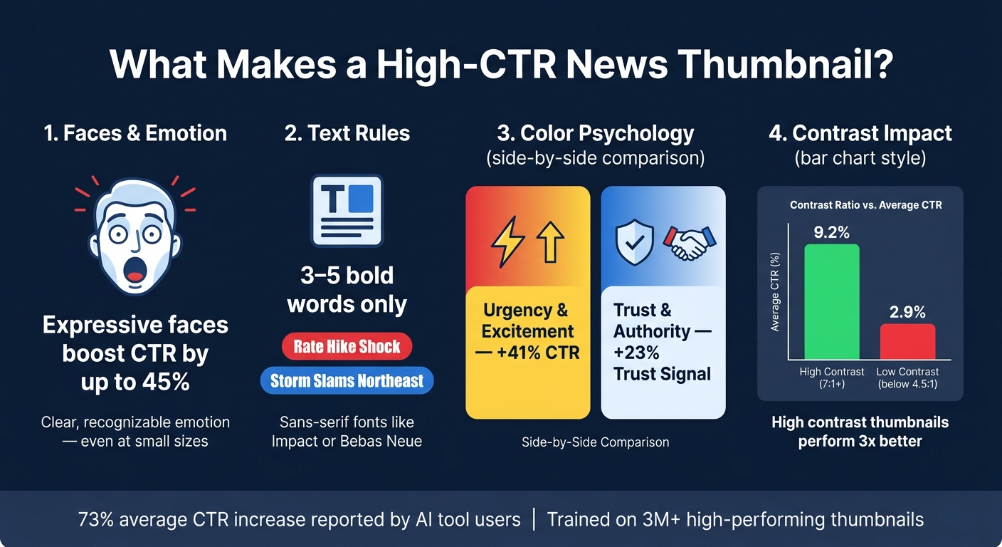
- Faces drive clicks: Thumbnails with clear, expressive faces can increase CTR by 38–45%.
- Keep text short: Use 3–5 bold words like "Rate Hike Shock" or "Storm Slams Northeast".
- Colors matter: Red and yellow create urgency, while blue and white build trust.
- High contrast works: Designs with a 7:1 contrast ratio outperform low-contrast ones.
With AI, you can quickly create thumbnails tailored to your content - whether it’s breaking news, political analysis, or financial updates. Just input a brief, refine the design, and ensure it aligns with YouTube’s technical specs (e.g., 16:9 ratio, 4K resolution for larger screens). These tools not only save time but also help your thumbnails stand out in crowded feeds.
This AI Tool Generates Viral Thumbnails (Prompts Included)
Core Principles of Effective News Thumbnails
News Thumbnail Design: CTR Stats & Best Practices at a Glance
Key Elements of a Strong News Thumbnail
A great news thumbnail gets its message across in an instant. The best ones revolve around a single focal point - whether it’s a face, a short headline, or a bold visual element - that occupies at least one-third of the frame. Keeping it simple and uncluttered is key.
Faces are powerful. Thumbnails featuring faces can increase click-through rates (CTR) by 38%, and when the expression conveys emotions like shock or surprise, that boost jumps to 45%. Make sure the emotion is clear and recognizable, even at smaller sizes.
Text also plays a crucial role. Stick to 3–5 bold words that hint at the story. Headlines like "Fed Raises Rates" or "War Crimes Evidence" are far more effective than long sentences. Use bold, sans-serif fonts like Impact or Bebas Neue to ensure the text is easy to read.
These principles are integral to tools like ThumbnailCreator, which help automate the creation of effective news thumbnails.
How Design Choices Affect Click-Through Rates
Color choice can make or break your thumbnail’s performance. Red and yellow together create a sense of urgency and can boost CTR by 41%. Meanwhile, blue and white evoke trust and professionalism, making them ideal for news and financial content, increasing trust signals by 23%.
Contrast is another big factor. High-contrast designs with a ratio of 7:1 or higher achieve an average CTR of 9.2%, compared to just 2.9% for low-contrast thumbnails (below 4.5:1). To make your text stand out, use techniques like thick outlines, drop shadows, or solid color backgrounds.
"If your core message, emotional hook, and visual hierarchy aren't instantly clear, you've lost the click." - SkySnail Blog
YouTube’s "Test & Compare" tool tracks watch time share, so thumbnails that overpromise and lead to early viewer drop-offs can hurt your channel’s performance. Ensure the thumbnail aligns with the content in the video’s first 30 seconds. These insights, often powered by AI, allow creators to fine-tune their thumbnails for maximum impact.
Mastering these design principles lays the groundwork for meeting YouTube’s technical requirements.
YouTube Thumbnail Specifications for News Creators
Even with strong design, technical accuracy is crucial. A blurry or poorly cropped thumbnail can cost you valuable clicks. Here’s a breakdown of the essential specs:
| Specification | Standard | 4K (2026 Update) |
|---|---|---|
| Resolution | 1280 x 720 pixels | 3840 x 2160 pixels |
| Aspect Ratio | 16:9 | 16:9 |
| File Size (Desktop) | Under 2 MB | Up to 50 MB |
| File Size (Mobile) | Under 2 MB | Capped at 2 MB |
| Formats | JPG, PNG, GIF (static) | JPG, PNG, WebP |
The shift to 4K resolution is becoming more important. With TV viewership on YouTube growing by 80% in 2025, standard 1280x720 thumbnails can appear blurry on larger screens like 65-inch TVs. If your audience watches on connected TVs, upgrading to 3840x2160 resolution is worth the larger file size.
For mobile devices, the priorities flip. Since 69% of YouTube views come from mobile, your thumbnail must remain clear at just 120 pixels wide - roughly the size of a postage stamp. Test your design at this scale to ensure that text, faces, and visuals are still legible. Also, keep key elements - like text and faces - within the center 90% of the frame to avoid being obscured by YouTube’s UI overlays, such as the video duration timestamp.
How to Create News Thumbnails with AI Tools
Preparing Your Thumbnail Brief
Before diving into design, spend a couple of minutes crafting a clear, concise brief. This step ensures your thumbnail looks polished and professional - like it belongs on a major news channel.
Here’s what to include:
- Main subject: Pinpoint the core topic (e.g., "Federal Reserve rate decision", "Supreme Court ruling", or "Northeast winter storm").
- Dominant emotion: Decide on the tone you want to convey (e.g., urgency, concern, or calm authority).
- Headline hook: Keep it short and punchy - 6 to 8 words max (e.g., "Rate Hike Shock" or "Storm Slams Northeast").
- Target audience: Identify who you’re speaking to (e.g., general U.S. viewers, investors, or policy insiders).
Each part of the brief helps guide the AI tool. It shapes everything from visual style and color choices to text placement and tone. A sentence or two for each element is all you need to set ThumbnailCreator on the right path for a professional result.
Once your brief is ready, input it into ThumbnailCreator to bring your vision to life.
Generating Thumbnails with AI
Here’s a step-by-step guide to producing eye-catching thumbnails:
- Start a new project and select the YouTube thumbnail preset. This ensures the correct 16:9 ratio, typically 1280×720 pixels (or 3840×2160 for 4K).
- Choose a relevant template. Options like "Breaking News", "Business & Finance", or "Political" come with pre-designed layouts optimized for news content. Then, enter your AI prompt, pulling directly from your brief. A good prompt includes the content type, topic, emotion, visual focus, and text. For example: "YouTube thumbnail for breaking news: 'Major Winter Storm Hits Northeast.' Dramatic snowstorm over a U.S. city skyline, urgent mood, bold text 'Storm Slams Northeast,' high contrast, modern news channel style."
- Upload reference images - like a host’s headshot or a still from the video - to give the AI more context and ensure consistency in your channel’s branding.
- Generate multiple variations. Review them at phone-screen size to confirm the topic is clear and the main text is easy to read.
This process can reduce thumbnail creation time from 20–30 minutes of manual effort to just a few minutes of guided AI work and light editing. Once you’ve generated your options, move forward with refining the best one.
Refining AI-Generated Thumbnails
After generating thumbnails, it’s time to fine-tune them for both technical precision and editorial quality. While reviewing, consider these questions:
- Is the topic instantly recognizable (within a second)?
- Is the main text short, bold, and easy to read?
- Does the thumbnail's tone align with the story?
- Does it match your channel’s editorial style?
- Are there AI errors, like distorted faces or unreadable text?
If a thumbnail passes these checks, move it into the editing phase. ThumbnailCreator offers tools like face swapping to seamlessly add a specific anchor or commentator’s face - perfect for channels with recurring hosts. Similarly, the object swapping feature allows you to localize the image by replacing elements. For instance, you can swap a generic skyline with the New York Stock Exchange for a Wall Street story or replace a generic gavel with the U.S. Supreme Court building for a legal ruling piece.
Keep the main text concise - 3 to 5 bold words in high contrast work best. The text should complement the video title, not repeat it. For example, if the video title is "Why the Fed's Latest Move Matters," the thumbnail text might read "Rate Hike Fallout" to add urgency while avoiding redundancy. Use U.S.-style formatting for clarity: write "$1.2T" instead of "$1.2 trillion," and stick to familiar phrases like "gas prices" or "stock market crash" for better recognition by U.S. audiences.
sbb-itb-b59debf
Tailoring Thumbnails to Different News Formats
News thumbnails should align with the type of content they represent to maximize click-through rates (CTR).
Breaking News and Daily Updates
When it comes to breaking news, speed is the name of the game. AI tools can whip up a polished thumbnail in under 30 seconds. To convey urgency, use bold red and yellow colors paired with shocked facial expressions - this approach can increase CTR and engagement by as much as 45%. Keep text short and snappy - 3 to 5 words max - and position it in the top-left corner to improve readability by 34%.
Political and Analytical Content
For political and analytical news, the focus shifts from urgency to trustworthiness. Instead of dramatic visuals, lean on blue and white tones, which are known to evoke trust and can deliver a 23% boost in CTR. Blue alone can enhance viewer trust by 18%. Use close-up shots of a confident or curious presenter to signal in-depth analysis. Bold sans-serif fonts (again, stick to 3–5 words) are a staple of 78% of top-performing thumbnails, and adding text outlines can improve readability by up to 40%.
It's worth noting that YouTube's evolving algorithm prioritizes "quality CTR" - thumbnails that not only attract clicks but also align with the video's content and keep viewers engaged.
"The winning thumbnail is no longer the most clickable one. It is the one that sets the most accurate expectation." - Hooksnap Blog
Also, ensure thumbnails meet 4K specs to look sharp on larger screens.
Business, Finance, and Tech News
For business and tech content, numbers are your best friend. Including specific figures like "$1.2T deficit" or "$0 → $10K" can instantly communicate value, with finance-focused thumbnails using precise text seeing a 15–25% CTR increase. One finance channel saw its CTR jump from 2.8% to 7.2% after switching to minimalist designs with just 2–3 words of text.
Stick to U.S. conventions for formatting: use "$" for currency, MM/DD/YYYY for dates, and commas for large numbers (e.g., $1,200,000). Simple visuals like line charts or bar graphs can hint at analytical depth without overwhelming the design. Always perform a stamp test - shrink the thumbnail to 120–160 pixels to ensure text and visuals remain legible. If they don’t, simplify further.
Final Checks Before Publishing News Thumbnails
After creating and refining your thumbnail using ThumbnailCreator, take a moment to run through these essential checks. These steps will help ensure your thumbnail performs effectively across platforms.
Checking Clarity and Readability
Start by shrinking your thumbnail down to 120 pixels wide. This is the average size it will appear in mobile search results and suggested feeds. At this reduced size, both the text and main subject should still be clear and recognizable. For text, capital letters should occupy at least 12% of the frame height when scaled to 120px width. Additionally, make sure there’s enough luminance contrast to distinguish faces and text from the background. Avoid placing any critical details in the bottom-right corner, as YouTube’s timestamp overlay could obscure them.
"The 120-pixel benchmark isn't a worst case. It's an average across the surfaces where most clicks actually happen. Designing for that size isn't pessimism, it's calibration." - Creaticalc
Once clarity is confirmed, check to see if your thumbnail aligns with editorial guidelines.
Keeping Thumbnails Editorially Accurate
YouTube now uses a metric called "Quality CTR" to evaluate thumbnails. This focuses on watch time share rather than just click-through rates. A thumbnail that exaggerates or misrepresents the content can hurt performance by creating a mismatch between what viewers expect and what they actually see. For instance, if your thumbnail features an emotional expression like shock or confidence, make sure it reflects the video’s tone. Similarly, the thumbnail text should spark curiosity without simply restating the video title.
YouTube’s "Test & Compare" feature can help you analyze which thumbnails drive better watch time share.
"If your CTR is above [average] ranges but retention is below 40%, you may have a thumbnail accuracy problem - not a thumbnail quality problem." - Hooksnap Blog
After addressing content accuracy, shift your focus to technical specifications.
Technical Quality Control
Before uploading, double-check that your thumbnail meets YouTube’s latest technical requirements. As of March 2026, desktop uploads support file sizes up to 50MB with 4K resolution (3,840 x 2,160 pixels), while mobile uploads are capped at 2MB.
| Technical Attribute | Specification |
|---|---|
| Recommended Resolution | 3,840 x 2,160 (4K) or 1,280 x 720 (HD) |
| Aspect Ratio | 16:9 |
| File Size Limit (Desktop) | 50MB |
| File Size Limit (Mobile) | 2MB |
| Accepted Formats | JPG, PNG, WebP, GIF (static only) |
For the best results, use the sRGB color profile and export your thumbnail at 72 DPI to ensure accurate screen rendering. Finally, run ThumbnailCreator’s Auto-Optimize tool. This will automatically check for proper contrast, element placement, and mobile visibility, saving you time and effort.
Conclusion and Key Takeaways
AI tools have made thumbnail design a much faster process, cutting the time from 30–60 minutes down to just a few minutes. This allows creators to spend more energy on critical editorial decisions instead of getting bogged down in design details.
The fundamentals of effective thumbnails remain the same: short, readable text, a clear focal point, high contrast, and an honest representation of the content. While AI can speed up the process, your editorial judgment is what ensures that a thumbnail for a Supreme Court ruling looks entirely different from one for tech earnings.
These concepts fit seamlessly into daily workflows. Tools like ThumbnailCreator offer built-in templates, face-swapping features, and AI-generated designs, making it easy to produce several options in minutes. For high-stakes content - like election results, major policy announcements, or breaking financial news - creating two or three variations and analyzing their performance with YouTube Analytics can help fine-tune your approach. According to users of ThumbnailCreator, this method has led to an average 73% increase in click-through rates. The platform’s training on over 3 million high-performing YouTube thumbnails ensures it’s well-equipped to support creators.
However, editorial accuracy is non-negotiable. Thumbnails enhanced by AI should complement the story and not exaggerate it. If your video presents a balanced analysis, the thumbnail should reflect that tone. Viewers can sense when there’s a mismatch, and YouTube’s Quality CTR metric picks up on it too.
To get started, choose one upcoming video and draft a 3–7 word hook. Use an AI tool to create a first draft, track the click-through rate, tweak the design, and repeat the process. This cycle of brainstorming, generating, refining, and measuring is a proven strategy for growing your channel over time.
FAQs
What should I include in my thumbnail brief for AI?
For a strong AI thumbnail brief, focus on these essential details: identify the subject and their action or emotion, include 3–5 words of specific text, choose a preferred color scheme, and describe the desired composition. Clearly state that it’s for a YouTube thumbnail to ensure proper framing. Also, specify text placement, such as avoiding the timestamp area. Keep the prompt short and to the point - ideally under 200 words - for optimal results with ThumbnailCreator.
How do I make a news thumbnail readable on mobile?
To make sure your news thumbnail stays readable on mobile, stick to a clean, high-contrast design. Keep text short - just 3–5 words - and use bold, sans-serif fonts like Impact or Montserrat. Aim for a contrast ratio of at least 4.5:1 for better visibility. Avoid putting any important elements in the bottom-right corner, as YouTube's timestamp will cover that area. Tools like ThumbnailCreator can help you test how your design looks at smaller sizes, such as 120 pixels wide.
When should I use 4K thumbnails on YouTube?
Creating thumbnails in 4K resolution (3840x2160 pixels) ensures they look crisp and polished on high-resolution devices, including TVs. With more people watching YouTube on large screens, 4K thumbnails prevent pixelation and help your content feel more professional.
When designing for 4K, make sure your thumbnails remain easy to read on smaller screens by focusing on clear text and avoiding overly intricate details. Prioritize simplicity and readability to ensure your design works across all device sizes.