
Before-and-After Thumbnails: What Works and Why
Want more views on YouTube? Your thumbnail might be the key. Thumbnails have just one second to grab attention, and custom designs can boost click-through rates (CTR) by 60–70%. Here’s what works:
- Expressive Faces: Thumbnails with emotional faces can increase CTR by 47%.
- Short Text: Reducing text from 7 words to 4 improves CTR by 34%.
- High-Contrast Colors: Bold color combinations like yellow and black raise CTR by 41%.
- Simplicity: Cluttered designs confuse viewers - stick to one clear subject.
- Brand Consistency: Using the same colors, fonts, and layouts helps viewers recognize your channel.
- High-Resolution Images: Blurry thumbnails lower quality perception.
Custom thumbnails outperform auto-generated ones, averaging a CTR of 8.2% compared to 3.2%. Even small tweaks, like adding bold outlines or improving contrast, can make a big difference. Use these principles to create thumbnails that stand out and drive clicks.
Before & After Thumbnails! 🔥 @Imangadzhi (FULL TUTORIAL)
sbb-itb-b59debf
7-Point Thumbnail Design Checklist
This checklist highlights specific areas that can hurt click-through rates (CTR) and provides actionable fixes. Below, you'll find examples of common mistakes and how to address them.
1. Keep It Simple: The 3-Second Rule
Your thumbnail should focus on one clear subject - a face, an object, or a text hook. Adding too many elements can confuse viewers and slow down their ability to process the image.
Thumbnails with more than six words of text often experience a 31% drop in average CTR. Stick to 3–5 words and leave 30–40% of the frame as negative space for balance. Use solid colors, gradients, or blurred backgrounds to ensure the main subject stands out as the sharpest element.
Example: A fitness thumbnail cluttered with a person, gym equipment, a logo, a timer, and seven words of text had half the CTR of a simplified version. The redesign - a close-up of a dumbbell with bold numbers - doubled engagement.
To test simplicity, try the squint test: shrink your thumbnail to 120 pixels and squint. If the subject and emotional tone aren’t immediately clear, simplify the design.
2. Use High-Contrast Colors
High-contrast colors aren’t just aesthetic - they’re essential. With over 70% of YouTube watch time happening on mobile devices, thumbnails need to stand out even at sizes as small as 120–150 pixels.
Limit your palette to 3–4 colors. Pairings like yellow and black or bright blue and orange create strong visual hierarchy and make key elements pop against YouTube’s red, white, and dark-gray interface.
Example: A muted tech tutorial thumbnail using grays and blues struggled to grab attention. When redesigned with bright yellow text on a deep purple background, visibility and engagement improved significantly.
Avoid placing important details in the bottom 15% of the frame or the bottom-right corner - YouTube’s duration badges and progress bars can obscure these areas.
3. Add Expressive Faces
Humans are naturally drawn to faces. Our brains process them faster than text or objects, making them perfect for grabbing attention. An expressive face also sets the emotional tone of the video.
Example 1: An education channel tested two thumbnails. The version with a face showing wide eyes and an open mouth achieved a 2.4× higher CTR than a text-only graphic.
Example 2: A software tutorial featuring a frustrated expression saw a 2.1% increase in CTR compared to a thumbnail showing just the interface.
Position faces to cover 25–40% of the thumbnail height, using the rule of thirds for balance. Subtle expressions can get lost at smaller sizes, so exaggerate features - widen eyes, open mouths - to ensure emotions are clear at 120 pixels. Adding a soft glow or a 4–8 pixel stroke around the face can help it stand out.
4. Keep Text Short and Bold
Reducing text length can make a huge difference. Cutting text from seven words to four can boost CTR by 34%. On mobile, where thumbnails are often 168×94 pixels, long text becomes unreadable.
Use bold, sans-serif fonts at 60pt or larger. Place text strategically - align it with the subject’s gaze to guide attention naturally.
Example: A cooking thumbnail with "Learn How to Make the Perfect Chocolate Chip Cookies at Home" (11 words) was too cluttered for mobile screens. Simplifying it to "PERFECT COOKIES" (2 words) in bold white text with a black outline made it instantly readable and more engaging.
5. Apply the Rule of Thirds
Thumbnails that follow the rule of thirds feel balanced and visually dynamic. Centered layouts, by contrast, can look flat and uninspired.
Divide your thumbnail into thirds and position key elements at the intersections. Allocate 40–50% of the space to the main subject, 20–30% to the text, and 10–20% to supporting graphics. Layering text slightly behind or in front of the subject can add depth.
Example: A gaming thumbnail with a centered character and text felt static. By moving the face to the left third and the text to the right, the design created movement and guided the viewer’s eye naturally.
6. Maintain Brand Consistency
Consistency across your thumbnails builds instant recognition for your channel. A cohesive style - using the same colors, fonts, and layouts - makes your content easily identifiable in a crowded feed.
This doesn’t mean every thumbnail should look identical. Instead, establish visual anchors: choose two or three brand colors, a headline font, and a consistent placement for your logo or face.
Example: A channel with inconsistent thumbnail styles (varying fonts, colors, and layouts) looked disorganized. After adopting a template - bright orange backgrounds, bold white text, and the creator’s face always on the left third - subscribers began recognizing the content instantly.
Your branding elements should occupy 10–20% of the thumbnail without overpowering the main focus.
7. Use High-Resolution Images
Blurry or pixelated thumbnails can make your content seem low-quality before anyone even clicks. High-resolution images are a must for maintaining a professional appearance on any screen size.
YouTube recommends uploading thumbnails at 1280×720 pixels. Avoid over-compressing your images to preserve clarity.
Example: A travel vlog thumbnail using a low-quality social media photo looked grainy, especially on larger screens. When replaced with a high-resolution image sized correctly for YouTube, the thumbnail appeared sharper and more inviting.
Clear visuals not only enhance your thumbnail’s appeal but also build trust with your audience.
Before vs. After Performance Data
YouTube Thumbnail Design Impact: Before vs After CTR Performance Data
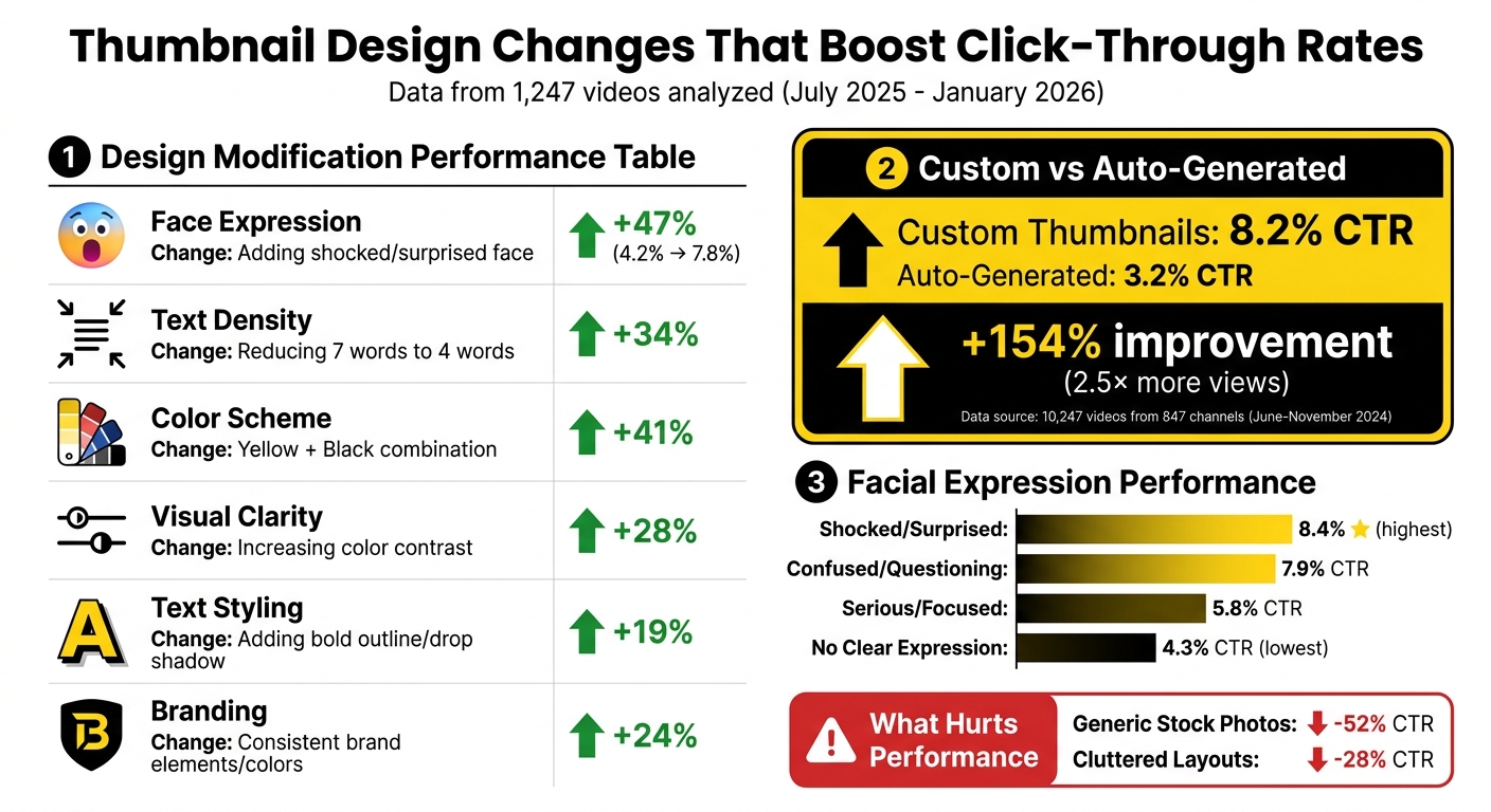
The numbers are clear: specific design tweaks can lead to noticeable improvements in click-through rates (CTR). Here's the performance data backing up the design changes mentioned earlier.
Between July 2025 and January 2026, the NoteLM Team analyzed 1,247 videos from 20 YouTube channels to see how different design elements impacted performance. Their research revealed some impressive results:
- Adding an expressive face boosted CTR by 47%, jumping from 4.2% to 7.8%.
- Simplifying text increased CTR by 34%, consistent with past studies.
- Switching to a high-contrast yellow and black color scheme raised CTR by 41%.
Here’s a summary of how each design tweak performed:
| Design Modification | Specific Change Made | Measured CTR Impact |
|---|---|---|
| Face Expression | Adding a shocked/surprised face | +47% |
| Text Density | Reducing text from 7 words to 4 words | +34% |
| Color Scheme | Switching to Yellow + Black combination | +41% |
| Visual Clarity | Increasing color contrast | +28% |
| Text Styling | Adding a bold outline or drop shadow | +19% |
| Branding | Adding consistent brand elements/colors | +24% |
These findings highlight how even small adjustments can have a meaningful impact.
Looking at the bigger picture, custom thumbnails outperformed auto-generated ones in a separate study by ThumbAI. From June to November 2024, they reviewed 10,247 videos from 847 channels (ranging from 1,000 to 1,000,000 subscribers). The results? Custom thumbnails averaged an 8.2% CTR, a massive 154% increase over the 3.2% CTR of auto-generated thumbnails. This improvement translated to 2.5× more views on average.
Facial expressions also played a major role. Shocked or surprised faces delivered the highest CTR at 8.4%, followed by confused or questioning expressions at 7.9%. On the lower end, serious or focused expressions managed only 5.8%, while thumbnails with no clear expression dropped to 4.3%.
Finally, some design choices hurt performance. Generic stock photos slashed CTR by up to 52%, and cluttered layouts reduced it by 28%. Steering clear of these mistakes is just as important as implementing the positive changes outlined above.
Create Better Thumbnails with ThumbnailCreator
Designing eye-catching thumbnails can be tricky, especially if you're not a professional designer. But ThumbnailCreator simplifies the process by combining proven design principles with advanced AI tools, saving you time and effort.
Instead of manually applying seven design principles, ThumbnailCreator uses AI to handle tasks like background removal, style transfer, and composition adjustments. This means you can create professional-quality thumbnails in just minutes.
The tool is built to meet the "3-second rule" by optimizing visual hierarchy, ensuring your thumbnail has a strong focal point to grab attention quickly. It also generates high-contrast color palettes that stand out across different themes. Plus, all thumbnails are output at YouTube's recommended resolution of 1280×720. Considering that 90% of top-performing YouTube videos use custom thumbnails, having a tool like this can give you a real edge.
ThumbnailCreator also helps you maintain brand consistency with its template library, ensuring your text is easy to read on mobile devices - where over 60% of YouTube views happen. Features like face and object swapping, as well as AI-generated backgrounds, let you experiment with different looks and emotions without starting from scratch. You can even add effects like neon rim lighting to make faces pop, especially on smaller screens.
This hybrid approach combines the speed of AI with your creative control. Automated features like contrast optimization and composition adjustments ensure your thumbnails follow best practices while letting you fine-tune the final result to match your channel's unique style. The result? Thumbnails that stand out and drive clicks instead of being ignored.
ThumbnailCreator Pricing Plans
Find the plan that fits your needs and budget.
ThumbnailCreator offers three pricing tiers designed to suit a range of content creators:
| Plan | Price | Best For | Key Features |
|---|---|---|---|
| Free Plan | $0 | Beginners exploring the platform | Basic templates, AI generation, limited thumbnail exports |
| Pro Plan | $XX/month | Individual creators, small channels | Full template library, advanced AI, face/object swapping, unlimited exports |
| Agency Plan | $XX/month | Agencies managing multiple channels | All Pro features, team collaboration tools, priority support, multi-channel management |
The Free Plan is perfect for testing the platform's core features without any cost. The Pro Plan unlocks advanced AI tools and removes export limits, making it ideal for growing creators. For teams managing multiple channels, the Agency Plan adds collaboration tools and priority support to streamline workflows.
Conclusion
These seven design principles aren’t just ideas - they’re actionable steps that can directly influence your channel’s growth. For example, custom vs. auto-generated thumbnails can generate 60–70% higher click-through rates compared to auto-generated ones, while using high-contrast colors alone can increase CTR by 20–30%. By combining expressive faces, minimal text, and well-thought-out composition, you’re creating thumbnails that align with YouTube’s algorithm and grab viewers’ attention.
"The biggest hurdle to get over with thumbnails is not making them pretty, but making them clickable. They need to be fairly simple and bold... This is not graphic design. It is marketing." - NerdCrave
With tools like ThumbnailCreator, the technical aspects - contrast, resolution, visual hierarchy - are handled for you, letting you focus on crafting engaging content. Whether you’re designing your first thumbnail or perfecting your tenth, consistently applying these principles ensures your videos stand out in crowded feeds and turn casual viewers into active clickers.
Start small: pick one video, follow the checklist, track the results, and refine your approach using tools like ThumbnailCreator to create designs that deliver real impact.
FAQs
How do I A/B test thumbnails on YouTube?
To test thumbnails on YouTube effectively, start by designing multiple versions, altering just one specific element at a time - such as the color scheme, text style, or overall layout. Run each version for about 7–14 days, making sure each gets between 1,000 and 2,000 impressions. Use YouTube Analytics to monitor key metrics like click-through rate (CTR) and viewer engagement. The thumbnail that achieves the highest CTR without negatively affecting watch time is your best choice. Testing one element at a time ensures you can pinpoint what drives better results.
What thumbnail changes should I try first for a low-CTR video?
To make your thumbnail pop, start by improving contrast and clarity. Use bold colors and ensure your subject is easy to spot at a glance. Keep the design clean by avoiding unnecessary clutter. Focus on a single main subject, and if you include text, make sure it’s clear, large, and easy to read. These tweaks tackle common problems like poor visibility and dull visuals, which can help increase your click-through rates.
How can I keep thumbnails consistent without making them look repetitive?
To keep your visuals consistent yet engaging, stick to a recognizable color palette, use similar fonts, and maintain a layout that draws attention to your main subject. At the same time, switch up elements like facial expressions or background images to keep things fresh and interesting.
Incorporate a unified branding style - whether through specific colors, framing techniques, or other design elements - so your thumbnails are easily identifiable. This approach strikes the right balance between uniformity and variety, ensuring your content remains visually appealing without becoming repetitive.