
How Simplicity Impacts Thumbnail Click-Through Rates
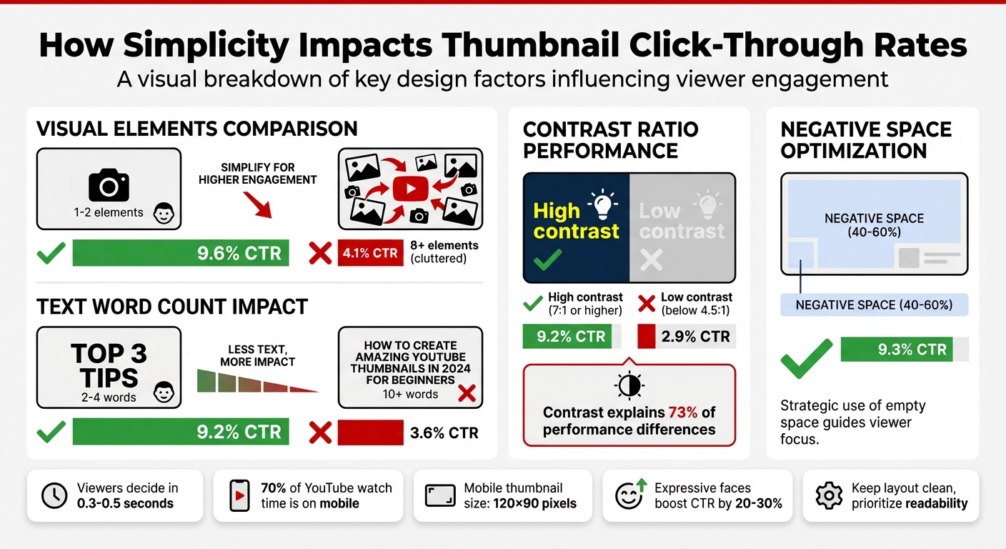
When it comes to YouTube thumbnails, simple designs perform better. Research shows that thumbnails with fewer elements, minimal text, and bold visuals consistently achieve higher click-through rates (CTR). Why? Viewers decide whether to click in just 0.3–0.5 seconds, especially on mobile devices where thumbnails are small. Overloading the design with text, colors, or visuals makes it harder for viewers to process the message quickly.
Key takeaways:
- Thumbnails with 1–2 elements get a 9.6% CTR, compared to 4.1% for cluttered designs.
- Using 2–4 words of text increases CTR to 9.2%, while 10+ words drop CTR to 3.6%.
- High-contrast vs low-contrast designs (7:1 ratio or higher) show significant performance differences, with a 9.2% vs. 2.9% CTR.
- Negative space (40–60% of the thumbnail area) helps focus attention and averages a 9.3% CTR.
Simple thumbnails are not just visually appealing - they directly influence YouTube’s algorithm by increasing CTR, which can lead to more impressions and visibility. Whether you’re creating thumbnails manually or with tools like ThumbnailCreator, following these principles can improve your video’s performance.
YouTube Thumbnail Simplicity vs Click-Through Rate Statistics
Research Data on Simplicity and CTR
VidIQ and TubeBuddy Studies on Simple Thumbnails
Studies from VidIQ and TubeBuddy reveal a clear trend: simpler thumbnails perform better. Thumbnails with only 1–2 visual elements achieve a 9.6% CTR, compared to just 4.1% for those cluttered with 8 or more elements. Similarly, thumbnails with 1–3 words see a 9.2% CTR, while those with 10+ words drop to 3.6%. The takeaway? Less is definitely more.
Louis Vick from Virvid.ai puts it succinctly:
"At 120×90 pixels, complexity becomes visual noise. Viewers can't process multiple elements in the 0.3 seconds they glance at your thumbnail."
Contrast is another critical factor. High-contrast thumbnails (7:1 ratio or higher) average a 9.2% CTR, while low-contrast designs (below 4.5:1) lag behind at 2.9%. In fact, contrast alone explains 73% of performance differences in recent tests. Savanna, a designer at Savvy Thumbnails, emphasizes:
"When too many elements compete for attention, nothing stands out."
These findings highlight how simplicity and thumbnail composition work together to lower cognitive load and improve performance.
Cognitive Load Reduction and Viewer Behavior
These numbers illustrate why simplicity is a cornerstone of effective thumbnail design. Viewers decide whether to click or scroll past your video in just 0.3–0.5 seconds, relying heavily on peripheral vision. On mobile devices, where thumbnails are displayed at around 120×90 pixels, excessive detail becomes unrecognizable noise. Given that 70% of YouTube watch time happens on mobile, designing with simplicity in mind is non-negotiable.
An A/B test on a personal finance video further proves this point. Variant A, with a 7-word title, achieved a 7.43% CTR, while Variant B, with a shorter 3-word title, outperformed it with an 8.91% CTR across 4,891 impressions.
Another key factor is negative space. Thumbnails that dedicate 40–60% of their area to negative space average a 9.3% CTR. This spacing allows the brain to quickly lock onto the main subject without unnecessary distractions. High-contrast elements also grab attention more effectively, making them excellent for stopping a scroll in its tracks.
sbb-itb-b59debf
Design Principles for Simple and Effective Thumbnails
Focus on One Clear Visual Element
When designing thumbnails, it's essential to focus on a single, dominant visual element - like an expressive face, a standout object, or anything that directly communicates your video's theme. Why? Because simplicity grabs attention. According to VidIQ, thumbnails featuring expressive faces can boost click-through rates (CTR) by 20–30%. Faces showing strong emotions - like curiosity, surprise, or intensity - can double the chances of someone clicking.
Take TED Talks as an example. Their thumbnails consistently showcase a prominent speaker against a plain background, with minimal text. This approach keeps the focus on the subject while reinforcing their educational identity. Similarly, BuzzFeed's "Worth It" series nails this by featuring a single expressive face paired with high-contrast design elements, sparking curiosity and driving engagement.
Text and color choices also play a massive role in keeping the design clean and impactful.
Limit Text to 2–4 Words
Think of thumbnail text as a quick hook, not a full explanation. Sticking to 2–4 bold words ensures your message is instantly readable, especially on mobile screens where space is limited.
Use Bold Colors and High Contrast
In a sea of thumbnails, bold colors and high-contrast designs help yours stand out. Pair striking color combinations that complement each other and create visual unity. Research shows that high-contrast thumbnails consistently achieve better CTRs. Adding plenty of negative space around your main subject also helps it stand out, drawing the viewer's eye to the most important part of your thumbnail.
Examples and A/B Testing Results
Top YouTube Thumbnails: What They Do Right
Research data isn't just theoretical - it translates into practical strategies. Let's dive into how top-performing YouTube thumbnails use simplicity to succeed across different niches, backed by A/B testing.
The best thumbnails follow a "Three Elements Maximum" rule: a face or subject, a background that provides context, and a text or graphic overlay. This minimalist approach ensures the design stays clean, allowing viewers to process the thumbnail's message in under a second - critical for mobile users.
Each niche tweaks this simplicity to fit its audience. For instance:
- Gaming channels often feature an oversized prop, an expressive face (like shock or excitement), and 2–4 bold words. This approach has been shown to drive click-through rates (CTR) between 12% and 18%.
- Tech review channels lean on angled product shots against gradient backgrounds, often paired with a single rating badge. This setup resonates with viewers in a "buying mode."
- Educational content thrives on before-and-after visuals, highlighting one key metric to engage the viewer's reward-prediction instinct.
While the average YouTube CTR hovers between 2% and 5%, thumbnails designed with simplicity in mind often achieve CTRs of 8% to 18%. Thumbnails featuring human faces tend to perform even better, receiving 30–40% more impressions on average. However, this only works when the faces convey clear emotions - neutral expressions offer no noticeable boost.
These examples highlight how simplicity isn't just a design choice - it's a performance strategy. Comparing A/B testing vs. gut feeling adds another layer of proof to these findings.
A/B Testing Simplicity in Thumbnails
A/B testing provides hard numbers to back up the effectiveness of simple thumbnails. Here are a couple of standout experiments.
On a tech review channel, Marcus Chen tested the impact of including a surprised expression on the creator's face. The result? CTR jumped from 7.32% to 9.19% over 28,000 impressions - a relative increase of 25.5%.
"Mobile-first design constraints force clarity, which benefits all viewers." - Marcus Chen, YouTube Optimization Consultant
Another test on a personal finance channel compared two thumbnail text designs for a video about credit scores:
- Variant A: A 7-word phrase, "The Hidden Factor Destroying Your Credit Score", set in 52px font. CTR: 7.43%.
- Variant B: A simplified 3-word phrase, "Credit Score Mistake", set in 96px font. CTR: 8.91%.
This test showed how reducing text and increasing font size improves legibility, especially on mobile, and directly influences click behavior.
For reliable results, valid A/B tests need at least 1,500–2,000 impressions per variant. Tests with fewer than 1,000 impressions can produce false positives 43% of the time. YouTube Studio's "Test & Compare" feature simplifies this process, splitting impressions evenly between variants. However, it's not just about clicks - keep an eye on average view duration. If a simpler thumbnail boosts CTR but cuts watch time by more than 5%, it could mean the design is drawing clicks without delivering on its promise.
How ThumbnailCreator Simplifies Thumbnail Design
AI-Driven Tools for Effortless Design
ThumbnailCreator takes the hassle out of thumbnail creation by using AI to simplify the entire process. Forget spending hours in Photoshop or needing advanced design skills. With this tool, YouTube creators can craft professional-looking thumbnails in just minutes. The platform offers pre-designed templates that focus on a single, clear visual element, minimal text, and bold contrasts - perfect for grabbing attention without overcomplicating the design.
The AI feature goes a step further by analyzing your YouTube video link and generating thumbnail ideas based on proven simplicity principles. These templates are tailored to include concise text (just 2–4 words) and vibrant colors, which can increase click-through rates (CTR) by up to 20%. It’s a game-changer for creators who understand the power of simplicity but need help executing it effectively.
Features Designed to Boost CTR
ThumbnailCreator includes tools like face swapping, which enhances emotional expression in thumbnails and can improve CTR by 35–50%. Another standout feature is object swapping, allowing creators to quickly test different visual elements. For example, you can experiment with whether a red arrow performs better than a yellow circle and track the results using YouTube Studio analytics. This type of testing mirrors the strategies top creators use to achieve CTR benchmarks between 5% and 10% through systematic thumbnail optimization.
Beyond these performance-boosting features, the platform prioritizes speed, helping creators quickly adapt and refine their thumbnails to keep up with their publishing schedules.
Streamlined Workflow for Faster Results
For creators juggling multiple uploads each week, speed is everything. ThumbnailCreator drastically reduces the time it takes to design thumbnails - from hours to just minutes - while maintaining a consistent brand identity. This is especially helpful for those who need multiple thumbnail variations for A/B testing. Instead of painstakingly designing each option with traditional tools, you can generate them instantly in ThumbnailCreator and use YouTube Studio analytics to see what works best.
This streamlined approach allows you to focus more on creating content while leaving the design complexities to the tool.
The Thumbnail Experiment: Using Science to Boost CTR
Conclusion: The Power of Simplicity in Thumbnail Design
Simplicity works wonders when it comes to boosting click-through rates (CTR) and growing your YouTube channel. The numbers back this up: thumbnails with fewer than 4 words see a 30% higher CTR, while those cluttered with more than three distinct visual elements experience a 23% drop in CTR. With viewers making decisions in just 1–3 seconds as they scroll, your thumbnail needs to deliver its message at a glance.
But the benefits don’t stop at individual clicks. A high CTR signals to the YouTube algorithm that your content is engaging, which can result in better placement in suggested videos and more visibility overall. Considering that 67% of total engagement happens within the first 24 hours, a well-designed thumbnail can dramatically expand your video's reach.
Here’s a simple way to understand the impact:
"The math is simple: A 1% CTR improvement on a video with 100,000 impressions means 1,000 extra views - from the same content, same algorithm, just a better thumbnail." - Alici.AI
To recap, focusing on the basics—and avoiding common thumbnail mistakes—can make a massive difference. Channels that use optimized thumbnails see an average of 154% higher CTR compared to those relying on auto-generated ones. Whether you’re creating thumbnails manually or using AI tools like ThumbnailCreator, the key is to stay consistent and keep testing. Start applying these strategies today to see the difference in your CTR.
FAQs
How do I know if my thumbnail is too cluttered?
A thumbnail can feel overwhelming when it’s packed with too many elements, making it difficult to follow or visually distracting. Common signs of clutter include multiple faces, excessive props, or too much text fighting for attention. Small fonts or low-contrast text can also add to the confusion. To keep things clean and appealing, stick with one face, one prop, and short text (no more than 4 words). This approach can help boost click-through rates by making your thumbnail easier to understand at a glance.
What’s the best way to test two thumbnail versions on YouTube?
The most effective way to compare two thumbnail versions on YouTube is through YouTube Studio's 'Test & Compare' feature for A/B testing. Simply upload two distinct thumbnails, activate the feature, and track key metrics like click-through rate (CTR) and watch time over a 7–14 day period. To get meaningful insights, test one design element at a time - like facial expressions or color schemes - so you can pinpoint what drives better performance.
How can I create a high-contrast thumbnail that stays true to my brand?
When designing visuals, bold, contrasting colors like yellow and black can grab attention effectively. To maintain a cohesive look, blend in one or two signature colors from your brand palette. For text, choose bold, sans-serif fonts with outlines or shadows to enhance readability, especially in busy environments.
Adding expressive faces or key visuals that reflect your brand's personality can make your designs more relatable and memorable. To ensure your designs strike the right balance between visibility and brand consistency, use A/B testing to compare different approaches and refine your choices.