
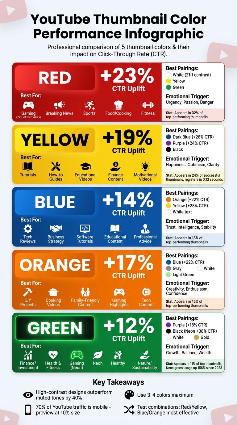
Best Thumbnail Colors for Viewer Engagement
When it comes to YouTube thumbnails, color choice can make or break your click-through rate (CTR). Here’s what you need to know:
- Red: Boosts CTR by 23%. Great for urgency-driven content like gaming, news, and sports. Pair with white or yellow for maximum impact.
- Yellow: Increases CTR by 19%. Works well for tutorials and educational videos. Best with dark backgrounds like blue or black.
- Blue: Improves CTR by 14%. Ideal for professional or tech-focused content. Combine with orange or yellow to add energy.
- Orange: Lifts CTR by 17%. Perfect for DIY, food, and family-friendly videos. Pairs well with blue for contrast.
- Green: Adds a 12% CTR boost. Best for finance, wellness, and nature topics. Neon green is popular in gaming thumbnails.
Key Takeaways:
- High-contrast designs outperform muted tones.
- Use bold, saturated colors to stand out on mobile (70% of YouTube traffic).
- Test combinations like red/yellow or blue/orange to find what resonates with your audience.
Quick Tip: Preview thumbnails at 10% size to ensure clarity on mobile. Tools like ThumbnailCreator and YouTube’s "Test & Compare" feature can help refine your designs.
YouTube Thumbnail Colors CTR Performance Comparison Chart
How To Make a Thumbnail 'POP'? - Color Theory In Thumbnails
sbb-itb-b59debf
1. Red
Red dominates in 32% of top-performing YouTube thumbnails, making it a standout choice for grabbing attention. Its vibrant saturation and longer wavelength help it pop against YouTube's dark interface, making it one of the first colors viewers notice. Beyond being visually striking, red taps into deep-seated instincts, compelling users to pause and engage. This combination of visual appeal and emotional impact highlights how color choice can directly influence channel performance.
CTR Uplift
Using red in thumbnails delivers a +23% increase in click-through rates (CTR) compared to neutral tones. High-contrast designs that incorporate red outperform muted options by 40%. Pairing red with yellow creates one of the most effective combinations for driving clicks. In gaming content, red is especially dominant, appearing in 72% of thumbnails for videos with over 1 million views - a testament to its effectiveness in highly competitive niches.
Best Content Types
Red's versatility makes it an excellent choice across a wide range of content genres. For gaming, red is often used in text outlines and accents to convey excitement and urgency. Food and cooking channels benefit from red's ability to stimulate appetite and evoke hunger. Similarly, breaking news and dramatic updates align perfectly with red's association with danger and importance. Sports highlights, fitness content, and even time-sensitive promotions also capitalize on red's energy and sense of urgency.
Emotional Triggers
Red isn't just eye-catching - it triggers primal survival instincts tied to fire, blood, and vitality. It can even evoke physical responses like a faster heart rate, higher blood pressure, and increased metabolism. This color conveys passion, urgency, and sometimes danger, making it a powerful tool for emotionally charged content. Web designer Bogdan Sandu captures its impact well:
Red stops people mid-scroll. No other color commands attention quite like it.
When used strategically, red acts as an emotional magnet, drawing attention and amplifying engagement, especially when paired with complementary colors.
Contrast Pairings
Pairing red with the right colors enhances its effectiveness. For example, white text on a red background achieves a 21:1 contrast ratio, ensuring maximum readability. Red and yellow together create one of the most engaging combinations for thumbnails. You can also pair red with green or white to maintain focus and readability. Following the 60-30-10 rule - 60% neutral (like black or gray), 30% secondary color, and 10% red - helps prevent visual fatigue. However, avoid using red text on dark backgrounds, as it can hurt readability. Instead, use red for outlines, icons, or accents to maintain clarity.
2. Yellow
Yellow is the second most popular color in high-performing thumbnails, showing up in 24% of successful designs. It strikes a balance between being highly visible and approachable - less intense than red but still eye-catching. Interestingly, yellow registers in just 0.13 seconds, faster than both images and text.
CTR Uplift
Using yellow can boost click-through rates (CTR) by 19% compared to neutral tones. When combined with dark blue, purple, or black backgrounds, the contrast ratios (10:1 or 19:1) can increase CTR by as much as 28% and 24%, respectively. To make yellow stand out against YouTube's bright interface, increasing its saturation by 20–30% is recommended.
Best Content Types
Yellow is a great fit for tutorials, how-to guides, and educational videos because it encourages mental engagement and communication. It’s also effective for finance and success-focused content - like "how to make money" or investment tips - due to its association with optimism and positivity. Motivational videos, self-improvement topics, and creative arts tutorials also benefit from yellow’s energizing and uplifting qualities. However, it’s best to avoid yellow for serious corporate or professional topics, as it might appear too casual or diminish the content’s seriousness.
Emotional Triggers
Yellow evokes feelings of happiness, warmth, clarity, and energy. It stimulates the mind and conveys a sense of optimism without the urgency of warm color thumbnails like red. These traits make it an excellent choice for content aimed at inspiring or educating viewers in a positive way.
Contrast Pairings
For the best results, pair yellow with dark backgrounds. Yellow text on dark blue or purple backgrounds ensures strong readability while maintaining visual appeal. Black text on a yellow background creates the highest contrast and draws immediate attention. Purple is another excellent pairing for creative or design-focused content, as it signals innovation. On the other hand, avoid pairing yellow with red for text and background combinations - it can make thumbnails hard to read and visually overwhelming.
Next, we’ll explore how blue plays a role in boosting thumbnail engagement.
3. Blue
Blue is all about trust and credibility. As the third most popular thumbnail color, it shows up in around 18% of top-performing thumbnails. Unlike the urgency-driven vibes of red or yellow, blue takes a calmer route. It’s the go-to choice for content that aims to educate or establish expertise. While red and yellow grab immediate attention, blue works in the background, building loyalty by signaling reliability. Let’s dive into how blue makes its mark and how to make the most of it.
CTR Uplift
Blue thumbnails can boost click-through rates (CTR) by 14% compared to neutral colors. That said, red still outpaces blue with a 23% higher CTR. This highlights blue’s more subtle, trust-building nature. However, monochromatic or low-contrast blue thumbnails can underperform, with CTRs dipping below 4%. To maximize impact, pair blue with yellow text on a dark background or add orange accents - these combinations can increase CTR by up to 28% and 22%, respectively.
Best Content Types
Blue thrives in content that prioritizes credibility and professionalism, like tech reviews, business strategies, software tutorials, and educational videos. For instance, well-known tech reviewers such as MKBHD often use blue or teal tones to signal innovation and quality. It’s also a strong choice for professional advice and scientific topics. However, blue might not be the best fit for high-energy content like gaming, breaking news, or dramatic reveals, where urgency is key.
Emotional Triggers
Blue has a calming effect, often associated with trust, intelligence, and stability. While it doesn’t spark the excitement that warmer colors do, it fosters a sense of dependability. This emotional connection encourages viewers to return, making it a great choice for long-term engagement.
Contrast Pairings
One challenge with blue is that it can blend into YouTube’s white and gray interface. To counter this, pair it with warm accent colors. Blue and orange create a balanced yet energetic look, perfect for tech and business content. Dark blue combined with bright yellow offers excellent readability for text-heavy thumbnails. For gaming content, electric blue (#00BFFF) paired with neon green delivers a modern, high-energy vibe - this combination appears in over 60% of top-performing thumbnails. Additionally, white text on deep blue backgrounds ensures clarity for professional topics.
Always test your designs in grayscale to ensure strong contrast, especially when optimizing for mobile viewers. If the subject blends into the background, the contrast needs adjustment. Tools like ThumbnailCreator make it easy to experiment with these color pairings, blending professionalism with attention-grabbing design.
4. Orange
Orange combines the intensity of red with the vibrancy of yellow. As the fourth most-used color in top-performing YouTube thumbnails, it shows up in about 15% of them. This lively hue brings energy and urgency without feeling overbearing, making it perfect for content that’s engaging yet approachable. Popular tech channels like Linus Tech Tips use orange as a core branding color, ensuring their thumbnails remain instantly recognizable.
CTR Uplift
Using orange in thumbnails can lead to a 17% increase in click-through rates compared to neutral tones. When paired with a blue background, that uplift jumps to 22%. In high-energy niches like action or gaming, this boost can range from 20% to 30%. Increasing orange’s saturation by 20–30% further heightens its warm, inviting appeal, helping it stand out against YouTube’s interface.
Best Content Types
Orange thrives in creative and dynamic content. It’s a great choice for:
- DIY projects
- Cooking videos (its warm tones are known to stimulate appetite)
- Family-friendly entertainment
- High-energy gaming highlights
Tech content creators also use orange accents to add a modern, energetic flair to their thumbnails. However, it’s less suited for formal business topics, serious news, or luxury branding, where it might feel too casual.
Emotional Triggers
Orange sparks feelings of creativity, enthusiasm, and self-assurance. It naturally encourages physical activity and engagement, making it a great fit for energetic content. Unlike red, which often signals urgency or danger, orange offers a playful and inviting excitement that draws viewers in without overwhelming them.
Contrast Pairings
Pairing orange with blue creates a bold, eye-catching contrast that helps thumbnails stand out in crowded feeds. For tech or business content, try orange elements on a dark blue background. Food creators might prefer light green or white backdrops to keep visuals fresh, while gaming channels can experiment with orange alongside red or purple for added drama. Another effective combination is a bright orange subject against a muted gray background, which uses saturation differences to grab attention. These strategic pairings pave the way for a deeper dive into the use of green in thumbnail design.
5. Green
After orange’s high-energy appeal, green steps in with a more polished feel, perfect for niche content. It shows up in about 11% of top-performing thumbnails, making it an excellent choice for content tied to themes like wealth, wellness, and growth. One standout trend is the rise of neon green, now the most popular neon shade, featured in 34% of thumbnails using neon palettes. Since 2023, neon green’s popularity has skyrocketed, with usage jumping 156%, especially in gaming content and among Gen-Z creators.
CTR Uplift
Green increases click-through rates (CTR) by +12% compared to neutral tones. While it doesn’t match the CTR boosts of red (23%) or yellow (19%), green shines when paired strategically. For instance, combining green with a purple background elevates CTR to +18% due to their complementary contrast. Neon green on dark backgrounds is particularly effective, outperforming neon on light backgrounds by 38%. This is why gaming thumbnails often feature neon green - it grabs attention and creates a strong visual identity in crowded niches. Eye-tracking studies also reveal that text with neon green glow effects attracts 27% more attention than standard text.
Best Content Types
Green thrives when aligned with audience expectations, making it a go-to color for specific content categories:
- Finance channels: Green’s association with money and growth makes it ideal for investment and wealth-related content.
- Health and fitness creators: It conveys vitality and a sense of organic wellness.
- Gaming channels: Neon green paired with black or dark blue backgrounds signals modern, high-tech aesthetics.
- Nature and sustainability content: Green naturally complements topics related to the environment and outdoor adventures.
That said, green isn’t the best fit for high-energy entertainment or breaking news, where colors like red or yellow tend to perform better.
Emotional Triggers
Green taps into feelings of growth, balance, and renewal. It’s often linked to the “go” signal, subtly encouraging clicks. It also has a calming effect, reducing stress and promoting harmony. For financial content, green evokes wealth and progress, while in wellness, it symbolizes health and rejuvenation. Among gaming audiences, neon green feels energetic and futuristic, making it perfect for transformation stories or success-themed content.
Contrast Pairings
Pairing green effectively with other colors can amplify its impact. Here are some proven combinations:
| Green Pairing | Best Use Case | CTR Impact |
|---|---|---|
| Neon Green + Black | Gaming, Gen-Z content | +38% |
| Green + Purple | Creative branding, unique content | +18% |
| Green + White | Lifestyle, health, nature | High (fresh) |
| Green + Black/Gold | Finance, luxury topics | High (premium) |
For gaming or tech-related content, neon green works best with black or deep blue backgrounds to make visuals pop. Finance creators can use green with black or gold for a polished, premium look. Meanwhile, health and lifestyle channels benefit from pairing green with white for a clean, uplifting vibe.
One thing to keep in mind: around 8% of men and 0.5% of women experience red-green color blindness, so avoid relying solely on color. Adding brightness contrast or supporting elements like icons and text ensures accessibility. For green, increasing saturation by 20–30% can help it stand out against YouTube’s bright interface.
Pros and Cons
Let’s break down the strengths and weaknesses of different colors in thumbnail design based on the data. By understanding each color’s impact, you can fine-tune your approach to better connect with your audience.
Red stands out with a +23% CTR boost, making it perfect for high-energy or urgent content like breaking news or gaming. Its ability to stimulate - raising heart rate and even blood pressure - grabs attention effectively. However, too much red can lead to "thumbnail fatigue" and might feel overly aggressive in some contexts.
Yellow brings a +19% CTR boost, radiating optimism and cheerfulness, which works wonderfully for tutorials or upbeat content. On the downside, overuse can lead to visual fatigue, and without enough contrast, readability might suffer.
Blue achieves a +14% CTR boost and is known for building trust. Its calming and professional vibe makes it a go-to for tech, business, and educational topics. But in fast-paced environments, it may lack the urgency to grab attention. Pairing it with warmer tones like orange can help balance its reliability with a touch of energy.
Orange delivers a +17% CTR boost, exuding creativity and enthusiasm. It’s a good choice for DIY, food, or family-oriented content. The challenge? It can feel overstimulating or too casual for more formal or serious themes.
Green offers a +12% CTR boost and conveys balance and calmness. It’s a natural fit for finance, health, and environmental topics. However, its subtlety can make it less effective in grabbing attention in fast-moving feeds, and certain shades might not be visually appealing.
| Color | Pros | Cons |
|---|---|---|
| Red | Highest CTR (+23%), creates urgency, grabs attention | Can feel aggressive, causes thumbnail fatigue |
| Yellow | Strong CTR (+19%), optimistic, eye-catching | Can cause fatigue, struggles with poor contrast |
| Blue | Builds trust (+14%), professional, calming | May lack urgency, can feel distant or cold |
| Orange | Engaging (+17%), creative, friendly energy | Risk of overstimulation, less formal |
| Green | Growth-oriented (+12%), calming, stress-reducing | Too subtle for fast feeds, some shades unappealing |
This breakdown offers practical insights to help you align your thumbnail color choices with the specific tone and goals of your content.
Conclusion
Picking the right thumbnail colors is all about matching your content to what grabs your audience's attention. For example, red and white combinations work great for action, gaming, and drama content where urgency and energy are key. Yellow and black pairings stand out for educational and tutorial videos because of their sharp contrast. Tech and business channels often thrive with blue and orange schemes, offering a mix of professionalism and vibrancy. On the other hand, purple and yellow is ideal for creative content, while green and white gives lifestyle and health channels a fresh, uplifting feel. These combinations reflect the insights covered earlier.
The data speaks volumes: high-contrast designs consistently outperform muted tones. Sticking to 3–4 colors max keeps your thumbnails clean and visually appealing. For gaming, dark backgrounds are a huge win, significantly boosting clicks. Neon green and electric blue accents are also a common theme in top-performing gaming thumbnails. These trends underscore the importance of testing and refining your approach.
YouTube's "Test & Compare" feature is a valuable tool for this. It allows you to upload up to three thumbnail variations, but you’ll need at least 1,000 impressions or two weeks of data to draw meaningful conclusions. Always preview thumbnails at 10% size to ensure they’re clear on mobile, especially since 70% of YouTube traffic comes from mobile users. The right color palette doesn’t just catch the eye - it also shapes your channel’s overall identity.
Tools like ThumbnailCreator make it easier to apply these strategies. With features like AI-powered editing, you can experiment with neon accents, high-contrast text, and other trending elements. This is especially useful given the 64% increase in neon accent usage and the 78% preference for dark backgrounds. These tools help you stay ahead in a constantly shifting landscape.
Start with palettes tailored to your content type, test consistently, and let the data guide your tweaks. The right color choices can turn a glance into a click, making all the difference for your channel’s growth.
FAQs
How do I pick a thumbnail color for my niche?
When picking a thumbnail color, think about how colors influence emotions and reactions. Warm tones like red, orange, and yellow can spark a sense of urgency, making them perfect for tutorials or time-sensitive content. On the other hand, cooler shades like blue and green evoke feelings of trust and calm, which work well for educational or informative topics.
If you want your thumbnail to stand out, consider using high-contrast color combinations, such as yellow and black, to grab attention quickly. To fine-tune your choices and see what resonates best with your audience, tools like ThumbnailCreator can be invaluable for testing and improving engagement.
What’s the best way to A/B test thumbnail colors on YouTube?
To test how thumbnail colors affect performance on YouTube, start by creating several versions of your thumbnail that differ only in color. Use YouTube's "Test & Compare" feature to run the experiment over a period of 7 to 14 days. Focus on key metrics like click-through rate (CTR) and impressions to gauge the results. Make sure to change just one element - like the color - so you can clearly see its influence. This method allows you to fine-tune your thumbnails for improved engagement and visibility.
How can I keep thumbnails readable on mobile and accessible?
To make your thumbnails easy to read and accessible on mobile, focus on high-contrast colors, bold sans-serif fonts, and add outlines or shadows to improve text clarity. Stick to short text (3–5 words) and test your designs at a resolution of 168×94 pixels to ensure they work well on smaller screens. Prioritize simple, bold visuals and avoid clutter to make your thumbnails stand out and stay clear across all devices.