

Top 7 Thumbnail Styles for Different Video Types
The best thumbnail style is the one that matches the video’s main promise fast. If people can grasp the point in one glance, clicks tend to go up. If the thumbnail overpromises, watch time often drops.
Here’s the short version:
- Tutorials: show the result first, often with a before/after layout
- Product reviews: put the product first and make the verdict easy to spot
- Comparisons: use side-by-side contrast with a clear “VS” or split
- Reactions: let the face and emotion lead
- Listicles and rankings: make the number the first thing people see
- Storytelling and documentaries: use one scene that hints at tension or mystery
- Entertainment and challenges: show the stakes, goal, or payoff at once
A few rules apply to all of them:
- Keep text short: 2–6 words
- Make it readable on mobile
- Avoid the lower-right corner because the timestamp sits there
- Stay accurate to the video
- Check CTR and watch time, not CTR alone
YouTube’s base specs are still simple: 16:9, 1,280 × 720 pixels, JPG/GIF/PNG, and under 2 MB.
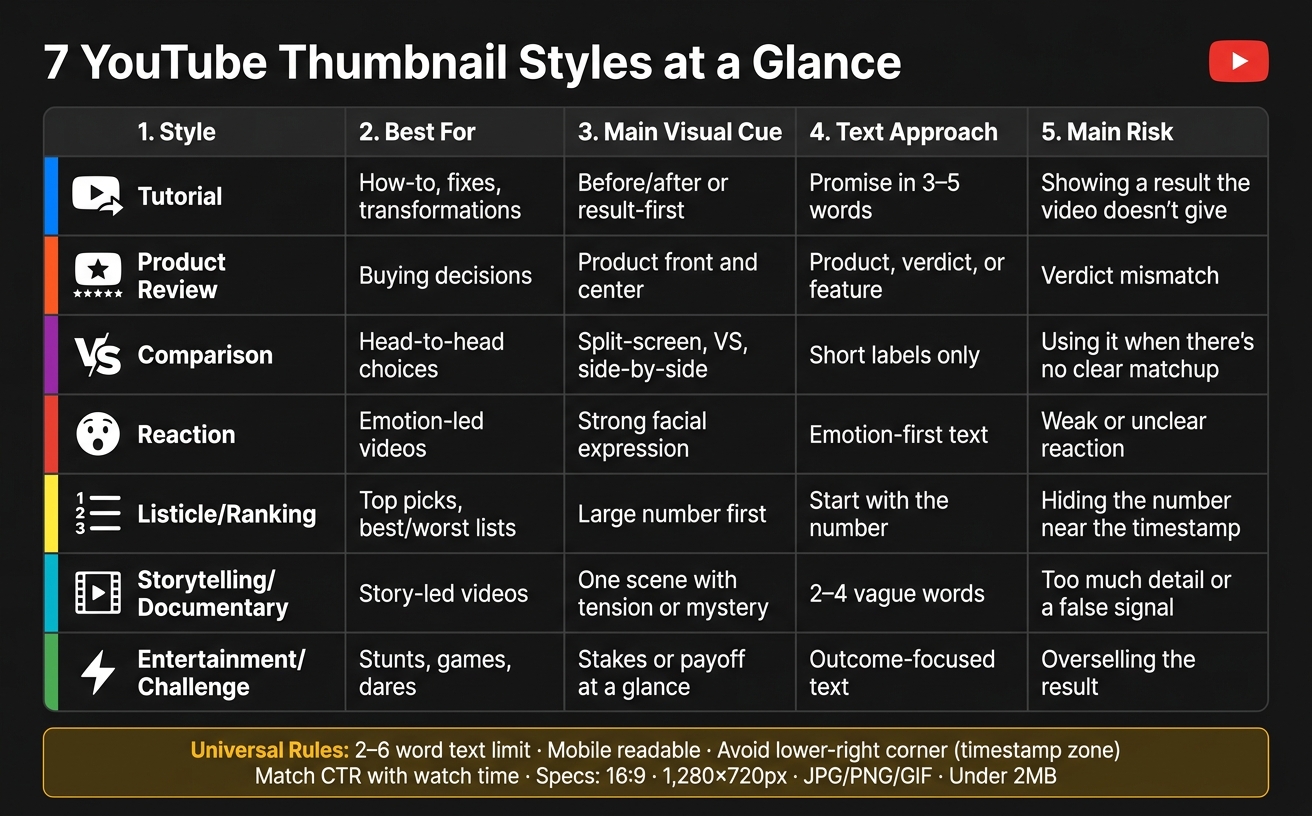
7 YouTube Thumbnail Styles: Quick Comparison Guide
The New Thumbnails Dominating YouTube in 2026
sbb-itb-b59debf
Quick Comparison
| Style | Best for | Main visual cue | Text approach | Main risk |
|---|---|---|---|---|
| Tutorial | How-to, fixes, transformations | Before/after vs single image results | Promise in 3–5 words | Showing a result the video doesn’t give |
| Product Review | Buying decisions | Product front and center | Product, verdict, or feature | Verdict mismatch |
| Comparison | Head-to-head choices | Split-screen, “VS,” side-by-side | Short labels only | Using it when there’s no clear matchup |
| Reaction | Emotion-led videos | Strong facial expression | Emotion-first text | Weak or unclear reaction |
| Listicle/Ranking | Top picks, best/worst lists | Large number first | Start with the number | Hiding the number near the timestamp |
| Storytelling/Documentary | Story-led videos | One scene with tension or mystery | 2–4 vague words | Too much detail or a false signal |
| Entertainment/Challenge | Stunts, games, dares | Stakes or payoff at a glance | Outcome-focused text | Overselling the result |
If I had to sum up the full article in one line, it would be this: pick the thumbnail style based on why someone would click the video in the first place.
1. Tutorial Thumbnail Style
Best-Fit Video Types
Tutorial thumbnails work best when the video promises a clear result or fixes a specific problem. They tend to do especially well for transformation-focused videos and problem-solution content.
Core Visual Layout
With tutorial thumbnails, show the result first. That’s the big idea.
For transformation tutorials, a split-screen before/after layout tends to work best. Put the before state on one side, the after result on the other, then add an arrow to show the change. One finance channel used this split-screen approach and lifted CTR from 6.3% to 8.7%.
Use split-screen when the video shows a clear transformation. For tips-only tutorials, go with a presenter-plus-prop layout instead. Pick the format that makes the result feel obvious at a glance.
Text Treatment
Once the result is obvious, the text only needs to do one thing: sharpen the promise.
Tutorial thumbnails often do need text, but keep it short - 3–5 words in bold sans serif with an outline. Place the text in the top-left. Only center it when the text needs to dominate the frame. If the thumbnail includes a face, point the subject’s gaze toward the text or the main object. And don’t put anything important in the lower-right corner because the timestamp sits there.
Blue and green can signal trust in educational thumbnails. It also helps to use a curiosity gap: hint at the outcome without giving away the whole thing.
Design Watch-Outs
Once clarity is in place, the biggest risk is promising too much. Don’t tease a result the video never delivers. If the thumbnail sets one expectation and the video misses it, retention drops and future reach can take a hit.
The lower-right corner is still off-limits because of the timestamp, so keep key visuals somewhere else. When you test thumbnails, change one variable at a time - like expression, prop, or text - so you can see what actually affects clicks.
2. Product Review Thumbnail Style
Best-Fit Video Types
When someone is thinking, "Is this worth buying?", the thumbnail needs to answer that fast. Put the product front and center, then make the verdict easy to spot. This style works best for review videos where people want a quick read before they spend money.
Core Visual Layout
Start with the product. For review thumbnails, faceless designs vs. face-forward thumbnails performance data shows that no-face designs often do better by 8%. If you do use your face, place it on the right side of the frame and let it take up about 30–50% of the thumbnail area. Your eyes should point toward the product or the text so the viewer's attention goes there too.
A clear brand logo can help with trust and can lift CTR by 19%. Strong contrast between the product and the background also matters a lot. In some cases, it can lift impressions by up to 37%.
Text Treatment
Keep the text short and punchy. Use 3–5 words in a bold sans serif font, and keep the overlay light. The top-left is usually the best spot for readability. For review thumbnails, the text should zero in on the main thing the viewer cares about:
- Product name
- Verdict
- Key feature
Design Watch-Outs
Don’t place key elements in the lower-right corner because YouTube’s timestamp will sit there. And keep the thumbnail in line with the actual review verdict. If the video doesn’t deliver a certain result, the thumbnail shouldn’t hint at it.
If the video compares two products, the next style moves away from a product-first layout and into side-by-side contrast.
3. Comparison Thumbnail Style
Best-Fit Video Types
This style fits videos that put two options head to head. The goal is simple: make the contrast obvious at a glance so people instantly get that the video is a direct matchup.
Core Visual Layout
The go-to setup here is a split-screen. Put the two options side by side, then divide them with a line, an arrow, or a bold “VS”. It works because the choice is clear right away. In one test, a split-screen format lifted CTR from 6.3% to 8.7%, which is a 38% gain.
If you include people, show the contrast fast with opposite expressions or different settings. Think one side calm, the other side frustrated. That kind of visual cue helps the viewer read the thumbnail in a split second.
Split-screen layouts do best when the video is built around a direct comparison. For videos that are mostly informational, this format can underperform standard layouts by about 10%, so it’s best to use it only when the contrast is the main hook.
Text Treatment
Keep the text short. Simple labels like “A vs B,” “Best,” or the product names usually do the job.
Use bold, sans-serif fonts with outlines, and place the text in the top-left for readability or in the center when you want more emphasis.
Skip the lower-right corner. YouTube’s timestamp sits there, and it’ll cover anything you place in that spot.
If the main hook is emotion rather than a choice between two options, switch to a reaction-style thumbnail.
4. Reaction Thumbnail Style
Best-Fit Video Types
Use a reaction thumbnail when the emotion is the hook, not the matchup. This style fits videos where the creator’s response is the main draw, and the thumbnail needs to make that feeling clear before the viewer even knows the full topic.
It works best for videos built around a reaction to something surprising or emotional.
Core Visual Layout
Let the face do the heavy lifting. The face is the hook. Shocked or exaggerated expressions beat subtle ones by 33%.
Use split-screen only if the thing being reacted to needs to stay on screen. In that case, put the creator on one side and the subject of the reaction on the other. Keep both sides clean and simple so the emotion doesn’t get lost.
Text Treatment
Stick to 3–5 words that show the reaction, not the setup. A line like "I Can't Believe This" works because it leads with emotion instead of context.
Design Watch-Outs
Make the gaze direction clear. Have the creator look toward the text or the reacted-to subject so the viewer’s eye moves straight to the emotional moment.
5. Listicle and Ranking Thumbnail Style
Best-Fit Video Types
This style works best when the click comes from instant ranking recognition. It fits videos built around a ranked list, like "Top 10 Budget Laptops", "Best Coffee Shops in NYC," or "5 Worst Mistakes New Investors Make." The thumbnail should make that ranking clear in a split second.
Core Visual Layout
Make the ranking easy to read right away. Put the number front and center. Digits get +34% more clicks than spelled-out words. So use "10" instead of "Ten."
If you include a face, direct the eyes toward the number or the list title. That small cue helps pull attention where you want it.
Text Treatment
Stick to 3–5 words. (See our guide on text-heavy vs minimal text thumbnails for more on word counts.) Start with the number, then keep the rest short. The text should be bold, outlined, and easy to read at a glance. For placement, top-left or center usually works best.
Design Watch-Outs
Don’t place key numbers or main imagery in the lower-right corner. YouTube puts the video duration stamp there, and it can cover anything in that area.
If the video leans more on story than ranking, move to the next style.
6. Storytelling and Documentary Thumbnail Style
Best-Fit Video Types
When the hook is a story, the thumbnail should feel like a scene, not a recap. This style fits best when the story itself is the main draw, especially for documentaries and other story-led videos. The goal is simple: people should get the sense that they're about to watch a story before they even read the title.
Core Visual Layout
Start with one visual clue that hints at tension, discovery, or mystery. Pick a single frame that sparks a question right away. The image should make someone pause and think, Wait, what happened here?
Use gaze direction with purpose. If someone's looking at something in the frame, that look should guide the viewer to the main clue in the story, not just to the title text. It also helps to match the background tone and number of faces to the thumbnails that already perform well in your niche. That way, the image still feels familiar while giving people a reason to click.
Text Treatment
Use 2–4 words at most. Keep the text a little vague so it builds intrigue without giving the whole story away.
Design Watch-Outs
Keep the subject's face and the story's main clue away from the lower-right corner. That's often where YouTube's timestamp sits, and covering the wrong detail can weaken the image fast.
A thumbnail can drive clicks and still hurt the video if it sets the wrong expectation. If people click and then leave, distribution can drop. So The sweet spot is finding the balance between curiosity and authenticity to earn the click while holding attention.
7. Entertainment and Challenge Thumbnail Style
Documentary thumbnails sell mystery. Challenge thumbnails sell stakes. The viewer should get the risk, goal, or payoff in one quick glance.
Best-Fit Video Types
Use this style for stunts, games, and challenge videos where the outcome needs to read right away.
Core Visual Layout
Use a large face only if it helps show the result of the challenge. Then pair that face with the object, action, or end result, and aim the gaze toward it. Strong contrast helps separate the main item from the rest of the image, so the stakes are easy to read at a glance.
Once the challenge is easy to understand, let the text spell out the stakes in as few words as possible.
Text Treatment
Keep text to 3–5 words. Start with a number or "World's" when it fits the idea - numbers drive a +34% edge over words, and that prefix can lift clicks by +52%. The text should name the outcome, not the setup.
Design Watch-Outs
Keep key parts out of the lower-right corner, where YouTube's duration stamp appears. And avoid thumbnail mistakes like overselling the image. If people click, then leave right away, YouTube can limit the video's reach.
Use this style only when the challenge is clear at once and the result feels believable.
How to Pick the Right Thumbnail Style: A Quick Checklist
Pick the style that lines up with the video's promise and what the viewer wants. If a thumbnail gets more clicks but watch time slips, that's usually a sign the thumbnail and the video aren't in sync. So don't judge style by CTR alone. Look at watch time and CTR benchmarks too.
Use this checklist after you pick a style to make sure it fits the video.
| Checkpoint | What to Look For |
|---|---|
| Promise | Does the thumbnail match what the video actually delivers, not just what sounds interesting? |
| One focal point | Is there one clear subject pulling the eye, without other elements fighting for attention? |
| Short text | Is text kept to 2–6 words and easy to read at a glance? |
| Contrast | Does the subject stand out from the background? |
| Adds new info | Does the thumbnail add context that the title doesn't already cover? |
| Mobile readable | Is it still easy to read in mobile preview at mobile size? |
| No false signals | Does each visual element match the actual video? |
If two styles both work, go with the one that matches the video's main promise more closely.
Test CTR alongside retention. If clicks go up but watch time falls, switch to a style that better matches the video.
Conclusion
The best thumbnail style is the one that matches what the viewer wants and what the video is about to give them.
That’s the whole game.
The seven styles in this article each do a different job: tutorial, review, comparison, reaction, listicle, storytelling, or challenge. Pick the one that fits the actual video, not just the one that looks good on the page.
When the style, the promise, and the text are all in sync, the thumbnail is much more likely to earn the click and help keep people watching.
FAQs
How do I choose the right thumbnail style?
Start with your viewer’s main intent.
If they want entertainment, try Bold Reaction Face or Minimal Text Curiosity. Those styles lean into emotion and make people stop for a second.
If they’re looking for a fix or a clear answer, use Split-Screen Before-and-After or Big Number Results. That kind of thumbnail tells the story fast.
For product reviews, High-Contrast Object Focus tends to work best. It puts the item front and center, which is usually what the viewer wants to see.
ThumbnailCreator can help you make and test these styles with AI-powered templates built for your niche.
What if my CTR goes up but watch time drops?
If CTR goes up but watch time drops, your thumbnail is probably overselling the video. People click because the promise looks good, then leave fast when the video doesn’t deliver on that promise.
Match the thumbnail more closely to what the video actually covers. Then use YouTube’s Test & Compare to try small tweaks, changing one design detail at a time so you can see what’s helping and what’s not.
Should I use text on every thumbnail?
No. It depends on your video’s theme and whether the visuals already make the main point clear.
Text tends to work better for abstract topics, like educational or finance content. For vlogs or entertainment, strong visuals often do more of the heavy lifting, with little or no text.
If you add text, keep it short: 1–5 words so it’s easy to read on mobile.