

7 Steps to Create a Consistent Thumbnail Style
If I want people to spot my videos fast, I need a thumbnail system, not random designs. The article breaks that down into 7 clear steps: set the right specs, lock in colors and fonts, fix the layout, build templates, use the same workflow every time, and test results without losing channel recognition.
Here’s the short version:
- I start with YouTube’s baseline specs: 1,280 × 720 px, 16:9, and under 2 MB
- I pick a small color set, one main font, and fixed text rules
- I keep the subject and headline in set positions across uploads
- I build separate templates for formats like tutorials, reviews, and Shorts
- I check each thumbnail on mobile, where small text and weak contrast fail fast
- I review both brand fit and performance, because CTR alone is not enough
- I test one change at a time and track results over time
A few numbers stand out. The article recommends making the main subject about 40%–60% of the frame, leaving 8%–10% padding around key elements, and keeping thumbnail text to 1–5 words. It also points out that YouTube’s Test & Compare can test up to three thumbnail versions for one video.
| Step | Main focus | What I lock down |
|---|---|---|
| 1 | Visual identity | Colors, font, subject treatment |
| 2 | Color palette | Fixed color jobs and HEX values |
| 3 | Text rules | Font weight, case, text length, placement |
| 4 | Layout | Subject zone, text zone, spacing, outlines |
| 5 | Templates | Reusable files for each video type |
| 6 | Workflow | Same checks before every upload |
| 7 | Review and testing | Brand checks, analytics, controlled tests |
The main idea is simple: keep the style easy to repeat, easy to read, and easy to recognize. That’s what the full article explains, step by step.
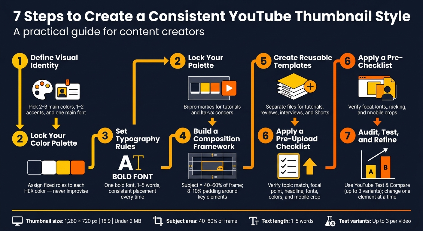
7 Steps to Create a Consistent YouTube Thumbnail Style
Steps 1–3: Build Your Visual System
Step 1: Define Your Channel's Visual Identity
Your visual identity is the set of design choices you repeat across every thumbnail.
Start simple: pick 2–3 main colors, 1–2 accent colors, and one main font. Then decide how people or objects should appear in the frame. Maybe that means close-up facial reactions, bright edge lighting, and a thin colored outline around each cutout. Put all of this into a one-page style sheet with HEX codes, font names and weights, spacing, and background rules.
Your niche should shape the overall feel. A gaming channel may lean on dark backgrounds, electric blue accents, and high-energy cutouts. A personal-finance channel may go with navy and green, clean layouts, and more restrained expressions. The point isn’t to copy a look. It’s to make clear choices, write them down, and stick to them. Use the style sheet to lock in your color and text rules before you start building layouts.
Step 2: Choose a Restricted Color Palette
A restricted palette makes thumbnails easier to spot and faster to produce, since you’re not rethinking colors every time.
Once your identity is set, give each color a fixed job. For example:
- Deep navy for backgrounds
- White for main text
- Bright yellow for one emphasis word
- Orange only for small highlights or callout graphics
Use those same roles on every thumbnail. Then test the palette on different subjects and at mobile size. If the contrast doesn’t hold up, change the background or add an outline. Don’t solve the problem by tossing in a new color.
| Approach | Recognition | Production Speed | Visual Consistency |
|---|---|---|---|
| Restricted palette with documented HEX values | Stronger; repeated colors become recognizable cues | Faster; approved colors are ready to use | High; thumbnails look related across uploads |
| Unrestricted color choices | Weaker; each upload may look unrelated | Slower; color decisions restart each time | Low; the channel can look visually fragmented |
Step 3: Set typography and text rules
Once the palette is locked, do the same thing with typography. Use the same rules every time.
Choose one primary font family and one weight, usually bold. Set one capitalization style too: all caps or title case. Keep text short - one to five words - and limit it to two lines.
Put your headline in the same area on each thumbnail. Upper-left is a common pick when the subject sits on the right. Always keep text away from the lower-right corner, since the duration badge can cover it. If text sits on top of a photo or a busy background, add a solid color block, a dark outline, or a light shadow so it stays readable. Then shrink the thumbnail to about 160 px wide and make sure the headline is still clear.
sbb-itb-b59debf
Steps 4–5: Turn Your Style Into Layouts and Templates
Step 4: Set a Consistent Composition Framework
Once your colors and fonts are locked in, the next move is simple: decide where things go, and keep that structure the same from one thumbnail to the next.
A good place to start is the rule of thirds. Split the canvas into nine equal parts, then place the main subject near one of the four points where the lines meet. That spot tends to hold attention well, even when the thumbnail gets tiny.
From there, set four fixed zones in every layout: a subject zone, a text zone, a background zone, and, if needed, a logo area. Put the subject on one side and the headline on the other so they don’t fight for attention. In most cases, the subject should stay the biggest thing in the frame - about 40%–60% of the canvas. Also leave about 8%–10% padding around key content so nothing gets clipped when the thumbnail appears in different placements.
Consistency matters here. If one thumbnail uses a thick outline and hard shadow, and the next uses a thin outline and soft shadow, the channel starts to feel scattered. Write down the rules for outline width, shadow blur, and crop style so any editor can get the same look without guessing. Those rules become the backbone of your templates in the next step.
Then do one quick gut check: shrink the thumbnail to about 168 px wide and see if the subject and headline still read as two separate parts.
Step 5: Build Reusable Thumbnail Templates
Now turn those layout rules into template files you can use again and again.
Make separate templates for each recurring video type - tutorials, reviews, interviews, Shorts, and anything else you publish on a regular schedule. That saves time and keeps the channel from looking all over the place.
For standard YouTube videos, set the master file to 3,840 × 2,160 pixels in a 16:9 aspect ratio. For Shorts, make a separate file at 2,160 × 3,840 pixels with a 9:16 ratio. Don’t just crop a horizontal design and hope it works. Build each format for its actual frame.
It also helps to build masters at a higher resolution first, then export at the needed thumbnail size. Inside each template, lock the parts that should never drift:
- Canvas size
- Color swatches
- Fonts
- Text zones
- Subject scale range
- Outline treatment
- Logo position
Leave only the content-specific parts open for editing: the headline, subject image, background image, and any accent shape that stays inside the approved palette.
If you use a template tool, keep those same locked layers in place and still review each version by hand. ThumbnailCreator can help you apply the same brand rules fast, but you should still check the final output for wording, contrast, and alignment.
A simple way to think about it:
- Use fixed templates for repeatable series
- Use flexible templates for formats that change more often
- Use AI-generated drafts when you need a fast starting point
And don’t skip layer naming. Labels like TEXT, SUBJECT, and BACKGROUND make the file easy to use for anyone on the team, which means fewer mistakes and less back-and-forth.
Steps 6–7: Apply, Review, and Improve the System
Step 6: Apply the Style to Every New Thumbnail
Once your templates are ready, the next move is simple: use the same workflow every time.
Pick the template that fits the video type. Use a close-up face template for reactions or opinion videos, a product-led layout for reviews, or a two-subject comparison layout for “A vs. B” topics. Then duplicate the template, swap in the new subject, background, and headline, and leave every locked brand element alone.
This is where a short checklist helps. It keeps the process steady, even if more than one person is making thumbnails. And if a version breaks the system, fix it before you publish. No shortcuts.
Before uploading, run five fast checks:
- Does the image match the video topic?
- Is the focal point clear right away?
- Is the headline accurate and easy to read?
- Are you using the approved fonts and colors?
- Is anything important getting cropped on mobile or desktop?
Then do one more thing: shrink the thumbnail to mobile size. If the subject or headline gets muddy, you’ve got a problem. A high CTR can look nice at first glance, but it doesn’t mean much if viewers click and then leave fast.
After the thumbnail passes the upload check, review it again from two angles: brand fit and performance.
Step 7: Audit, Test, and Refine Without Losing Brand Recognition
Review each thumbnail in two passes: brand fit and performance.
The brand pass asks a simple question: does this look like it belongs on your channel? That means checking the palette, typography, composition, focal point, spacing, and how easy it is to recognize at a glance. The performance pass looks at how people reacted once the thumbnail was out in the world: impressions, impression click-through rate, watch time, average view duration, retention, and traffic source.
Those are not the same thing. And mixing them up is where channels get themselves in trouble. A weak video can make a good thumbnail look bad. On the flip side, a flashy thumbnail can pull clicks without helping watch time.
| Evaluation area | Brand-consistency check | Performance check |
|---|---|---|
| Main question | Does this look like it belongs to the channel? | Does this packaging attract the right viewers and support viewing? |
| Typical criteria | Colors, fonts, composition, spacing, focal point, recognizability | Impressions, impression CTR, watch time, average view duration, retention |
| Common mistake | Changing the style so much that recognition declines | Comparing A/B testing vs. gut feeling results helps avoid declaring a winner from CTR alone |
For the brand pass, review your last 10–20 uploads together instead of judging one thumbnail on its own. Patterns are easier to spot in a group. You may notice drift you’d miss otherwise: font weights changing from video to video, logos sliding around, off-brand colors creeping in, layouts getting crowded, or subjects shrinking too much.
For the performance pass, compare like with like inside YouTube Analytics. Don’t lump unlike videos together. A reaction video and a product review may live on the same channel, but they often behave very differently.
When you’re ready to test, use YouTube’s native Test & Compare feature. It lets creators upload up to three thumbnail variants for one video and review the results in YouTube Studio. Keep the test clean by changing only one element at a time, like the facial expression, the crop, or the headline. If you change three things at once, you won’t know what did the work.
If you use a tool like ThumbnailCreator to make variants fast, that’s fine. Just make sure every version still goes through the same checks for brand fit, readability, accuracy, and small-screen legibility before it goes live. Then record the outcome before making the next version.
Document each test with the date, the video, what changed, and the result. Over time, that log turns into a channel-specific record you can lean on. It gives your next test a starting point instead of forcing you to guess from scratch.
How to design GREAT thumbnails (even if you’re not a designer)
Conclusion: Keep Your Style Simple, Documented, and Repeatable
A steady thumbnail style does not mean every thumbnail should look the same. It means building a visual system people can spot right away, even when the subject shifts. These seven steps help turn thumbnail design into something you can repeat without having to reinvent it each time.
Once that system is in place, the next goal is simple: move fast without drifting off-brand. That’s where tools like ThumbnailCreator can help, with faster drafting and template-based edits. Your style guide does the other half of the job by keeping the output aligned and helping you produce more without losing that familiar look.
Keep the rules short enough to remember and clear enough to write down. For most channels, a brand-consistent color palette, one typeface, a handful of layouts, and a brief checklist will do the job. YouTube recommends clear, readable text and warns against overly complex designs; thumbnails also need to stay readable across different devices. Simple systems tend to hold up better on phones, tablets, and desktops than busy designs do. Avoiding common thumbnail mistakes ensures your visual system remains effective.
That same discipline should show up in review and revision. Treat your style guide like a working document, not something frozen in time. As your channel, formats, or platform shift, go back to the guide and change what no longer fits. YouTube’s testing system looks at overall watch time - not just click-through rate - so the aim is to bring in the right viewers, not just more clicks.
The best thumbnail is clear, recognizable, and easy to read on mobile. Build a system that lets you repeat that result, and the design work gets easier each time.
FAQs
How often should I update my thumbnail style guide?
Check your thumbnail style guide every few months so you can spot drift in your visual identity and fix it before it spreads. It also helps to review your top videos each month to see if the main design cues still line up with what your audience expects.
Update your brand rules based on performance data, not by following a set calendar. And if you decide to make a bigger refresh, introduce those changes step by step over 4 to 6 weeks.
What should I do if my CTR improves but watch time drops?
If your click-through rate (CTR) goes up but watch time falls, your thumbnail may be setting the wrong expectation. In plain terms, people click, then leave. That usually means the image pulled them in, but the video didn’t match what they thought they were getting.
Your thumbnail should line up with the content as closely as possible, so it brings in viewers who are actually interested.
Use YouTube’s Test & Compare tool to watch both metrics side by side. Then make small, deliberate design tweaks one at a time. That way, you can improve performance without hurting retention.
Can I keep one style across tutorials, reviews, and Shorts?
Yes. Use one brand system across all three, then tweak the layout for each content type.
Your thumbnails don't need to look exactly the same. The goal is consistency, not copy-paste. Keep the core brand pieces in place - like your color palette, fonts, and logo placement - then build category-based templates that follow those same rules.