
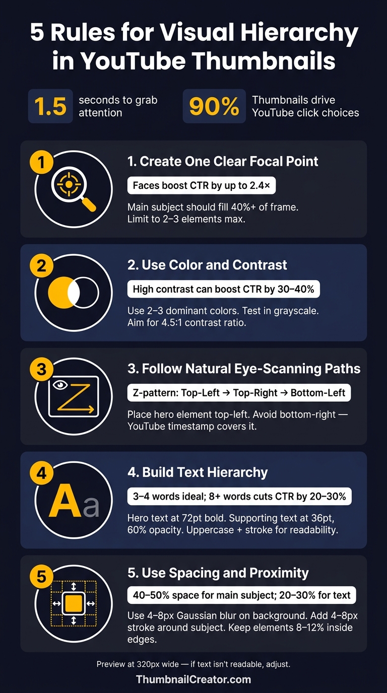
5 Rules for Visual Hierarchy in Thumbnails
Your thumbnail has 1.5 seconds to grab attention and influence a click. With thumbnails driving 90% of YouTube click choices, mastering visual hierarchy is critical. This means arranging elements - like size, color, and placement - to ensure the viewer's eye lands on the most important part first.
Here’s how to design effective thumbnails:
- Focus on One Key Element: Use size and scale to highlight a single subject, like a face or object. Avoid clutter by limiting to 2–3 elements max.
- Leverage Color and Contrast: Use bold, complementary colors to make your thumbnail stand out. Test designs in grayscale to ensure clarity.
- Position Elements Strategically: Align visuals along natural eye-scanning paths (like the Z-pattern). Avoid placing key elements in the bottom-right corner, as YouTube’s timestamp will cover them.
- Organize Text Hierarchy: Keep text short (3–4 words) and use varying font sizes to emphasize the main message. Ensure readability even at small sizes.
- Use Spacing Effectively: Leave room between elements to avoid clutter. Isolate the focal point with spacing, blur backgrounds, or add subtle outlines.
Each rule works together to create a thumbnail that grabs attention, communicates clearly, and drives clicks. Tools like ThumbnailCreator can simplify the process, helping you refine designs for maximum impact.
5 Rules for Visual Hierarchy in YouTube Thumbnails
How Important Is Visual Hierarchy In Thumbnail Design? - Drawing and Painting Academy
sbb-itb-b59debf
1. Create One Clear Focal Point Using Size and Scale
Every thumbnail needs a single, standout element - whether it’s a face, an object, or a catchy text hook. Trying to include multiple elements of the same size can confuse viewers. Their brains pause to process the clutter, and that moment of hesitation might cost you a click.
Larger elements naturally grab attention first. By making one subject noticeably bigger than the rest, you guide the viewer’s eye immediately. For creators who appear on camera, your face should take up at least 40% of the thumbnail area. This size ensures it remains clear, even on a small 120-pixel mobile screen.
There’s also a scientific edge to using faces. The human brain has a built-in preference for spotting faces before anything else - this is called face detection bias. Using a face as your focal point taps into this instinct, establishing focus instantly. Plus, thumbnails with expressive faces can boost click-through rates by as much as 2.4× compared to those with just text.
Here’s a quick test: shrink your thumbnail to 100×100 pixels. If the main subject isn’t obvious, it’s time to simplify. This helps you avoid common thumbnail mistakes that hurt performance. Remove extra elements like logos or timers until the primary focus is crystal clear. Sticking to 2–3 visual elements max keeps the design clean and the message sharp.
| Element | Recommended Size | Purpose |
|---|---|---|
| Main Subject (Face/Object) | 40%+ of frame | Draws immediate attention |
| Text Hook | Medium | Adds context or emotion |
| Supporting Graphics | Small | Enhances without distracting |
Tools like ThumbnailCreator make it easy to experiment with size and placement. Once your focal point is nailed down, you can move on to using color and contrast to guide the viewer’s attention even further.
2. Use Color and Contrast to Guide Attention
Once you've established your focal point, color psychology becomes a powerful tool to guide attention to other key elements. High contrast is essential - it helps your thumbnail stand out in a crowded feed rather than blending into the background. As the GrabThumbs Editorial Team aptly said:
"If every color is equally loud, nothing feels important." - GrabThumbs Editorial Team
To make your thumbnails pop, rely on complementary color pairs like yellow on black, white on deep blue, or orange on navy. These combinations stay visually distinct even in small previews (120–150 pixels). Avoid pairings with similar brightness levels, such as medium blue on medium purple or light gray on white, which can blur together and lose impact at reduced sizes.
Platforms like YouTube, with both light and dark modes, emphasize bold colors like red and yellow. Stick to a palette of 2–3 dominant colors to avoid overwhelming the viewer. Thumbnails with sharp color contrasts can boost click-through rates by as much as 30% to 40%.
A quick way to test your design? Use the grayscale test. If your key elements look indistinct in grayscale, increase the contrast to meet at least a 4.5:1 ratio.
For niches with darker themes, a bright, unexpected color can break through the monotony and grab attention. Tools like ThumbnailCreator allow you to experiment with different color schemes and see how your design holds up before finalizing it.
Once your color palette is optimized to draw attention, the next step is positioning elements along natural eye-scanning paths.
3. Place Key Elements Along Natural Eye-Scanning Paths
When it comes to thumbnails, viewers only have milliseconds to take them in. That means where you position elements is just as important as what those elements are. To grab attention effectively, you need to align with natural eye movements.
Using focal points and color is a great start, but placement along natural scanning paths completes the picture. For Western audiences, the eye typically follows a Z-pattern in rectangular layouts. It begins at the top-left, moves across to the top-right, then diagonally down to the bottom-left, and finally ends at the bottom-right. Your most attention-grabbing element - whether it's a bold face, striking image, or compelling text - should be placed in the top-left corner, where the scan starts.
"A face looking toward the text draws the viewer from face to text, which is exactly the visual hierarchy you want." - 1of10
You can also use gaze direction to guide viewers. For example, consider face direction or add directional cues like arrows or pointing fingers to lead the viewer toward your text or key details. This technique creates a seamless connection between your main element and the supporting content.
One crucial thing to avoid: placing important elements in the bottom-right corner. YouTube's duration badge occupies that space and will cover up anything there. In fact, it's best to keep all vital text and visuals out of the bottom 15% of your thumbnail. Use the squint test - shrink your design to 120 pixels wide, squint, and see if your eye naturally moves from the subject to the text. If it doesn’t, you’ll need to adjust the layout.
| Scanning Zone | Priority | What to Place Here |
|---|---|---|
| Top-Left | Highest | Main subject, expressive face, or primary text hook |
| Top-Right | Medium | Secondary context or supporting visual |
| Center | High | Primary focal point for mobile-optimized designs |
| Bottom-Left | Low | Supplementary info only |
| Bottom-Right | Avoid | Nothing - obscured by YouTube's timestamp overlay |
Once you've nailed the placement, make sure your text flows naturally with these visual paths.
4. Build Text Hierarchy with Font Size, Weight, and Placement
Once you've set focal points and established natural scanning paths, the next step is organizing your text for maximum impact. Without a clear hierarchy, competing text blocks can confuse the viewer, leaving their attention scattered. The solution? Pick one standout phrase as the "hero" - make it the largest and boldest element. Everything else should take a backseat, creating a clear visual order that guides the viewer effortlessly.
For example, pair a bold sans-serif headline at 72 pt (fonts like Anton or Bebas Neue are excellent choices) with smaller supporting text at 36 pt and 60% opacity. This shift from a single-font layout to a two-tiered system has been shown to boost click-through rates (CTR) by 9%.
"One phrase is the hero (biggest, boldest). Everything else is smaller supporting text. Two equal-sized text blocks cancel each other out." - Artiphik
Keep your word count tight, too. Thumbnails perform best when text is limited to 3–4 words, while going over 8 words can slash CTR by 20–30%. Content creator Ali Abdaal proved this point when he trimmed his thumbnail text from 12 words to just 3, doubling his CTR from 3.2% to 7.8%. The key is not to summarize the entire video but to create intrigue that complements the title.
"Thumbnail text has one job: create curiosity the title can't close." - Rahaman Bin Ujit, Founder, Artiphik
Before finalizing your design, shrink your thumbnail down to 320 pixels wide - the typical size on mobile feeds, where 70% to 80% of YouTube watch time occurs. If the text isn't instantly readable at this size, it needs adjustment. Use uppercase letters and add a 2-pixel stroke to your headline for better visibility against cluttered backgrounds. And remember: only include text if it clarifies the message or piques curiosity. Every element should work together to deliver a clear and engaging visual experience.
5. Use Spacing and Proximity to Organize Elements
Proper spacing and proximity are essential for making your design elements communicate effectively. Even with a strong focal point, a thumbnail can feel cluttered if everything is crammed together. Spacing isn’t just about making things look good - it’s about guiding the viewer’s attention in a split second.
The key is to isolate what’s most important. If your main subject, text, and supporting graphics are all fighting for the same space, none of them stand out. A good rule of thumb: dedicate about 40–50% of the space to your main subject, 20–30% to the text hook, and 10–20% to supporting graphics. The rest? Leave it open to create clarity.
"Negative space: Don't fill every pixel - give elements room to breathe." - instantviews.net
Once your spacing is in place, you can take it further with a few technical tweaks to sharpen the separation between elements. First, try adding a 4–8 pixel Gaussian blur to the background layer. This softens the background, helping your sharp foreground subject stand out while keeping the overall image cohesive. Next, apply a 4–8 pixel stroke or outer glow around your main subject. This adds a subtle border, lifting the subject off the background and making it instantly recognizable, even at smaller sizes.
"When a subject and background blend, the brain works harder to decipher the image, often causing the viewer to scroll past. A clear separation creates an effortless viewing experience." - ClickyApps Team
One critical detail: avoid placing text or key visuals in the bottom-right corner. YouTube’s timestamp overlay will obscure them. Keep all important elements at least 8–12% inside the edges of your 1280×720 canvas, and position key details within the central 50% of the frame to avoid issues with mobile cropping or UI overlays. Always double-check by previewing your design as a thumbnail. For more foundational tips, see our YouTube thumbnail beginners guide. If the subject and text don’t immediately stand out as distinct, adjust the layout to reduce visual noise or remove unnecessary elements.
Conclusion
Every strategy - from establishing a clear focal point to utilizing effective spacing - works together to create thumbnails that grab attention and drive clicks. These principles, when applied consistently, can significantly improve your click-through rate, boosting your video's visibility on the platform. Even small adjustments can snowball through algorithmic promotion, leading to a noticeable increase in total views.
"Your thumbnail is a promise. Your video is the fulfillment. If they don't match, viewers leave and the algorithm punishes you." - Paddy Galloway
Consistency is just as crucial as the individual design rules. By sticking to the same color palette, font styles, and layout across your thumbnails, you make your content instantly recognizable in a crowded feed by following current thumbnail trends. This recognition not only shortens decision time for viewers but also fosters long-term loyalty to your channel.
To streamline the process, consider using ThumbnailCreator. Its AI-driven tools handle tasks like subject extraction, contrast adjustments, and layout optimization, allowing you to focus on crafting the perfect creative hook. Whether you're tweaking text weight, experimenting with colors, or refining details, this tool provides a solid foundation for producing professional, eye-catching thumbnails that enhance branding and attract clicks consistently.
FAQs
How do I pick the one focal point for my thumbnail?
Choose one clear, standout element that instantly communicates your video's main message. This could be a face, an object, or bold text. Faces showing exaggerated emotions work especially well because people are naturally drawn to them.
To ensure your focal point pops, use high-contrast colors and bold outlines - this is particularly important for mobile viewers. Keep the overall design simple and uncluttered so that nothing distracts from the key element you want viewers to notice.
What’s the fastest way to test thumbnail readability on mobile?
To check if your thumbnail works well on mobile, resize it to around 120 pixels wide. This quick test ensures the text and main subject stay clear and easy to read. Since most viewers use mobile devices, this step is key to making sure your thumbnail grabs attention on smaller screens.
How can I keep thumbnails consistent without looking repetitive?
To keep your thumbnails consistent yet not monotonous, use a clear visual hierarchy and cohesive design elements such as complementary colors, matching fonts, and uniform layouts. Make sure essential features - like logos or text - maintain consistent sizes and placements to establish a recognizable aesthetic. Incorporating recurring visual themes strengthens brand identity, while introducing subtle changes in focal points or intricate details ensures your thumbnails remain engaging and dynamic. This approach keeps them looking polished and professional.