
Checklist for AI Thumbnail Text Placement
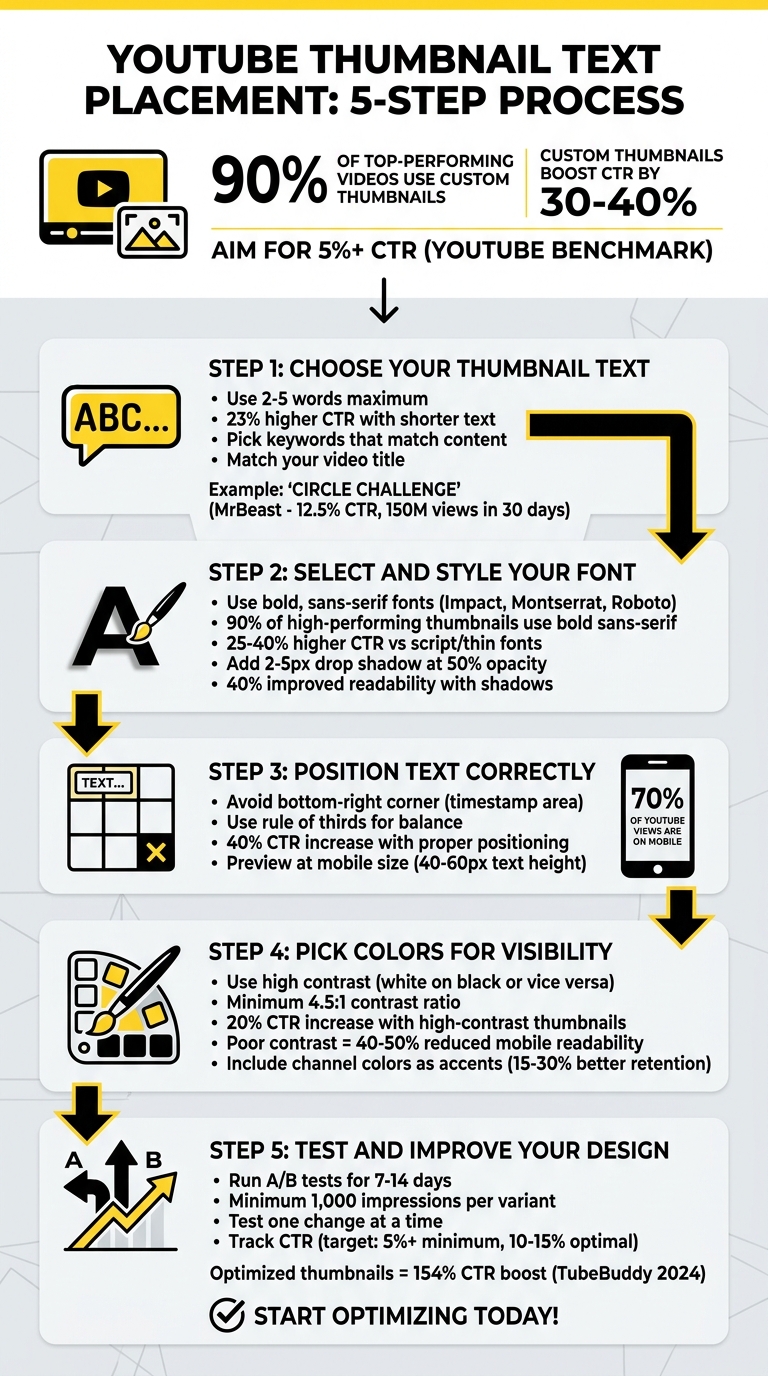
Your thumbnail can make or break your video's success. It’s the first thing viewers see, and 90% of top-performing videos use custom thumbnails, which can boost click-through rates (CTR) by 30-40%. Here’s a simple guide to creating effective thumbnails:
- Text: Keep it short (2-5 words) and match it to your video title. Use impactful keywords that reflect your content.
- Font: Use bold, sans-serif fonts like Impact or Montserrat for clarity, even at small sizes.
- Placement: Avoid the bottom-right corner (timestamps cover this area). Use the rule of thirds for balance.
- Colors: Choose high-contrast combinations (e.g., white on black) for readability, especially on mobile devices.
- Testing: Run A/B tests to see what works best. Monitor CTR (aim for 5%+), impressions, and watch-time share.
Focus on readability, alignment with your video’s theme, and testing designs for better performance. Tools like ThumbnailCreator can simplify the process by offering templates and previews for various devices.
5-Step YouTube Thumbnail Text Placement Checklist
The perfect amount of text for thumbnails
sbb-itb-b59debf
Step 1: Choose Your Thumbnail Text
The text on your thumbnail plays a huge role in how well your video performs. Since viewers make decisions in less than two seconds, keeping your text short and impactful is key.
Use 2-5 Words Maximum
Stick to 2-5 words for your thumbnail text. This keeps it readable, even on smaller screens like mobile devices, where thumbnails appear tiny. Research shows that thumbnails with shorter text see a 23% higher click-through rate (CTR) compared to those with longer text.
Take cues from successful creators. For instance, MrBeast’s thumbnail for "Last to Leave Their Circle Wins $500,000" simply said "CIRCLE CHALLENGE" - just three words. This helped the video hit 150 million views in 30 days with a 12.5% CTR, well above his channel average of 8%. For different types of content, examples like "Top 10 Hacks" for tutorials, "Mind-Blowing Facts" for listicles, or "Quick Recipe Win" for cooking videos work well.
Pick Keywords That Match Your Content
Choose 2-5 core keywords from your video script or title that clearly communicate the value of your content. For example, "AI Tools" works for a tech review, while "Weight Loss Tips" fits fitness content. Tools like YouTube Analytics or TubeBuddy can help you find keywords with high search volume and low competition. To make your text even more effective, pull these keywords directly from your video's opening to ensure they reflect its main promise.
Once you have your keywords, avoid common thumbnail mistakes by ensuring your text aligns closely with your video title to strengthen recognition.
Match Your Video Title
Your thumbnail text and video title should complement each other, not compete. When they align, viewers know exactly what to expect, which builds trust and boosts watch time - factors that YouTube's algorithm rewards. For example, if your video is titled "Best Budget Laptops 2024", use thumbnail text like "Best Budget Laptops" or "Cheap Laptop Deals". Similarly, for "How to Edit Videos Fast", a thumbnail that says "Fast Video Edits" is clear and engaging. A video titled "5-Minute Abs Workout" pairs perfectly with "5-Min Abs".
According to VidIQ's 2024 study, 90% of high-performing thumbnails use keywords from their video title, often increasing CTR by 15–20%. In one case, a gaming channel switched to a keyword-matched thumbnail like "Fortnite God Tips", which boosted their CTR from 4% to 12% in just one month.
If you’re using AI tools like ThumbnailCreator, you can quickly generate concise text based on your video title. For example, "Ultimate Guide to Productivity Hacks" could become "Ultimate Guide Hack", giving you a short, relevant option without needing advanced design skills.
Once your text is ready, the next step is choosing a font that reinforces your branding and makes the keywords stand out.
Step 2: Select and Style Your Font
Choosing the right font is crucial for making your thumbnail text easy to read on any device. Bold, sans-serif fonts work best because they remain sharp and clear, even when scaled down to small sizes like 128×72 pixels on mobile screens. Fonts such as Impact, Montserrat, and Roboto are excellent choices for maintaining clarity at any size. In fact, expert guides suggest that sans-serif fonts can reduce viewer drop-off by up to 20% in A/B tests compared to more decorative or serif options. Additionally, your font choice should align with your branding for a cohesive look.
Choose Bold, Sans-Serif Fonts
Fonts with bold strokes are especially effective for thumbnails. For example, Impact works well on busy backgrounds, with case studies showing it can increase click-through rates (CTR) by 15–30% in this niche. Bebas Neue is a great option for tight spaces due to its condensed design, while Oswald offers a sleek, geometric aesthetic. These fonts are readily available in tools like ThumbnailCreator, simplifying the process of applying them with AI assistance. According to TubeBuddy's analysis of over 1 million thumbnails, 90% of high-performing designs use bold sans-serif fonts, yielding 25–40% higher CTRs compared to script or thin fonts.
Match Your Channel's Font Style
Consistency in font style strengthens your brand identity. When you use the same font across all your thumbnails, it creates instant recognition for your audience. Research shows that this uniformity can boost subscriber retention by 15%. A consistent typography style not only enhances recognition but also contributes to higher CTRs. For instance, creators like MrBeast stick to a signature bold sans-serif font for every video. To achieve this, review your previous thumbnails to identify your current font choice - or select one now - and save it as a custom preset in your design tool for easy reuse.
Add Contrast and Shadows
To ensure your text stands out, use high-contrast color combinations like white text on dark backgrounds or black on light ones. Adding a 2–5 pixel drop shadow at 50% opacity can further separate your text from the background, making it easier to read. AI tools like ThumbnailCreator often include auto-contrast features to handle this for you. Tests show that shadowed text improves readability by 40% on photorealistic backgrounds, which is especially important since 70% of YouTube views come from mobile devices. Poor font contrast can lead to up to 35% fewer mobile views, so this step is essential.
Step 3: Position Text Correctly
Now that you've nailed down your font choices and created clear text, the next step is all about where you place it. Strategic text placement can make or break your thumbnail’s visibility and effectiveness.
YouTube’s interface adds overlays - like the timestamp in the bottom-right corner - that can block parts of your thumbnail. Placing your text carefully ensures your message stays clear and gives your thumbnail a polished, professional look that grabs attention.
Keep Text Away from Timestamps
YouTube automatically adds a timestamp to the bottom-right corner of every thumbnail. If your text overlaps this area, it becomes difficult - or even impossible - to read. To avoid this, steer clear of placing text in that corner. This simple adjustment ensures your message stays visible and easy to read.
Use the Rule of Thirds for Balance
The rule of thirds is a classic design principle that can bring balance to your thumbnail. Picture your thumbnail divided into a 3×3 grid. Placing your text at key intersection points (or along the left side) creates a visually appealing layout while avoiding YouTube’s interface overlays. In fact, well-positioned text can increase click-through rates by as much as 40% in some niches.
Preview for Mobile and Desktop
With so many viewers watching on mobile, your thumbnail needs to be legible on smaller screens. Always test how your design looks at mobile size. A good rule of thumb? Make sure your main text is about 40–60px high - it’ll stay sharp and readable when scaled down. Tools like ThumbnailCreator even let you preview your design across devices, so you can spot any issues before they start costing you clicks.
Step 4: Pick Colors for Visibility
Making your text easy to read is non-negotiable. The colors you choose can make or break your thumbnail's ability to grab attention. Poor color combinations can slash readability by as much as 40–50% on mobile screens.
Use Light Text on Dark Backgrounds (or Vice Versa)
High-contrast color combinations are your best friend here. Pairings like white on black or black on yellow create a strong visual distinction and meet accessibility standards with a contrast ratio of at least 4.5:1. In fact, YouTube's own data shows that high-contrast thumbnails can increase click-through rates by up to 20%.
For specific niches, certain combos work especially well: (You can see these in action by browsing trending YouTube thumbnails.)
- Tech videos: Neon yellow (#FFFF00) on deep blue (#001F3F)
- Gaming channels: White on forest green (#228B22)
- Lifestyle content: Bold black on pastel pink (#FFC0CB)
Avoid Bright or Conflicting Colors
Some color choices can actually hurt your thumbnail's readability. For example:
- Red text on green backgrounds offers a weak contrast ratio of about 1.4:1, which makes it hard to read.
- Neon pink on yellow can cause the colors to blur together, leading to eye strain.
To ensure your design works, preview your thumbnail at a smaller size (like 100×75 pixels) using free thumbnail tools like ThumbnailCreator. For extra precision, try free resources like WebAIM Contrast Checker to confirm your hex codes meet the contrast ratio requirements.
Include Your Channel Colors
Sticking to your brand colors helps build recognition and can improve subscriber retention by 15–30%, according to YouTube Creator Academy. But readability should always come first. Use your brand color as an accent - like a text outline or shadow - while keeping the main text in a neutral, high-contrast color.
For instance, if your brand color is blue (#007BFF), use it as a shadow for white text on a dark background. This way, you maintain the 4.5:1 contrast ratio while reinforcing your brand identity. Once you've nailed your color choices, you're ready to test and refine your design in the next step.
Step 5: Test and Improve Your Design
Once you've created your thumbnail, the next step is to test how well it performs and make necessary adjustments. Testing is the only way to know if your design resonates with viewers. YouTube's "Test & Compare" feature is a great tool for this. It allows you to upload up to three thumbnail versions and splits your audience evenly among them. By analyzing watch-time share, this feature helps identify which thumbnail captures your audience's attention best.
Run A/B Tests
When running A/B tests, stick to one change at a time. If you modify multiple elements - like text placement, colors, and facial expressions - you won't know which change made the difference. For example, you might test moving text from one side to the center or swapping a phrase like "How to Win" with "Win Every Time." Keeping everything else consistent ensures accurate results.
Aim to run each test for 7–14 days to collect enough data. Ideally, each variant should receive at least 1,000 impressions. Tools like ThumbnailCreator can streamline the process of creating multiple versions with minor tweaks, making your tests more efficient.
Check Readability at Small Sizes
Your thumbnail needs to stand out, even on smaller screens. Preview your design at around 200×125 pixels to simulate how it looks on mobile devices. If viewers can’t read the text within two seconds, it’s time to rethink your layout.
Track Your Click-Through Rate
A great thumbnail doesn't just look good - it drives results. Focus on metrics like click-through rate (CTR) to measure its success. YouTube considers a CTR above 5% strong, though averages generally fall between 2% and 10%. Keep an eye on both CTR and average view duration. If your thumbnail draws clicks but viewers leave quickly, it may not align with their expectations.
Document these results in a spreadsheet to track patterns. Over time, you'll build a library of insights about what appeals to your audience.
| Metric | Target/Benchmark | Why It Matters |
|---|---|---|
| Click-Through Rate (CTR) | 5% or higher | Indicates how well your thumbnail grabs attention |
| Testing Duration | 7–14 days minimum | Ensures data is statistically reliable |
| Sample Size | 1,000+ impressions | Reduces the risk of drawing conclusions from limited data |
| Watch-Time Share | Higher than competitors | Determines the most engaging thumbnail for your audience |
Conclusion
Getting your text placement right on YouTube thumbnails doesn’t have to be complicated. Stick to these five steps: use concise keywords, opt for bold fonts, place text strategically, choose high-contrast colors, and test your designs. These simple tweaks can make a big difference in your click-through rates and channel growth.
Here’s why it matters: thumbnails with clear, contrasting text can boost CTR by 154%, according to TubeBuddy's 2024 analysis of over 1 million videos. Optimized designs can lead to a 30% increase in CTR within three months. The best-performing thumbnails typically hit a 10-15% CTR range.
To make this process easier, tools like ThumbnailCreator can save you time. With features like templates, AI-powered text suggestions, and real-time previews for different devices, you can skip the hassle of mastering design software and focus on creating great content.
Keep in mind that 70% of YouTube views come from mobile devices. This means your text needs to be readable even at small sizes, like 128×72 pixels. Always preview your thumbnails on mobile, track your CTR in YouTube Analytics, and aim for at least a 5% CTR as a starting point. From there, refine your approach based on what works best for your audience.
The key to success? Test your designs, analyze the data, and keep improving. This checklist gives you the foundation you need to create thumbnails that grab attention and drive results.
FAQs
How do I choose the best 2–5 words for my thumbnail?
To get more clicks, pick short, clear, and attention-grabbing words that spark curiosity or emphasize key benefits. Use bold, large fonts with high contrast to make the text stand out, especially on mobile screens. The goal is to ensure the text is visually appealing and easy to read on any device.
Where should I place text so YouTube overlays don’t block it?
When designing content for YouTube, it's crucial to keep important text away from the bottom-right corner - this is where elements like timestamps and other overlays typically appear. To make sure your text stays visible across all devices, stick to safe zones and avoid placing text in areas where YouTube's interface might cover it. This simple adjustment ensures your message won't get lost under platform elements.
How do I A/B test thumbnails and know which one wins?
YouTube Studio's "Test & Compare" feature makes it easy to A/B test thumbnails. Here's how it works: upload different thumbnail variations and let the test run for about 7–14 days. During this time, track key metrics like click-through rate (CTR) and watch time to see which design performs better.
For the best results, focus on testing one element at a time. For example, you might experiment with colors, text placement, or font styles. By isolating variables, you can pinpoint what’s driving engagement. Once you identify the winning design, use those insights to fine-tune your future thumbnails and boost viewer interaction.